antd 를 이용해 TreeSelect 를 구현하던 중, 추가된 요구사항을 적용하는 과정에서 이슈가 발생했다.
기존 antd - TreeSelect 에는 자동으로 select box 가 생성되고 select box 를 클릭했을 때 하위에 dropdown 이 자동으로 생성된다.
dropdown 이 활성화 되었을 때, 사용자는 내가 만든 트리뷰의 가장 좌측의 아이콘(기본값: ▶)을 클릭하면 아이콘이 회전하며 하위 트리가 확장된다.
option 값으로 treeDefaultExpandAll 혹은 treeDefaultExpandedKeys 등을 이용하면 렌더링 시 자동으로 확장된 상태로 보이게도 가능하다.
추가된 요구사항은 dropdown 이 활성화 되었을 때, 트리뷰의 아이콘이 아니라 트리뷰 텍스트를 클릭했을 때도 트리가 확장되었으면 좋겠다는 것이었다.
위의 요구사항에 부합하는 기능은 antd - Tree 의 DirectoryTree 를 이용했을 때 흡사하게 구현가능 했다.
해당 트리를 이용하면 아이콘이 아닌 목록자체를 클릭해도 트리가 확장되는 것을 확인할 수 있었고, select box 와 dropdown 이 생성되는 부분을 직접 만들어줘야 했지만 방법을 찾았다고 생각하고 진행했다.
하지만 금방 또 다른 문제가 발생했다.
현재 작업했던 부분은 중복선택이 가능해야했는데, DirectoryTree 는 중복선택은 가능했지만 그럴려면 ctrl(Windows) / command(Mac) 와 같은 보조키를 사용해야만 했다. 클릭만으로 진행이 되어야 했기에 다른 방법을 찾아야했다.
그래서 css 로 직접 접근해보기로 했고, 적용시키기 위해 TreeSelect - dropdown 에 className 을 삽입시킨 후 진행했다.
// Selector.js
...
return (
<>
...
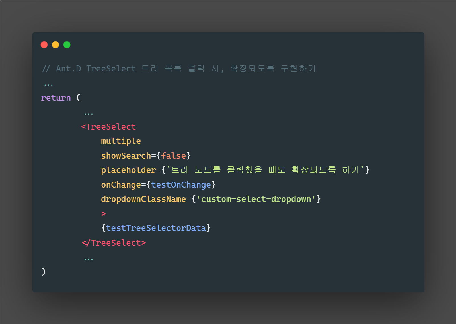
<TreeSelect
listHeight={600}
value={testValue}
placeholder={`트리 노드를 클릭했을 때도 확장되도록 하기`}
allowClear
multiple
maxTagCount={'responsive'}
maxTagTextLength={8}
treeDefaultExpandAll
onChange={testOnChange}
dropdownClassName={'custom-select-dropdown'}
>
{testTreeSelectorData}
</TreeSelect>
...
</>
)styled-component 로 진행을 하기엔, TreeSelect 에서 불러오는 dropdown 이 내부에 있지 않아 접근이 어려웠다. 그래서 scss 로 따로 파일을 빼서 진행했다.
// Selector.scss
.custom-select-dropdown {
  .ant-select-tree {
    .ant-select-tree-treenode {
      .ant-select-tree-switcher {
        position: absolute;
        width: 100%;
        text-align: left;
        z-index: 2;
        left: 7px;

        .ant-select-tree-switcher-icon {
          visibility: hidden;
        }

        &:hover + .ant-select-tree-node-content-wrapper {
          background-color: #1a335334;
        }
      }

      .ant-select-tree-node-content-wrapper {
        margin-left: 24px;
      }

      &.ant-select-tree-treenode-switcher-open:not(.last-sensor-node) {
        .ant-select-tree-node-content-wrapper {
          &:before {
            content: '';
            position: absolute;
            top: 10px;
            left: -16px;
            width: 0;
            height: 0;
            border-left: 4px solid transparent;
            border-right: 4px solid transparent;
            border-top: 4px solid #161616;
            z-index: 1;
            transform: rotate(0deg);
          }
        }
      }

      &.ant-select-tree-treenode-switcher-close {
        .ant-select-tree-node-content-wrapper {
          &:before {
            content: '';
            position: absolute;
            top: 10px;
            left: -16px;
            width: 0;
            height: 0;
            border-left: 4px solid transparent;
            border-right: 4px solid transparent;
            border-top: 4px solid #161616;
            z-index: 1;
            transform: rotate(-90deg);
          }
        }
      }
    }
  }
}(.last-sensor-node 는 마지막 노드에는 아이콘을 표기하지 않기 위해 임의로 className 을 삽입한 것이다.)
이렇게 하면, 대체적으로 만족하는 것을 확인할 수 있다. 하지만 Select box 에 검색기능을 활성화 시킨 경우 검색 후 Tree 를 클릭했을 때 css 가 깨진다.
추가적인 처리를 해줘야 하지만 검색기능은 비활성화 상태이기에 나중에 진행하기로 하고 여기까지만 정리를 한다.
