HTML&CSS 강의
반응형 웹(media 쿼리 실습)
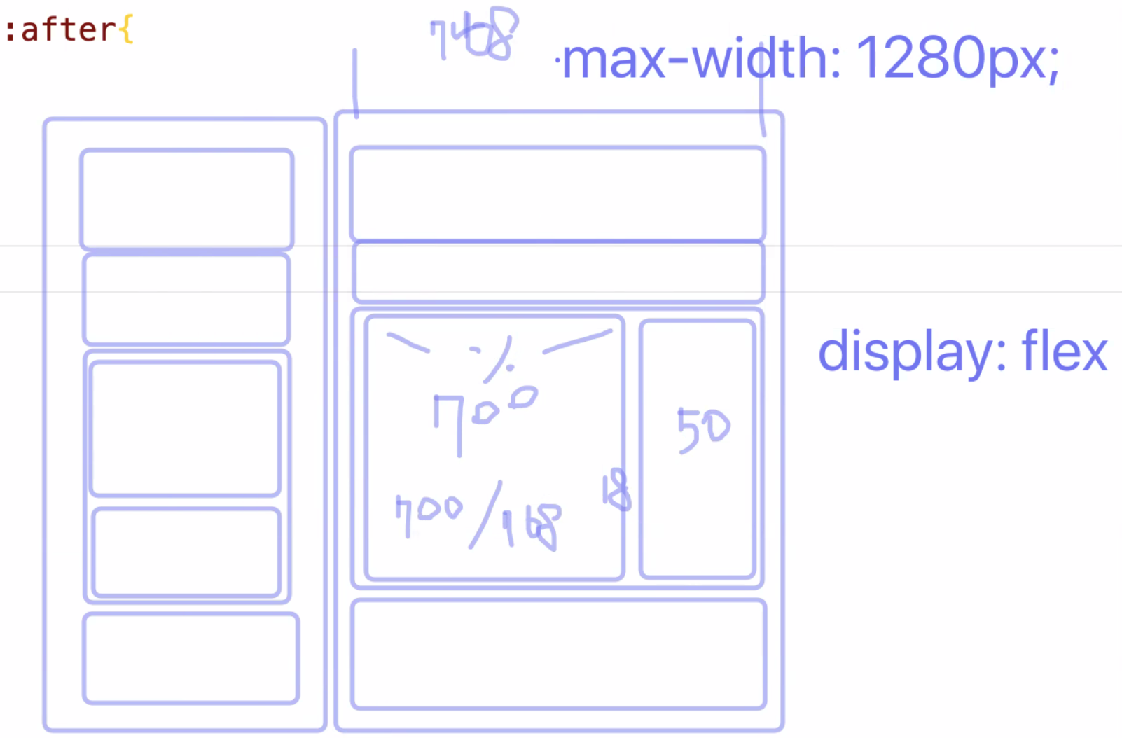
유동형 반응형 웹으로 만들고 싶을 땐 요소의 너비를 다음과 같이 화면 비율에 맞추어 나누어 주는 작업이 필요함
반응형을 만들 때, 모바일과 웹을 동시에 주는 속성과 그렇지 않은 속성을 구별하는 것이 필요!
화면을 구성할 때, flex row 가 column보다 더 유연함
media-query.html
<!DOCTYPE html>
<html lang="ko">
<head>
    <meta charset="UTF-8">
    <meta http-equiv="X-UA-Compatible" content="IE=edge">
    <meta name="viewport" content="width=device-width, initial-scale=1.0">
    <title>미디어 쿼리</title>
    <link rel="stylesheet" href="./css/media-query.css">
</head>
<body>
    <div class="container">
        <header class="header">헤더</header>
            <nav class="navigation">내비게이션</nav>
            <main class="main">
                <section class="content">메인 컨텐츠</section>
                <aside class="sidebar">사이드바</aside>
            </main>
            <footer class="footer">푸터</footer>
    </div>
</body>
</html>
base.css
/* 변수를 미리 지정해 둠 */
/* css의 변수는 앞에 $대신 --를 붙임(custom property) */
:root {
  --gray: #E8F0F2;
  --tomato: #CD5C5C;
  --coral: #ED8E7C;
  --green: #CDF3A2;
  --violet: #9B72AA;
  --pink: #FFC0CB;
  --yellow: #FFE194;
  --blue: #77ACF1;
  --cyan: #4CA1A3;
}

*, *::before, *::after {
    margin: 0;
    padding: 0;
    /* 버튼의 경우 border가 없어지기 때문에 모든 요소에 적용하는 것이 좋은 것만은 아님! */
    border: 0;
}
media-query.css
@import url("./base.css");

/* 공통 */
.container {
    display: flex;
    /* 단축속성, 행방향, 줄바꿈 허용! */
    flex-flow: row wrap;
    min-height: 100vh;
    /* 여러 줄 일땐 align-content */
    align-content: flex-start;
}

.header, .navigation, .main, .footer {
    width: 100%;
    min-height: 10vh;
}

.header {
    /* var라는 함수를 이용하여 변수를 가져옴 */
    background-color: var(--yellow);
}

.navigation {
    background-color: var(--pink);
}

.main {
    background-color: var(--blue);
}

.content {
    background-color: var(--coral);
}

.sidebar {
    background-color: var(--violet);
}

.footer {
    background-color: var(--tomato);
}

/* 태블릿의 기본 768px (이러한 사이즈는 통계를 많이 찾아보아야 함!) */
/* min과 max width를 잘 정의하는 것이 중요 */
@media screen and (max-width: 767px) {

}

@media screen and (min-width: 768px) {
    .container {
        max-width: 1200px;
        /* 가운데 정렬 하기위해 flex를 쓰기보다 margin을 이용한 가운데 정렬 */
        margin: 0 auto;
    }
    .main {
        display: flex;
        flex-flow: row nowrap;
        flex-grow: 1;
        justify-content: space-between;
    }
    .content {
        width: 78.125%
    }
    .sidebar {
        width: 19.53125%
    }
}
반응형 이미지(responsive-image 실습)
responsive-image.html
<!DOCTYPE html>
<html lang="ko">
<head>
    <meta charset="UTF-8">
    <meta http-equiv="X-UA-Compatible" content="IE=edge">
    <meta name="viewport" content="width=device-width, initial-scale=1.0">
    <title>반응형 미디어 (img 요소)</title>
    <link rel="stylesheet" href="./css/responsive.css">
</head>
<body>
    <h1>반응형 미디어 (img 요소)</h1>
    <!-- figure가 있으면 좋은 점은 반응형을 구현할 때, 결국 부모의 크기에 따라 이미지 크기가 반응하기 때문에
    시멘틱한 부모요소를 가질 수 있음 -->
    <!-- <figure>
        <img class="fullsize-max" src="./images/lezhin-narrow.webp" alt="">
    </figure> -->
    <!-- webp이미지를 지원하지 않는 경우 medium-1024가 나옴! -->
    <img srcset="./images/lezhin-wide.webp" src="./images/medium-1024.jpg" alt="" class="fullsize-max">
</body>
</html>
responsive.css
@import url("./base.css");

figure {
    background-color: var(--pink);
}

.fullsize {
    width: 100%;
    height: auto;
}

.fullsize-max {
    /* 이미지의 원본 크기보다 커지지 않기 위해 max-width 사용 */
    max-width: 100%;
    height: auto;
}
반응형 사진(responsive-picture 실습)
<!DOCTYPE html>
<html lang="ko">
<head>
    <meta charset="UTF-8">
    <meta http-equiv="X-UA-Compatible" content="IE=edge">
    <meta name="viewport" content="width=device-width, initial-scale=1.0">
    <title>반응형 미디어 (picture 요소)</title>
    <link rel="stylesheet" href="./css/responsive.css">
</head>
<body>
    <h1>반응형 미디어 (picture 요소)</h1>
    <figure>
        <!-- HTML5에서 표준으로 포함된 <picture>와 <source> 태그를 사용해 화면의 해상도 또는 브라우저 화면의 폭 너비에 따라 다른 이미지를 표시할 수 있다.
        그러나 IE11에서 지원 X -->
        <picture>
            <source srcset="/images/banner-narrow.jpg 1x, ./images/banner-narrow@2x.jpg 2x" media="(max-width: 767px)">
            <source srcset="/images/banner-wide.jpg 1x, ./images/banner-wide@2x.jpg 2x" media="(min-width: 1000px)">
            <!-- 이미지에다가 클래스룰 크기를 주어야 줄일 수 있음 (비디오와 다름) -->
            <img class="fullsize-max" src="./images/banner-wide.jpg" alt="">
        </picture>
    </figure>
</body>
</html>반응형 비디오(responsive-video 실습)
<!DOCTYPE html>
<html lang="ko">
<head>
    <meta charset="UTF-8">
    <meta http-equiv="X-UA-Compatible" content="IE=edge">
    <meta name="viewport" content="width=device-width, initial-scale=1.0">
    <title>반응형 미디어 (video 요소)</title>
    <link rel="stylesheet" href="./css/responsive.css">
</head>
<body>
    <h1>반응형 미디어 (video 요소)</h1>
    <figure>
        <video class="fullsize" poster="./video/poster.jpg">
            <source src="./video/Google Developer Stories.mp4" type="video/mp4">
            <source src="./video/Google Developer Stories.mov" type="video/mov">
            <source src="./video/Google Developer Stories.ogg" type="video/ogg">
            <source src="./video/google-developer-stories.webm" type="video/webm">
            <track src="./video/google-developer-stories-subtitles-en.vtt" kind="captions" srclang="en" label="English Caption">
        </video>
    </figure>
</body>
</html>
반응형 iframe(responsive-iframe 실습)
<!DOCTYPE html>
<html lang="ko">
<head>
    <meta charset="UTF-8">
    <meta http-equiv="X-UA-Compatible" content="IE=edge">
    <meta name="viewport" content="width=device-width, initial-scale=1.0">
    <title>반응형 미디어 (iframe 요소)</title>
    <link rel="stylesheet" href="./css/responsive.css">
</head>
<body>
    <h1>반응형 미디어 (iframe 요소)</h1>
    <figure>
        <div class="iframe-container iframe16">
            <!-- 가로는 반응형으로 딱 맞아도 세로가 다름 -->
            <iframe class="fullsize" src="https://www.youtube.com/embed/gdZLi9oWNZg" aria-label="방탄소년단 - Dynamite" frameborder="0" allowfullscreen></iframe>
        </div>
    </figure>
</body>
</html>
css
/* 패딩 트릭 */
.iframe-container {
    width: 100%;
    /* height: 0; */
    position: relative;
}

.iframe4 {
    padding-top: 75%;
}

.iframe16 {
    /* 이 aspect-ration쓰면 손쉽게 가능 iframe-container의 (height: 0) 을 지우고 해야함. IE에는 지원 X */
    /* aspect-ratio: 16/9; */
    padding-top: 56.25%;
}

.iframe-container iframe {
    position: absolute;
    top: 0;
    left: 0;
    width: 100%;
    height: 100%;
}
iframe의 높이를 조절하는 방법으로
padding 트릭과aspect-ratio를 사용하는 방법이 있음!
반응형 이디야 홈페이지 만들기 실습
반응형 헤더 만들기
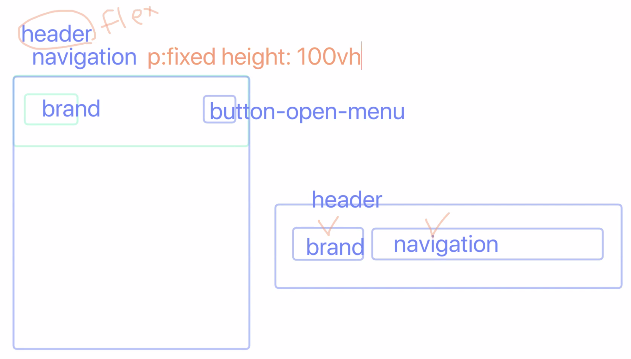
height에 퍼센트 단위가 아닌 뷰포트 단위로 해야함! (퍼센트 단위로 하려면 루트까지 올라가서 값을 주어야함)
<!DOCTYPE html>
<html lang="ko">
<head>
  <meta charset="UTF-8" />
  <meta http-equiv="X-UA-Compatible" content="IE=edge" />
  <meta name="viewport" content="width=device-width, initial-scale=1.0" />
  <link rel="shortcut icon" href="./images/favicon.ico" />
  <link rel="stylesheet" href="./css/main.css" />
  <title>음료 소개 - 이디야 커피</title>
</head>
<body>
  <div class="container">
    <div class="header-container">
        <div class="header" role="banner">
            <!-- 반응형에서는 이미지를 사용할 때 백그라운드로 사용하기 보다 img태그가 좋다. -->
          <h1 class="brand reset-box">
            <a href="#">
              <img class="fullsize-max" srcset="./images/ediya-logo.png 1x,
                          ./images/ediya-logo@2x.png 2x,
                          ./images/ediya-logo@3x.png 3x"
              src="./images/ediya-logo.png" alt="EDIYA COFFEE" />
            </a>
          </h1>
          <button type="button" class="button button-open-menu" aria-label="메뉴 열기" title="메뉴 열기">
            <span class="ir"></span>
          </button>
          <div class="navigation is-active" role="navigation">
            <h2 class="a11y-hidden">메인 메뉴</h2>
            <ul class="reset-list">
              <li><a href="#">로그인</a></li>
              <li><a href="#">회원가입</a></li>
              <li><a href="#">이디야 디자인</a></li>
              <li class="is-selected"><a href="#">이디야 음료</a></li>
              <li><a href="#">이디야 뉴스</a></li>
              <li><a href="#">매장찾기</a></li>
            </ul>
            <button class="button button-close-menu" type="button" aria-label="메뉴 닫기">
                <!-- 아이콘 이미지가 아닌 이렇게 x로 할 수 있음. 스크린 리더기를 위해 aria-hidden="true"을 사용해 읽지 않게 함 -->
              <span aria-hidden="true">×</span>
            </button>
          </div>
        </div>
    </div>
    <div class="main" role="main">메인 콘텐츠</div>
    <div class="footer a11y-hidden" role="contentinfo"></div>
  </div>
</body>
</html>
main.css
@import url(//spoqa.github.io/spoqa-han-sans/css/SpoqaHanSansNeo.css);
@import url(https://cdnjs.cloudflare.com/ajax/libs/normalize/8.0.1/normalize.css);
@import url(./reset.css);

:root{
  --gray: #e0e0e0;
  --tomato: #CD5C5C;
  --coral: #ED8E7C;
  --green: #CDF3A2;
  --violet: #9B72AA;
  --pink: #FFC0CB;
  --yellow: #FFE194;
  --blue: #2e437c;
  --cyan: #4CA1A3;

  /* blue 재 정의 --> primary로 */
  --primary: var(--blue);
}

body {
    font-family: 'Spoqa Han Sans Neo', 'sans-serif';
}

.container{
  /* background-color: var(--gray); */
}

.header-container {
    border-bottom: 1px solid var(--gray);
}
/* 헤더 */
.header{
  /* background-color: var(--pink); */
  display: flex;
  flex-flow: row nowrap;
  align-items: center;
}

/* 브랜드 로고 */
.brand {
    font-size: 1em;
    /* background-color: var(--yellow); */
    width: 46.93333333333333%;
    max-width: 200px;
}

.brand a {
    display: inline-block;
    padding: 1.125rem;
}


/* 모바일 */
@media screen and (max-width: 767px) {
    .header{
        justify-content: space-between;
    }
    .header .button-open-menu {
        user-select: none;
        padding: 0;
        background-color: #fff;
    }
    .header .button-open-menu .ir {
        display: block;
        width: 3.125rem;
        height: 3.125rem;
        background-image: url(./../images/button-navigation.svg);
        background-repeat: no-repeat;
        background-color: #fff;
        transition: all 300ms ease;
    }

    .header .button-open-menu:hover .ir {
        background-color: #f5f5f5;
        box-shadow: 0 0 1px 1px #eee;
    }

    .navigation{
        /* display: none; */
        background-color: hsla(225, 57%, 10%, 0.9);
        position: fixed;
        top: 0;
        left: 0;
        width: 100%;
        height: 100vh;
        color: #fff;
        padding-top: 3.5rem;
        transform: translateX(105vw);
        transition: all 400ms ease;
    }
    .navigation.is-active {
        transform: translateX(0);
    }

    .navigation li {
        border-bottom: 1px solid hsla(225, 57%, 30%);
    }

    .navigation a {
        display: block;
        padding: 1rem;
        transition: all 400ms ease-in;
    }

    .navigation a:hover, .navigation a:focus {
        background-color: var(--primary);
    }

    .button-close-menu {
        position: absolute;
        top: 0.625rem;
        right: 0.625rem;
        padding: 0.5rem;
        color: inherit;
        background-color: transparent;
        /* transition은 여기에다가 주어야함! 다시 마우스를 뗄 떼도 고려해야되어서 */
        transition: all 400ms ease;
    }

    .button-close-menu:hover, .button-close-menu:focus {
        transform: scale(1.5);
    }

}
/* 태블릿 이상 */
@media screen and (min-width: 768px) {
    .header {
        max-width: 75em;
        margin-left: auto;
        margin-right: auto;
    }

    .brand {
        margin-right: auto;
    }
    .button-open-menu, .button-close-menu{
        display: none;
    }

    .navigation ul {
        display: flex;
        flex-flow: row nowrap;
    }

    .navigation li {
        margin-left: 0.5rem;
    }

    .is-selected {
        font-weight: 700;
    }

    .navigation a {
        color: var(--primary);
        display: block;
        /* 14/16 */
        padding: 0.875rem 0;
    }
}
reset.css
*, *::before, *::after {
    box-sizing: border-box;
}

.reset-box {
    margin: 0;
    padding: 0;
  }

.reset-list {
    margin: 0;
    padding-left: 0;
    list-style: none;
}

.a11y-hidden {
    position: absolute;
    width: 1px;
    height: 1px;
    margin: -1px;
    clip: rect(0, 0, 0, 0);
    clip-path: polygon(0 0, 0 0, 0 0);
    overflow: hidden;
}

h1, h2, h3, h4 {
    font-size: inherit;
}

a {
    color: inherit;
    text-decoration: none;
}

a:focus {
    outline-offset: -2px;
}

.fullsize-max {
    max-width: 100%;
    height: auto;
}

.fullsize {
    width: 100%;
    height: auto;
}

.button {
    cursor: pointer;
    border: 0;
}
수업시간에 나온 사이트
The State Of Mobile First and Desktop First
프로젝트 완성 후 검증 다하기(html, css)
It is possible for ordinary people to choose to be extraordinary.