HTML&CSS 강의
웹 접근성 지침
최근 온라인 강의가 많이 늘어나고 있는데 줌을 많이 사용. 경쟁사로 webex가 있는데 zoom은 사용자 접근성을 많이 고려하여 만들어 졌다고 함
Accessibility - Zoom
클론코딩을 하되 접근성의 측면에서 고려해야할 부분이 무엇인가?를 생각하면서 그 부분을 반영하여 프로젝트를 하면 차별성을 둘 수 있음
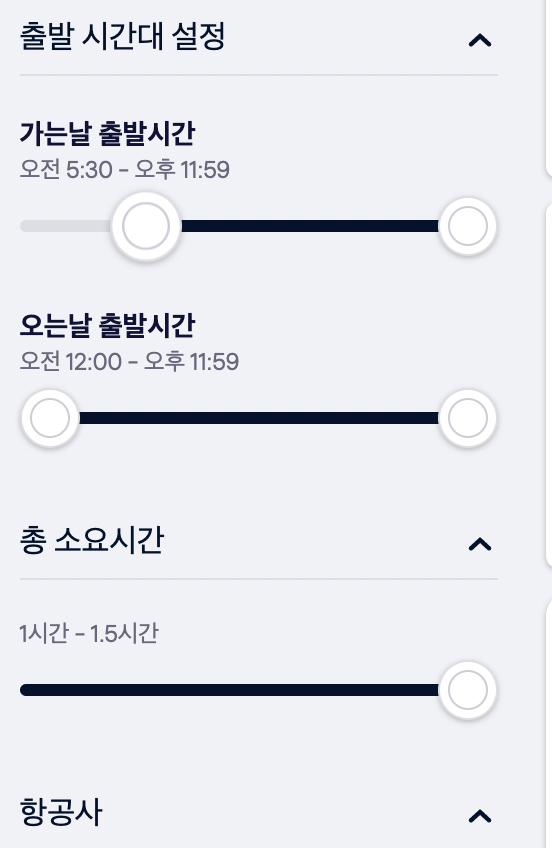
Skyscanner의 이러한 UI는 커스텀 UI인데 접근성 관점에서는 문제가 있음 마우스로는 되지만 키보드나 터치 부분에서 문제가 발생!
이러한 UI들을 볼 때 접근성에 관점에서도 생각을 해보면 시각을 넓힐 수 있음
화면 UI만들기 실습 (term css)
.term {
    background: #ccc linear-gradient(#ccc, #eee);
    border: 1px solid #aaa;
    margin-top: 20px;
    padding: 10px 15px;
    border-radius: 5px;
}

.term-heading {
    margin: 0;
    font-size: 1rem;
}

.term-list {
    display: flow-root;
    margin: 10px 0 0 0;
}

.term-list dd {
    margin-left: 0;
}

/* 구형 브라우저에서는 콜롬 하나만 붙여야 됨 */
.term-list:after {
    content: "";
    display: block;
    clear: both;
}

.term-list > div {
    margin: 10px 0;
}

.term-list-subject, .term-list-brief{
    float: right;
    width: 145px;
}

.term-list-subject {
    line-height: 1;
    /* margin-top: -3px; */
    color: #277684;
    margin-bottom: 5px;
}

.term-list-thumbnail {
    float: left;
}

.term-list-thumbnail img {
    vertical-align: top;
}

.term-list-brief {
    line-height: 1.2;
    font-size: 0.8725em;
}
term-list-thumbnail img와 dd태그의 term-list-thumbnail의 갭 차이가 나는 이유: vertical align이 달라서! (vertical align: top 이나 미드라인으로 바꾸어 주면 됨)
구조 선택자 누가 몇번째 자식인지(:nth-child) 를 이용하여 div 없이도 레이아웃을 여러개 만들 수 있음
화면에 나오는 키보드 접근 마크업
a 요소를 숨김 콘텐츠이지만 접근할 수 있어야하는 형태로 만들어야 함
그러다가 a요소가 포커스를 받았을 때 나오게 만들면 됨.
<div class="skip-navigation">
  <a href="#userEmail">본문 바로가기</a>
</div>
.skip-navigation {
position: fixed;
background: black;
text-align:center;
width: 100%;
z-index: 10;
}
.skip-navigation a {
position: absolute;
width: 1px;
height: 1px;
margin: -1px;
clip: rect(0, 0, 0, 0);
clip-path: inset(50%);
overflow: hidden;
padding: 15px;
color: white;
font-size: 0.875rem;
}
.skip-navigation a:focus {
position: static;
width: auto;
height: auto;
clip: initial;
clip-path: initial;
margin: initial;
display: inline-block;
outline-offset: -10px;
}z-index를 주지 않으면 그 아래 헤더가
position:relative를 갖고 있어서 마크업 순서상 마지막에 작성한 레이어가 겹쳐있어서 아래에 있는 것처럼 보임 --> z-index 값을 주어 해결
숨김 방법은 숨김 콘텐츠를 배운 그대로clip사용!
group2의 자료검색 form
주의해야할점: flex 컨테이너가 form관련 요소와 같이 작업할 때 오류가 많이 발생함
헤딩을 줄 수 없을 떄 aria를 사용하여 접근성에 도움을 줌
input type="search" 사용 추천
aria-label = "Search"
<h2 class="a11y-hidden">검색</h2>
<form method="POST" action="https://formspree.io/seulbinim@gmail.com" class="search-form">
  <fieldset>
    <legend>검색 폼</legend>
    <label for="search"><span class="icon-search" aria-hidden="true"></span>자료검색</label><input type="search" id="search" name="search" required placeholder="검색어를 입력하세요">
    <button class="button-search" type="submit">검색</button>
  </fieldset>
</form>
/* 검색 폼 */
.search-form {
background: #ccc linear-gradient(#ccc, #eee);
padding: 15px 25px 10px 15px;
border: 1px solid #aaa;
border-bottom-color: white;
border-radius: 15px 15px 0 0;
font-size: 0.875rem;
}
.search-form fieldset {
border: 0;
margin: 0;
padding: 0;
}
.search-form label {
line-height: 1;
}
.search-form * {
vertical-align: middle;
}
.search-form input {
appearance: none;
border: 1px solid #aaa;
height: 22px;
border-radius: 2px;
padding: 1px 1px 1px 5px;
margin: 0 10px;
width: 202px;
}
.button-search {
border: 0;
padding: 0 10px;
background: #000;
color: white;
height: 22px;
font-size: 0.75rem;
border-radius: 2px;
}그 외
주석에 조건부 주석을 달 수 있음
html5shiv polyfill
polyfill --> 간격을 줄여주는 것