1. 전체 탭 바 스타일 꾸미기
<MainTab.Navigator initialRouteName='메인'
      screenOptions={{
        tabBarStyle: {
          height: 70, shadowColor: "#000",
          shadowOffset: {
            width: 2,
            height: 4
          },
          shadowOpacity: 0.6,
          shadowRadius: 4,
          elevation: 4,
          borderTopRightRadius: 20,
          borderTopLeftRadius: 20,
          // paddingBottom: insets.bottom
        }
      }}
    >
screenOptions를 사용해서 스타일을 적용시킬 수 있었다.
이 때 탭바 높이를 설정하다 보니 문제가 하나 발생했다. ios폰중에 위에 m자 탈모(노치)가 있는 경우에 아래 탭바가 먹혀들어가는 현상이 발생했다. 이를 해결하자고 Ios에서만 이를 적용시키자니 노치가 없는 모델의 경우 문제가 생길 수 있어서 해당 부분을 서치 해봤다.
서치해 보니 react-native-safe-area-context의 useSafeAreaInsets 라는 함수가 있었고 해당 함수 사용 시 자동으로 화면의 가용범위를 받아와 줬다.
import {
  useSafeAreaInsets,
} from 'react-native-safe-area-context';

 const insets = useSafeAreaInsets();

 <MainTab.Navigator initialRouteName='메인'
      screenOptions={{
        tabBarStyle: {
          height: 70 + insets.bottom, shadowColor: "#000",
          shadowOffset: {
            width: 2,
            height: 4
          },
          shadowOpacity: 0.6,
          shadowRadius: 4,
          elevation: 4,
          borderTopRightRadius: 20,
          borderTopLeftRadius: 20,
          // paddingBottom: insets.bottom
        }
      }}
    >
위 코드와 같이 적용 결과
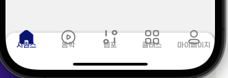
이런찌글이가
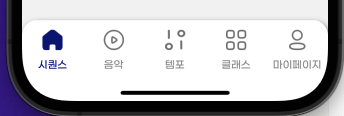
이렇게 정상적인 모양이 되었다!!
2. 탭바 클릭시 모양 변화
클릭 했을 때와 다른 탭 클릭시 색을 변화시키거나 아이콘의 모양을 변화시키는 방법은 해당 탭의 option중 tabBarIcon의 내부 값 focused 를 사용하면 됐다!
        component={HomeScreen}
        options={{
          tabBarIcon: ({ focused }) => (
            focused ?
            //클릭시 나오는 이미지 및 모양
              <Image
                source={assets.homeC}
                style={{ width: 26, height: 26 }}
              /> :
              //비활성화시 나오는 이미지 및 모양
              <Image
                source={assets.home}
                style={{ width: 26, height: 26 }}
              />
          ),
          tabBarActiveTintColor: '#000A7C'
          ,
tabBarActiveTintColor 이 옵션 또한 탭 시에 라벨 색을 변화시켜준다.

좋아하는걸 배우는건 신나🎵