커스텀
글자색과 크기 선택되면 나타나는 바
- 탭 크기
<Box sx={{width: '100%'}}> //100%로 주고
<Box sx={{borderBottom: 1, borderColor: 'divider'}}>
<TabList
value={value}
onChange={handleChange}
aria-label="basic tabs example"
variant="fullWidth" // 꽉차도록
disabled={false}>
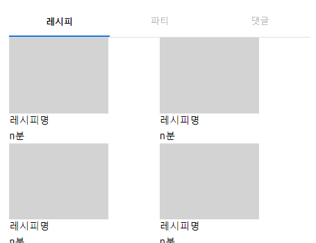
<Tab label="레시피" {...a11yProps(0)} />
<Tab label="파티" {...a11yProps(1)} />
<Tab label="댓글" {...a11yProps(2)} />
</TabList>
</Box>
<TabPanel value={value} index={0}>
<RecipeTab />
</TabPanel>
<TabPanel value={value} index={1}>
<PartyTab />
</TabPanel>
<TabPanel value={value} index={2}>
<CommentTab />
</TabPanel>
</Box>- 글자 색
테마생성
const theme = createTheme({
  components: {
    MuiTab: {
      styleOverrides: {
        textColorPrimary: {
          color: '#bababa',
          '&.Mui-selected': {
            //글씨색 지정이 primary랑 secondery만 지정되서 여기서 변경해주었다.
            color: '#000000',
            fontWeight: '800',
          },
        },
        indicator: {
          height: 0,
        },
      },
    },
  },
});- 선택시 나오는 바(indicator)
 <TabList
              value={value}
              onChange={handleChange}
              aria-label="basic tabs example"
              variant="fullWidth"
              disabled={false}
              TabIndicatorProps={{sx: {height: ''}}}> //삭제
              <Tab label="레시피" {...a11yProps(0)} />
              <Tab label="파티" {...a11yProps(1)} />
              <Tab label="댓글" {...a11yProps(2)} />
            </TabList>
전체코드
import * as React from 'react';
import PropTypes from 'prop-types';
import TabList from '@mui/material/Tabs';
import Tab from '@mui/material/Tab';
import Typography from '@mui/material/Typography';
import Box from '@mui/material/Box';
import {createTheme, ThemeProvider} from '@mui/material/styles';

import RecipeTab from 'pages/myPage/RecipeTab';
import PartyTab from 'pages/myPage/PartyTab';
import CommentTab from 'pages/myPage/CommentTab';

const theme = createTheme({
  components: {
    MuiTab: {
      styleOverrides: {
        textColorPrimary: {
          color: '#bababa',
          '&.Mui-selected': {
            color: '#000000',
            fontWeight: '800',
          },
        },
        indicator: {
          height: 0,
        },
      },
    },
  },
});

function TabPanel(props) {
  const {children, value, index, ...other} = props;

  return (
    <div
      role="tabpanel"
      hidden={value !== index}
      id={`simple-tabpanel-${index}`}
      aria-labelledby={`simple-tab-${index}`}
      {...other}>
      {value === index && (
        <Box sx={{p: 3, padding: 0}}>
          <Typography>{children}</Typography>
        </Box>
      )}
    </div>
  );
}

TabPanel.propTypes = {
  children: PropTypes.node,
  index: PropTypes.number.isRequired,
  value: PropTypes.number.isRequired,
};

function a11yProps(index) {
  return {
    id: `simple-tab-${index}`,
    'aria-controls': `simple-tabpanel-${index}`,
  };
}

function MyPost() {
  const [value, setValue] = React.useState(0);

  const handleChange = (event, newValue) => {
    setValue(newValue);
  };

  return (
    <>
      <h3>나의 글</h3>
      <ThemeProvider theme={theme}>
        <Box sx={{width: '100%'}}>
          <Box sx={{borderBottom: 1, borderColor: 'divider'}}>
            <TabList
              value={value}
              onChange={handleChange}
              aria-label="basic tabs example"
              variant="fullWidth"
              disabled={false}>
              <Tab label="레시피" {...a11yProps(0)} />
              <Tab label="파티" {...a11yProps(1)} />
              <Tab label="댓글" {...a11yProps(2)} />
            </TabList>
          </Box>
          <TabPanel value={value} index={0}>
            <RecipeTab />
          </TabPanel>
          <TabPanel value={value} index={1}>
            <PartyTab />
          </TabPanel>
          <TabPanel value={value} index={2}>
            <CommentTab />
          </TabPanel>
        </Box>
      </ThemeProvider>
    </>
  );
}

export default MyPost;
출처
공식문서:https://mui.com/material-ui/react-tabs/#main-content
이슈: https://github.com/mui/material-ui/issues/32490

웹개발자가 되자