출처 : 유튜브 드림코딩 flexbox
flexbox
flexbox? item들을 행 또는 열로 자유자재로 배치시킬 수 있다.
float : flexbox 이전에 사람들이 자주 사용하던 것. image와 text를 어떻게 배치할 것인지를 정의하기 위해 나타남.
ex) float : left ; float : center
**
✏️ flexbox의 큰 특징 2가지
1. container/ item 속성값들이 존재한다.
2. 중심축(main axis)와 반대축(cross axis)이 있다.
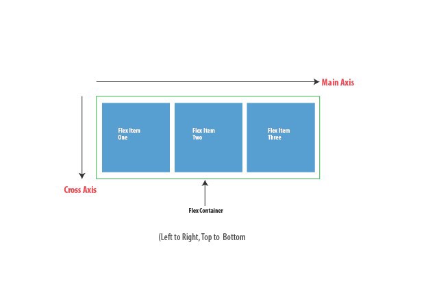
container/ item 속성값들
flexbox에는 container 내에 적용할 수 있는 속성값들, item 내에 적용할 수 있는 속성값들이 존재한다.
- container 속성값 ex) display, flex-direction, flex-wrap, flex-flow, justify-content, align-items, align-content
- item 속성값 ex) order, flex-grow, flex-shrink, flex, algin-self
container 속성값
▪️ flex-direction
flex의 방향을 가로(행, row)로 할 것인지 세로(열, column)로 할 것인지 결정한다. 기본값 : row
▪️ flex-wrap
wrap : item 들이 한줄에 꽉 차게 되면 자동적으로 다음 line으로 넘어가게 한다. flex-wrap 기본값 : nowrap
.container{
	display : flex;
    flex-direction : row;
    flex-wrap : wrap;}

.container{
	display : flex;
    flex-direction : row-reverse;
    }
row-reverse : 행으로 배치하고 item들의 순서를 역으로 바꾼다.
▪️ flex-flow
flex-direction 과 flex-wrap 을 합친 것
.container{
	flex-flow : row nowrap;}
▪️ justify-content
중심축(main axis)에서 item 이 어떻게 배치할 것인지를 보여준다. 기본값 : flex-start
justify-content: flex-end;위의 코드를 통해 item들을 오른쪽에 배치한다.
flex-direction : column;
justify-content: flex-end;
위의 코드를 통해 item들을 아래쪽에 배치한다.
- jusify-content는 item의 순서를 바꾸지는 않는다. reverse만 순서 바꾸는 것!
justify-content : center; -> item 가운데 정렬
justify-content : space-around; -> item 사이 양 옆 공간을 준다.
justify-content : space-evenly; -> item 모든 사이 공간이 같다.
justify-content : space-between; -> 가장 끝 item들은 공간이 없다.
▪️ align-items
반대축(cross axis)에서 item을 배치한다.
ex)
align-items : center;---> 반대축(열)의 가운데에 배치
align-items : baseline;----> item 모두 균등하게 배치
▪️ align-content
반대축(cross axis) item을 지정한다.
align-content : space-between;
align-content : center;
align-content : space-evenly;
item 속성값
▪️ order
item 들의 순서 지정 가능
.item{
	order : 1;}
▪️ flex-grow
container를 item들이 꽉 채울 수 있게끔 만들어줌. 기본값 : 0
.item1{
	flex-grow:1}
.item2{
	flex-grow:1}
.item3{
	flex-grow:1}
▪️ flex-shrink
container가 점점 작아졌을 때 얼마나 item 줄어들게 할 것인지 지정한다. 기본값 : 0
.item1{
	flex-shrink:2}
.item2{
	flex-shrink:1}
.item3{
	flex-shrink:1}
item1 이 다른 item들보다 두배 더 작게 줄어든다.
=> flex-grow 와 flex-shrink는 container의 size가 바뀜에 따라 item들이 얼마나 줄어들고 늘어나야하는지를 정의한다.
▪️ flex-basis
item들이 얼마나 자리를 차지해야 하는지 세부적으로 명시할 수 있게 해준다.
기본값 : auto
flex-basis : 70%무조건 다른 item들에 비해 70%를 차지한다.
▪️ align-self
item 개개별로 item을 정렬한다. container을 벗어날 수 있다.
.item1{
	align-self : center}
위의 해당 아이템만 중앙정렬된다.
참고)
- 간단하게 태그 만드는 법
ex)
div.container>div.item.item${$}*10tap key 누르면, 아래와 같이 생성됌.
<div class = container>
	<div class = "item item1">1</div>
    <div class = "item item2">2</div>
    .생략
    .
    .
    .
    .
    <div class = "item item10">10</div>

</div>
- css-trick 웹사이트 : flexbox 기억이 잘 안날 때 찾아볼 수 있음!