ThemeData
Setting properties such as text and color inside the theme data within the build method can save us a lot of time from hard coding reusable codes.
// Example
theme: ThemeData(
  backgroundColor: // your background color
  textTheme: TextTheme(
  	headline1: TextStyle(
      color: // your text color
    ),
  ),
  cardColor: your color
),
To access theme themes, we use the Theme.of(context) widget.
Theme.of(context).backgroundColor
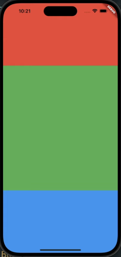
Flexible
Flexible allows us to create multiple UI screens without hard coding.
We can easily set the ratio of the screens using the flex property.
// Example
body: Column(
  children: [
  	Flexible(
      flex: 1,
      child: Container(
      decoration: BoxDecoration(
      	color: Colors.red;
      ),
    ),
    Flexible(
      flex: 3,
      child: Container(
      decoration: BoxDecoration(
      	color: Colors.green;
      ),
    ),
    Flexible(
      flex: 1,
      child: Container(
      	decoration: BoxDecoration(
      	  color: Colors.blue;
        ),
      ),
    ),
  ],
)
Timer
The Timer class allows you to create timers that can execute a specified function after a certain duration has passed.
Timer.periodic(Duration(seconds: seconds), (timer) {})For each time passed, the timer class will implement a certain function to activate.
// Example
int totalSeconds = 1500;
late Timer timer;

void onTick(Timer timer) {
  setState() {
  	totalSeconds = totalSeconds - 1;
  });
}

void onStartPressed() {
  timer = Timer.periodic(
  	const Duration(seconds: 1),
    onTick,
  );
}
We can stop the timer by implementing the cancel() function.
// Example
timer.cancel();
Date Format
We can use a date formatting method to customize our integers to look more like a timer. This can be done with the Duration() class.
Duration(seconds: seconds)By using a combination of the Duration() class and varous string methods, we can make our integers look like an actual countdown timer.
// Example
String format(int seconds) {
  var duration = Duration(seconds: seconds);
  return duration.toString().split(",").first.substring(2, 7);
}
SafeArea
A SafeArea is a widget that inserts its child into an area of the screen that is safe from overlapping by the operating system's UI elements, such as the status bar or the notch (the cut-out) in newer phones.
body: SafeArea(
  // Your code
),
bottomNavigationBar
BottomNavigationBar is a widget that's typically used at the bottom of the Scaffold to display a set of navigation items. It's a common pattern in many mobile applications to provide quick access to top-level views or functionalities of the app.
Specifically, we can use the BottomAppBar widget to create a navigation bar on the bottom of the screen without the need of any gaps.
bottomNavigationBar: BottomAppBar(
  // Your code
),
FractionallySizedBox
FractionallySizedBox is a widget that sizes its child to a fraction of the total available space. This allows you to create layouts where a child widget takes up a certain percentage of its parent's size, either in width, height, or both.
return FractionallySizedBox(
  widthFactor: 1, // 100%
),
Expanded
Expanded widget is a simple yet powerful tool when working with layouts, especially with the Row and Column widgets. The primary purpose of the Expanded widget is to take up available space along the main axis (horizontal for Row and vertical for Column).
Expanded(
  flex: 1,
  child: Container(
    color: Colors.blue,
    child: Center(
      child: Text(
        'Takes up 1/3 of space'
      )
    )
  ),
),
Stack
Stack widget is used to overlay several children widgets on top of each other. The children are positioned based on the top, right, bottom, and left edge of their non-positioned children in the stack. This makes the Stack widget very useful for creating complex layouts where widgets overlap or are positioned in a layered manner.
body: Center(
  child: Stack(
    alignment: Alignment.center,
    children: [
      Container(  // Non-positioned child
        width: 300,
        height: 300,
        color: Colors.blue,
      ),
      Positioned(  // Positioned child
        top: 10,
        left: 10,
        child: Icon(Icons.star, size: 50, color: Colors.white),
      ),
      Positioned(  // Another positioned child
        bottom: 10,
        right: 10,
        child: Icon(Icons.star, size: 50, color: Colors.white),
      ),
      Text('Centered Text'),  // This is centered due to the Stack's alignment property
    ],
  ),
),
Align
Align widget is used to align its child within itself and optionally resize the child based on the child's alignment. It's a useful widget when you want to position a child within a larger container in a specific manner without having to deal with the complexities of a Stack or other layout widgets.
Align(
  alignment: Alignment.centerRight,
  child: icon,
),
TextField
TextField widget is an essential and commonly used widget for receiving user input in the form of text. It provides an editable text field with various customization options to accommodate a wide range of use-cases.
TextField(
  decoration: InputDecoration(
  	hintText: "Username", // placeholder
    enabledBorder: UnderlineInputBorder(
      borderSide: BorderSide(
        color: Colors.grey.shade400, // enabled state
      ),
    ),
    focusedBorder: UnderlineInputBorder(
      borderSide: BorderSide(
        color: Colors.grey.shade400,
      ),
    ),
  ),
  cursorColor: Colors.grey, // cursor color
),
Form
Form widget acts as a container for grouping together multiple FormField widgets (like TextFormField). It provides features for validating the input of all the FormField children collectively and handling their data. The Form widget works in combination with a GlobalKey FormState to manage the state of its fields.
Form(
  child: Column(
  	children: [
  	  TextFormField() // Your text
  	],
  ),
),
Controller
Controllers are objects that allow you to interact with certain widgets and maintain and manage their state. They serve as a bridge between the UI (the widget) and the underlying logic, enabling you to read widget values or update them programmatically. Controllers can also be used to listen to changes and execute certain logic in response.
NOTE: Switch to stateless widget.
final TextEditingController _usernameController = TextEditingController();
String _username = "";
void initState() {
super.initState();
_usernameController.addListener(() {
setState(() {
_username = _usernameController.text;
});
});
}
decoration: BoxDecoration(
  color: _username.isEmpty ? Colors.grey.shade400 : Colors.green;
),

TextField(
  controller: _usernameController,
  decoration: InputDecoration(
  	hintText: "Username", // placeholder
    enabledBorder: UnderlineInputBorder(
      borderSide: BorderSide(
        color: Colors.grey.shade400, // enabled state
      ),
    ),
    focusedBorder: UnderlineInputBorder(
      borderSide: BorderSide(
        color: Colors.grey.shade400,
      ),
    ),
  ),
  cursorColor: Colors.grey, // cursor color
),
AnimatedContainer
AnimatedContainer widget in Flutter provides a way to automatically animate between old and new values of properties over a given duration. It's essentially a Container that can smoothly change its properties like width, height, color, padding, margin, and more.
child: AnimatedContainer(
  duration: Duration(millisseconds: 500),
),
AnimataedDefaultTextStyle widget in Flutter provides a way to implement animation effects on texts within containers or buttons.
child: AnimatedDefaultTextStyle(
  duration: const Duration(milliseconds: 00),
  style: TextStyle(
    color:
      _name.isEmpty || _email.isEmpty || _birthday.isEmpty
        ? const Color.fromARGB(255, 229, 226, 226)
        : Colors.white,
    fontSize: Sizes.size16 + 2,
  ),
),
CupertinoDatePicker
CupertinoDatePicker is a widget in Flutter's Cupertino library, which aims to mimic the iOS UI design. The CupertinoDatePicker is specifically styled after the iOS date picker component. This widget allows users to pick a date, time, or both using a spinning wheel, which is typical in the iOS design language.
CupertinoDatePicker(
  mode: CupertinoDatePickerMode.date,
  initialDateTime: DateTime.now(),
  onDateTimeChanged: (DateTime newDateTime) {
    // Handle the new date time here
  },
);
Wrap
The Wrap widget is used to lay out its children in multiple run-like flow lines. It's similar to a Row or Column, but if the horizontal (or vertical) space runs out, it wraps its children to the next line.
The Wrap widget is particularly useful when the number of children is unknown or can change dynamically. It arranges its children in a line, and when it runs out of space, it wraps them to the next line.
Wrap(
  spacing: 8.0, // gap between adjacent chips
  runSpacing: 4.0, // gap between lines
  children: <Widget>[
    Chip(label: Text('One')),
    Chip(label: Text('Two')),
    Chip(label: Text('Three')),
    Chip(label: Text('Four')),
    // ... other children
  ],
)
Cupertino Button
CupertinoButton is a widget that provides an iOS-style button. The Cupertino library in Flutter is designed to replicate the iOS Human Interface Guidelines, so when you want your app to have a look and feel similar to native iOS apps, you would use Cupertino widgets.
CupertinoButton(
  child: Text('Tap Me'),
  onPressed: () {
    print('Button tapped!');
  },
)
Scrollbar
The Scrollbar widget is a material design scrollbar that indicates which portion of a Scrollable widget is currently visible. It's often used in combination with lists, grids, or any scrollable content to provide visual feedback to users about their scroll position.
The Scrollbar itself is an interactive widget. Users can drag the scrollbar thumb to move content, or they can just scroll the content directly, and the scrollbar will adjust its position correspondingly.
Scrollbar(
  child: ListView.builder(
    itemCount: 100,
    itemBuilder: (context, index) {
      return ListTile(title: Text('Item $index'));
    },
  ),
)
Animated Opacity
AnimatedOpacity widget allows you to animate the opacity of a widget over a given duration. It provides a smooth transition of the opacity, making it ideal for fade-in or fade-out effects.
AnimatedOpacity(
  opacity: _visible ? 1.0 : 0.0,
  duration: Duration(seconds: 1),
  child: Text('Fade me in/out'),
)
Tab Widgets
DefaultTabController
DefaultTabController is a convenient widget that provides a default TabController for its descendants. This is particularly useful when working with the combination of TabBar (to display the tabs) and TabBarView (to display the content corresponding to each tab).
Using a DefaultTabController means you don't have to explicitly create and manage a TabController yourself, which can simplify the code for typical tab setups.
TabBarView
TabBarView widget is designed to display the contents corresponding to each tab in a TabBar. When you swipe between each item in the TabBarView, the corresponding tab in the TabBar gets activated.
DefaultTabController(
  length: 3, // Number of tabs
  child: Scaffold(
    appBar: AppBar(
      title: Text("TabBar Example"),
      bottom: TabBar(
        tabs: <Widget>[
          Tab(icon: Icon(Icons.one_k)),
          Tab(icon: Icon(Icons.two_k)),
          Tab(icon: Icon(Icons.three_k)),
        ],
      ),
    ),
    body: TabBarView(
      children: <Widget>[
        Center(child: Text('Tab 1 content')),
        Center(child: Text('Tab 2 content')),
        Center(child: Text('Tab 3 content')),
      ],
    ),
  ),
)
TabPageSelector
TabPageSelector widget is an indicator that displays the currently selected page of a page view. It's often used in conjunction with the PageView widget to show the user which page they are currently viewing and how many pages are available.
The TabPageSelector will display a series of dots, with one dot corresponding to each page in the PageView. The dot corresponding to the currently viewed page will be highlighted.
class PageViewWithSelector extends StatefulWidget {
_PageViewWithSelectorState createState() => _PageViewWithSelectorState();
}
class _PageViewWithSelectorState extends State<PageViewWithSelector> {
final controller = PageController();
Widget build(BuildContext context) {
return Scaffold(
appBar: AppBar(
title: Text('TabPageSelector Example'),
actions: <Widget>[
// Displaying the TabPageSelector in the AppBar
TabPageSelector(controller: controller),
],
),
body: PageView(
controller: controller,
children: <Widget>[
Center(child: Text('Page 1')),
Center(child: Text('Page 2')),
Center(child: Text('Page 3')),
],
),
);
}
}
AnimatedCrossFade
AnimatedCrossFade widget is used to animate between two children. It cross-fades between a "first" and "second" child, with the ability to animate the fade-in of the second child and fade-out of the first child simultaneously. It can also animate between the given children's sizes.
This widget can be handy when you want to switch between two widgets with a smooth fade transition, such as toggling between two states in your UI.
class CrossFadeExample extends StatefulWidget {
_CrossFadeExampleState createState() => _CrossFadeExampleState();
}
class _CrossFadeExampleState extends State<CrossFadeExample> {
bool _showFirst = true;
Widget build(BuildContext context) {
return Scaffold(
appBar: AppBar(title: Text('AnimatedCrossFade Example')),
body: Center(
child: AnimatedCrossFade(
duration: const Duration(seconds: 1),
firstChild: const FlutterLogo(style: FlutterLogoStyle.horizontal, size: 100.0),
secondChild: const FlutterLogo(style: FlutterLogoStyle.stacked, size: 100.0),
crossFadeState: _showFirst ? CrossFadeState.showFirst : CrossFadeState.showSecond,
),
),
floatingActionButton: FloatingActionButton(
onPressed: () {
setState(() {
_showFirst = !_showFirst;
});
},
child: Icon(Icons.swap_horiz),
),
);
}
}
showModalBottomSheet
showModalBottomSheet is a function in the Flutter framework that is used to display a modal bottom sheet. A bottom sheet is a type of user interface element that slides up from the bottom of the screen to display additional content or options without taking up the entire screen space. It's commonly used to present a set of actions, additional information, or user controls in a context that doesn't require a new screen.
The showModalBottomSheet function takes a BuildContext as a parameter and returns a Future that resolves when the modal bottom sheet is dismissed. You can provide a widget to be displayed within the bottom sheet using the builder parameter. This widget can contain any content you want to display, such as buttons, text, images, or more complex UI components.
void _showBottomSheet(BuildContext context) {
  showModalBottomSheet<void>(
    context: context,
    builder: (BuildContext context) {
      return Container(
        height: 200,
        child: Column(
          children: <Widget>[
            ListTile(
              title: Text('Option 1'),
              onTap: () {
                // Perform action for Option 1
                Navigator.pop(context);
              },
            ),
            ListTile(
              title: Text('Option 2'),
              onTap: () {
                // Perform action for Option 2
                Navigator.pop(context);
              },
            ),
            // Add more options or content as needed
          ],
        ),
      );
    },
  );
}
Vertical Divdider
VerticalDivider widget is used to create a vertical line that can be used as a divider between UI elements, typically in a Row. It's a handy widget when you want to visually separate content horizontally. This widget is analogous to the Divider widget, which provides a horizontal line.
VerticalDivider(
  color: Colors.black,
  thickness: 2.0,
  width: 20.0,
),
Close Button
CloseButton widget represents a Material Design close button. Typically, you'd see this used in app bars (AppBar) to dismiss a view, such as on a dialog or a page pushed onto the navigation stack.
The CloseButton is visually represented as an "X" icon, and it's essentially a simplified and specific version of the IconButton with the close icon already specified.
When the CloseButton is tapped, it pops the current route off the navigation stack (i.e., it calls Navigator.pop(context)).
AppBar(
  leading: CloseButton(onPressed: () {
    // Custom behavior on button press (optional).
    // By default, it would pop the current screen/view.
    Navigator.pop(context);
  }),
  title: Text('Close Button Example'),
),
Circular Progress Indicator
CircularProgressIndicator widget is a material design circular progress indicator, which can be used to show that the application is in progress of completing a task. It's essentially a spinning circle, commonly used to indicate waiting or loading state to the user.
For efficiency, it is recommended to use the CircularProgressIndicator.adaptive widget which will automatically detect devices and apply either Android or iOS design repectively.
CircularProgressIndicator(
  value: 0.5, // 50% progress
  backgroundColor: Colors.grey,
  valueColor: AlwaysStoppedAnimation<Color>(Colors.blue),
)CircularProgressIndicator.adaptive(
value: 0.5, // 50% progress
backgroundColor: Colors.grey,
valueColor: AlwaysStoppedAnimation<Color>(Colors.blue),
)
showDatePicker
showDatePicker is a function that presents a material design date picker to the user. It allows users to pick a date from the calendar dialog, and you can use the selected date in your Flutter application.
await showDatePicker(
  context: context,
  initialDate: //reqd,
  firstDate: //reqd,
  lastDate: //reqd,
);

///Date
DateTime selected = DateTime.now();
DateTime initial = DateTime(2000);
DateTime last = DateTime(2025);
showTimePicker
showTimePicker is a function that presents a material design time picker to the user. It allows users to pick a time from a clock, and you can use the selected time in your Flutter application.
await showTimePicker(
    context: context,
    initialTime: timeOfDay);

///Time
TimeOfDay timeOfDay = TimeOfDay.now();
showDateRangePicker
showDateRangePicker is another function provided by Flutter that displays a material design date range picker. Instead of picking just a single date, like with showDatePicker, the showDateRangePicker function allows the user to pick a range of dates, which is useful for scenarios where start and end dates are required.
_selectDateRange(BuildContext context) async {
    DateTimeRange newSelectedDateRange = await showDateRangePicker(
      context: context,
      firstDate: DateTime(2000),
      lastDate: DateTime(2101),
      initialDateRange: _selectedDateRange ??
          DateTimeRange(
            start: DateTime.now(),
            end: DateTime.now().add(Duration(days: 7)),
          ),
    );

    if (newSelectedDateRange != null) {
      setState(() {
        _selectedDateRange = newSelectedDateRange;
      });
    }
  }
Cupertino Alert Dialog
CupertinoAlertDialog widget in Flutter is part of the flutter/cupertino.dart package and is designed to replicate the iOS-style alert dialog. This dialog often comes with a title, content, and a set of actions that the user can tap on. It is typically used to convey critical information, ask for decisions, or involve multiple levels of information in a single screen.
When using this widget, you should ensure it fits within the aesthetics and behavior of an iOS app. If you're aiming for a platform-agnostic design or a Material Design look, you'd be better off using the AlertDialog widget from the flutter/material.dart package.
To use Android style, remove the word "Cupertino" from the methods names.
import 'package:flutter/cupertino.dart';
void main() => runApp(MyApp());
class MyApp extends StatelessWidget {
Widget build(BuildContext context) {
return CupertinoApp(
title: 'CupertinoAlertDialog Demo',
home: MyHomePage(),
);
}
}
class MyHomePage extends StatelessWidget {
void _showDialog(BuildContext context) {
showCupertinoDialog(
context: context,
builder: (BuildContext context) => CupertinoAlertDialog(
title: Text('Alert'),
content: Text('This is a Cupertino alert dialog.'),
actions: <Widget>[
CupertinoDialogAction(
child: Text('Cancel'),
onPressed: () {
Navigator.of(context).pop();
},
),
CupertinoDialogAction(
child: Text('OK'),
onPressed: () {
Navigator.of(context).pop();
},
),
],
),
);
}
Widget build(BuildContext context) {
return CupertinoPageScaffold(
navigationBar: CupertinoNavigationBar(
middle: Text('CupertinoAlertDialog Demo'),
),
child: Center(
child: CupertinoButton(
child: Text('Show Alert'),
onPressed: () => _showDialog(context),
),
),
);
}
}
showCupertinoModelPopup()
showCupertinoModalPopup is a function that displays an iOS-style modal bottom popup, usually a context menu or a picker. This function is a part of the flutter/cupertino.dart package, and the modal appears by sliding up from the bottom of the screen. It's a useful function when you're aiming to replicate the native iOS user experience in your Flutter app.
import 'package:flutter/cupertino.dart';
void main() => runApp(MyApp());
class MyApp extends StatelessWidget {
Widget build(BuildContext context) {
return CupertinoApp(
title: 'showCupertinoModalPopup Demo',
home: MyHomePage(),
);
}
}
class MyHomePage extends StatelessWidget {
void _showCupertinoModal(BuildContext context) {
showCupertinoModalPopup(
context: context,
builder: (BuildContext context) => CupertinoActionSheet(
title: Text('Choose Option'),
actions: <Widget>[
CupertinoActionSheetAction(
child: Text('Option 1'),
onPressed: () {
Navigator.pop(context, 'Option 1');
},
),
CupertinoActionSheetAction(
child: Text('Option 2'),
onPressed: () {
Navigator.pop(context, 'Option 2');
},
),
],
cancelButton: CupertinoActionSheetAction(
child: Text('Cancel'),
onPressed: () {
Navigator.pop(context, 'Cancel');
},
),
),
);
}
Widget build(BuildContext context) {
return CupertinoPageScaffold(
navigationBar: CupertinoNavigationBar(
middle: Text('showCupertinoModalPopup Demo'),
),
child: Center(
child: CupertinoButton(
child: Text('Show Modal'),
onPressed: () => _showCupertinoModal(context),
),
),
);
}
}