
Grid 형태 만들기
container에
display : grid선언
grid-template-columns,grid-template-rows로 columns/rows 별 너비와 높이 지정
column-gap과row-gap으로 colunms/rows 간 간격 지정
.container{
	display : grid;
    	grid-template-columns: 250px 200px 100px;
    	grid-template-rows:250px 200px 100px;
        column-gap: 5px;
  	row-gap: 10px;
}
전체 그리드에서 (0,0)에 위치하는 item은 너비 250px, 높이 250px이고 다른 item과 좌우로 5px, 상하로 10px씩 띄워져 있음
repeat(횟수, 크기)
repeat를 이용해 반복되는 크기와 횟수 지정
.container{
display:grid;
grid-template-columns: repeat(4,250px);
/*grid-template-columns: 250px, 250px, 250px, 250px*/
grid-template-rows:repeat(4,250px);
/*grid-template-rows:250px 250px 250px 250px*/
column-gap: 5px;
row-gap:10px;
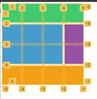
}grid-template-areas & grid-area
grid-template-areas
container에서 grid-template-areas를 이용해 row 단위로 " "로 구분하고 그 안에 item에서 지정한 grid-area 명칭을 이용해 해당 영역에 어떤 item이 올 것 layout 구성
grid-area
item에서 grid-area를 지정해 container의 grid-template-areas에서 자신을 부를 이름 지정
.container{
    display: grid;
    grid-template-columns: auto 200px;
    grid-template-rows: 100px repeat(2, 200px) 100px;
    column-gap: 5px;
    row-gap: 10px;
    grid-template-areas:
    /*grid rox X columns 별 item 지정해 layout 구성*/
      "header header header header"
      "content content content nav"
      "content content content nav"
      "footer footer footer footer";
}

.header {
  background-color: #2ecc71;
  grid-area: header;
  /*grid-template-areas에서 자신을 부를 이름 지정*/
}

.content {
  background-color: #3498db;
  grid-area: content;
  /*grid-template-areas에서 자신을 부를 이름 지정*/
}
.nav {
  background-color: #8e44ad;
  grid-area: nav;
  /*grid-template-areas에서 자신을 부를 이름 지정*/
}

.footer {
  background-color: #f39c12;
  grid-area: footer;
  /*grid-template-areas에서 자신을 부를 이름 지정*/
}
grid-column/row-start/end
container에서 grid-templates 형성
.grid {
  display: grid;
  grid-template-columns: repeat(4, 100px);
  grid-template-rows: repeat(4, 100px);
  gap: 10px;
}
item에서 해당 아이템을 column/row 기준으로 line x번에서 line y번까지 그 영역을 차지할 것인지
grid-column-start,grid-column-end,grid-row-start,grid-row-end로 명시함
여기서 start에서 end로 stretch하는 값은 칸이 기준이 아니라 line이 기준임
.header {
  background-color: #2ecc71;
  grid-column-start: 1;
  grid-column-end: 5;
}
header 칸이 column 기준으로 1번 라인에서 2번 라인까지 stretch됨
{start}/{end}를 이용해 더 간편하게 start와 end line 명시 가능
.content {
  background-color: #3498db;
  grid-column: 1/-2;
  /*grid-column-start: 1;
  grid-column-end: 4;*/
  grid-row: 2/4;
  /*grid-row-start: 2;
  grid-row-end: 4;*/
}
칸 기준으로 stretch 지정하는 경우
span {칸 수}로 작성
.footer {
  background-color: #f39c12;
  grid-area: footer;
  grid-column: span 4;
  /*grid-column-start: 1;
  grid-column-end: 5;*/
  grid-row: span 1;
  /*grid-row-start: 4;
  grid-row-end: 5;*/
}
line에 name을 지정해 해당 이름으로 start와 end를 명시
container에 line명과 크기를 지정함
.container {
  display: grid;
  grid-template-columns:
  	[first-line] 100px [second-line] 100px [third-line] 100px [fourth-line]100px [fifth-line];
  grid-template-rows: repeat(4, 100px [sexy-line]);
  gap: 10px;
}
item에서 start와 end 지점을 container에서 지정한 line name으로 표현
.header {
  background-color: #2ecc71;
  grid-column: first-line/fifth-line;
  /*grid-column-start: 1;
  grid-column-end: 5;*/
}
repeat과 line naming 동시에 사용
.grid {
  display: grid;
  grid-template-columns:
  	[first-line] 100px [second-line] 100px [third-line] 100px [fourth-line]100px [fifth-line];
  grid-template-rows:
  	repeat(4, 100px [sexy-line]);
  	/* 100px [sexy-line 1] 100px [sexy-line 2] 100px [sexy-line 3]100px [sexy-line 4];*/
  gap: 10px;
}
.content {
background-color: #3498db;
grid-column: first-line/fourth-line;
/*grid-column-start: 1;
grid-column-end: 4;*/
grid-row: sexy-line 1 / sexy-line 3;
/*grid-row-start: 2;
grid-row-end: 4;*/
}grid template
fr : fracttion은 grid에서 사용 가능한 공간을 의미하며 fr 값의 비율로 공간 나눔
grid-template-rows도 fr로 값을 지정하는 경우 height 크기를 꼭 할당해줘야 함
(height의 기본값이 0이기 때문)
.container {
  display: grid;
  gap: 5px;
  height: 50vh;
  grid-template-columns: repeat(4, 1fr); /*1fr 1fr 1fr 1fr*/
  grid-template-rows: repeat(4, 1fr);
}.item1{
background-color: #2ecc71;
grid-column: 1/-1;
grid-row: span 1;
}grid-template : container에 지정
"{grid-area 값}" {row 크기}
"{grid-area 값}" {row 크기}
"{grid-area 값}" {row 크기} / {column 크기}
item에서 grid-area 명칭 지정 해야함
.container{
  display: grid;
  gap: 5px;
  height: 50vh;
  grid-template:
    "header header header header" 1fr
    "content content content nav" 2fr
    "footer footer footer footer" 1fr/1fr 1fr 1fr 1fr;
}
.item1 {
  background-color: #8e44ad;
  grid-area: nav;
}
place-items
place-items : grid 칸에 들어가는 item에 대한 일괄적인 배치를 명시함
justify-items : {수평 기준}
align-items : {수직 기준}
place-items : {수직 기준} {수평 기준}
- stretch : grid를 늘려서 grid 채움 (default)
- start : item 을 cell 시작에 배치
- center : item을 cell 중앙에 배치
- end : item을 cell 끝에 배치
.container {
  display: grid;
  gap: 5px;
  height: 50vh;
  grid-template-columns: repeat(4, 1fr);
  grid-template-rows: repeat(4, 1fr);
  place-items: stretch center;
  /*justify-items: center;
  align-items: stretch; 과 동일*/


}

.item1 {
  background-color: #2ecc71;
}
place-contents
place-contents : grid 자체에 대한 배치를 명시함
container의 height가 grid 전체를 담을만큼 충분하도록 height 값을 지정해야함
place-contents: {수직 기준} {수평 기준};
.grid {
  display: grid;
  gap: 5px;
  height: 50vh;
  grid-template-columns: repeat(4, 1fr);
  grid-template-rows: repeat(4, 1fr);
  place-content: end center;
}

.header {
  background-color: #2ecc71;
}
place-self
place-self : grid 칸에 들어가는 item들 하나하나에 대한 배치를 명시함
place-self : {수직} {수평};
Auto-grid
grid-auto-flow : {방향}
- default : row
- flex-direction과 유사
- grid-template-row와 grid-template-column에서 지정한 grid에 content 배치하고
아직 content가 남은 경우 이를 배치하기 위해 새로운 column을 만들지 새로운 row를 만들지 지정
grid-auto-row : {크기}
만든 row보다 더 많은 content 존재 시, 해당 크기로 자동으로 row 만들어라
grid-auto-columns : {크기}
grid-auto-flow : columns일 때 작동
.grid {
  display: grid;
  gap: 5px;
  grid-template-columns: repeat(4, 100px);
  grid-template-rows: repeat(4, 100px);
  grid-auto-flow: row;
  grid-auto-rows: 100px;
}
.item:nth-child(odd) {
  background-color: #2ecc71;
}

.item:nth-child(even) {
  background-color: #3498db;
}
minmax
minmax(min,max)
item이 가능한 엄청 크길 원하는데 동시에 엄청 작게 되는 것은 원치 않을 때
최대 1fr로 하되 최소 100px 너비
.container {
  display: grid;
  gap: 5px;90
  grid-template-columns: repeat(5, minmax(100px,1fr));
  grid-template-rows: repeat(4, 100px);
  grid-auto-flow: column;
  grid-auto-rows: 100px;
}
auto-fit & auto-fill
repeat() 함수 안에서만 동작
auto-fill
공간 안에서 가능한 많이 column/row (빈 것까지 포함해) 생성
auto-fit
공간 안에서 가능한 현재 item을 최대한 stretch해서 colum/row에 맞게 함
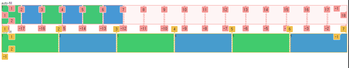
.grid {
  display: grid;
  gap: 5px;

  grid-auto-flow: column;
  grid-auto-rows: 100px;
  margin-bottom: 30px;
}

.grid:first-child {
  grid-template-columns: repeat(auto-fill, minmax(100px, 1fr));
}
.grid:last-child {
  grid-template-columns: repeat(auto-fit, minmax(100px, 1fr));
}
min-content & max-content
div 내 content에 따라 item 크기 조절
max-content
item 크기만큼 grid 해당 칸 늘려 최대 사이즈
min-content
item 크기 가장 줄여 grid 해당 칸 최소 사이즈
.grid {
  display: grid;
  gap: 5px;
  grid-template-columns: min-content max-content;
  grid-auto-rows: 100px;
  margin-bottom: 30px;
}