머신러닝이란?
- 명시적으로 프로그래밍하지 않고도 컴퓨터에 학습할 수 있는 능력을 부여하는 학문
- (과거 데이터로부터 얻은)경험이 쌓여 감에 따라 주어진 태스크의 성능이 점점 좋아질 때 컴퓨터 프로그램은 경험으로부터 학습한다고 할 수 있음
- 명시적인 프로그램에 의해서가 아니라, 주어진 데이터를 통해 규칙을 찾는 것
휴먼러닝
Iris Classification
Iris : 프랑스의 국화
- petal(꽃잎), sepal(꽃받침)의 길이/너비 정보를 이용해서 3종의 품종 구분
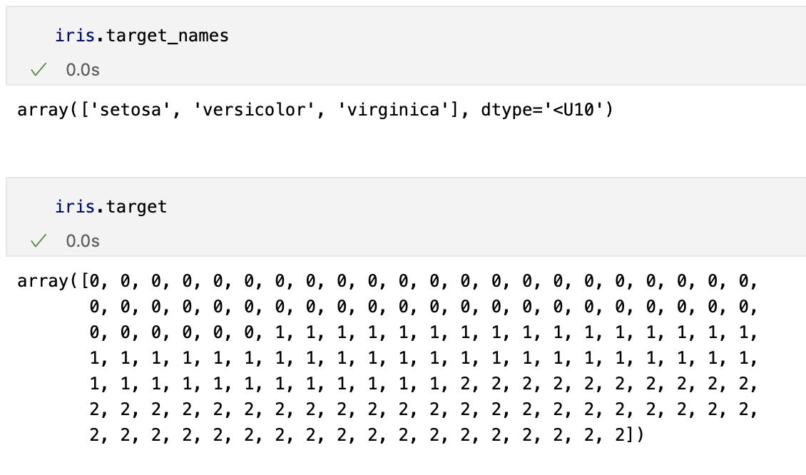
Versicolor, Virqincia, Setosa
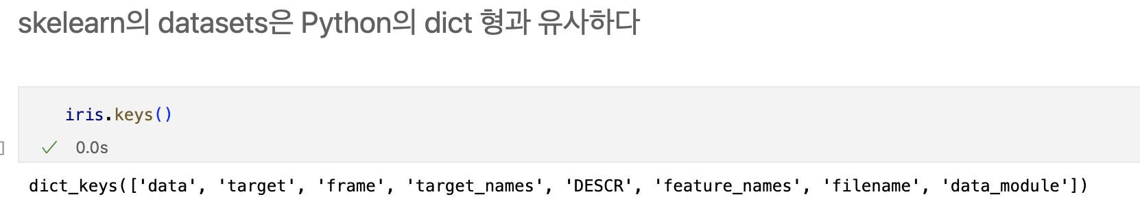
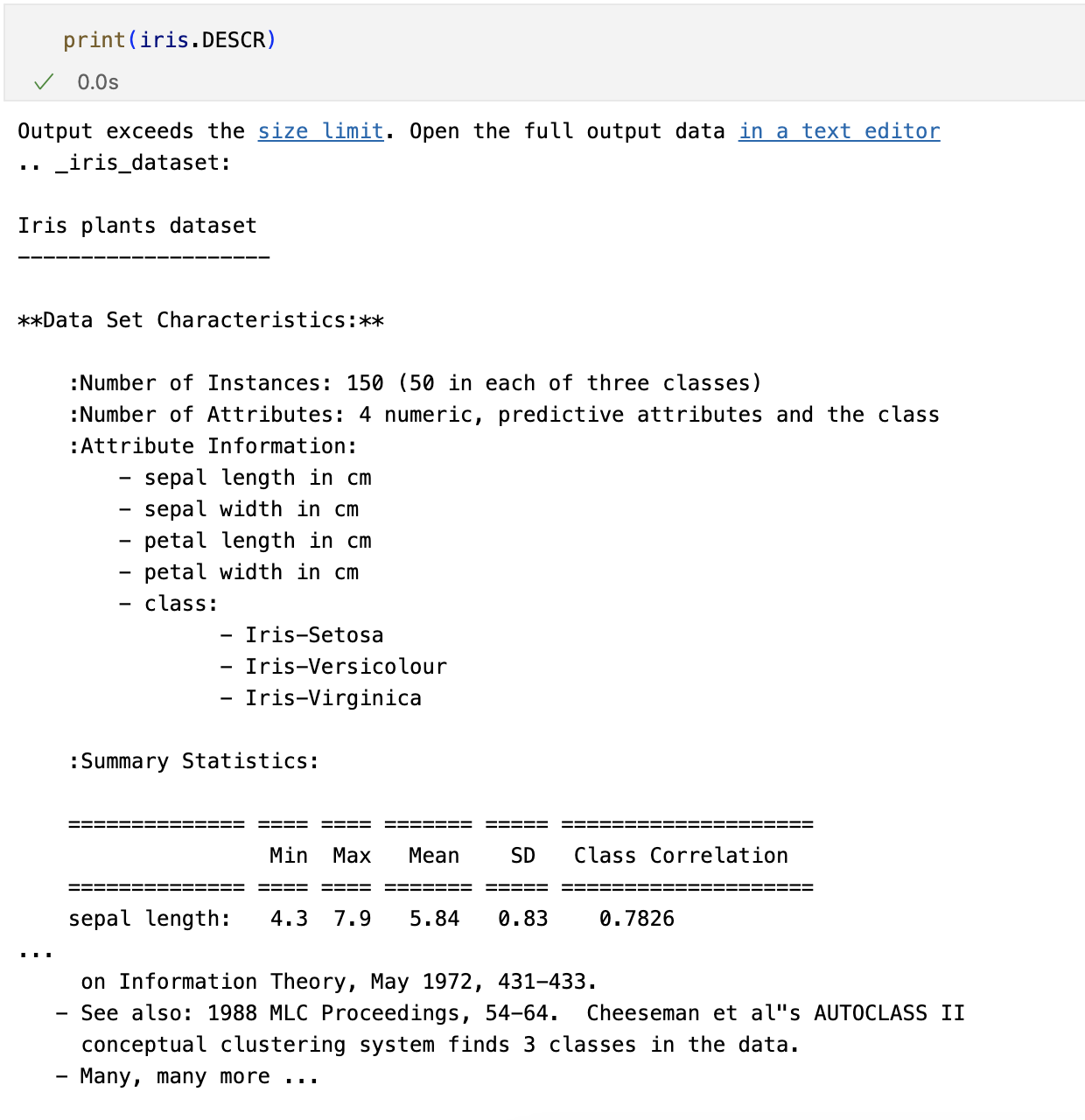
데이터 관찰(python)
from sklearn.datasets import load_iris

iris = load_iris()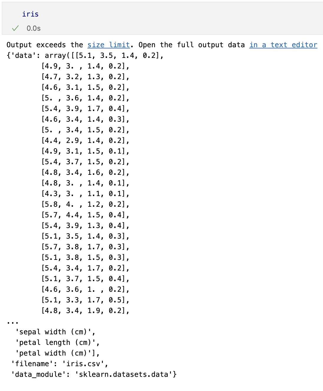
pandas
- 데이터를 바로 딥러닝에 적용하거나
- sklearn을 이용한 머신러닝에 적용할 때 꼭 필요한 것은 아니지만
- 데이터를 정리해서 관찰할 때는 아주 유용한 도구

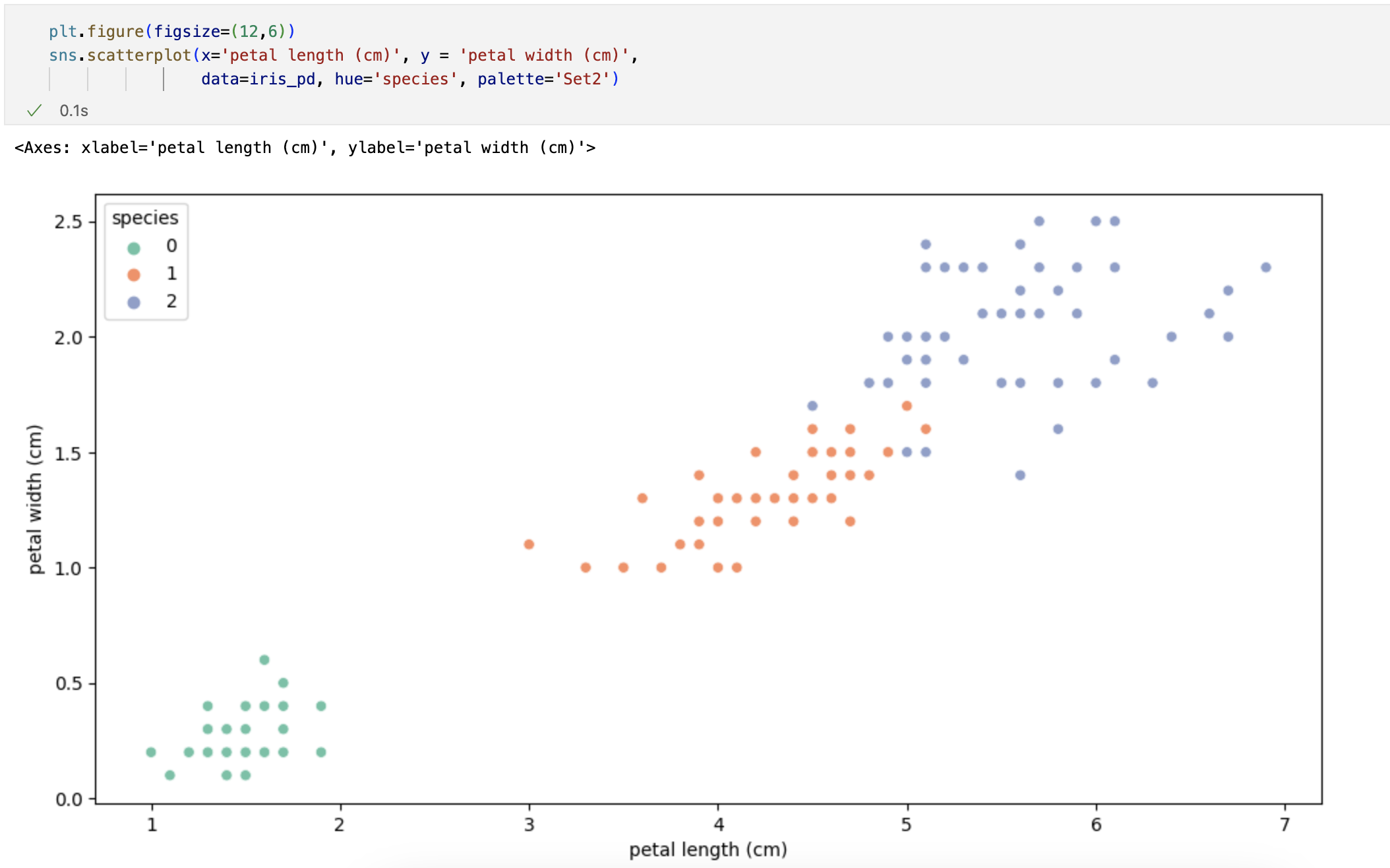
시각화

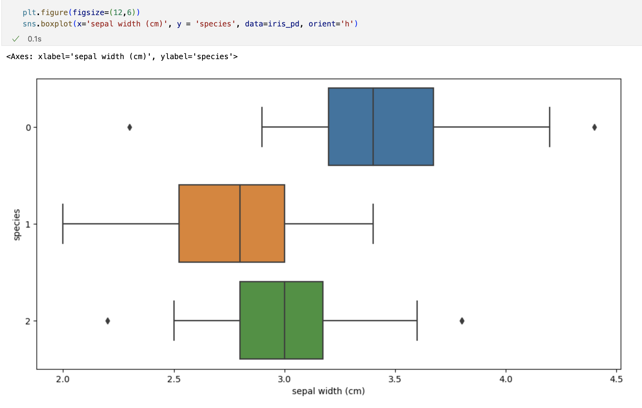
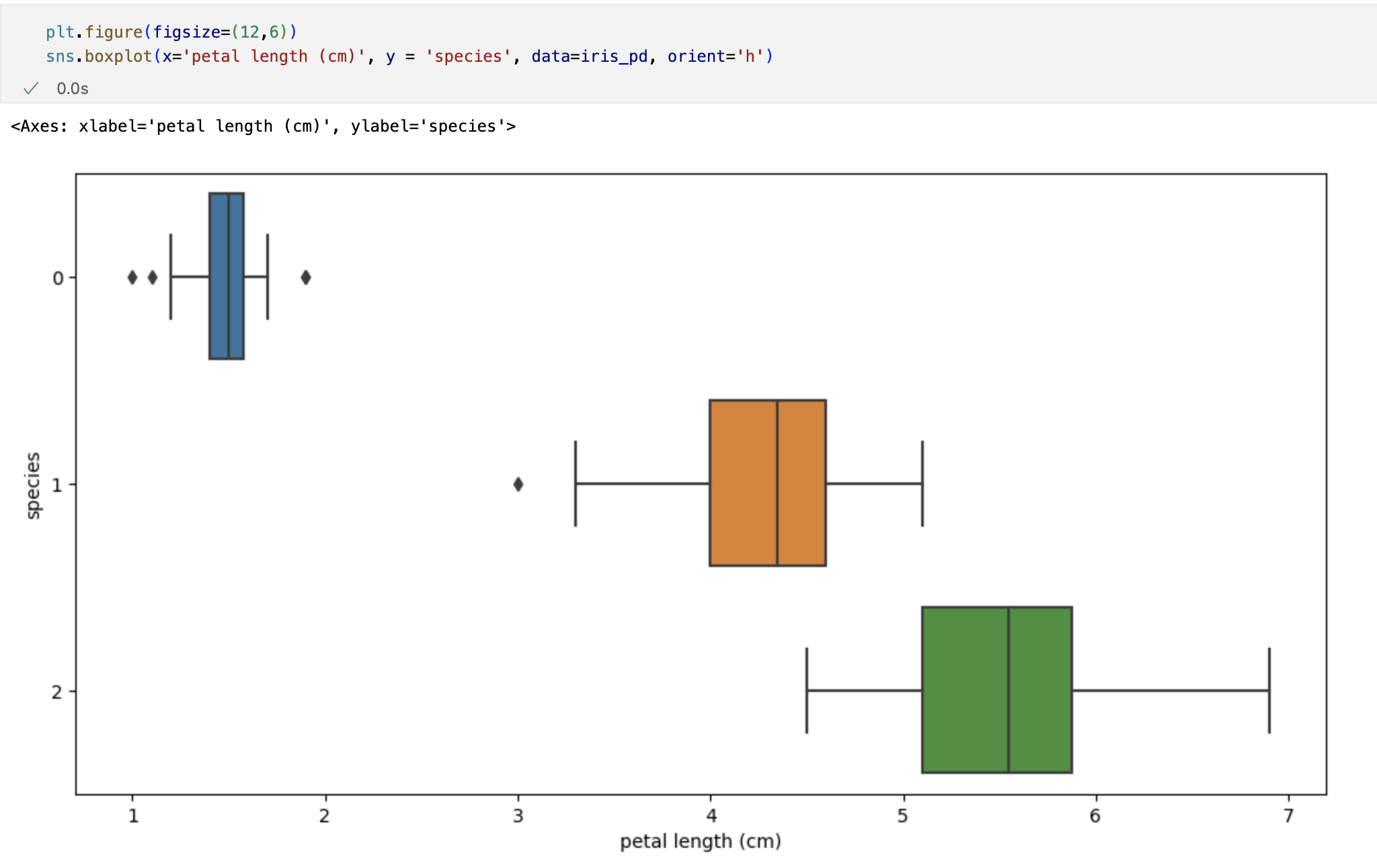

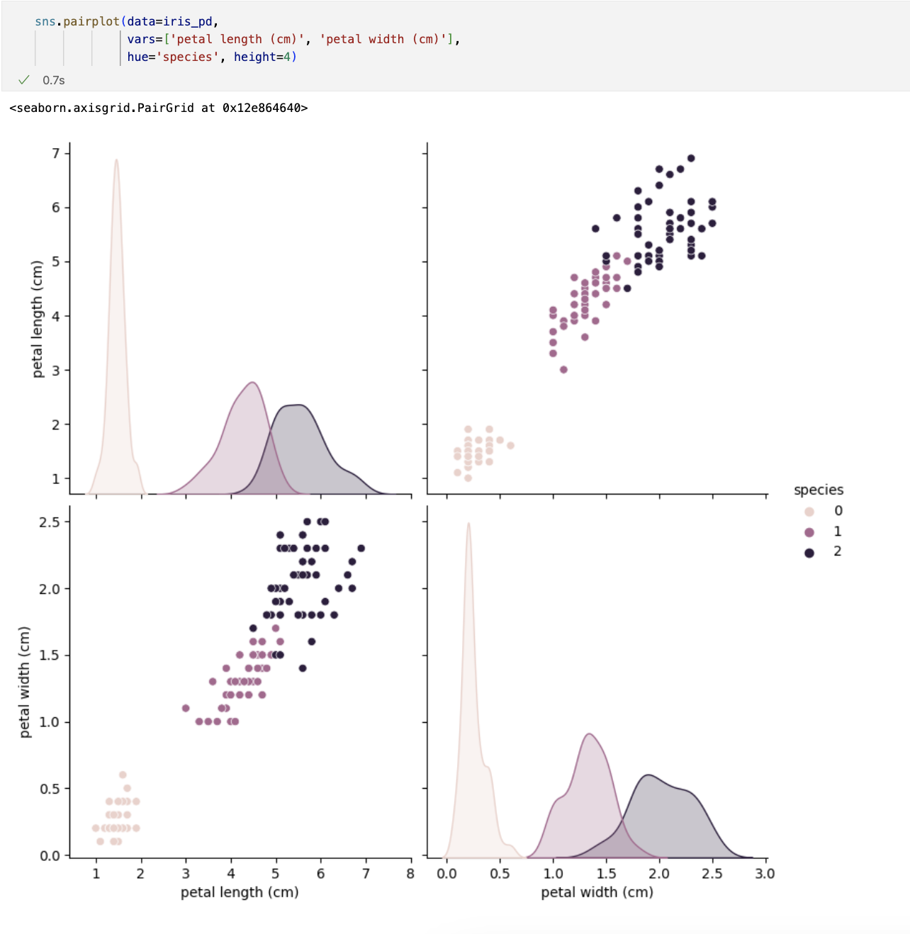
petal의 length와 width만 그렸는데 여기서 두 특징(petal length/width)만 가지고 세 개의 품종을 구분할 수 있나요?
일단 0번인 setosa는 가능하다. -> petal length가 2.5보다 작다면 모두 setosa로 분류해도 됨
Decision Tree
# 데이터 변경

iris_12 = iris_pd[iris_pd['species']!=0]
iris_12.info()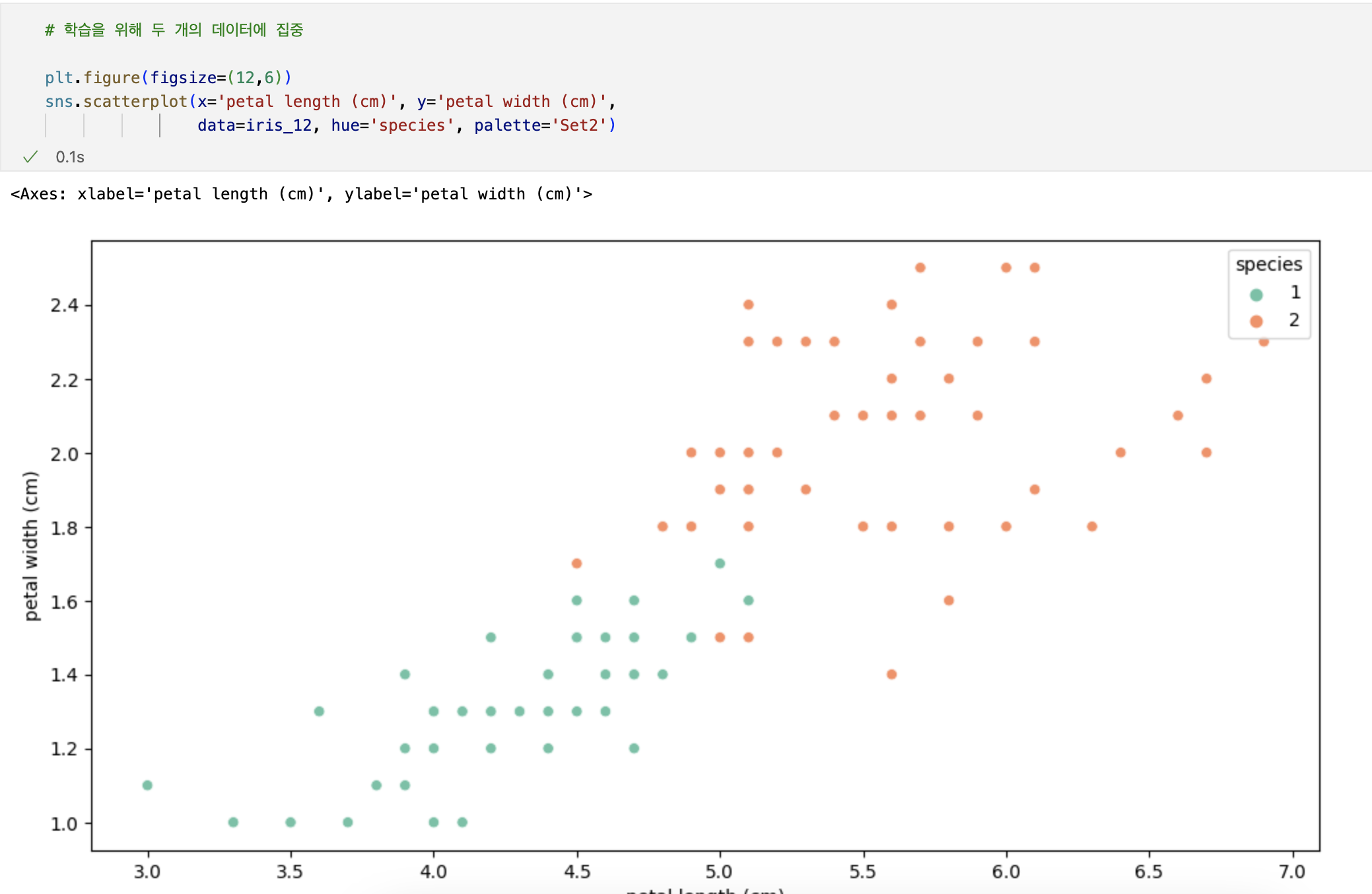
Decision Tree의 분할기준 (Split Criterion)
- 정보획득 : 정보의 가치를 반환하는 데 발생하는 사전의 확률이 작을수록 정보의 가치는 커진다
- 정보이득 : 어떤 속성을 선택함으로 인해서 데이터를 더 잘 구분하게 되는 것
엔트로피 개념
-
열역학의 용어로 물질의 열적 상태를 나타내는 물리 량의 단위 중 하나. 무질서의 정도를 나타냄
-
엔트로피 : 얼마만큼의 정보를 담고 있는가? 또한, 무질서도를 의미, 불확실성을 나타내기도
-
엔트로피가 내려가면 분할 하는 것이 좋다
-
엔트로피의 계산량이 많아서 비슷한 개념이면서 보다 계산량이 적은 지니계수를 사용하는 경우가 많다.
Scikit Learn
- 가장 유명한 기계 학습 오픈 소스 라이브러리
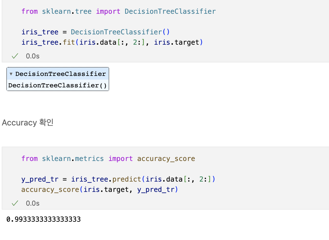
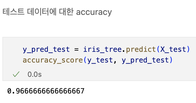
데이터 나누기 - Decision Tree를 이용한 Iris 분류
과적합
- 지도학습 : 정답을 알려주고 학습을 시킨다.
- 학습 대상이 되는 데이터에 정답(label)을 붙여서 학습시키고, 모델을 얻어서 완전히 새로운 데이터에 모델을 사용해서 '답'을 얻고자 하는 것
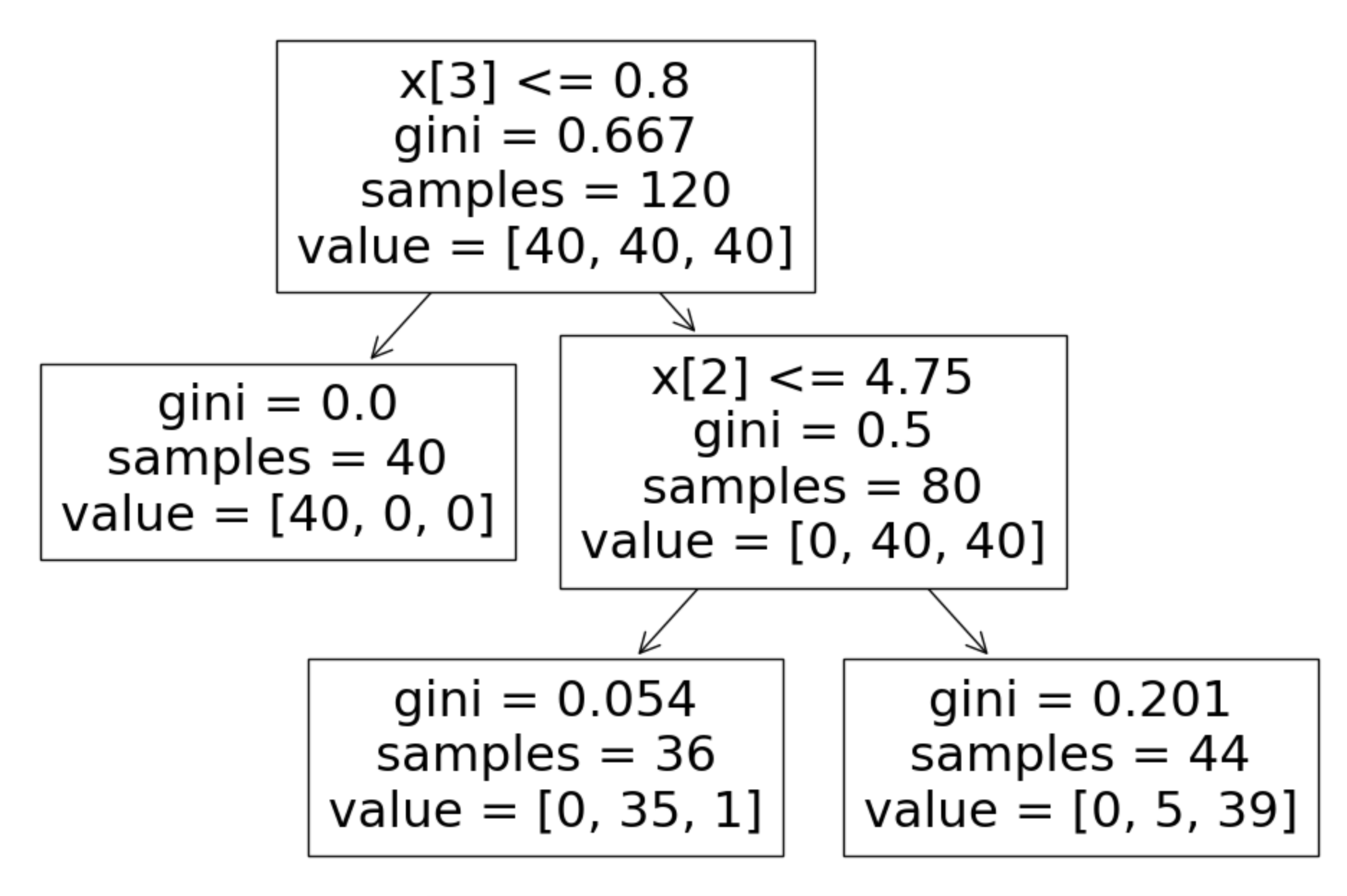
from sklearn.tree import plot_tree

plt.figure(figsize=(12,8))
plot_tree(iris_tree)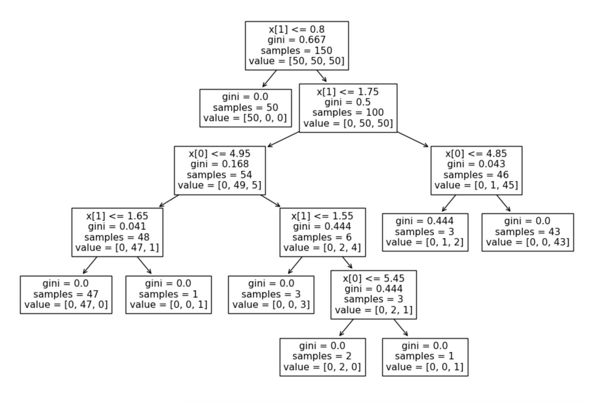
iris의 품종을 분류하는 결정나무 모델이 어떻게 데이터를 분류했는지 확인해보자
우리가 느껴야할 것은?
-> 복잡한 경계선
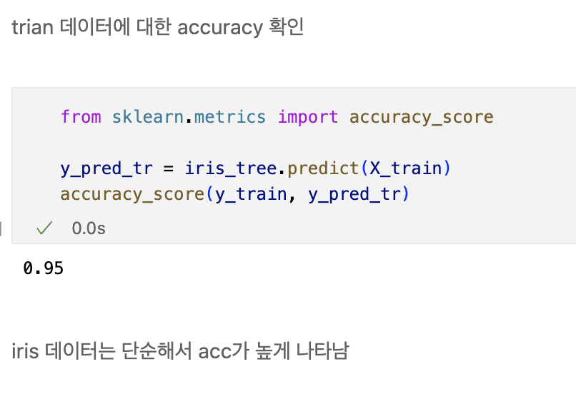
Accuracy가 높게 나왔다고 해도 좀 더 들여다 볼 필요가 당연히 있다.
- 어차피 얻은(혹은 구한)데이터는 유한하고 내가 얻은 데이터를 이용해서 일반화를 추구하게 된다.
- 이때 복잡한 경계면은 모델의 성능을 결국 나쁘게 만든다.
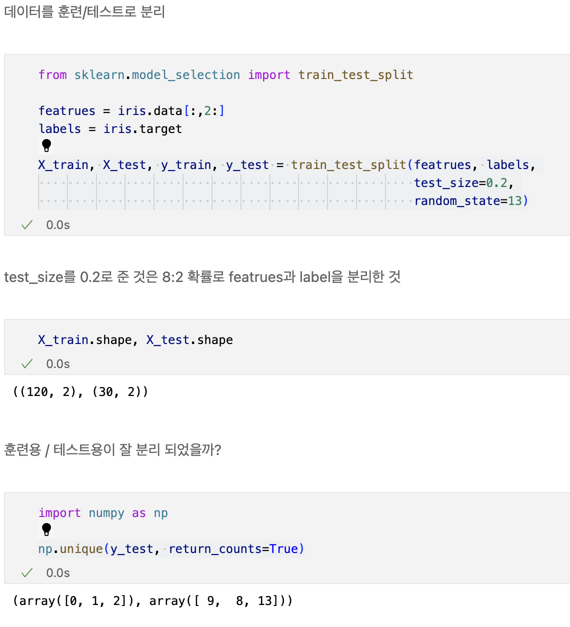
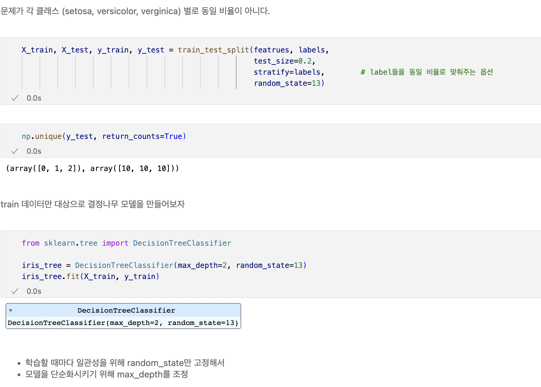
데이터 분리
- 확보한 데이터 중에서 모델 학습에 사용하지 않고 빼둔 데이터를 가지고 모델을 테스트한다.
plt.figure(figsize=(12,8))
plot_tree(iris_tree)
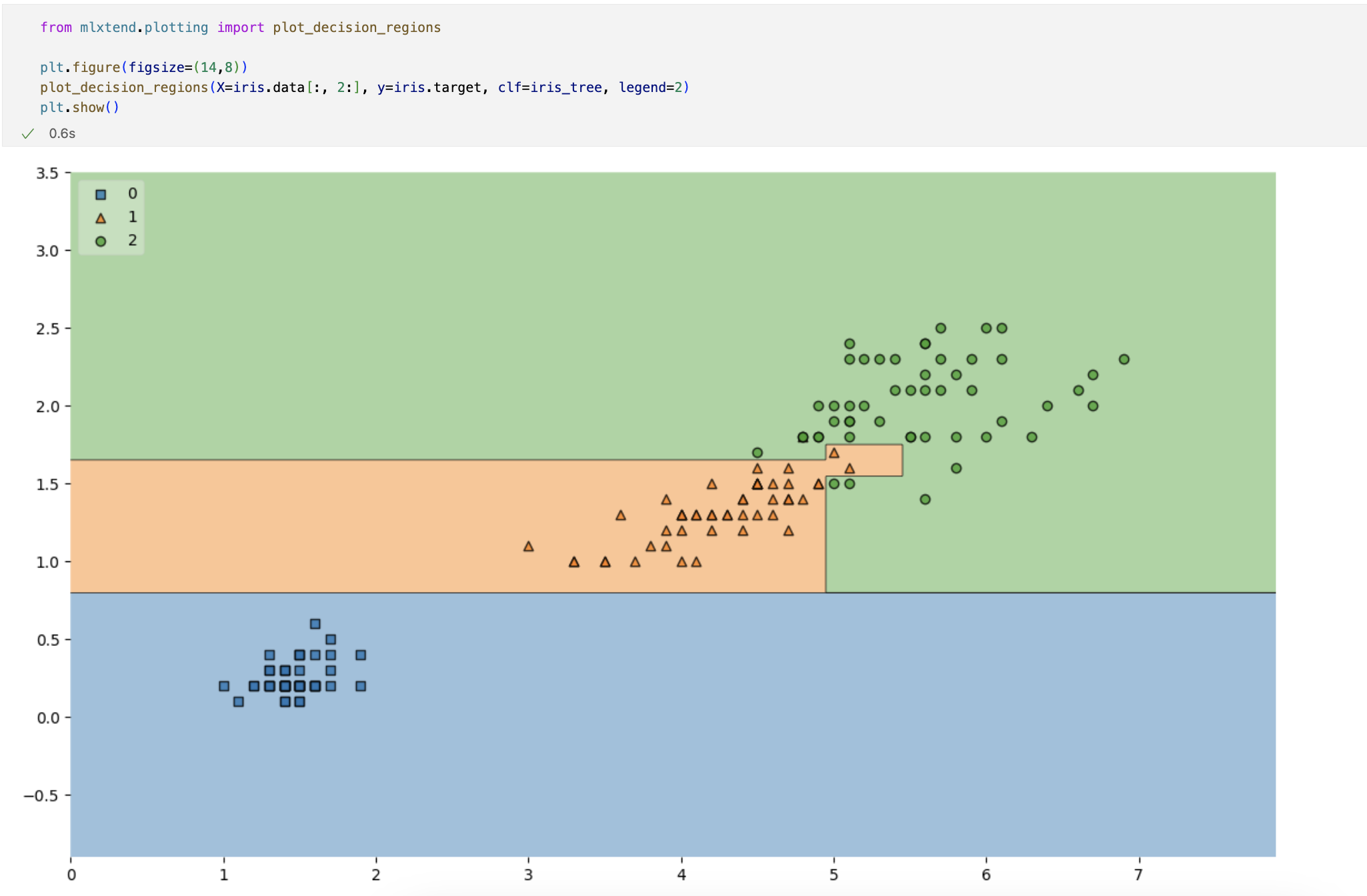
훈련데이터에 대한 결정경계를 확인해보자
import matplotlib.pyplot as plt
from mlxtend.plotting import plot_decision_regions

plt.figure(figsize=(12,8))

plot_decision_regions(X=X_train, y=y_train, clf=iris_tree, legend=2)
plt.show()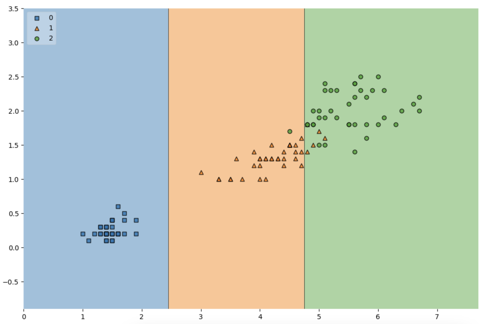
import matplotlib.pyplot as plt
from mlxtend.plotting import plot_decision_regions

plt.figure(figsize=(12,8))

plot_decision_regions(X=X_test, y=y_test, clf=iris_tree, legend=2)
plt.show()
전체 데이터에서 관찰해보기
scatter_highlight_kwargs = {'s':150, 'label': 'Test data', 'alpha': 0.9}
scatter_kwargs = {'s': 120, 'edgecolor':None, 'alpha':0.7}

plt.figure(figsize=(12,8))
plot_decision_regions(X=featrues, y=labels,
                      X_highlight=X_test, clf=iris_tree, legend=2,
                      scatter_highlight_kwargs=scatter_highlight_kwargs,
                      scatter_kwargs=scatter_kwargs,
                      contourf_kwargs={'alpha':0.2})
plt.show()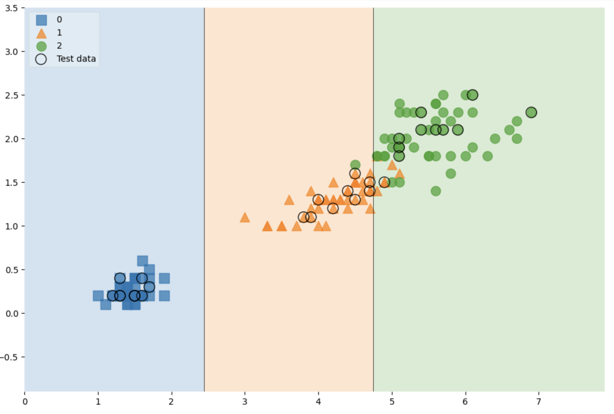
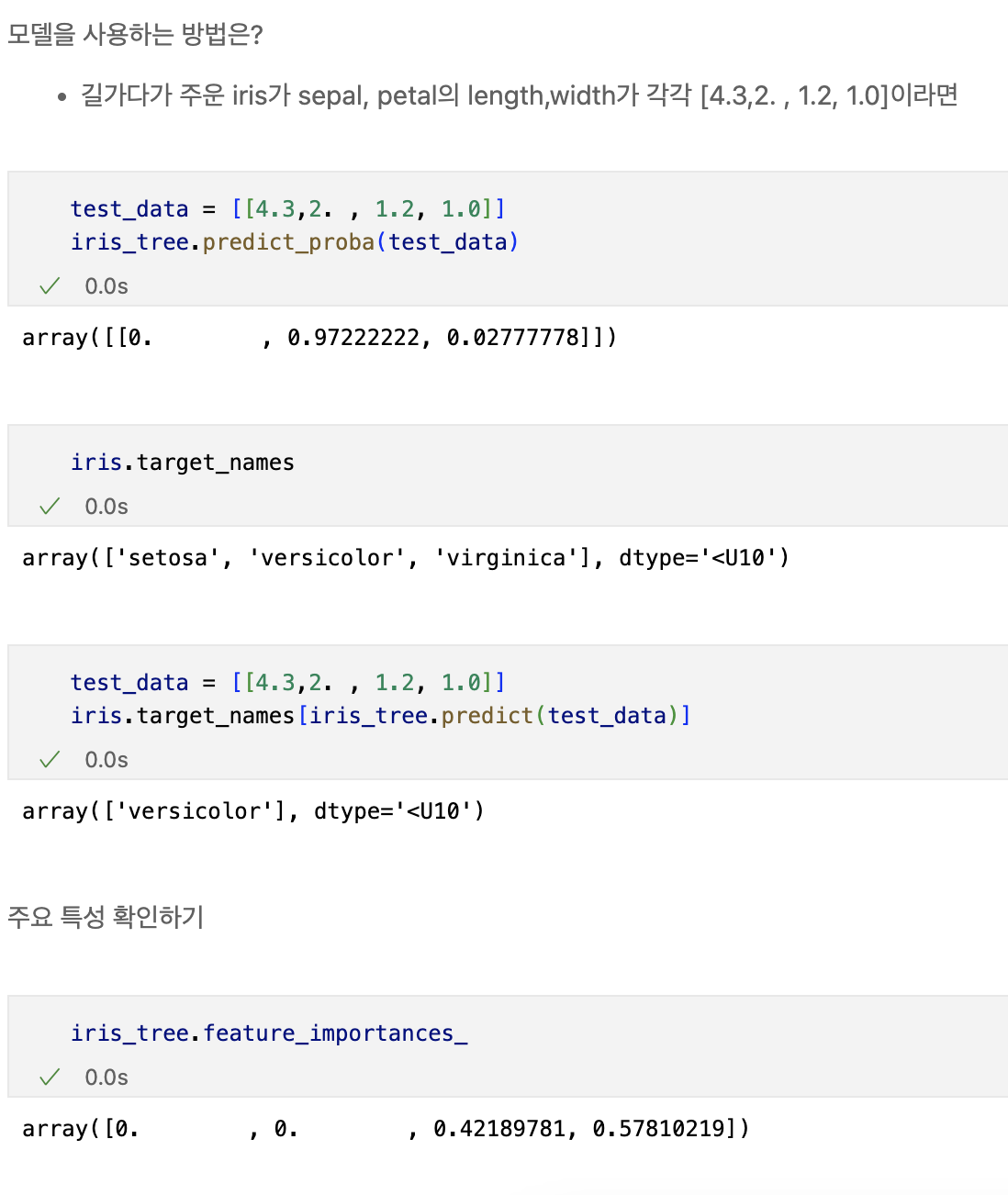
feature 4개 사용
featrues = iris.data
labels = iris.target

X_train, X_test, y_train, y_test = train_test_split(featrues, labels,
                                                    test_size=0.2,
                                                    stratify=labels,
                                                    random_state=13)
iris_tree = DecisionTreeClassifier(max_depth=2, random_state=13)
iris_tree.fit(X_train, y_train)

간단한 zip과 언패킹
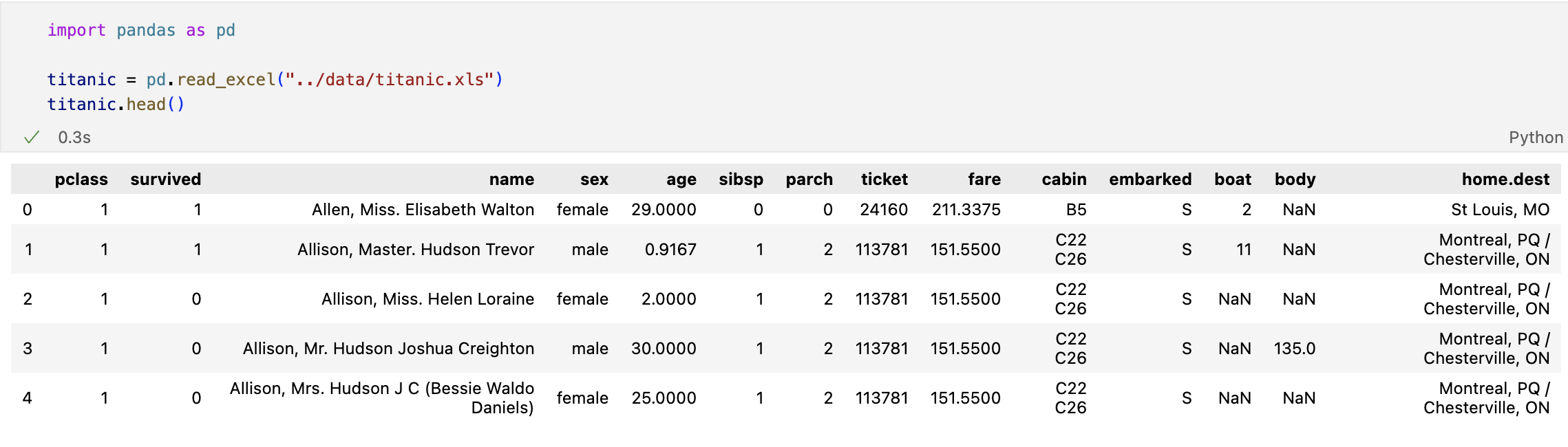
타이타닉 생존자 예측
- 엑셀파일 불러오기
생존상황
import matplotlib.pyplot as plt
import seaborn as sns
# %matplotlib inline

f, ax = plt.subplots(1,2, figsize=(12,6))

titanic['survived'].value_counts().plot.pie(explode=[0,0.05],
                                            autopct = '%1.1f%%', ax=ax[0], shadow=True)

ax[0].set_title('Pie plot - Survived')
ax[0].set_ylabel('')

sns.countplot(x='survived', data=titanic, ax=ax[1])
ax[1].set_title('Count plot - Survived')
성별에 따른 생존상황
f, ax = plt.subplots(1,2, figsize=(12,6))

sns.countplot(x='sex', data=titanic, ax=ax[0])
ax[0].set_title('Count of Passengers of Sex')
ax[0].set_ylabel('')

sns.countplot(x='sex', hue = 'survived', data=titanic, ax=ax[1])
ax[1].set_title('Sex:Survived and Unsurvived')
- 여성들의 탑승현황이 남자들의 반 밖에 되지 않는다.
- 하지만 여성들은 절반 이상의 사람들이 생존하였지만,
- 남자 승객들은 과반수 이상의 사람들이 죽었다.
경제력 대비 생존률
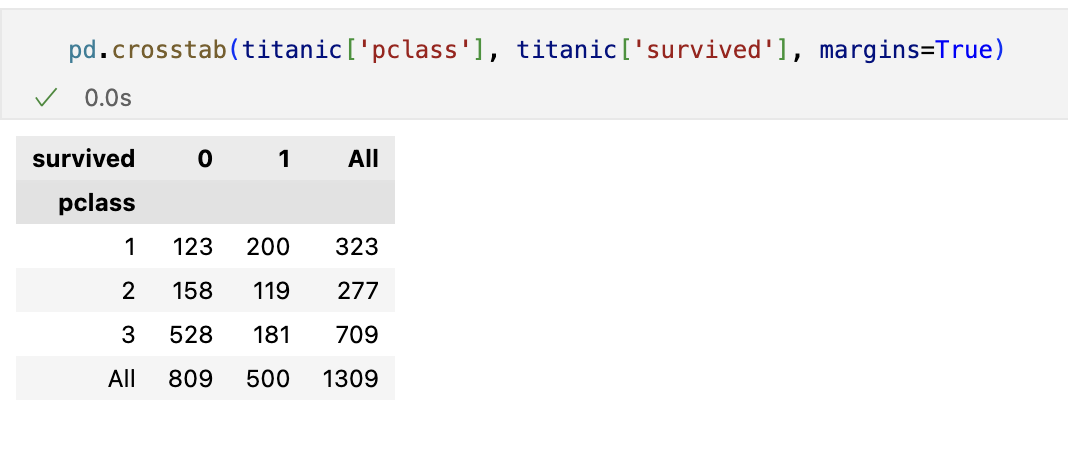
- margins 옵션을 주면 합계가 나온다.
- 1등실의 생존 가능성이 아주 높다.
선실 등급별 성별 상황
grid = sns.FacetGrid(titanic, row='pclass', col='sex', height=4, aspect=2)
grid.map(plt.hist, 'age', alpha=.8, bins=20)
grid.add_legend();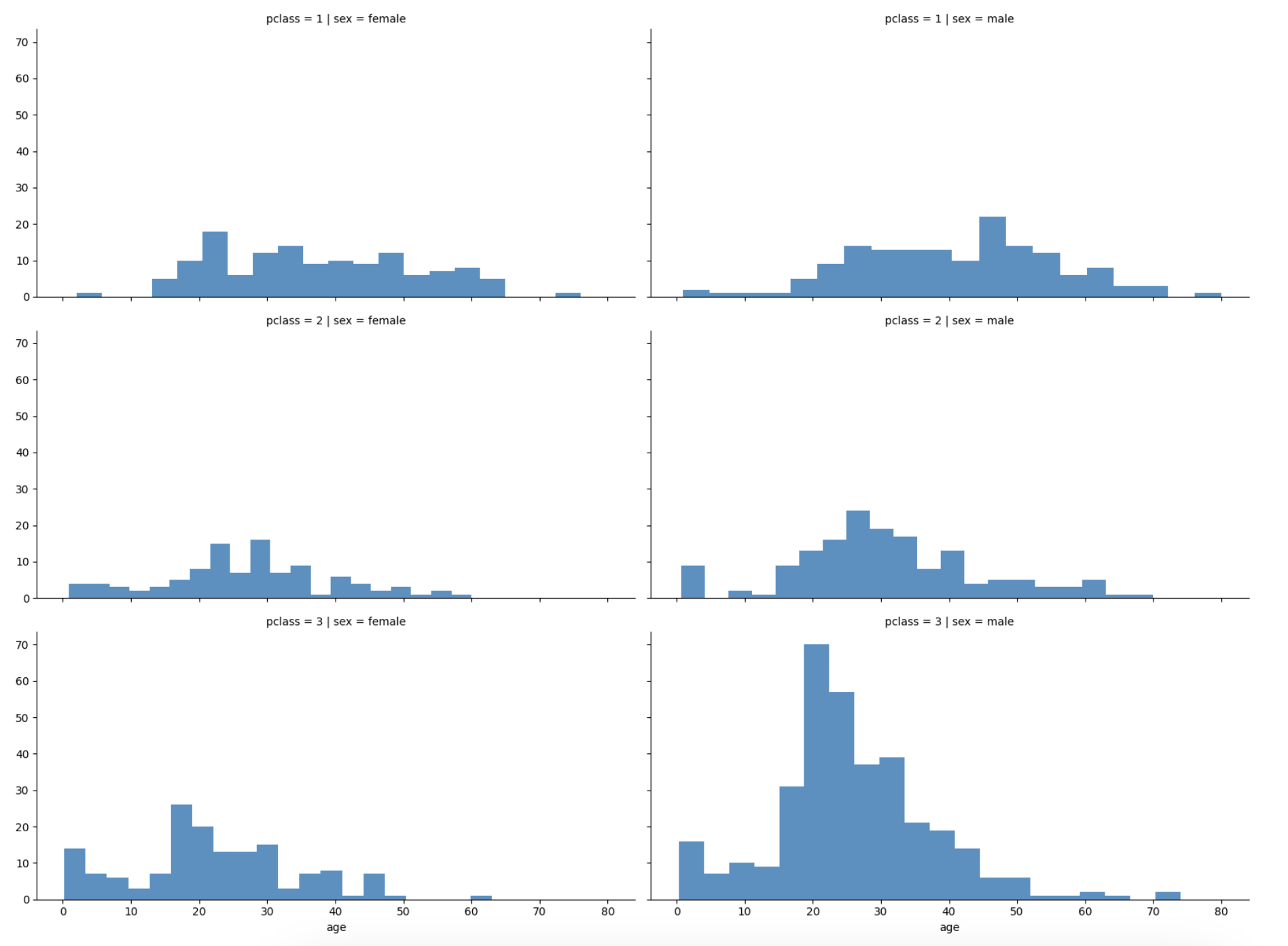
- 3등실에는 남성이 많았다 - 특히 20대 남성
나이별 승객 현황도 확인
import plotly.express as px

fig = px.histogram(titanic, x='age')
fig.show()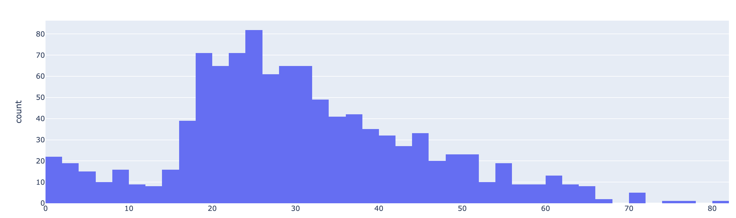
등실별 생존률을 연령별로 관찰
grid = sns.FacetGrid(titanic, col='survived', row='pclass', height=4, aspect=2)
grid.map(plt.hist, 'age', alpha=.5, bins=20)
grid.add_legend();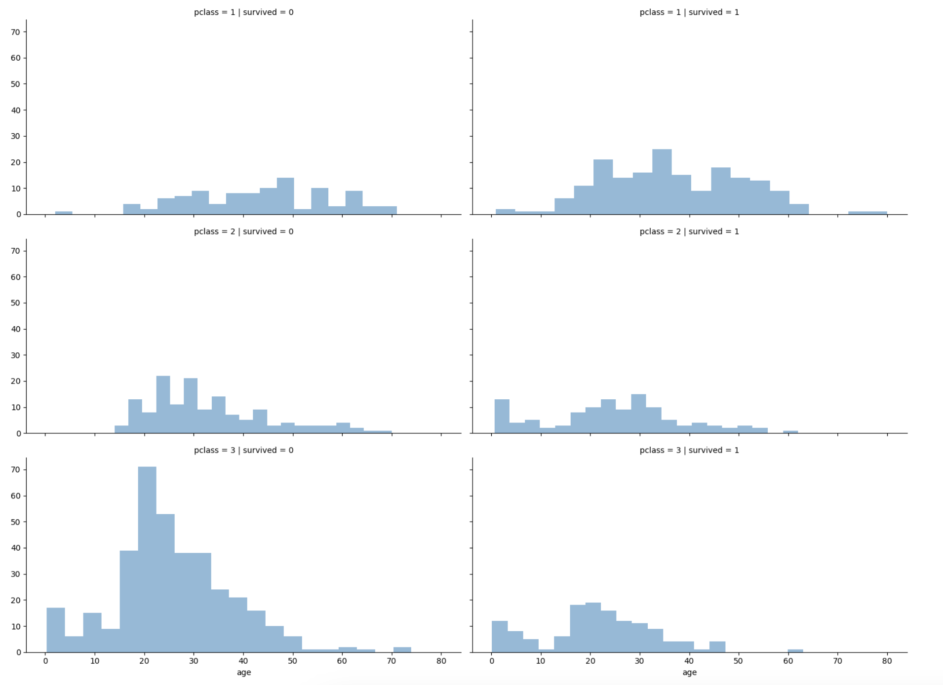
- 선실 등급이 높으면 생존률이 높은 듯 하다
나이,성별,등급별 생존자 수 한번에 파악
plt.figure(figsize=(12,4))
plt.subplot(131)
sns.barplot(x='pclass',y='survived',data=titanic)
plt.subplot(132)
sns.barplot(x='age_cat',y='survived',data=titanic)
plt.subplot(133)
sns.barplot(x='sex',y='survived',data=titanic)
plt.subplots_adjust(top=1, bottom=0.1, left=0.1, right=1, hspace=0.5, wspace=0.5)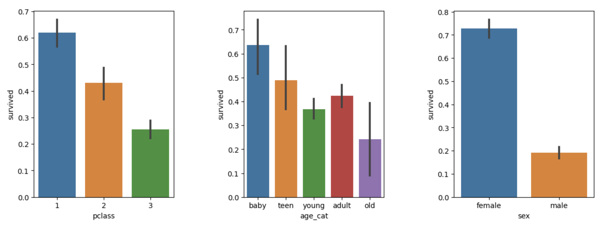
남/여 나이별 생존 상황
fig, axes = plt.subplots(nrows=1, ncols=2, figsize=(14,6))

women = titanic[titanic['sex']=='female']
men = titanic[titanic['sex']== 'male']

ax = sns.distplot(women[women['survived']==1]['age'], bins=20,
                 label = 'survived', ax = axes[0], kde=False)
ax = sns.distplot(women[women['survived']==0]['age'], bins=40,
                 label = 'not_survived', ax = axes[0], kde=False)
ax.legend(); ax.set_title('Female')

ax = sns.distplot(men[men['survived']==1]['age'], bins=18,
                 label = 'survived', ax = axes[1], kde=False)
ax = sns.distplot(men[men['survived']==0]['age'], bins=40,
                 label = 'not_survived', ax = axes[1], kde=False)
ax.legend(); ax = ax.set_title('Male')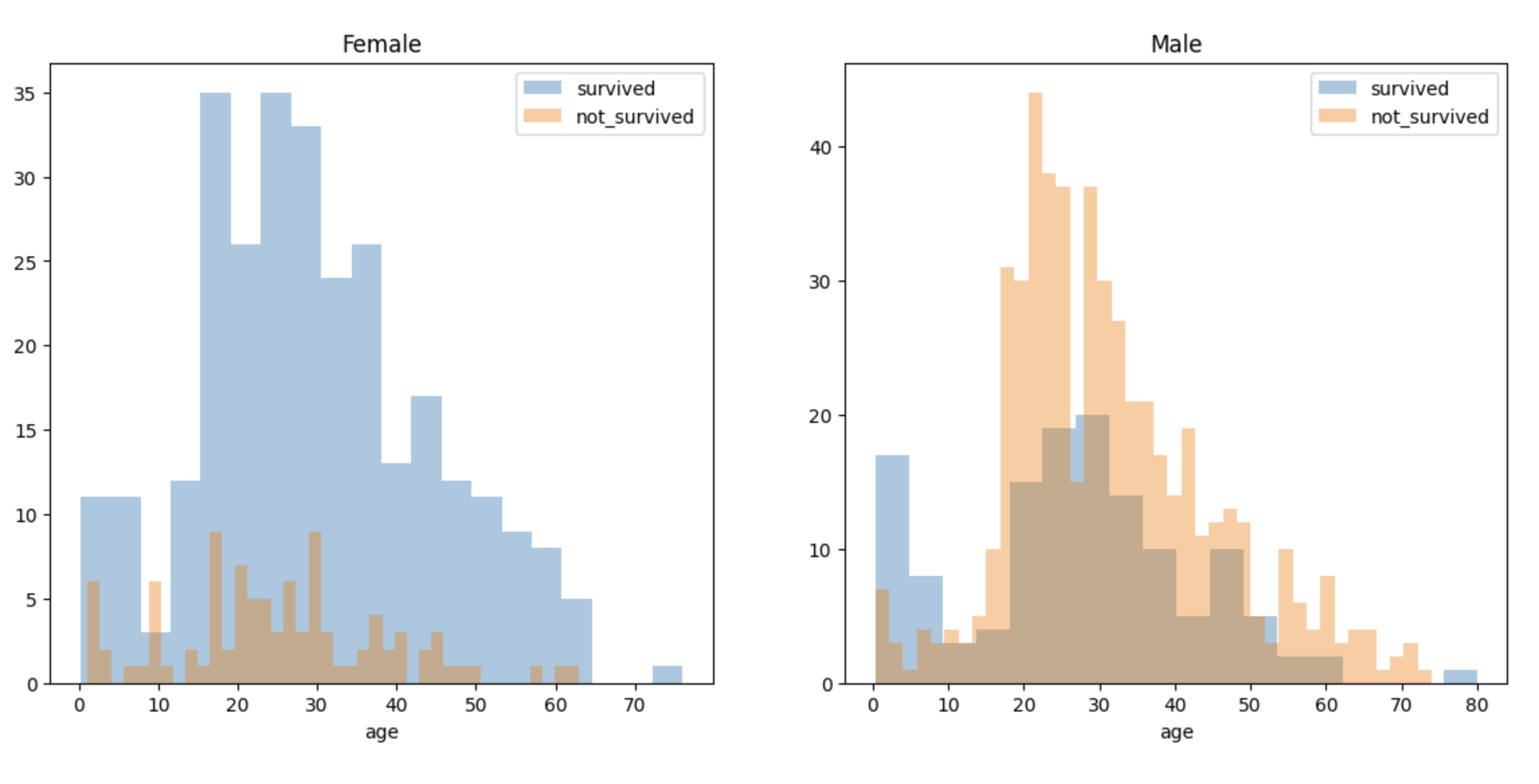
탑승객의 이름에서 신분을 알 수 있다.
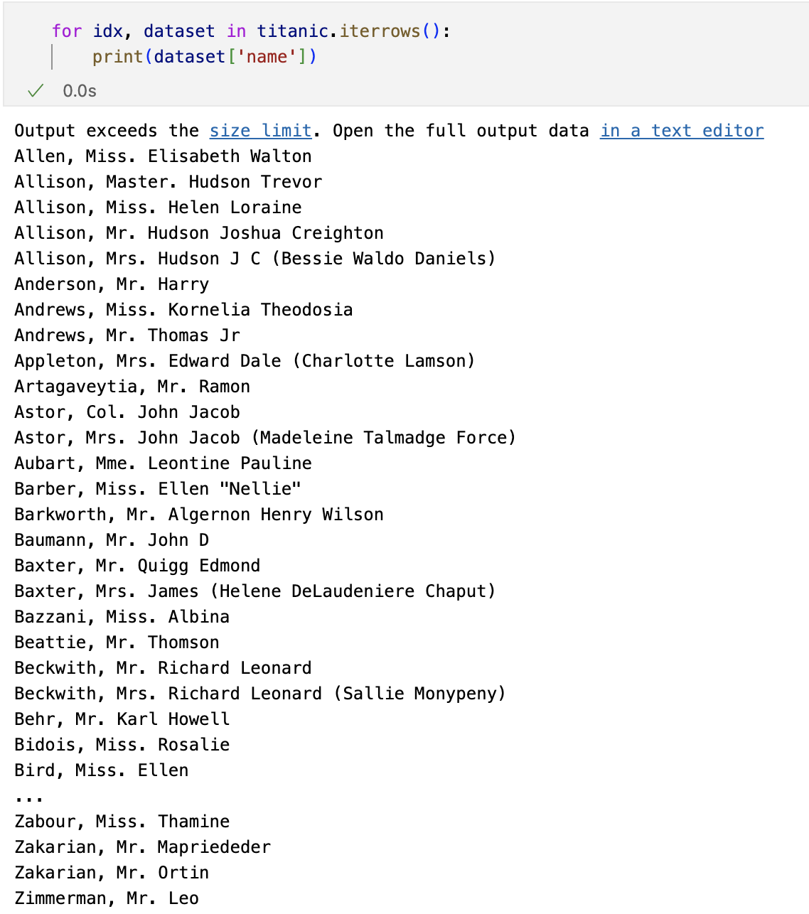
import re

titles = []
for idx, dataset in titanic.iterrows():
    match = re.search('\s\w+\.', dataset['name'])
    if match:
        title = match.group()[1:-1]
        if title in ['Miss', 'Master', 'Mrs', 'Mr','Col','Mme']:
            titles.append(title)
        else:
            titles.append('unknown')
    else:
        titles.append('unknown')

titanic['title'] = titles
titanic.head()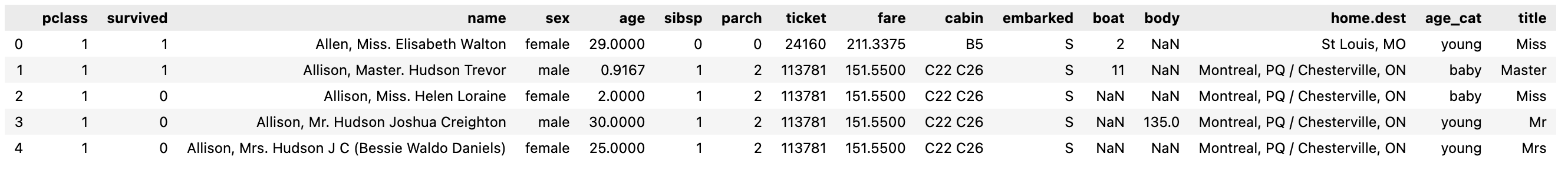
사회적 신분 정리
titanic['title'] = titanic['title'].replace('Mlle','Miss')
titanic['title'] = titanic['title'].replace('Ms','Miss')
titanic['title'] = titanic['title'].replace('Mme','Mrs')

Rare_f = ['Dona','Lady','unknown']
Rare_m = ['Capt','Col','Dr','Don','Major','Rev','Sir','Jonkheer','Master']

for each in Rare_f:
    titanic['title'] = titanic['title'].replace(each, 'Rare_f')

for each in Rare_m:
    titanic['title'] = titanic['title'].replace(each, 'Rare_m')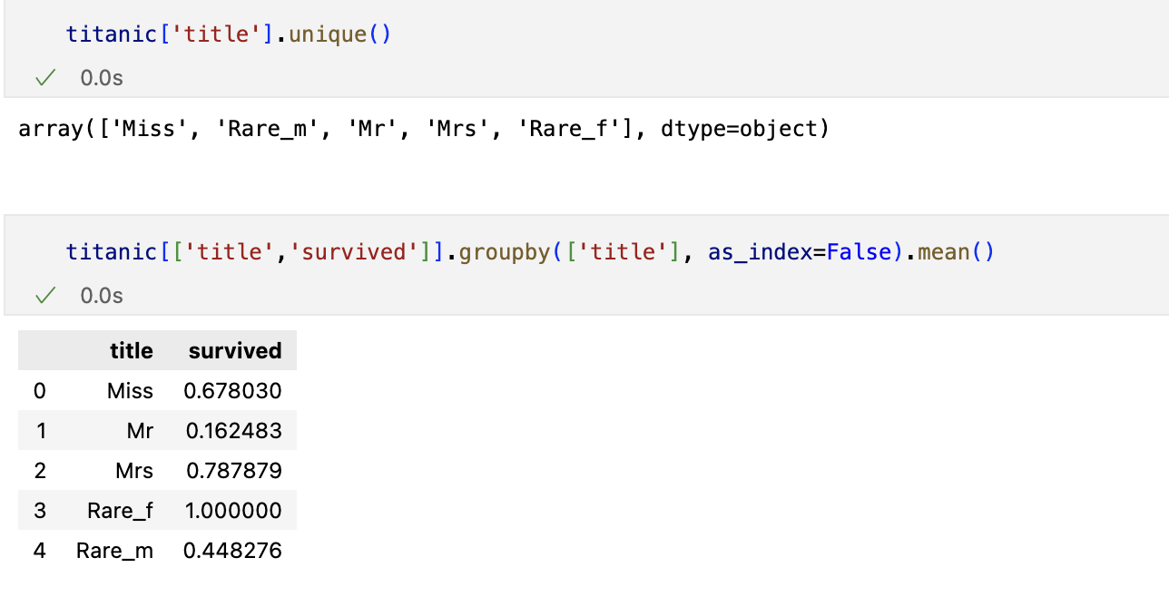
머신러닝을 이용한 생존자 예측

- 결측치값은 버린다
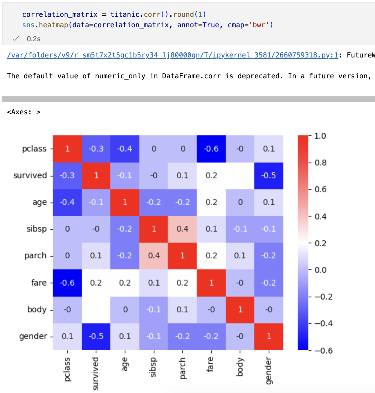
상관관계
특성 선택후 데이터 나누기
from sklearn.model_selection import train_test_split

X = titanic[['pclass','age','sibsp','parch','fare','gender']]
y = titanic['survived']

X_train, X_test, y_train, y_test = train_test_split(X, y, test_size=0.2, random_state=13)
Decision Tree

결론

Preprocessing
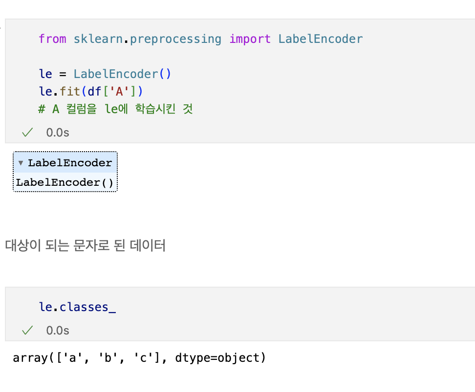
label_encoder
문자를 숫자로 바꿔주는 데 유용하다.


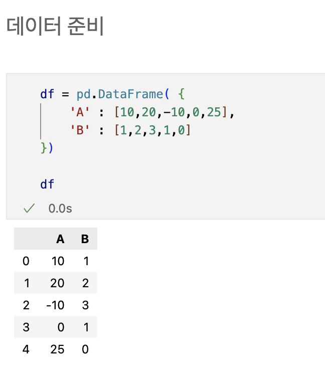
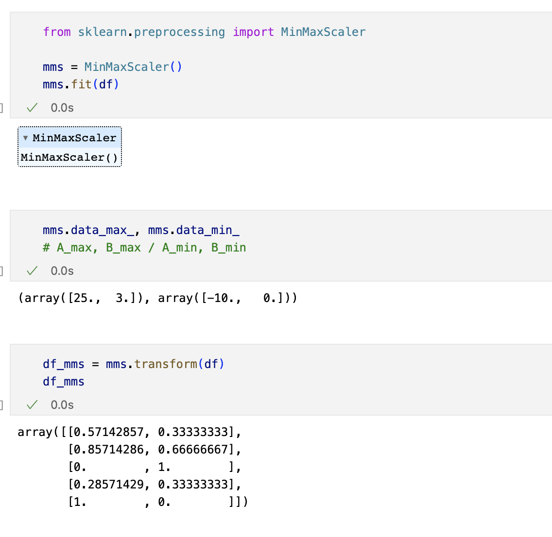
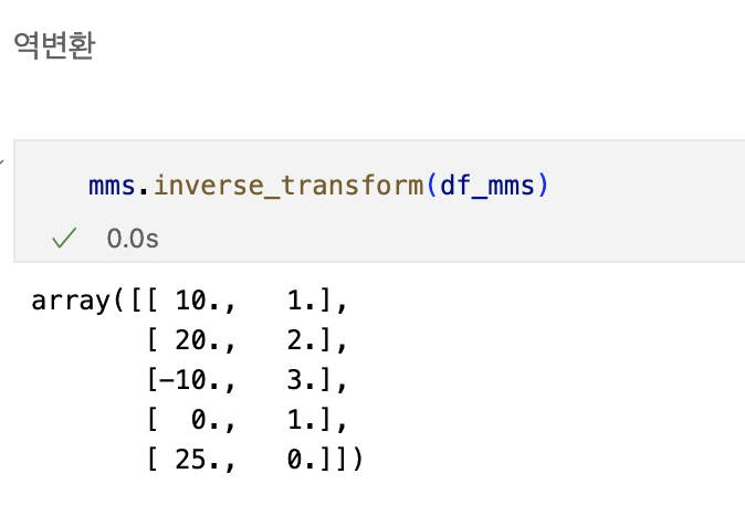
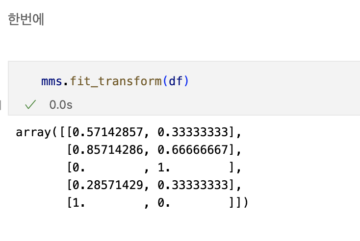
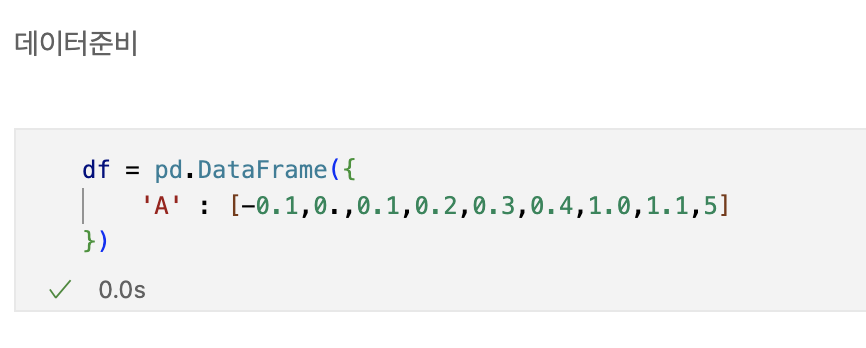
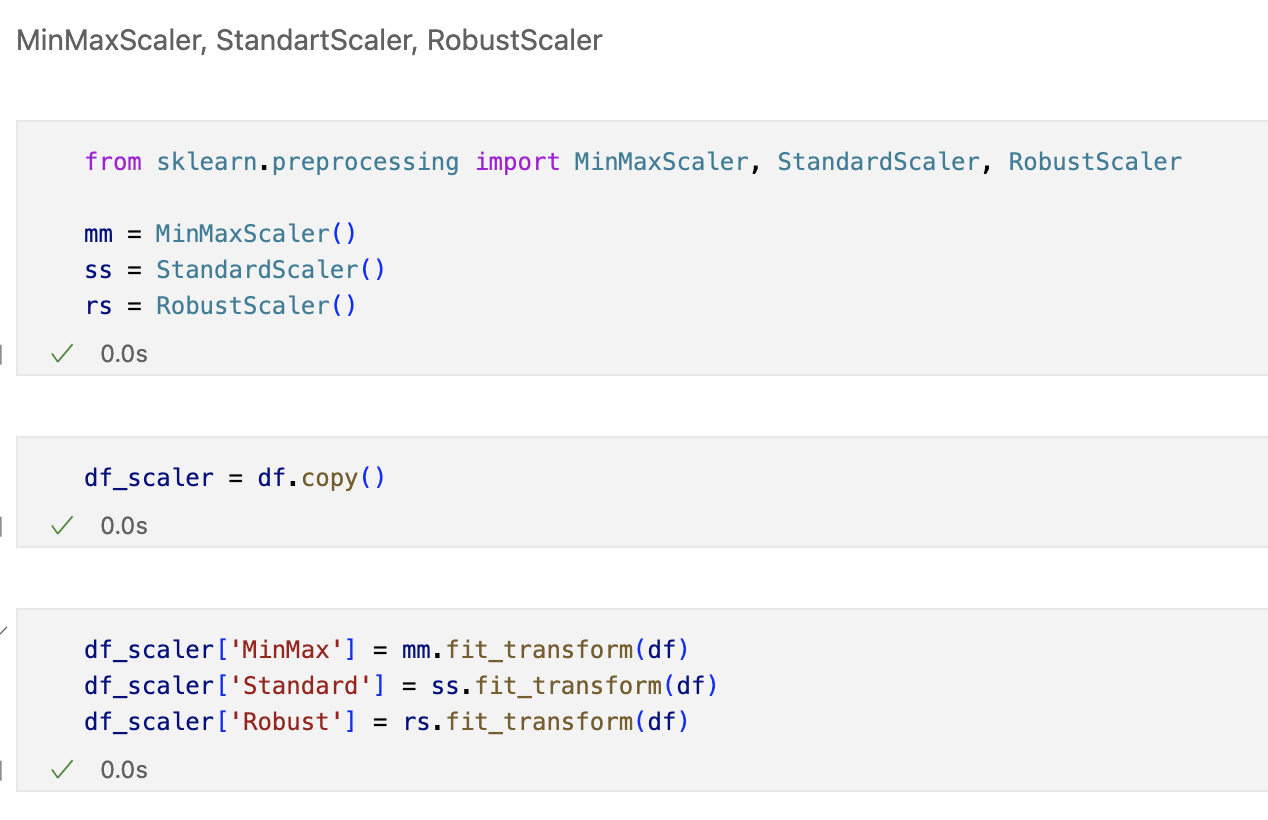
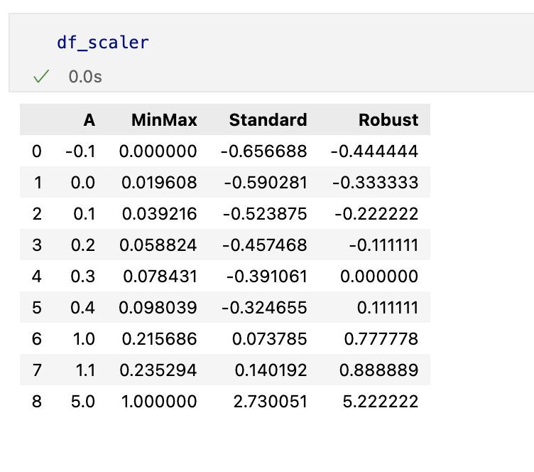
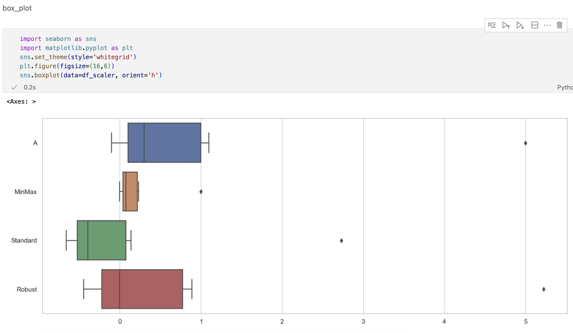
min-max scaling
정규화 시키는 과정
Standart Scaler
표준화 시키는 과정


Robust Scaler
아웃라이어의 영향을 최소화한다
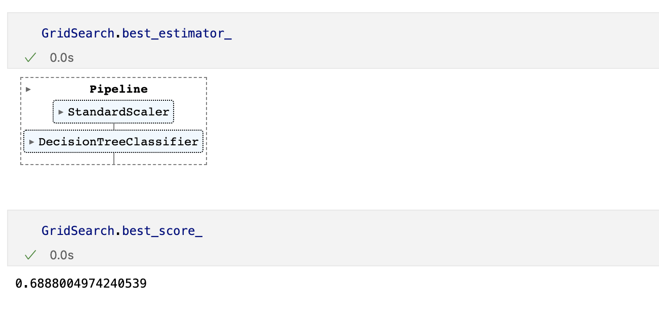
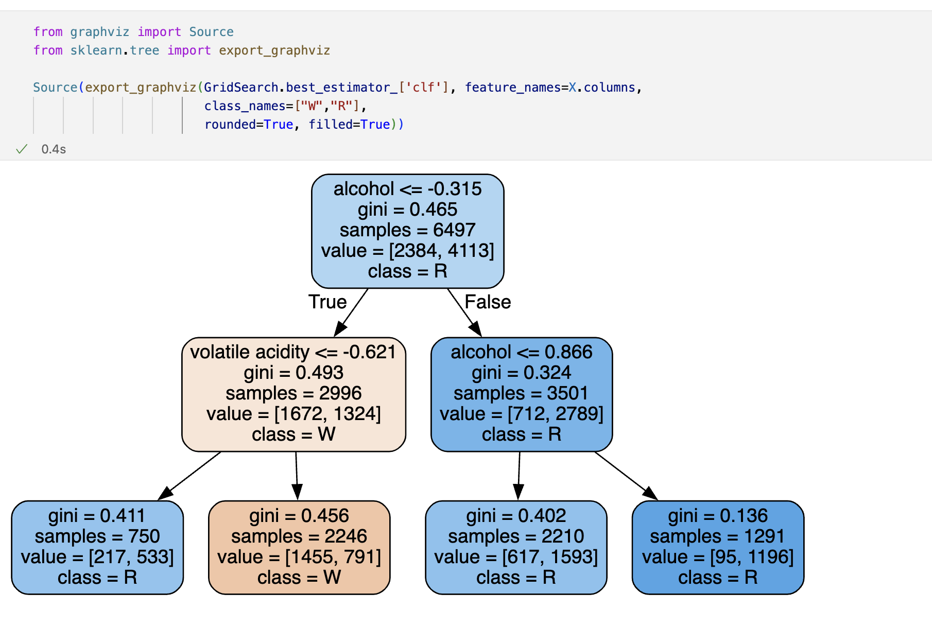
Decision Tree를 이용한 와인데이터분석
wine.ipynb 참고
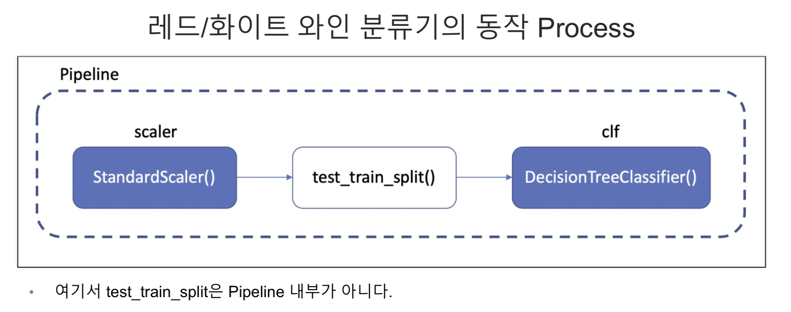
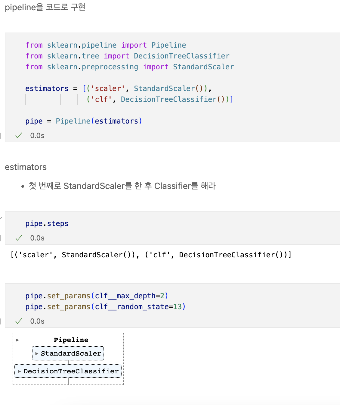
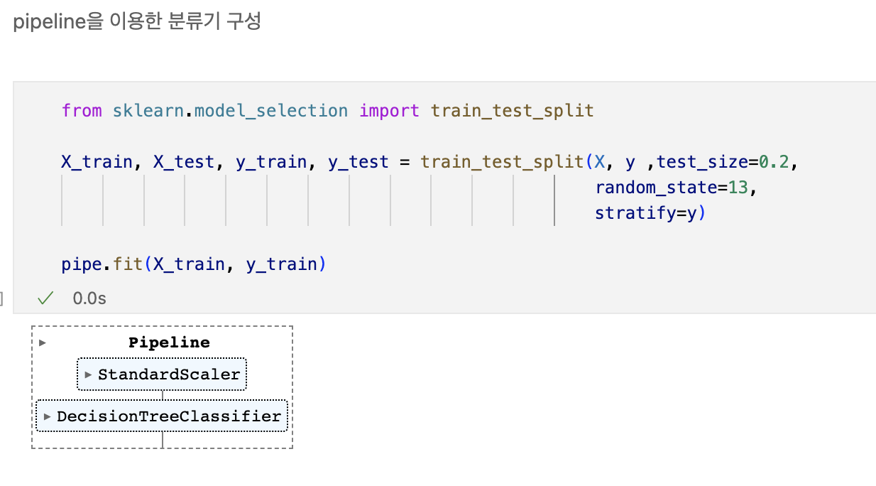
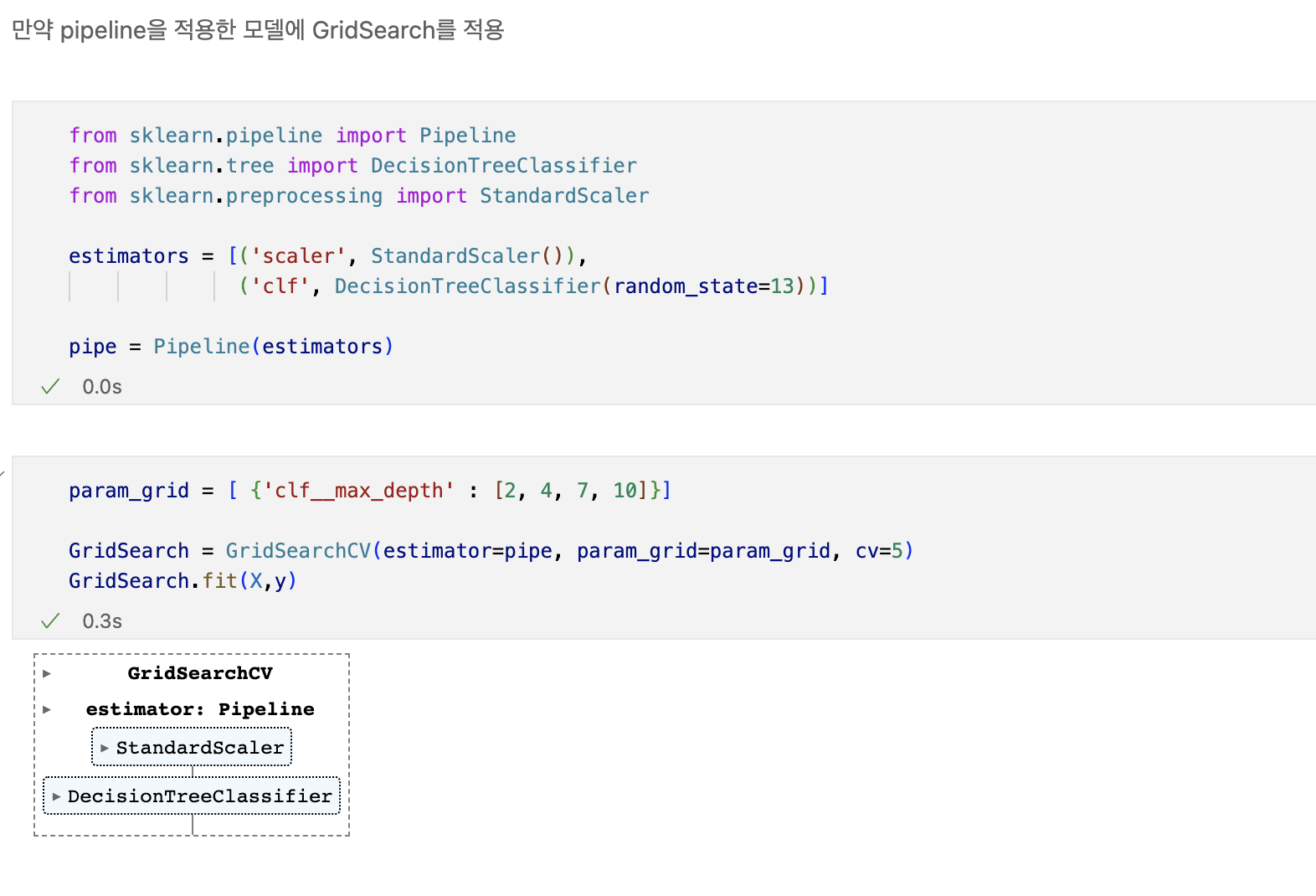
Pipeline
- 하이퍼 파라미터의 튜닝 과정을 번걸아 하다 보면 코드의 실행 순서에 혼돈이 있을 수 있다.
- sklearn 유저에게는 꼭 그럴 필요없이 준비된 기능 -> pipeline
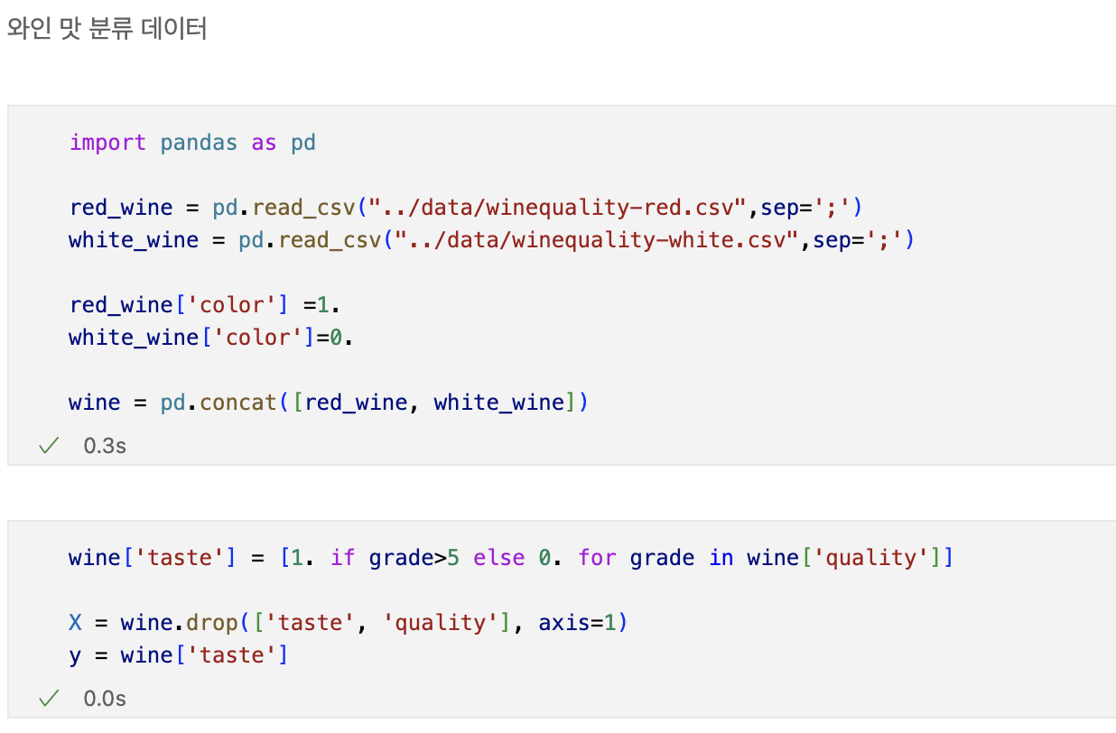
wine data를 불러온뒤

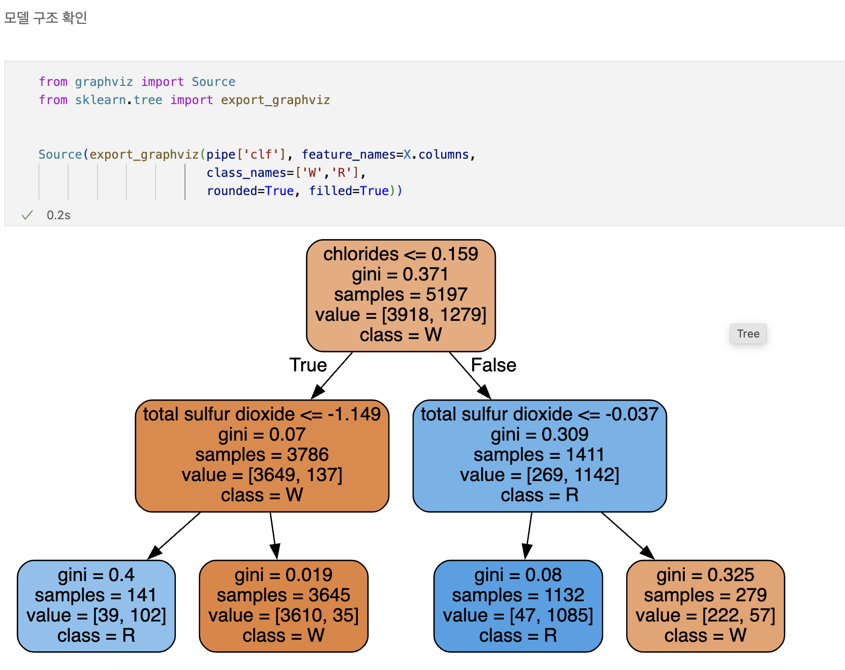
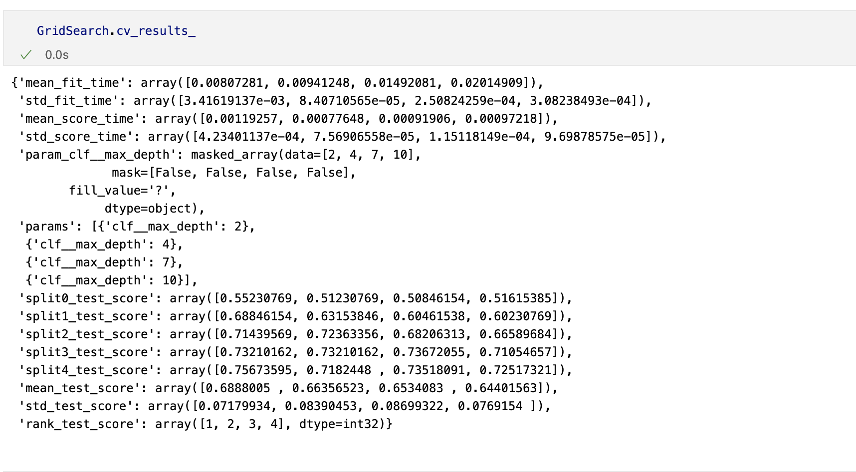
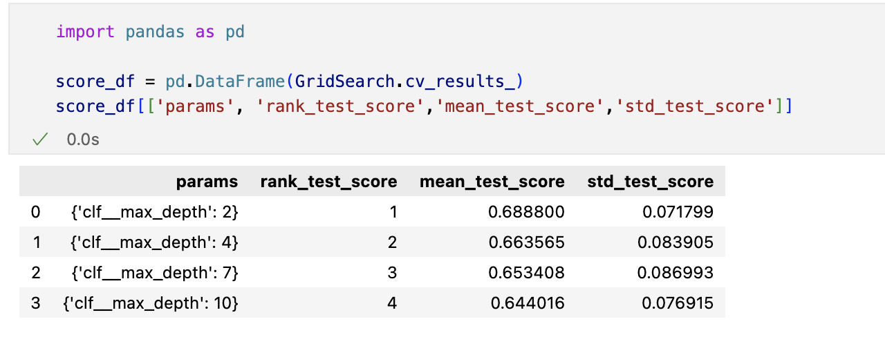
하이퍼파라미터 튜닝
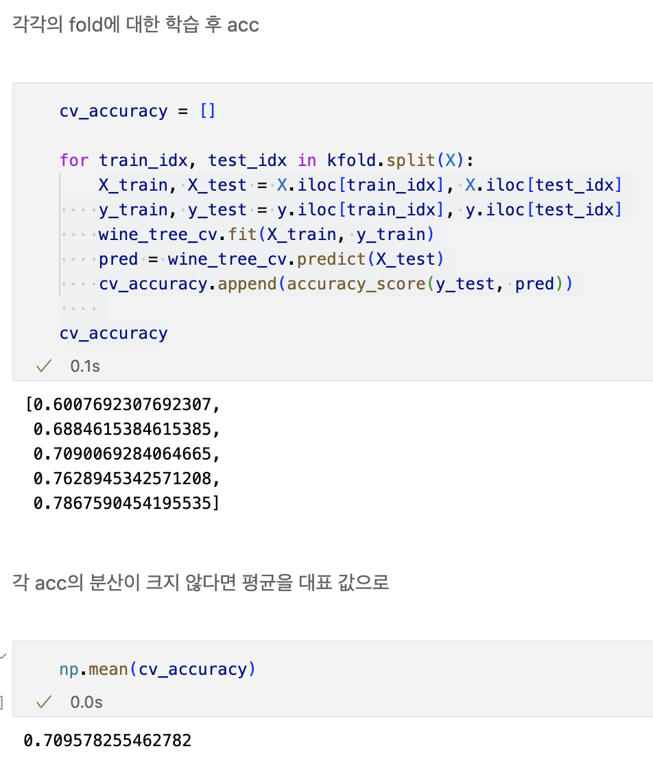
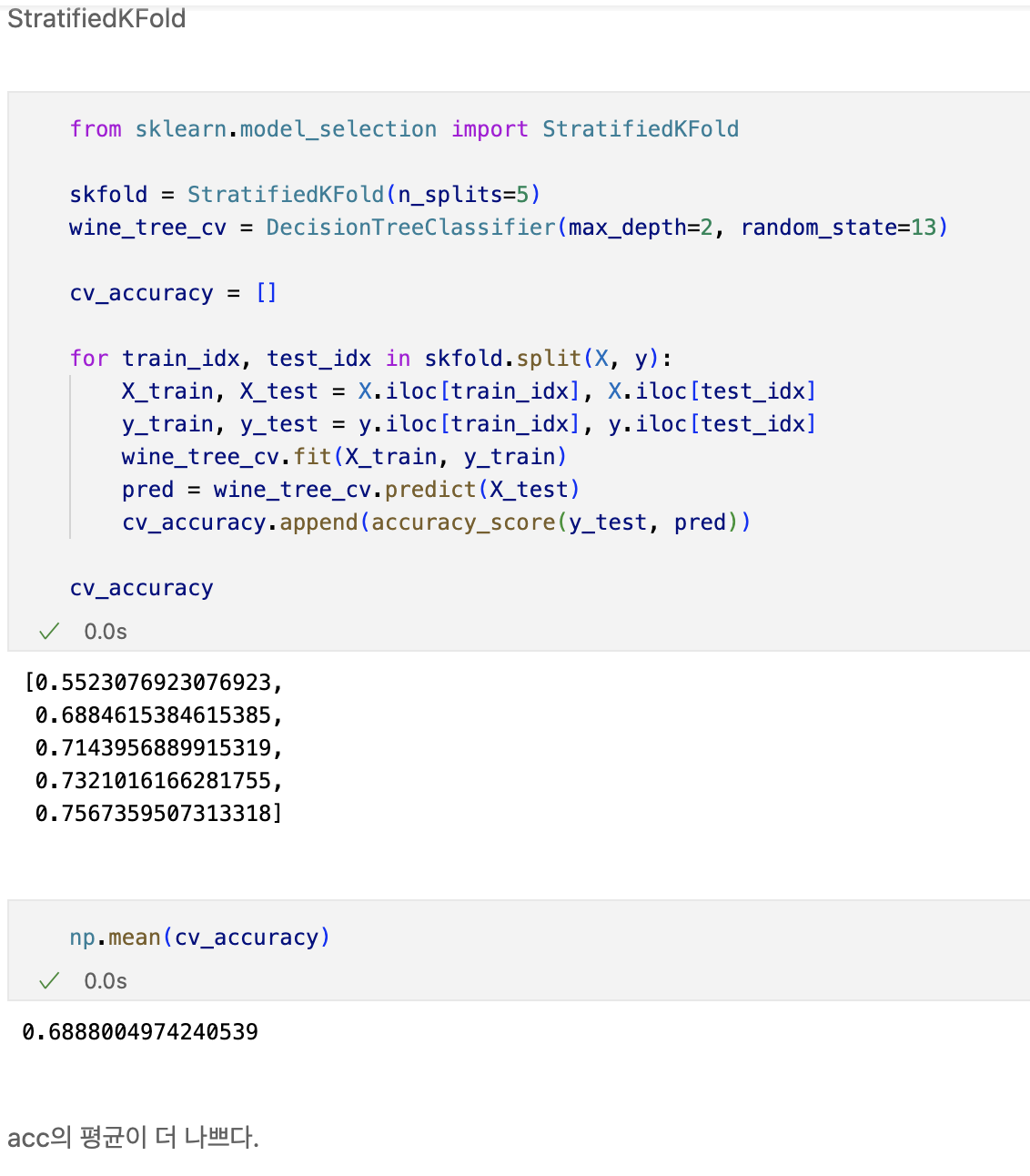
교차검증
- 과적합 : 모델이 학습 데이터에만 과도하게 최적화된 현상
- 그로 인해 일반화된 데이터에서는 예측 성능이 과하게 떨어지는 현상
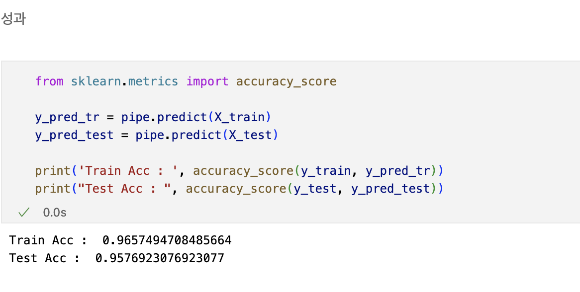
- 와인 맛 평가에서 훈련용 데이터의 ACC는 72.94,
- 테스트용 데이터는 ACC가 71.61%였는데, 이 결과는 괜찮은가?
- 나에게 주어진 데이터에 적용한 모델의 성능을 정확히 표현하기 위해서도 유용
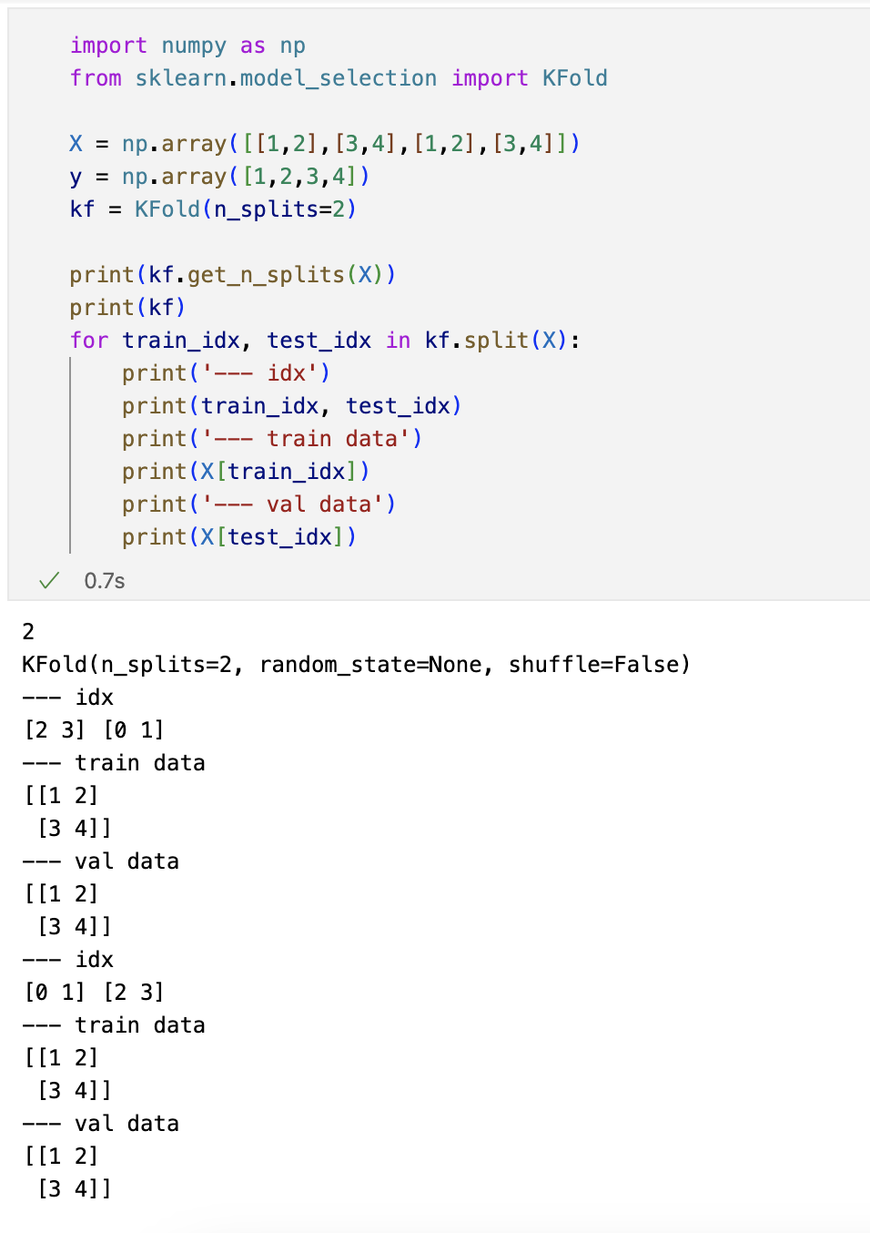
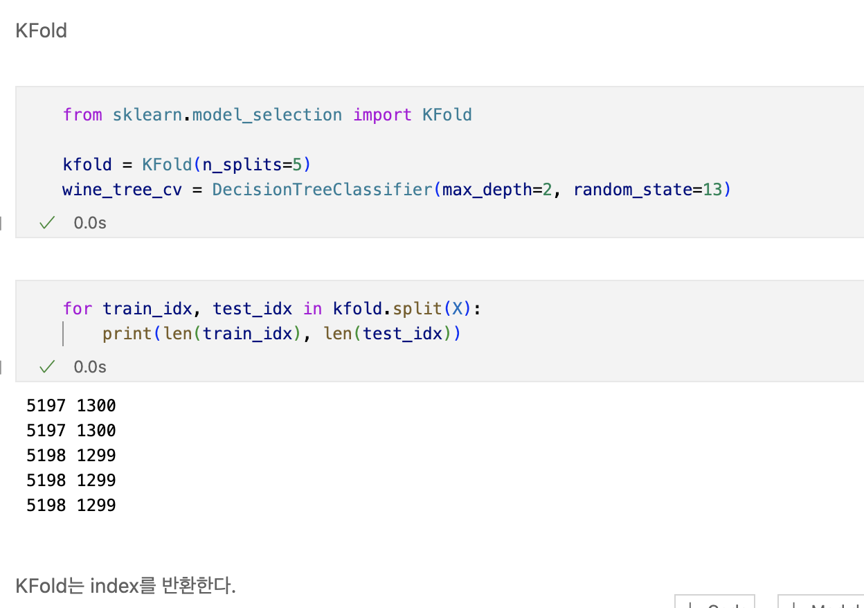
교차검증 구현하기
- simple example


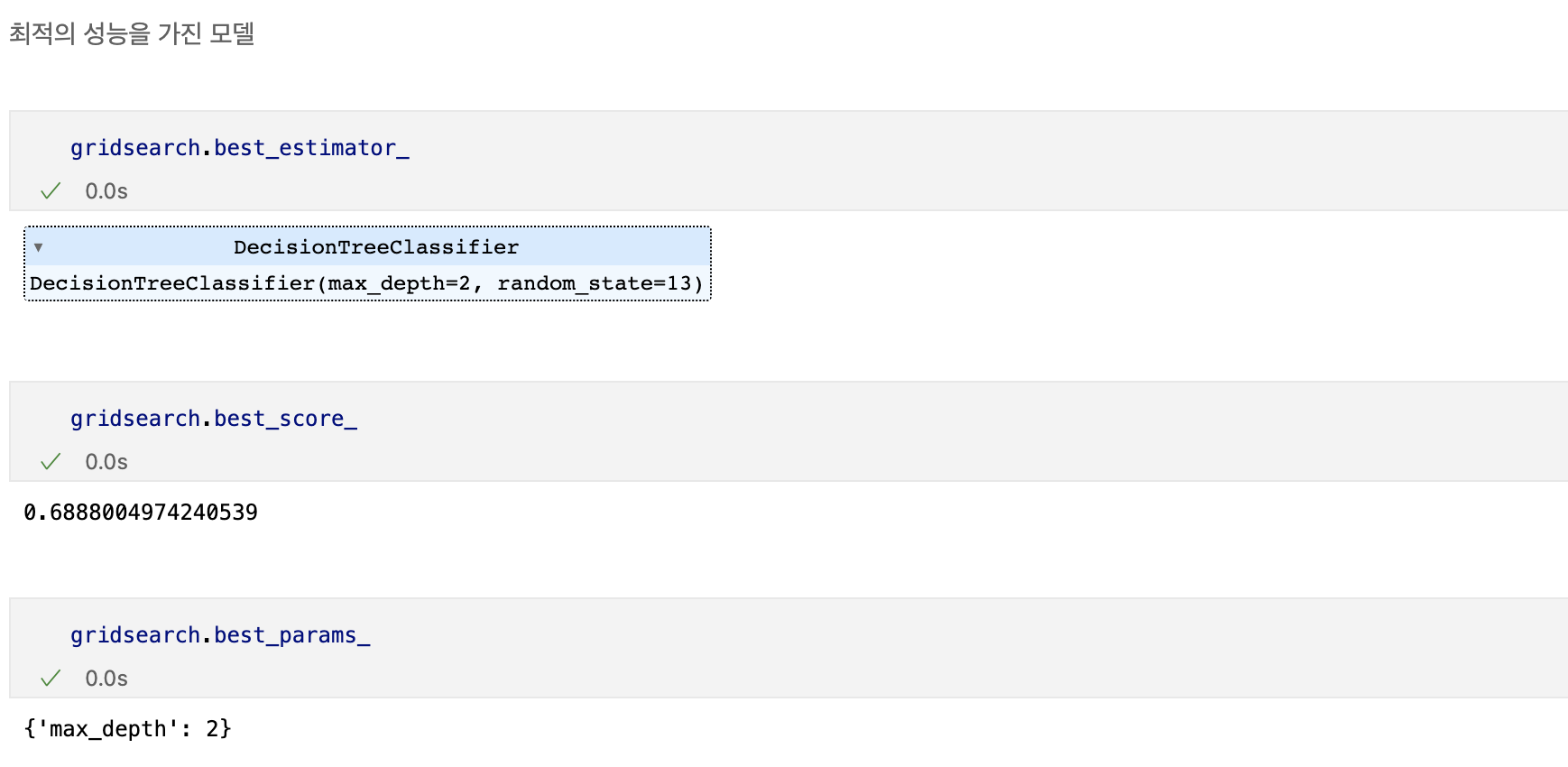
하이퍼파라미터 튜닝
- 모델의 성능을 확보하기 위해 조절하는 설정 값
튜닝대상
- 결정나무에서 아직 우리가 튜닝해 볼만한 것은 max_depth이다.
- 간단하게 반복문으로 max_depth를 바꿔가며 테스트


데이터분석가