
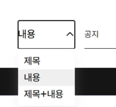
selectbox 에 스타일을 주고싶은데 Selectbox 의 경우 selectbox 태그를 사용하면 스타일을 커스텀 하는데 한계가 있기 때문에 ul, li 태그를 사용하여 option 을 구현하는등 따로 selectbox 전체를 직접 커스텀해서 구현해주어야 한다.
import React, { forwardRef, useEffect, useRef, useState } from 'react';
import * as S from './SelectFilter.styles';

export interface OptionType {
  value: any;
  label: string;
}

export interface OptionTypeArray extends Array<OptionType> {}

interface SelectProps {
  ...
}

const SelectFilter = forwardRef<HTMLDivElement, SelectProps>(
  (
    {
      options,
      value,
      label,
      defaultValue,
      onChange,
      size = 'default',
      width,
      placeholder,
      isFullWidth = false,
      isDisabled = false,
      error,
      name
    },
    ref
  ) => {
    const [isOpen, setIsOpen] = useState<boolean>(false);
    const [selectedOption, setSelectedOption] = useState<
      OptionType | undefined
    >(() => {
      if (value) {
        return options.find((opt) => opt.value === value);
      }
      return defaultValue;
    });
    const selectListRef = useRef<HTMLDivElement>(null);

    useEffect(() => {
      if (value) {
        const option = options.find((opt) => opt.value === value);
        setSelectedOption(option);
      }
    }, [value, options]);

    const toggleDropdown = (
      event: React.MouseEvent | React.KeyboardEvent
    ): void => {
      event.preventDefault();
      event.stopPropagation();
      // Enter 키로 실행되지 않도록 처리
      if ((event as React.KeyboardEvent).key === 'Enter') {
        return;
      }
      if (isDisabled) {
        setIsOpen(false);
        return;
      }

      setIsOpen(!isOpen);
    };

    const handleOptionClick = (
      option: OptionType,
      event: React.MouseEvent
    ): void => {
      event.preventDefault();
      event.stopPropagation();
      setSelectedOption(option);
      setIsOpen(false);
      if (onChange) {
        onChange(option.value);
      }
    };

    const getIsSelected = (option: OptionType): boolean => {
      return selectedOption?.value === option.value;
    };

    useEffect(() => {
      const handleOutsideClick = (event: MouseEvent) => {
        if (
          selectListRef.current &&
          !selectListRef.current.contains(event.target as Node)
        ) {
          setIsOpen(false);
        }
      };

      if (isOpen) {
        document.addEventListener('mousedown', handleOutsideClick);
      }
      return () => {
        document.removeEventListener('mousedown', handleOutsideClick);
      };
    }, [isOpen]);

    const handleButtonKeyDown = (event: React.KeyboardEvent): void => {
      if (!selectedOption) return;

      const currentIndex = options.findIndex(
        (opt) => opt.value === selectedOption.value
      );

      if (event.key === 'ArrowDown') {
        // 아래 방향키: 다음 옵션으로 이동 (순환)
        const nextIndex = (currentIndex + 1) % options.length;
        changedValue = options[nextIndex];
        setSelectedOption(options[nextIndex]);
        event.preventDefault();
      } else if (event.key === 'ArrowUp') {
        // 위 방향키: 이전 옵션으로 이동 (순환)
        const prevIndex = (currentIndex - 1 + options.length) % options.length;
        changedValue = options[prevIndex];
        setSelectedOption(options[prevIndex]);
        event.preventDefault();
      }
      if (event.key === 'Enter') {
        if (onChange) onChange(changedValue.value);
      }
    };
    return (
      <S.SelectContainer
        $size={size}
        $isFullWidth={isFullWidth}
        ref={selectListRef}
      >
        {label && <S.SelectLabel>{label}</S.SelectLabel>}
        <S.SelectButton
          $size={size}
          $isOpen={isOpen}
          $isDisabled={isDisabled}
          $width={width}
          onClick={toggleDropdown}
          onKeyDown={handleButtonKeyDown}
          $error={!!error}
          name={name}
        >
          <p>{selectedOption?.label || placeholder}</p>
          <span />
          {isOpen && (
            <S.OptionsList>
              {options.map((option) => (
                <S.Option
                  key={option?.value}
                  onClick={(e) => handleOptionClick(option, e)}
                  $isSelected={getIsSelected(option)}
                  value={option?.value}
                  role="option"
                >
                  {option?.label}
                </S.Option>
              ))}
            </S.OptionsList>
          )}
        </S.SelectButton>
      </S.SelectContainer>
    );
  }
);

SelectFilter.displayName = 'SelectFilter';

export default SelectFilter;
키보드를 통한 value 값 변경
이때 접근성을 위해 마우스 클릭 뿐만 아닌 키보드를 사용하여 selectbox 의 value 를 바꿔주는 경우도 고려해야하는데, 아래와 같이 구현이 되었다.
...
const SelectFilter = forwardRef<HTMLDivElement, SelectProps>(
  (
    ...
  ) => {
    ...
		// 키보드를 통한 option 의 value 변경
    const handleButtonKeyDown = (event: React.KeyboardEvent): void => {
      if (!selectedOption) return;
      const currentIndex = options.findIndex(
        (opt) => opt.value === selectedOption.value
      );

      if (event.key === 'ArrowDown') {
        // 아래 방향키: 다음 옵션으로 이동 (순환)
        const nextIndex = (currentIndex + 1) % options.length;
        changedValue = options[nextIndex];
        setSelectedOption(options[nextIndex]);
        event.preventDefault();
      } else if (event.key === 'ArrowUp') {
        // 위 방향키: 이전 옵션으로 이동 (순환)
        const prevIndex = (currentIndex - 1 + options.length) % options.length;
        changedValue = options[prevIndex];
        setSelectedOption(options[prevIndex]);
        event.preventDefault();
      }
      if (event.key === 'Enter') {
        if (onChange) onChange(changedValue.value);
      }
    };

    return (
      <S.SelectContainer
        $size={size}
        $isFullWidth={isFullWidth}
        ref={ref}
      >
        {label && <S.SelectLabel>{label}</S.SelectLabel>}
        <S.SelectButton
          ...
          onKeyDown={handleButtonKeyDown} // 키보드 이벤트 감지
          ...
        >
         ...
        </S.SelectButton>
      </S.SelectContainer>
    );
  }
);
...
selectbox 의 버튼이 포커싱 되었을 때 onKeyDown 이벤트를 걸어 키보드 사용이 감지되었을 때 handleButtonKeyDown 콜백함수가 실행되도록 했다.
윗방향 키는 event.key === 'ArrowUp , 아랫방향 키는 event.key === 'ArrowDown' 로 설정이 되고 그에 따라 현재 value 값을 기준으로 순환되어 변경되도록 작업을 했다.
% 와 같은 나머지 연산자를 사용하여 맨 마지막 혹은 맨 처음 index 에 다다랐을 때 다음에 선택되는 index 가 맨 처음 혹은 맨 마지막 index 가 되는, 이른바 순환되는 구조를 구현할 수 있었다.
SelectBox 외 다른 부분 클릭 시 드롭다운 off
const selectListRef = useRef<HTMLDivElement>(null);
...
useEffect(() => {
  const handleOutsideClick = (event: MouseEvent) => {
    if (
      selectListRef.current &&
      !selectListRef.current.contains(event.target as Node)
    ) {
      setIsOpen(false);
    }
  };

  if (isOpen) {
    document.addEventListener('mousedown', handleOutsideClick);
  }
  return () => {
    document.removeEventListener('mousedown', handleOutsideClick);
  };
}, [isOpen]);

...
return (
  <S.SelectContainer
    ...
    ref={selectListRef}
    ...
  >
useRef 를 사용하여 다른 부분을 클릭할 시 드롭다운이 닫히는 구조도 추가해주었다.
이전에는 selectbox 의 겉 부분만 스타일을 주거나, mui 같은 이미 커스텀화 되어있는 selectbox 를 사용해 왔기에 이런 작업의 경험이 없었다. 드롭다운 부분까지의 커스텀을 위해 아예 처음부터의 기능까지 새로 구현된 selectbox 를 다루게 된 점은 좋은 경험이었다고 생각한다.