transform
transform: rotate
transform: rotate(0.5turn);
transform: rotate3d(1, 2.0, 3.0, 10deg);
transform: rotateX(10deg);
transform: rotateY(10deg);
transform: rotateZ(10deg);
transform-origin
transform-origin: x-axis y-axis;
rotate으로 회전을 시키면 가운데 축으로 돌아가게 된다.

transform-origin: 100%;을 주면 아래와 같이 지정한 축을 중심으로 돌아가게 된다.

JS - 일정한 시간마다 시침 이동
const $hourHand = document.querySelector(".hour-hand");
const $minHand = document.querySelector(".min-hand");
const $secondHand = document.querySelector(".second-hand");

setInterval(getSec, 1000);

function getSec(){
  const now = new Date();
  const second = now.getSeconds();
  const min = now.getMinutes();
  const hour = now.getHours();

  $secondHand.style.transform =
    `rotate(${second / 60 * 360 + 90}deg)`;

  $minHand.style.transform =
    `rotate(${min / 60 * 360 + 90}deg)`;

  $hourHand.style.transform =
    `rotate(${((hour / 12) * 360) + 90}deg);`
}-
setInterval로 1초마다 getSec 함수를 호출한다.
-
getSec함수에서는 1초 단위로 생성자 함수로 now인스턴스를 생성하여 Date 객체에서 현재 시간을 받아온다.
-
rotate로 얼마나 회전시킬지는 각도로 지정해주어야 하기 때문에,
시간을 각도로 변환해주어 전달한다.
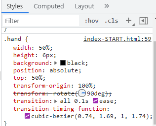
transition
transition-timing-function
cubic-bezier
elements > styles에서 바로 확인 가능한데, transition-timing-function을 아래 두번째 이미지와 같은 형태로 만들면 시침이 틱,틱 튕기듯 움직이는 효과를 낼 수 있다.

Reference
https://developer.mozilla.org/ko/docs/Web/CSS/transform
https://mjmjmj98.tistory.com/41 [Live passionate😎]`

Why?에서 시작해 How를 찾는 과정을 좋아합니다. 그 고민과 성장의 과정을 꾸준히 기록하고자 합니다.