얼마전 강의를 듣다가 flex-basis라는 것을 알게 되었다
TL;DR;
- flex-basis는 flex의 자식에 부여하는 속성으로 길이를 지정하는데 width와 min-width를 섞어 놓은 듯 유연한 모습을 보여준다
flex-basis
<!DOCTYPE html>
<html lang="en">
  <head>
    <meta charset="UTF-8" />
    <meta name="viewport" content="width=device-width, initial-scale=1.0" />
    <link rel="stylesheet" href="flex-basis.css" />
    <title>Document</title>
  </head>
  <body>
    <div class="container">
      <div class="item">item1</div>
      <div class="item">item2</div>
      <div class="item">item3</div>
    </div>
  </body>
</html>
body {
background: #20262e;
}
.container {
display: flex;
}
.item {
padding: 10px;
color: white;
}
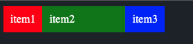
.item:nth-child(1) {
background: red;
flex-basis: 100px;
}
.item:nth-child(2) {
background: green;
width: 100px;
}
.item:nth-child(3) {
background: blue;
}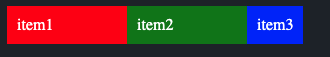
위와 같이 구성했을 땐 차이가 없다
여기에서 몇 가지 변화를 줘보자
body {
  background: #20262e;
}
.container {
  display: flex;
  flex-direction: column;
}
.item {
  padding: 10px;
  color: white;
}
.item:nth-child(1) {
  background: red;
  flex-basis: 100px;
}
.item:nth-child(2) {
  background: green;
  width: 100px;
}
.item:nth-child(3) {
  background: blue;
}
-
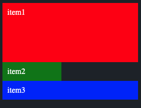
flex-direction을 column으로 지정하면 위와 같이 지정되는 영역이 달라진다
- item1의 경우 가로는 전체 영역을 잡지만 세로는 flex-basis에 의해 100px을 가져간다
-
만약 이 상태에서 2번째 item을 width 대신 min-width로 변경하면 아래와 같다
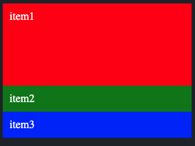
- 여기에서 flex-basis에 세로길이를 아래와 같이 줄여볼 수 있다
body {
  background: #20262e;
}
.container {
  display: flex;
  flex-direction: column;
}
.item {
  padding: 10px;
  color: white;
}
.item:nth-child(1) {
  background: red;
  flex-basis: 100px 0px;
}
.item:nth-child(2) {
  background: green;
  min-width: 100px;
}
.item:nth-child(3) {
  background: blue;
}
-
flex-basis는 띄어쓰기를 기준으로 가로 세로를 지정할 수 있다는 것을 알 수 있다
-
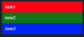
다시 flex-direction을 row로 변경하고 길이를 줄여보자
body {
  background: #20262e;
}
.container {
  display: flex;
  /* flex-direction: column; */
}
.item {
  padding: 10px;
  color: white;
}
.item:nth-child(1) {
  background: red;
  flex-basis: 100px;
}
.item:nth-child(2) {
  background: green;
  min-width: 100px;
}
.item:nth-child(3) {
  background: blue;
}
- item2는 min-width의 영향을 받아 100px을 최소로 가져가지만
- item1은 flex의 특성에 맞게 유연하게 줄어든다
- 유연한 반응형을 가져가고 싶다면 flex-basis를 사용하고
- 아이템의 최소 크기를 보장하고 싶다면 min-width를 사용할 것 같다
참고

움직이는 만큼 행복해진다