📢Seaborn(2)
데이터시각화 : 1. Matplotlib
데이터시각화 : 2. Seaborn(1)
데이터시각화 : 3. Seaborn(2)
데이터 불러오기
import pandas as pd
pd.plotting.register_matplotlib_converters()
import matplotlib.pyplot as plt
%matplotlib inline
import seaborn as sns
# Path of the file to read
insurance_filepath = "../input/insurance.csv"
# Read the file into a variable insurance_data
insurance_data = pd.read_csv(insurance_filepath)📌산점도 그래프
📍scatterplot()
- 간단한 산점도를 생성하려면 sns.scatterplot 명령을 사용하고 다음과 같이 지정한다.
수평 x축 (x=insurance_data['bmi'])
수직 y축 (y=insurance_data['charges'])
sns.scatterplot(x=insurance_data['bmi'], y=insurance_data['charges'])
- 위의 산점도는 체질량 지수(BMI)와 보험 요금이 양의 상관 관계가 있다는 것을 시사한다. 즉, 일반적으로 BMI가 높은 고객은 더 많은 보험료를 지불하는 경향이 있다.
📍regplot()
- 추세선
- 이 관계의 강도를 다시 확인하기 위해 데이터에 추세선을 추가할 수 있다.
sns.regplot(x=insurance_data['bmi'], y=insurance_data['charges'])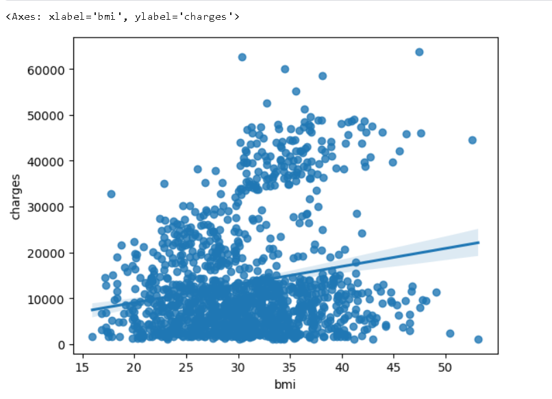
📌색상이 포함된 산점도
-
산점도를 사용하여 (2개가 아닌) 세 변수 간의 관계를 표현할 수 있습니다! 이를 위한 한 가지 방법은 점들을 색상으로 구분하는 것이다.
-
예를 들어, 흡연이 BMI와 보험료 사이의 관계에 어떤 영향을 미치는지 이해하기 위해 점들을 '흡연자'로 색상을 구분하고, 다른 두 열 ('bmi', 'charges')을 축에 플롯할 수 있다.
sns.scatterplot(x=insurance_data['bmi'], y=insurance_data['charges'], hue=insurance_data['smoker'])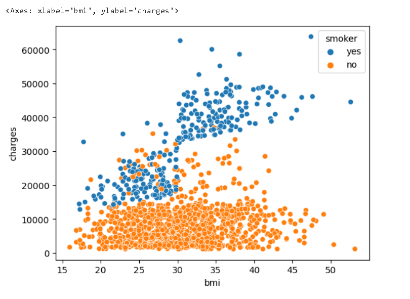
-
이 산점도는 비흡연자는 BMI가 증가함에 따라 약간 더 많은 보험료를 지불하지만, 흡연자는 훨씬 더 많은 보험료를 지불하는 것을 보여준다.
-
이 사실을 더 강조하기 위해, sns.lmplot 명령을 사용하여 흡연자와 비흡연자에 대한 두 개의 회귀선을 추가할 수 있다, 경사도를 보고 어느 것이 더 결과적으로 가파른지 알 수 있다.
📍lmplot()
sns.lmplot(x="bmi", y="charges", hue="smoker", data=insurance_data)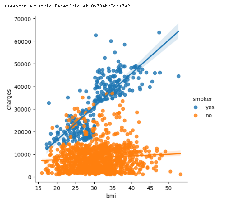
📍swarmplot()
- 겹치지 않게 산점을 한다.
sns.swarmplot(x=insurance_data['smoker'],
              y=insurance_data['charges'])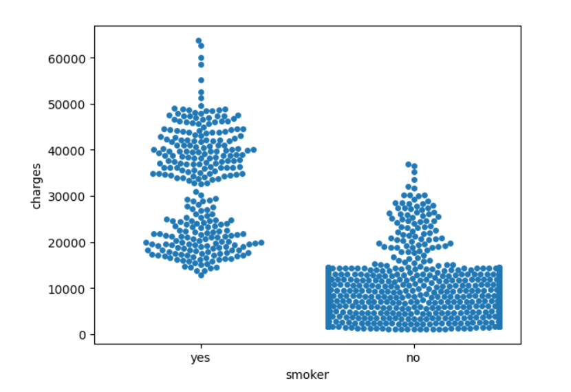
📌응용해보기
데이터 불러오기
# Path of the file to read
candy_filepath = "../input/candy.csv"

# Fill in the line below to read the file into a variable candy_data
candy_data = pd.read_csv(candy_filepath, index_col="id")
산점도 작성하기
# 'sugarpercent'와 'winpercent' 간의 관계를 보여주는 산점도를 작성합니다.
sns.scatterplot(x=candy_data['sugarpercent'], y=candy_data['winpercent'])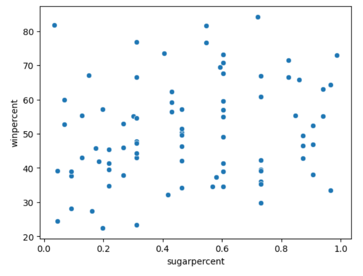
# 'sugarpercent'와 'winpercent' 간의 관계를 보여주는 산점도와 회귀선을 작성합니다.
sns.regplot(x=candy_data['sugarpercent'], y=candy_data['winpercent'])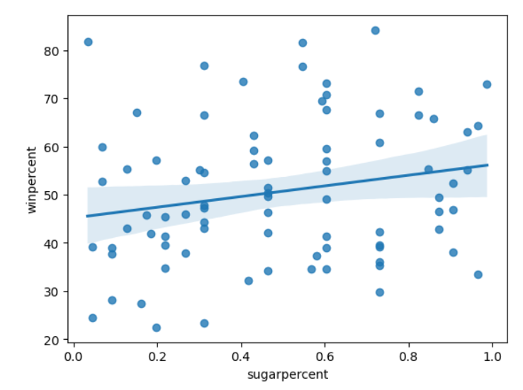
# 'pricepercent', 'winpercent', 'chocolate' 간의 관계를 보여주는 산점도를 작성합니다.
sns.scatterplot(x=candy_data['pricepercent'], y=candy_data['winpercent'], hue=candy_data['chocolate'])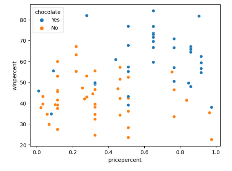
# 컬러코드된 산점도와 회귀선이 있는 그래프를 작성합니다.
sns.lmplot(x="pricepercent", y="winpercent", hue="chocolate", data=candy_data)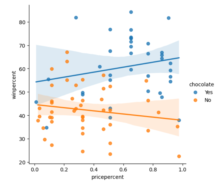
# 'chocolate'와 'winpercent' 간의 관계를 보여주는 산점도를 그립니다.
sns.swarmplot(x=candy_data['chocolate'], y=candy_data['winpercent'])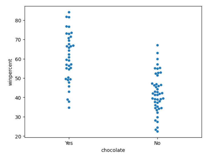
📌분포 그래프
📍histplot()
데이터 불러오기
In this tutorial you'll learn all about histograms and density plots.

Set up the notebook
As always, we begin by setting up the coding environment. (This code is hidden, but you can un-hide it by clicking on the "Code" button immediately below this text, on the right.)

import pandas as pd
pd.plotting.register_matplotlib_converters()
import matplotlib.pyplot as plt
%matplotlib inline
import seaborn as sns

# Path of the file to read
iris_filepath = "../input/iris.csv"

# Read the file into a variable iris_data
iris_data = pd.read_csv(iris_filepath, index_col="Id")
분포 그래프 작성하기
# Histogram
sns.histplot(iris_data['Petal Length (cm)'])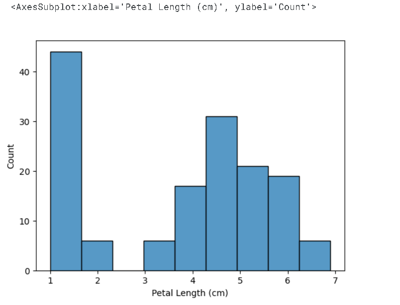
📍kdeplot()
- 밀도도
# KDE plot
sns.kdeplot(data=iris_data['Petal Length (cm)'], shade=True)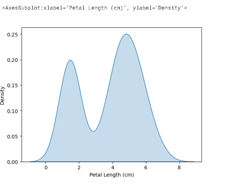
📍jointplot()
- 2D KDE 그림
- 두 개의 열에 대한 KDE(Kernel Density Estimation) 플롯을 만들 때는 하나의 열에 제한되지 않는다.
- sns.jointplot를 사용한다.
# 2D KDE plot
sns.jointplot(x=iris_data['Petal Length (cm)'], y=iris_data['Sepal Width (cm)'], kind="kde")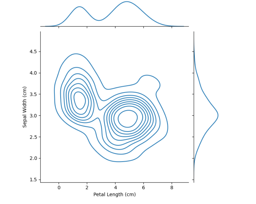
- 위의 플롯에서 색상 코딩은 각각의 꽃받침 너비(sepal width)와 꽃잎 길이(petal length)의 조합이 얼마나 발생할 가능성이 있는지를 나타내며, 더 어두운 부분일수록 발생 가능성이 높다.
📍shistplot()
- 색상 그래프
# Histograms for each species
sns.histplot(data=iris_data, x='Petal Length (cm)', hue='Species')

# Add title
plt.title("Histogram of Petal Lengths, by Species")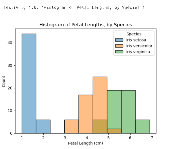
📍kdeplot()
- 색상 KDE 그래프
# KDE plots for each species
sns.kdeplot(data=iris_data, x='Petal Length (cm)', hue='Species', shade=True)

# Add title
plt.title("Distribution of Petal Lengths, by Species")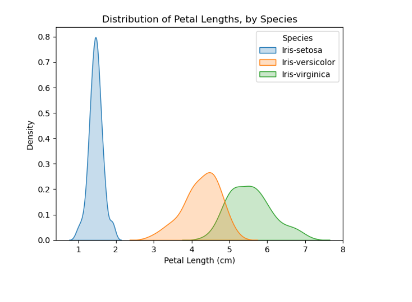

성공의 반대는 실패가 아닌 도전하지 않는 것이다.