- 들어가며
왜 사용하나요 ?
css를 입히는 방법은 코드 내에서 바로바로 주는 방법, 따로 css 파일을 만들어 주는 방법 등이 있는데 이는 가독성에 좋지 않으며 매우 귀찮다..! 💀
반면 styled components는 재사용이 매우 쉬우며 가독성 또한 좋은 편이다!
- 시작하기
npm i styled-components //터미널에서 설치
import styled from "styled-components"; // 코드 내 import
- styled componets 생성
styled.태그이름``;
태그이름에는 div, span, button 등등 우리가 익히 아는,
❗html 태그들❗이 들어가야한다.
import styled from "styled-components";

const BOX = styled.div`
  width: 100px;
  background-color: tomato;
`;

function App() {
  return <BOX>what</BOX>;
}
위와 같이 스타일을 입힌 div태그를 바로 가져다 쓰면 된다!
- props : 설정 변경
styled components를 여러번 사용할 때, 기본 구조는 같으나 색깔은 다르게 주고 싶을 때가 있을 수 있다.
그럴땐 props를 사용한다.
import styled from "styled-components";

const Box = styled.div`
  width: 100px;
  background-color: ${(props) => props.bgColor};
`;

function App() {
  return <Box bgColor="teal">what</Box>;
}
위와 같이 Box 컴포넌트의 props중 bgColor가 'teal'이다.
이를 styled components에서 ${(props)=>props.bgColor} 로 특정할 수 있다.
이제 props만 다르게 주면 색깔만 다른 styled-components를 찍어낼 수 있는 것이다!
- 확장하기 : 중복 코드 제거
Box 컴포넌트의 style을 모두 채택하고, 그 외의 속성을 더 주고 싶을 때 확장할 수 있다. 말하자면 상속과도 같은 개념이다.
styled(상속하고 싶은 컴포넌트 이름)``;
import styled from "styled-components";

const Box = styled.div`
  width: 100px;
  background-color: ${(props) => props.bgColor};
`;

const Circle = styled(Box)`
  border-radius: 50px;
`;

function App() {
  return (
    <>
      <Box bgColor="teal">what</Box>
      <Circle bgColor="tomato">circle</Circle>
    </>
  );
}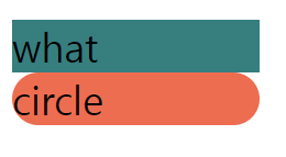
🔼 Box에서 border-radius만 추가된 컴포넌트가 생성됐다!
- 스타일은 같으나 태그를 다르게 :
as="태그이름"
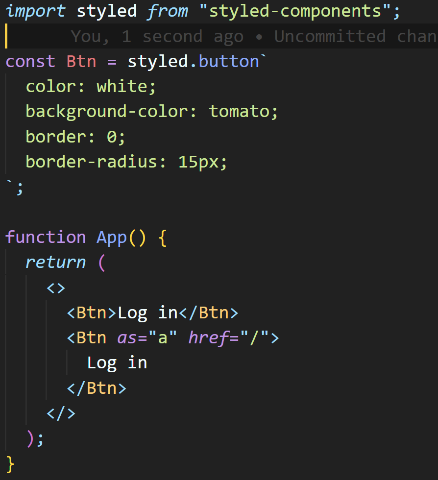
<Btn as="a" href="/">Log in</Btn> 에서,
as="a"를 주목하자.
Btn 컴포넌트는 버튼 태그이지만, html 태그 중 a로 사용된다는 의미이다.
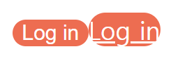
🔼 같은 Btn 컴포넌트지만 링크로 바뀌었다
- 애니메이션 주기
(1) import
import {keyframes} from "styled-components";
(2) animation 생성
const animation = keyframes`
%{
  transform : rotate(0deg);
  border-radius:0px;
}
50%{
  border-radius:100px;

}
100%{
  transform : rotate(360deg);
  border-radius:0px;
}
`; // css - animation
(3) 애니메이션을 주고 싶은 컴포넌트에 포함시키기
const Btn = styled.button`
  color: white;
  background-color: tomato;
  border: 0;
  border-radius: 15px;
  animation: ${animation} 1s linear infinite;
`;
${animation}을 사용한다는 것에 유의하기
- selector 사용하기
const Btn = styled.button`
  color: white;
  background-color: tomato;
  border: 0;
  border-radius: 15px;
  animation: ${animation} 1s linear infinite;
  span {
    font-size: 36px;
  }
`;
위와 같이 span 태그에 스타일을 따로 지정하면,
Btn 컴포넌트 안의 <span>태그에 적용된다!
function App() {
  return (
    <>
      <Btn>
        <div>💀</div>
        <span>👀</span>
      </Btn>
      <Btn as="a" href="/">
        Log in
      </Btn>
    </>
  );
}
<span>👀</span> 태그만 font-size가 36px로 적용된다

( + animation 효과로 빙글빙글 도는 중)