
데이터 시각화 라이브러리_Seaborn
- 최근에 많이 사용되는 라이브러리
- 좀 더 비주얼적인 면이 개선된
import warnings
warnings.filterwarnings('ignore')
import pandas as pd
import seaborn as sns
iris = sns.load_dataset('iris')
iris.head()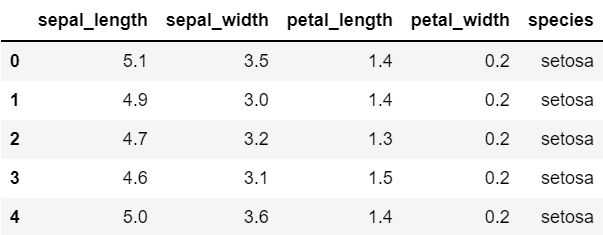
.pairplot ( data = 데이터 이름)
sns.pairplot(data = iris) # 하나씩 짝지어서 산점도로 나타나고, 자기 자신은 히스토그램으로 보여줌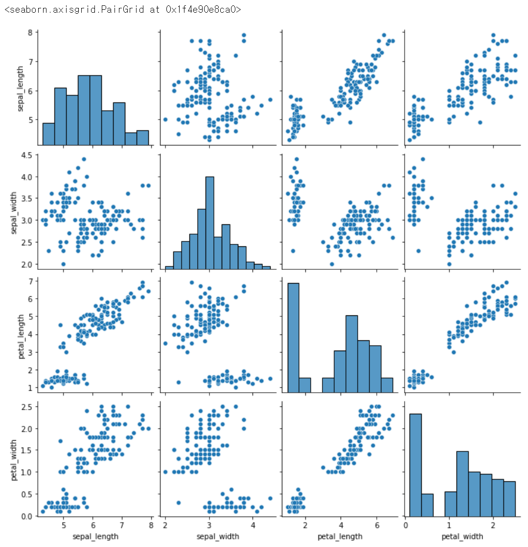
sns.pairplot(data = iris, hue='species') # hue : 어떠한 기준으로 구별해서 보여달라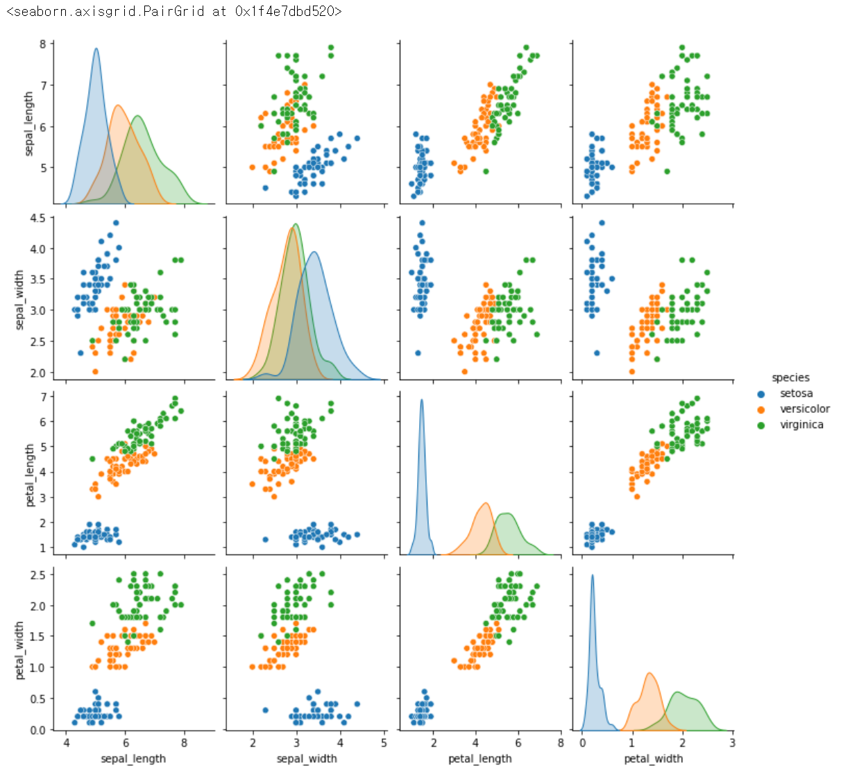
sns.pairplot(data = iris, hue='species', vars = ['petal_length', 'petal_width']) # 원하는 정보만 뽑아보기, x,y 다르게 해서 보여줌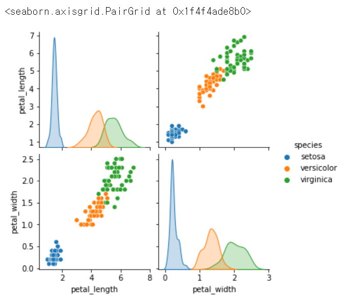
sns.pairplot(data = iris, hue='species', vars = ['petal_length', 'petal_width'], height=4) # 크기 조절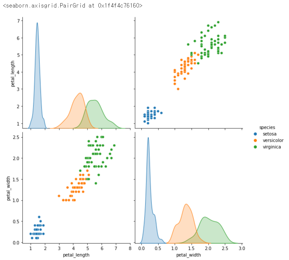
.jointplot( x = '원하는 컬럼명', y = '원하는 컬럼명', data = 데이터 이름, kind = 원하는 종류)
sns.jointplot(x = 'petal_length', y = 'petal_width', data = iris, kind = 'scatter') #jointplot도 x,y가 필요함, 산점도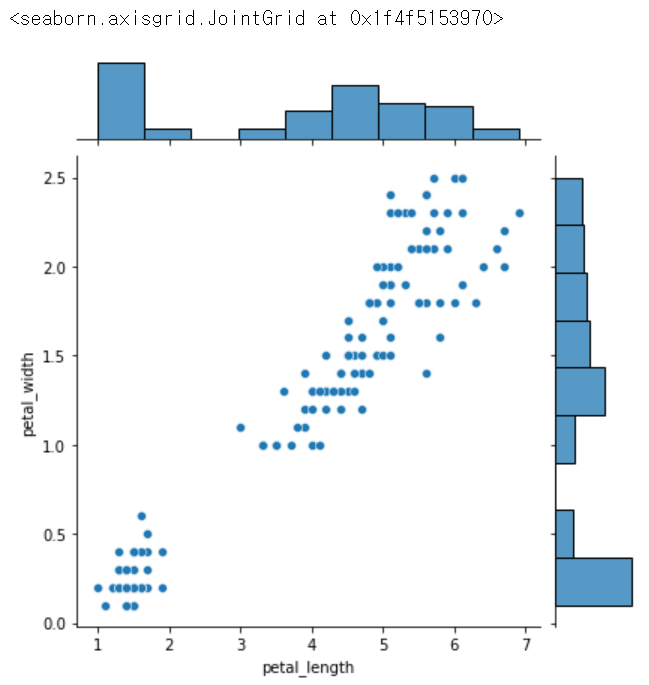
sns.jointplot(x = 'petal_length', y = 'petal_width', data = iris, kind = 'reg') # 회기선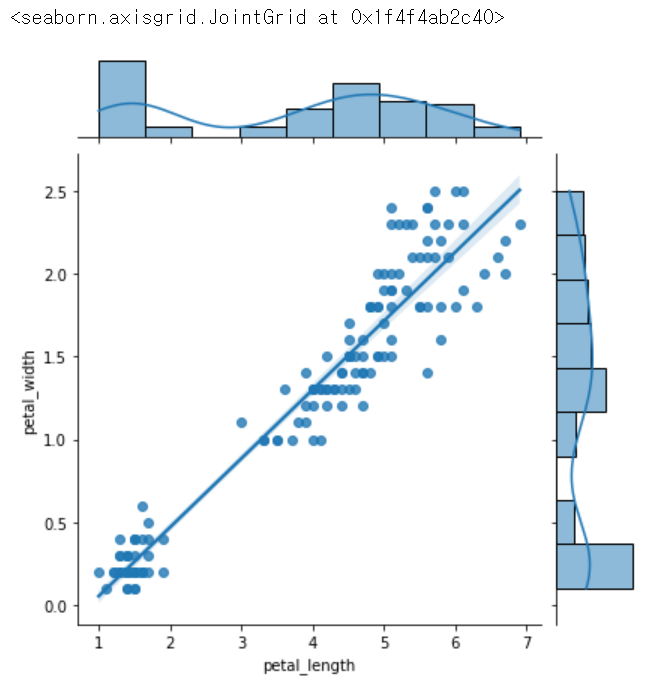
sns.jointplot(x = 'petal_length', y = 'petal_width', data = iris, kind = 'kde') # 등고선, 확률밀도함수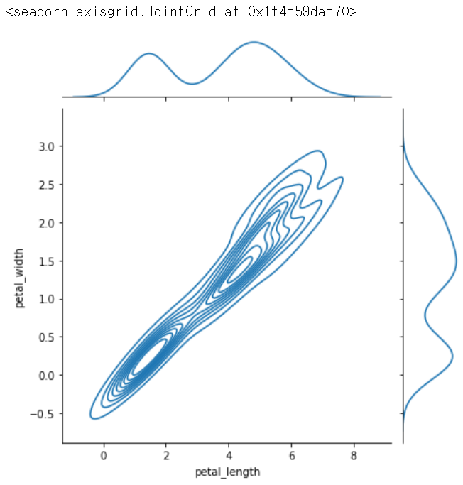
sns.jointplot(x = 'petal_length', y = 'petal_width', data = iris, kind = 'hex') # 지역볼 때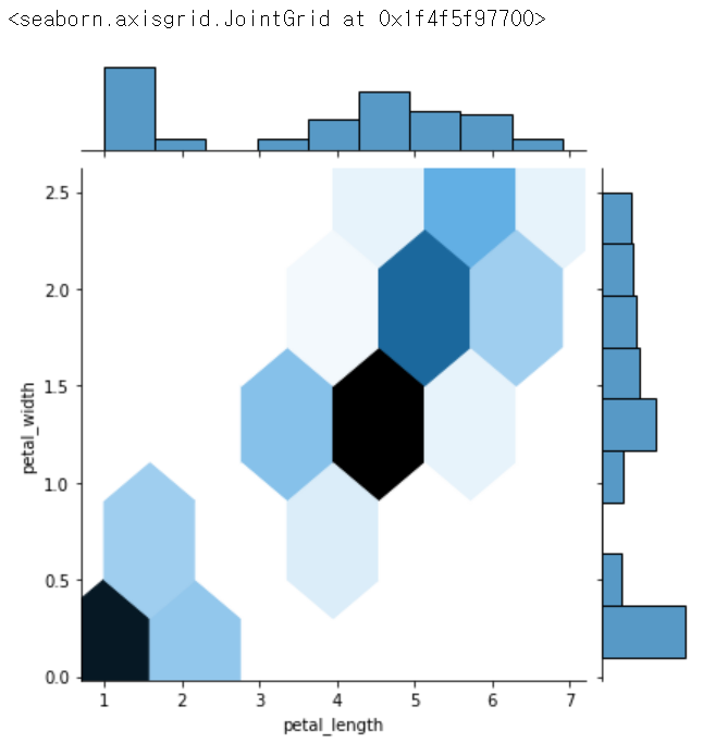
.lmplot (x = '원하는 컬럼명', y = '원하는 컬럼명', hue = '원하는 기준의 컬럼명', data = 데이터 이름)
sns.lmplot(x = 'sepal_length', y = 'sepal_width', hue = 'species', data = iris) # 종별로 선형관계를 나타내줌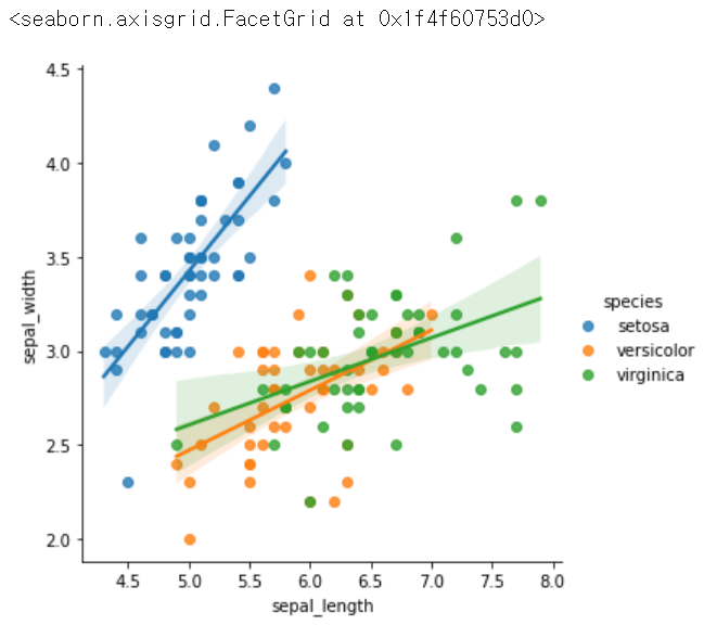
sns.lmplot(x = 'petal_length', y = 'petal_width', hue = 'species', data = iris)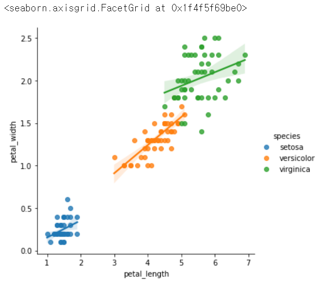
.heatmap
iris.corr()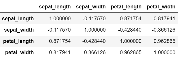
sns.heatmap(iris.corr())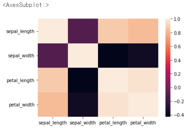
sns.heatmap(iris.corr(), annot = True) # 수치정보 추가
sns.heatmap(iris.corr(), annot = True, cmap = 'Blues') # - 로 갈수록 진해짐, 색깔을 바꿀 수도 있음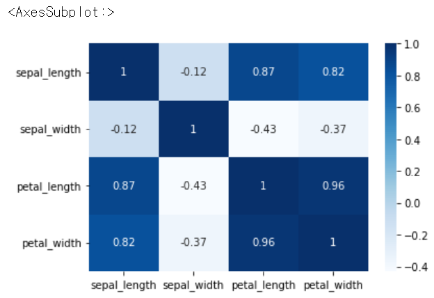
sns.heatmap(iris.corr(), annot = True, cmap = 'Reds') # 색을 바꾸면 거꾸로 1에 가까울 수록 진해짐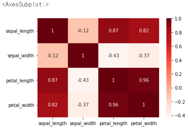
sns.heatmap(iris.corr(), annot = True, cmap = 'Greens')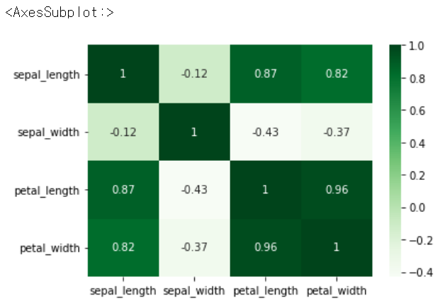
.scatterplot(x = '원하는 컬럼명', y = '원하는 컬럼명', data = 데이터 이름)
sns.scatterplot(x = 'petal_length', y = 'petal_width', data = iris) # 기본적인 산점도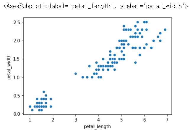
sns.scatterplot(x = 'petal_length', y = 'petal_width', size = 'species', data = iris) # 종별로 크기 달리하기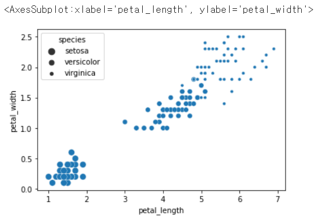
.relplot(x = '원하는 컬럼명', y = '원하는 컬럼명', hue = '기준이 되는 컬러명', data = 데이터 이름) :
-> np.where로 했던 것을 한번에 나타내줌
sns.relplot(x = 'petal_length', y = 'petal_width', hue = 'species', data = iris)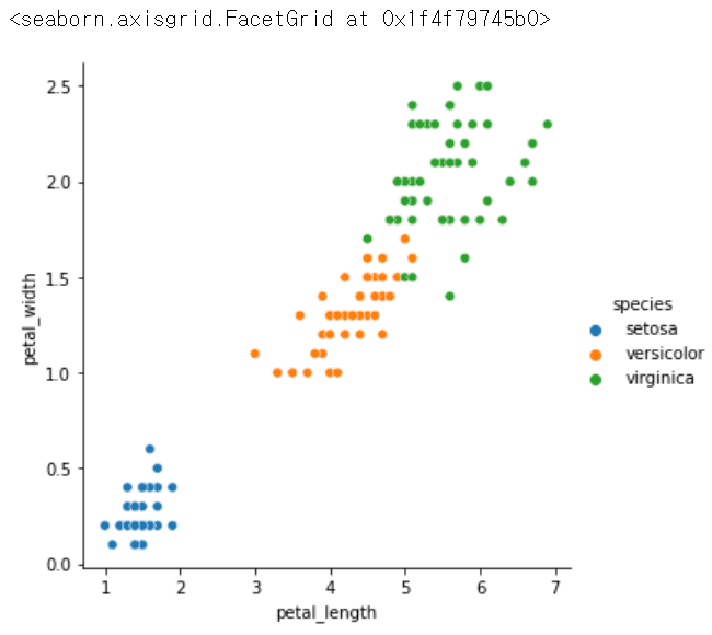
활용
tips = sns.load_dataset('tips')
tips.head()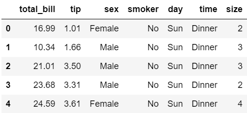
sns.pairplot(tips)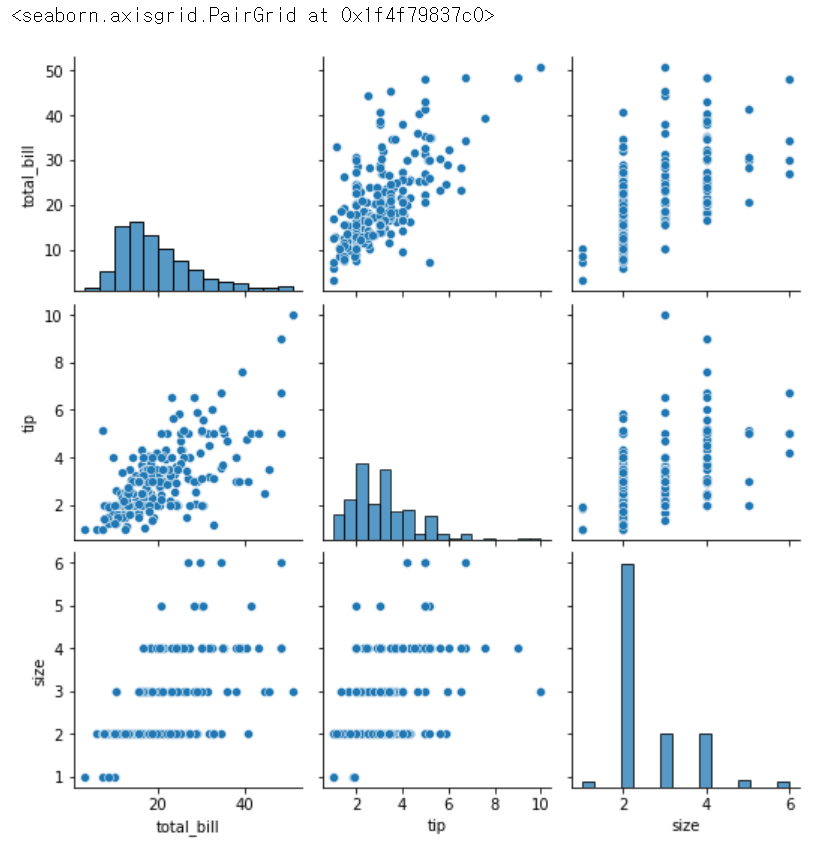
sns.pairplot(tips, hue = 'size') # 몇명 왔는지가 기준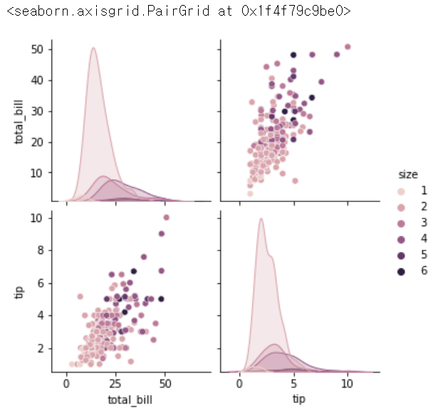
sns.pairplot(tips, hue = 'size', height = 4)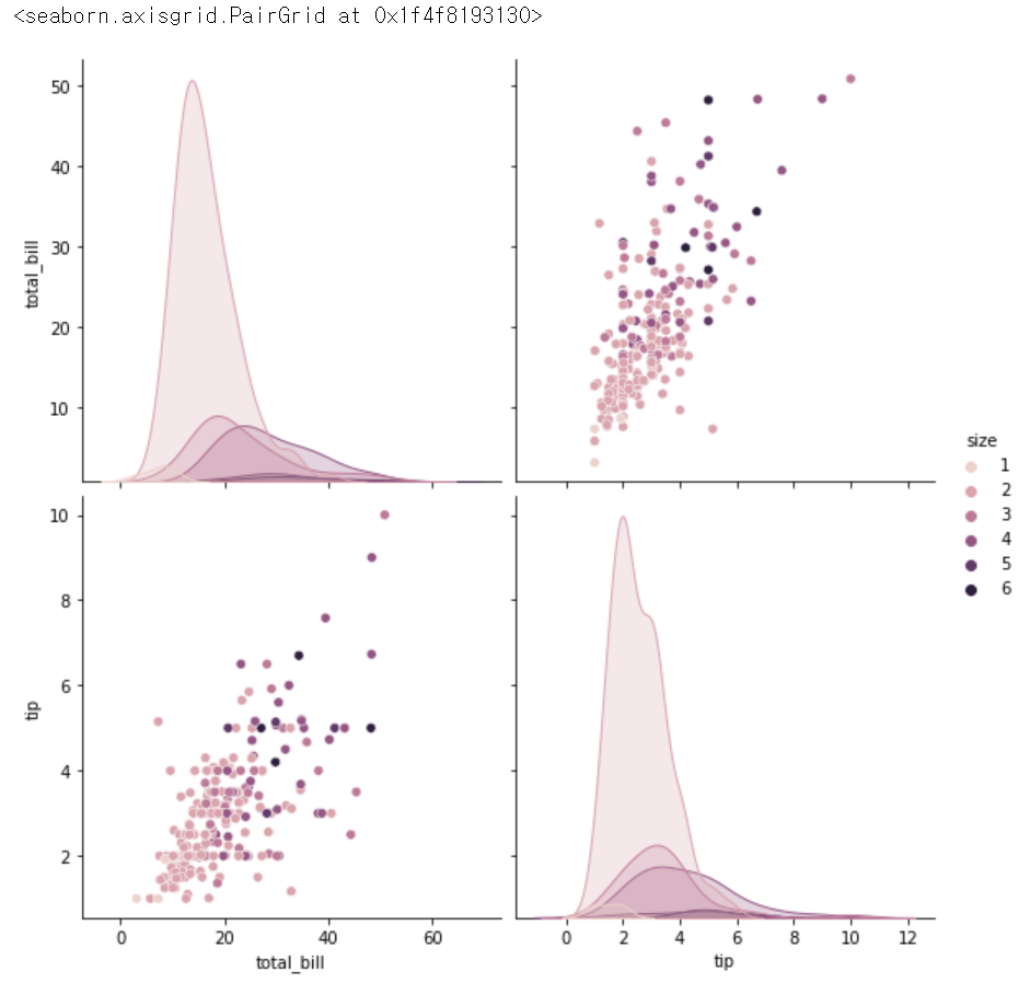
sns.pairplot(tips, hue = 'day')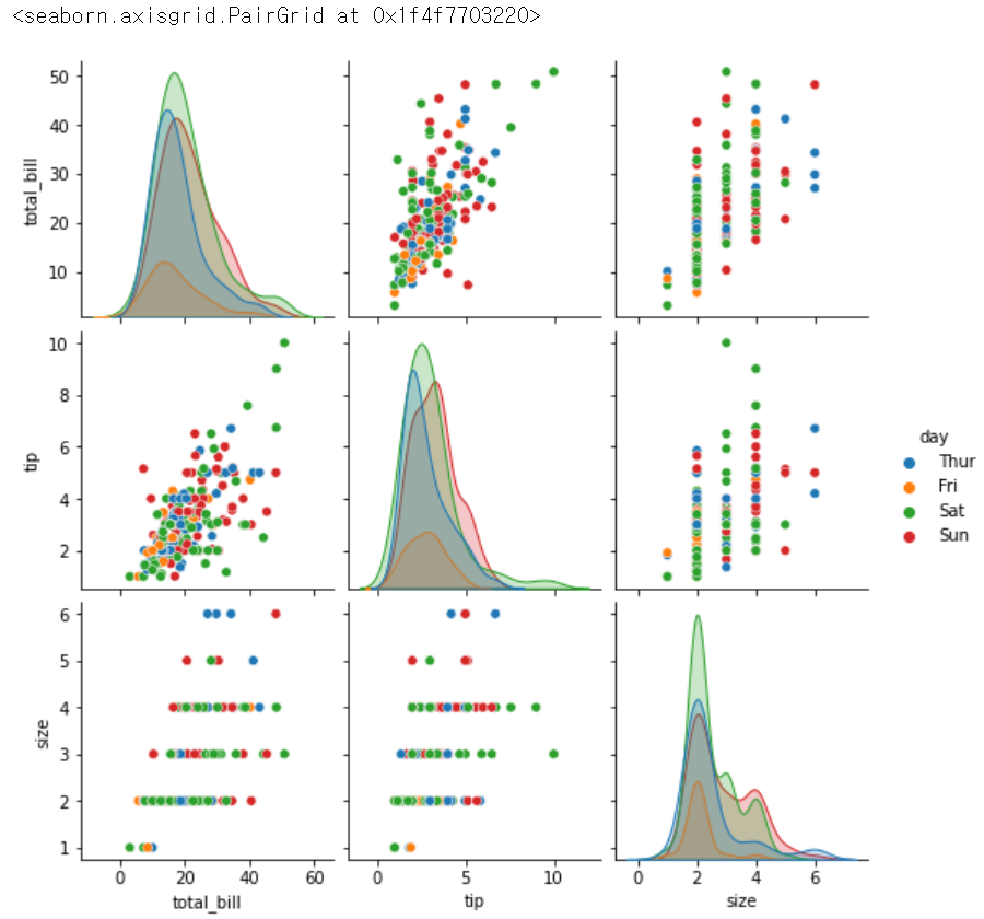
sns.pairplot(tips, hue = 'day', height = 3)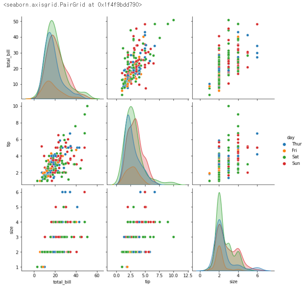
sns.barplot(x = 'day', y ='tip', data = tips)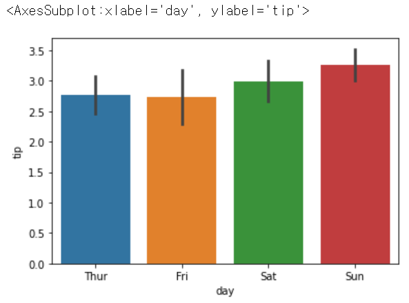
tips['day'].value_counts()
> Sat     87
  Sun     76
  Thur    62
  Fri     19
  Name: day, dtype: int64
sns.barplot(x = 'day', y ='tip', hue = 'smoker', data = tips)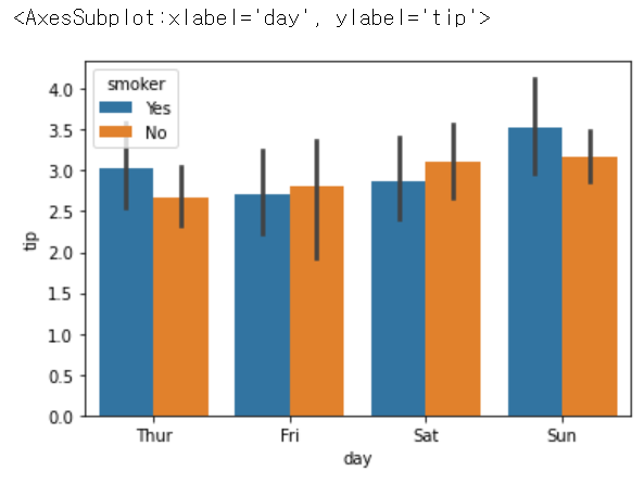
sns.lmplot(x= 'total_bill', y = 'tip', data = tips) # 선형선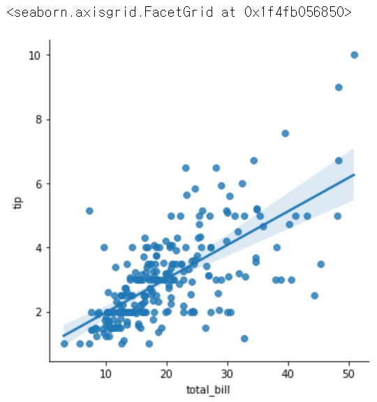
sns.lmplot(x= 'total_bill', y = 'tip', hue = 'smoker', data = tips)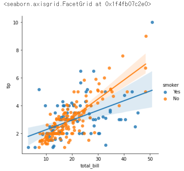
sns.lmplot(x= 'total_bill', y = 'tip', hue = 'smoker', col = 'size', data = tips) # 사이즈별로 끊어서 보여주는 옵션, size별로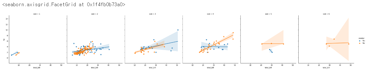
sns.lmplot(x= 'total_bill', y = 'tip', hue = 'smoker', col = 'size', col_wrap = 3, data = tips) # col_wrap 한줄에 몇개씩 보여달라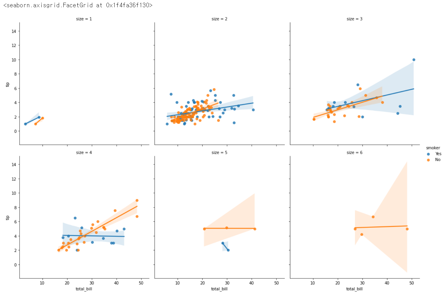
pivot = tips.pivot_table(index = 'day', columns = 'smoker', values = 'tip') # groupby랑 비슷
pivot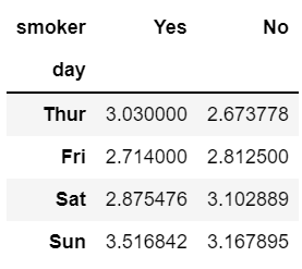
sns.heatmap(pivot, annot = True)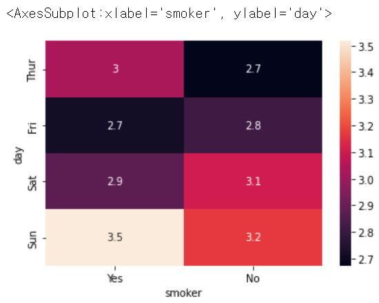
sns.heatmap(pivot, annot = True, cmap = 'Blues')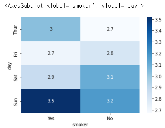
sns.scatterplot(x = 'total_bill', y = 'tip', data = tips)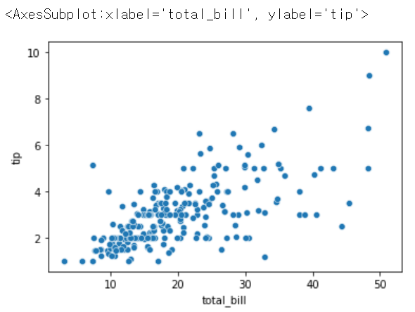
sns.scatterplot(x = 'total_bill', y = 'tip', size = 'size', data = tips)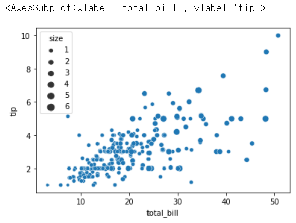
sns.scatterplot(x = 'total_bill', y = 'tip', size = 'smoker', data = tips)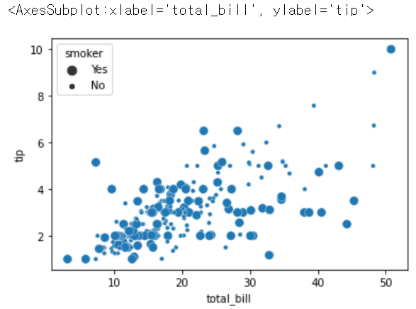
sns.relplot(x = 'total_bill', y = 'tip', data = tips)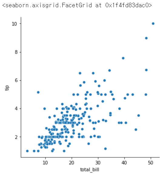
sns.relplot(x = 'total_bill', y = 'tip', hue = 'day', data = tips)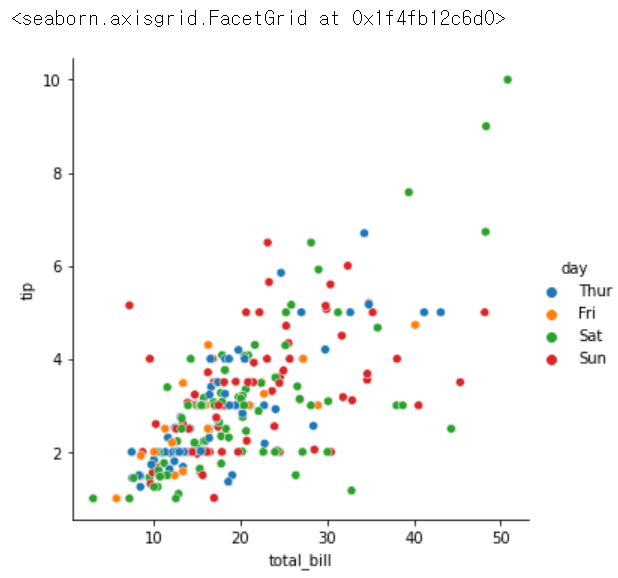
sns.relplot(x = 'total_bill', y = 'tip', hue = 'day', col='size', data = tips)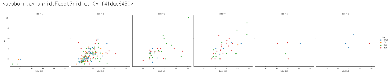
sns.relplot(x = 'total_bill', y = 'tip', hue = 'day', col='size', col_wrap = 3, data = tips)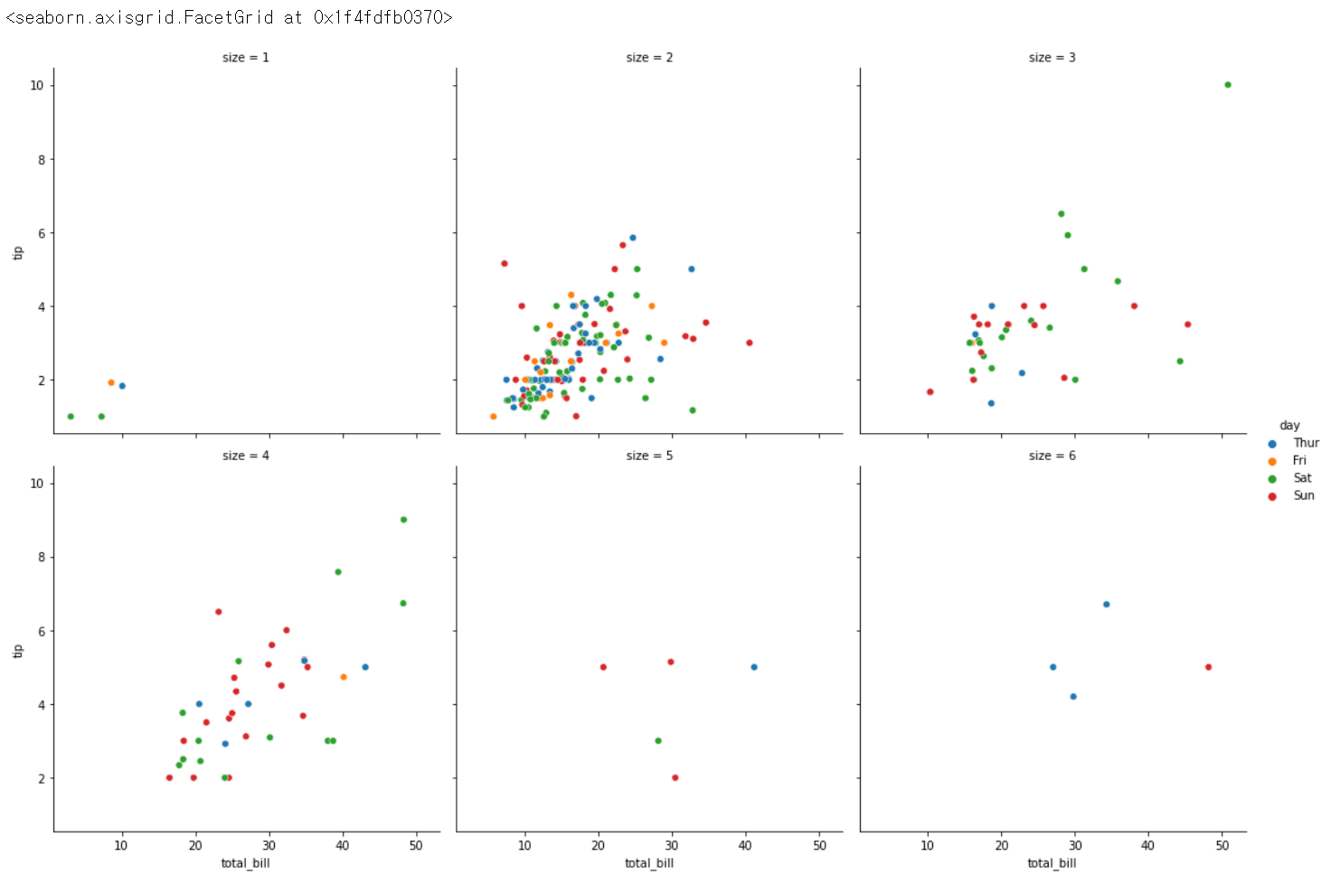
sns.catplot(x = 'day', y = 'total_bill', data = tips) # 카테고리 데이터에 쓰는, x는 카테고리컬 데이터, y는 상관없지만 수치면 좋음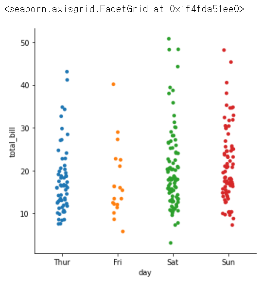
sns.catplot(x = 'smoker', y = 'total_bill', data = tips)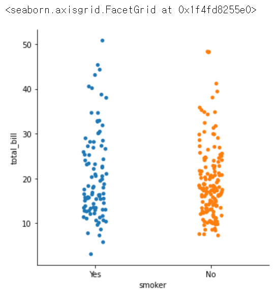
sns.catplot(x = 'smoker', y = 'total_bill', data = tips)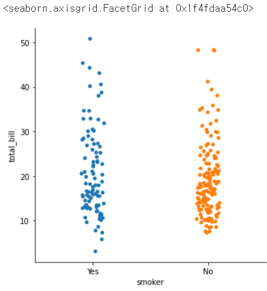
sns.catplot(x = 'smoker', y = 'tip', data = tips)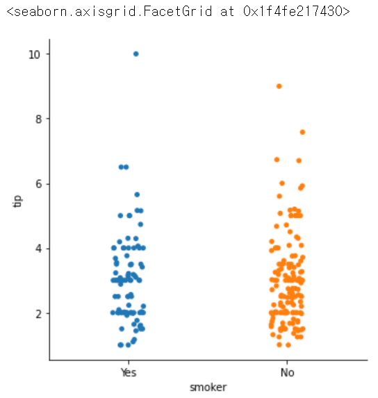

느리지만 확실하게