
컴포넌트에 스타일을 주는 방법
-
외부 css 파일을 import
-
css module 사용
-
컴포넌트 안에 props로 직접 설정
-
styled components
import styled from "styled-components";

const Parent = styled.div`
  display: flex;
`;

const Box = styled.div`
  background-color: ${(props) => props.bgColor};
  width: 100px;
  height: 100px;
`;

const Circle = styled(Box)`
  border-radius: 50px;
`; // extension of Box component ... get all properties and add new props

const Btn = styled.button`
  color: white;
  background-color: ${(props) => props.bgColor};
  border: 0;
  border-radius: 15px;
`;

const Input = styled.input.attrs({ required: true, minlength: 10 })`
  border: solid;
  background-color: whitesmoke;
`;

function App() {
  return (
    <div>
      <Parent>
        <Box bgColor="blue" />
        <Circle bgColor="teal" />
        <Box bgColor="tomato" />
        <Btn bgColor="black">button</Btn>
        <Btn bgColor="green" as="a">
          anchor
        </Btn>
      </Parent>
      <Parent>
        <Input />
        <Input />
        <Input />
        <Input />
      </Parent>
    </div>
  );
}

export default App;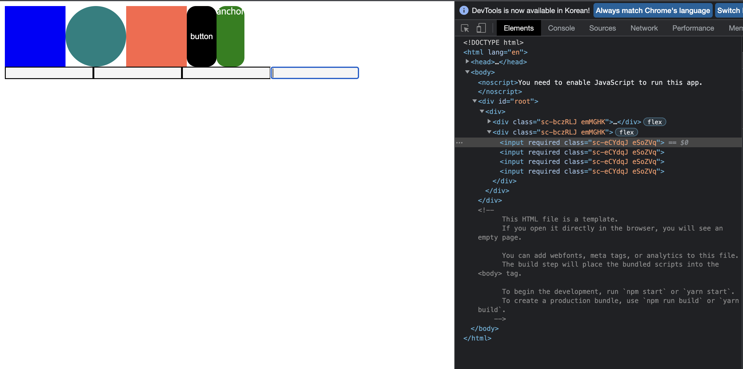
장점
-
컴포넌트를 생성하는 코드와 사용하는 코드의 위치를 분리시켜 가독성이 좋다.
-
컴포넌트의 재사용성이 높아진다.
- css style 코드를 변수처리 하여 해당 부분을 변경하여 사용
- 컴포넌트를 확장, 새로운 속성을 추가하여 사용
- 컴포넌트의 HTML 태그를 변경하여 사용 (as)
- 컴포넌트의 style 속성 뿐만 아니라 HTML 속성도 복사하여 사용 가능 (attrs)
-
css코드를 그대로 사용할 수 있음
-
class명을 자동으로 생성하여 중복되지 않게함

T.T