Compound Component 패턴으로 checkbox 만들기
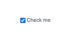
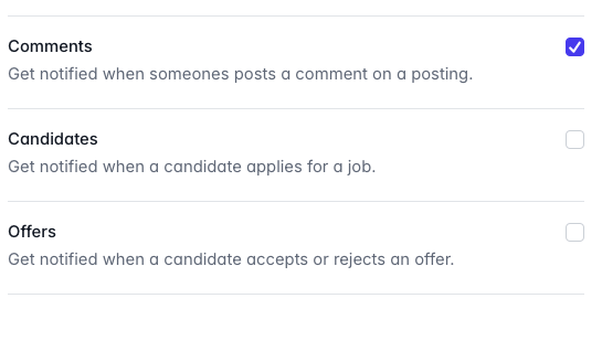
일반적으로 위와 같이 체크 박스 컴포넌트를 만들어 주세요! 라는 요청이 오면 아래와 같이 만들 수 있다.
interface CheckboxProps {
  label: string;
  isChecked: boolean;
  onChange: (e: React.ChangeEvent<HTMLInputElement>) => void;
}

export default function Checkbox(props: CheckboxProps) {
  const {label, isChecked, onChange} = props;
  return (
    <div className="flex gap-1 justify-center items-center">
      <input type="checkbox" className="w-4 h-4" checked={isChecked} onChange={onChange} />
      <label className="text-gray-500">{label}</label>
    </div>
  );
}
그런데 만약 아래와 같이 요청이 변경된다면 어떨까?
😬 체크박스 라벨 하위로 서브라벨을 달아주세요!
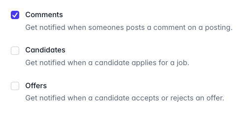
😜 서브라벨이 옆에 있는 컴포넌트도 만들어 주세요!
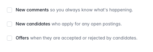
🤔 체크박스를 오른쪽으로 옯겨주세요!
😉 서브라벨이 없고 체크박스가 오른쪽에 있는 컴포넌트도 만들어 주세요!
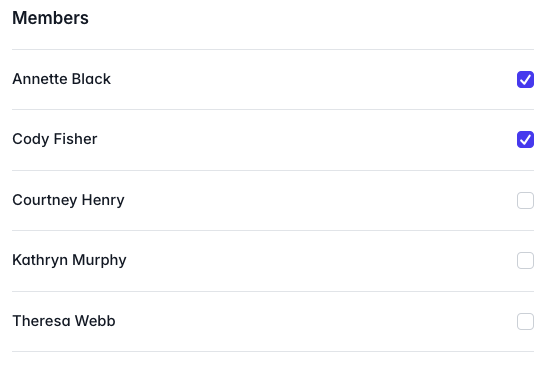
체크박스는 쓰임새가 다양한 컴포넌트 이기 때문에 위처럼 다양한 사용예시가 있을 수 있다. 이를 각각의 상황마다 프롭으로 받는다면 프롭의 종류가 너무 다양해질 수 있고, 사용처에서 컴포넌트의 결과물을 예측하기 쉽지 않을 수 있다.
이럴 때 컴파운드 컴포넌트 패턴을 사용해서 사용처에서 직접 조립해서 만들 수 있도록 해보자.
Compound Component
컴파운드 컴포넌트 패턴을 사용하면 유연하고 재사용 가능한 컴포넌트를 설계할 수 있고, 가독성과 유지 보수성을 높일 수 있다. 이름이 어렵지만 쉽게 이해하자면 자주 사용하는 html 태그인 select, options또한 컴포넌트 패턴의 일부이다!
이제 좀더 다양한 요구사항에 맞출 수 있는 컴포넌트로 checkbox를 변신시켜 보자.
interface CheckboxContextProps {
  id: string;

  isChecked: boolean;
  disabled: boolean;
  size: 'small' | 'medium' | 'large';
  theme: 'primary' | 'secondary';
  onChange: (checked: boolean) => void;
}

type CheckboxProps = CheckboxContextProps & React.PropsWithChildren<object>;

const CheckboxContext = createContext<CheckboxContextProps>({
  id: '',

  isChecked: false,
  size: 'medium',
  disabled: false,
  theme: 'primary',
  onChange: () => {},
});

const useCheckboxContext = () => useContext(CheckboxContext);

const CheckboxWrapper = ({
  id,
  isChecked,
  onChange,
  size,
  disabled,
  theme,
  children,
}: CheckboxProps) => {
  const value = {isChecked, onChange, id, size, theme, disabled};
  return (
    <CheckboxContext.Provider value={value}>
      <div className="flex justify-center items-center gap-2">{children}</div>
    </CheckboxContext.Provider>
  );
};
아래의 checkbox, label 컴포넌트는 provider로 부터 값을 주입받아 동적으로 스타일링 될것 이다.
const Checkbox = ({...props}) => {
  const {id, isChecked, onChange, size, disabled, theme} = useCheckboxContext();
  const sizeVariation = {
    small: 'w-4 h-4',
    medium: 'w-5 h-5',
    large: 'w-6 h-6',
  };

  const themeVariation = {
    primary: 'checked:bg-primary focus:ring-primary ',
    secondary: 'checked:bg-secondary focus:ring-secondary ',
  };

  const handleKeyDown = (e: React.KeyboardEvent<HTMLInputElement>) => {
    if (e.key === 'Enter' && !disabled) {
      e.preventDefault();
      onChange(!isChecked);
    }
  };
  return (
    <input
      id={id}
      type="checkbox"
      checked={isChecked}
      onChange={(e: ChangeEvent<HTMLInputElement>) => onChange(e.target.checked)}
      aria-labelledby={`${id}-label`}
      disabled={disabled}
      onKeyDown={handleKeyDown}
      className={`appearance-none border border-gray-300 border-solid rounded-md
        focus:ring-2 focus:ring-opacity-50 cursor-pointer
        ${sizeVariation[size]} ${themeVariation[theme]}
      `}
      {...props}
    />
  );
};

const Label = ({children}: {children: React.ReactNode}) => {
  const {id, size, theme} = useCheckboxContext();
  const sizeVariation = {
    small: 'text-sm',
    medium: 'text-base',
    large: 'text-lg',
  };

  const themeVariation = {
    primary: 'text-primary',
    secondary: 'text-secondary',
  };
  return (
    <label htmlFor={id} className={`${sizeVariation[size]} ${themeVariation[theme]}`}>
      {children}
    </label>
  );
};

CheckboxWrapper.Checkbox = Checkbox;
CheckboxWrapper.Label = Label;

export default CheckboxWrapper;
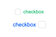
이제 사용처에서 label과 Checkbox의 위치를 자유롭게 조정할 수 있다.
<CheckboxWrapper
        id="checkbox"
        isChecked={check}
        onChange={(v: boolean) => setCheck(v)}
        size="medium"
        theme="primary"
        disabled={false}
      >
          // 해당 부분의 순서를 변경해주면 됨
        <CheckboxWrapper.Checkbox />
        <CheckboxWrapper.Label>checkbox</CheckboxWrapper.Label>

</CheckboxWrapper>
❄️❄️