Styled-components 활용
props.children
styled-components를 배우던 중, 컴포넌트의 props를 콘솔로 찍어보니 chlidren 이라는 키 값이 있었다.
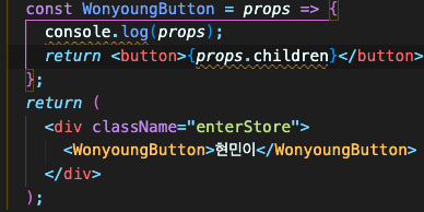

컴포넌트 안에 넣어둔 값을 props.children 으로 받을 수 있었다.
Input 태그안에 값이 있을 때 생기는 에러
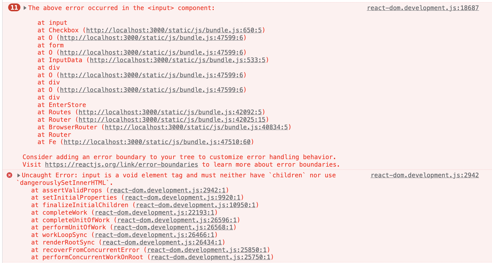
input is a void element tag and must neither have children nor use dangerouslySetInnerHTML
- styled-components 사용하여 input 태그를 생성해서 사용했을 때 발생한 에러.
- 알고보니, styled-components에서 input 태그는 자식을 가질 수 없다.
- input 태그 안에 값들을 없애서 오류를 제거했다.
styled component의 동적 활용
input 종류에 따라서 style을 다르게 부여해야할 때가 있다. 기존 css에서는 생성되는 input마다 className을 부여하고 모든 className에서 style값을 부여해야했다. 그러나 스타일드 컴포넌트는 이를 동적으로 활용할 수 있다.
const StyledInput = styled(Input)`
  flex: 1;
  ${props => props.theme.variables.flex()}
  height: ${props => (props.input.type === 'textarea' ? '100px' : '50px')}}

  ${props =>
    props.input.name === 'time' ||
    props.input.name === 'capacity' ||
    props.input.name === 'price' ||
    props.input.name === 'location'
      ? `
  justify-content: start;
  width: 100%;
  span {
    width: 20%;
    font-size: 11px;
    padding: 10px;
  }

  input {
    width: 30%;
    height: 80%;
    padding: 10px;
    border: 1px solid #e5e5e5;
    border-radius: 5px;

    &:focus {
      outline: none;
    }
    &::placeholder {
      padding-left: 2px;
      color: #bbbbbb;
    }
  `
      : ''}

  textarea {
    width: 100%;
    height: 80%;
    padding: 10px;
    line-height: 20px;
    border: 1px solid #e5e5e5;
    border-radius: 5px;
    word-wrap: break-word;


    &:focus {
       outline: none;
     }

     &::placeholder {
       color: #bbbbbb;
     }
   }

  input {
    width: 100%;
    height: 80%;
    padding: 10px;
    border: 1px solid #e5e5e5;
    border-radius: 5px;
    word-wrap: break-word;


    &:focus {
      outline: none;
    }
    &::placeholder {
      padding-left: 5px;
      color: #bbbbbb;
    }
  }
`;
height: ${props => (props.input.type === 'textarea' ? '100px' : '50px')}} 를 보면, input.type이 textarea일 때만 height를 100px을 부여하고, 나머지의 경우 50px을 부여한다.
 ${props =>
    props.input.name === 'time' ||
    props.input.name === 'capacity' ||
    props.input.name === 'price' ||
    props.input.name === 'location'
요 부분은 name이 다음과 같을때만 적용되는 부분이다.
${props => props.theme.variables.flex()} 부분은 공통 스타일드 컴포넌트에서 가져온 값이다.

학습한 지식을 개인적으로 정리하기 위해 만든 블로그입니다 :)