
Tagged Template literal
const foo1 = '하나';
const foo2 = '둘';
function countNumber(texts, ...values) {
  console.log(texts);
  console.log(values);
}
countNumber`숫자세기 ${foo1 }! ${foo2}!`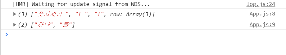
템플릿 리터럴을 사용하면서 ${} 안에 넣어 준 JS 값을 조회할 때 Tagged Template literal을 사용합니다. 컴포넌트간 prop를 전달할 때 종종 사용하는 파라미터에서의 rest문법을 이용합니다. ${}값들이 모여 ...value로 일반 string(여기서는 '숫자세기')은 texts로 저장됩니다.
앞으로 styled-components에서 props이나 자바스크립트를 사용하려면 ${}로 감싸준다고 생각하면 됩니다.
Getting Started
const Title = styled.h1`
  font-size: 1.5em;
  text-align: center;
  color: palevioletred;
`;
styled는 스타일과 리액트 컴포넌트를 생성합니다.
render(
    <Title>
      Hello World!
    </Title>
);
따라서 스타일을 적용해서 컴포넌트를 렌더링할 수 있습니다.
Adapting based on props
render(
    <Title primary={primary}>
      Hello World!
    </Title>
);
또 이런식으로 props(여기서는 primary)을 styled에 전달할 수 있습니다.
const Title = styled.h1`
  font-size: 1.5em;
  text-align: center;
  color: palevioletred;
  background: ${props => props.primary ? "palevioletred" : "white"};
`;
styled 컴포넌트에서 props을 받아와 사용할 수 있습니다.
props를 유용하게 사용할 수 있는 곳이 하나 더 있습니다. 바로 CSS입니다.
import styled, { css } from 'styled-components';

${props =>
            props.open &&
            css`
        background: #ff6b6b;
        &:hover {
            background: #ff8787;
        }`
 }
props를 받아와서 사용할 때 적용시키고 싶은 코드가 길어지면 css를 import 시켜야합니다. 템플릿(``)사이에 코드를 적으면 됩니다.
ThemeProvider
유지보수를 용이하게하는 ThemeProvider입니다. react의 context API 방법을 이용합니다.
import styled, { ThemeProvider } from 'styled-components'

const Box = styled.div`
  color: ${props => props.theme.color};
`

render(
  <ThemeProvider theme={{ color: 'mediumseagreen' }}>
    <Box>I'm mediumseagreen!</Box>
  </ThemeProvider>
)
context API와 비슷하게 사용합니다. value로 props넘기듯이 theme로 값을 넘기면 됩니다. depth문제, 단계별 props전달 문제를 해결할 수 있습니다. 전역으로 props를 관리합니다.
-
참고
${(props) => props.theme.~~};
${({ theme }) => theme.~~};
위 코드는 아래 코드처럼 사용할 수 있습니다.
createGlobalStyle
//app.js
import { createGlobalStyle } from 'styled-components'

const GlobalStyle = createGlobalStyle`
  body {
    color: ${props => (props.whiteColor ? 'white' : 'black')};
  }
`
<>
  <GlobalStyle whiteColor />

</>
createGlobalStyle 전역으로 style를 지정합니다. 그래서 app에서 생성하고 아래로 뿌려주면 좋습니다. a 태그에 밑줄 없애기, li의 - 없애기와 배경색상 지정 등을 관리하기에 좋습니다.
Extending Styles
const Button = styled.button`
  color: palevioletred;
  font-size: 1em;
  margin: 1em;
  padding: 0.25em 1em;
  border: 2px solid palevioletred;
  border-radius: 3px;
`;

// A new component based on Button, but with some override styles
const TomatoButton = styled(Button)`
  color: tomato;
  border-color: tomato;
`;

render(
  <div>
    <Button>Normal Button</Button>
    <TomatoButton>Tomato Button</TomatoButton>
  </div>
);
styled() constructor는 상속할때 많이 사용합니다. TomatoButton은 Button의 속성을 받아와 사용 및 변경합니다.
css참고
const StyledButton = styled.button`
  /* 공통 스타일 */

  & + & {
    margin-left: 1rem;
  }
`;
& + &
css 부모 선택자 &이디 style-components는 Css in JS임으로 &도 역시 사용가능하다. 컴파일하면 css처럼 템플릿 리터럴 밖에서 StyledButton + StyledButton가 됩니다.
