
1. Styled Components
컴포넌트들의 css 작업에 편리한 작은 트릭이나 간편한 방법들을 제공한다
2. 설치
npm i styled-components3. 기본 사용법
(1) 사용을 위해 import 해준다
import styled from "styled-components";(2) 기본적으로 아래와 같이 컴포넌트 선언이 가능하다
``(벡틱)안에 css코드를 적어주면 된다
const Component = styled.``;(3) styled components를 사용하지 않을 때,

위와 같은 컴포넌트를 만들 때의 코드이다
function App() {
return (
<div
style={{
display: "flex",
justifyContent: "center",
alignItems: "center",
height: "100vh",
}}
>
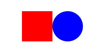
<div style={{ backgroundColor: "red", width: 100, height: 100 }}></div>
<div style={{ backgroundColor: "blue", width: 100, height: 100 }}></div>
</div>
);
}이처럼 굉장히 단순한 스타일도, 모두 div태그로 이루어져 있기 때문에 가시성이 떨어지고,
반복되는 코드가 굉장히 많은 것을 볼 수 있다
(4) styled components를 사용하면,
위와 같은 모형을 styled components를 사용하면 아래와 같은 코드를 작성 할 수 있다
const Components = styled.div`
  display: flex;
  justify-content: center;
  align-items: center;
  height: 100vh;
`;

const Box1 = styled.div`
  background-color: red;
  width: 100px;
  height: 100px;
`;

const Box2 = styled.div`
  background-color: blue;
  width: 100px;
  height: 100px;
`;

function App() {
  return (
    <Components>
      <Box1 />
      <Box2 />
    </Components>
  );
}
어떻게 보면 코드의 길이가 길어진 것 같지만, function안의 모습을 보면,
굉장히 간결하게 컴포넌트가 작성된 것을 볼 수 있다.
하지만 여전히 중복되는 경우가 많은 것을 볼 수 있다
4. 중복되는 코드를 없애자! (Props)
(1) 위에서 styled components 사용한 코드를 보면 여전히 중복되는 코드가 굉장히 많다

두개의 박스는 크기와 모양이 일치하고 배경색만 다른 것인데 굳이 컴포넌트를 두개나 만들었기 때문이다
(2) 이 때 props를 사용하면 짧은 코드는 물론 코드를 이해하기도 좋아진다
const Box = styled.div`
  background-color: ${(props) => props.bgColor};
  width: 100px;
  height: 100px;
`;

function App() {
  return (
    <Components>
      <Box bgColor={"red"} />
      <Box bgColor={"blue"} />
    </Components>
  );
}
위처럼 박스에 따라 컴포넌트를 두개 만드는 것이 아닌, 하나의 Box 컴포넌트를 생성 후,
배경색을 props으로 컴포넌트에 전달해준다
컴포넌트에서 props을 받아서 위의 코드처럼 function 형식으로 사용할 수 있다
코드의 길이가 반으로 줄고 가시성 또한 더욱 좋아졌다 ㄷㄷ
5. 컴포넌트를 확장하자!!
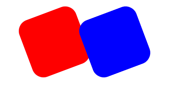
(1) 만약 위의 모양을 만드려면 어떻게 하면 될까?
const Box = styled.div`
  background-color: ${(props) => props.bgColor};
  width: 100px;
  height: 100px;
`;

const Circle = styled.div`
  background-color: ${(props) => props.bgColor};
  width: 100px;
  height: 100px;
  border-radius: 50%;
`;

function App() {
  return (
    <Components>
      <Box bgColor={"red"} />
      <Circle bgColor={"blue"} />
    </Components>
  );
}
위와 같은 코드를 작성해서 나타낼 수 있을 것이다
(2) Box 컴포넌트와 대부분이 일치하고 border-radius가 추가된 것 뿐인데..
한줄의 스타일이 늘었다고 하나의 컴포넌트를 처음부터 새로 만드는 것은 보다싶이 효율이 떨어진다
이럴 때 확장을 이용할 수 있다
const Box = styled.div`
  background-color: ${(props) => props.bgColor};
  width: 100px;
  height: 100px;
`;

const Circle = styled(Box)`
  border-radius: 50%;
`;

function App() {
  return (
    <Components>
      <Box bgColor={"red"} />
      <Circle bgColor={"blue"} />
    </Components>
  );
}
위와 같이 코드를 작성하는 것이다
Circle 컴포넌트는 styled.태그 형식이아닌 styled(컴포넌트) 형식으로 되어있는데,
이것이 괄호안의 컴포넌트에서 확장하겠습니다~ 와 같다
6. 애니메이션!?
(1) styled components의 도움을 받아 애니메이션도 보다 편리하게 처리할 수 있다
우선 애니메이션을 사용하기 위해 keyframes을 import 해준다
import styled, { keyframes } from "styled-components";(2) 사용할 애니메이션을 만들어 준다
const rotation = keyframes`
  0%{
    transform:rotate(0deg);
    border-radius:0px;
  }
  50%{
    border-radius:50%;
  }
  100%{
    transform:rotate(360deg);
    border-radius:0px;
  }
`;
(3) 컴포넌트에 전달해주기만 하면 된다
const Box = styled.div`
  height: 200px;
  width: 200px;
  background-color: ${(props) => props.bgColor};
  display: flex;
  justify-content: center;
  align-items: center;
  animation: ${rotation} 1s linear infinite;
`;
너무너무 쉽고 간편하다
7. 컴포넌트 안의 자식 (마치 scss)
(1) styled components 를 이용해서 마치 scss처럼 컴포넌트 안의 자식을 컴포넌트 안에서 처리할 수 있다
덕분에 모~든 component를 styled component 로 만들 필요가 없다
부모 component만 styled component로 만들고 자식들은 그냥 기본적인 HTML 태그로 컴포넌트를 만든 후, target 처리를 해줄 수 있다.

const Box = styled.div`
  height: 200px;
  width: 200px;
  background-color: tomato;
  display: flex;
  justify-content: center;
  align-items: center;
  span {
    font-size: 36px;
    &:hover {
      font-size: 98px;
    }
  }
`;

function App() {
  return (
    <Components>
      <Box bgColor={"skyblue"}>
        <span>와우..</span>
      </Box>
    </Components>
  );
}
span 태그는 Box 컴포넌트 안에 있기 때문에 위와 같이 Box 컴포넌트 안에서 자식 컴포넌트인,
span 태그까지 다룰 수 있다
(2) element를 선택하는 다른 방법
현재는 HTML의 태그명에 의존해서 타겟팅을 하고있다
뒤에 8번에 나올 as 로 태그를 마음대로 바꿔서 사용할 수 있기 때문에,
HTML의 태그명에 의존해서 타겟팅을 하고싶지 않다..
이럴 때 아래와 같이 작성할 수 있다
const Wow = styled.span`
  font-size: 36px;
`;

const Box = styled.div<{ bgColor: string }>`
  height: 200px;
  width: 200px;
  background-color: ${(props) => props.bgColor};
  display: flex;
  justify-content: center;
  align-items: center;
  ${Wow} {
    &:hover {
      font-size: 98px;
    }
  }
`;

function App() {
  return (
    <Components>
      <Box bgColor={"skyblue"}>
        <Wow>와우..</Wow>
      </Box>
    </Components>
  );
}
태그명이 아닌 컴포넌트의 이름에 의존해서 타겟팅을 하고있는 것을 볼 수 있다
8. As 와 Attrs(속성)
(1) As
다수의 컴포넌트를 다룰 때 도움이 된다 하지만 난 써본적이 없는 것 같다
function App() {
  return (
    <Components>
      <Box bgColor={"skyblue"}>
        <Wow as="h1">와우..</Wow>
      </Box>
    </Components>
  );
}
이미 만들어진 Wow 스타일 컴포넌트(span)에 as="태그명" 을 추가해서 styled comonent의 스타일을 그대로 가져와 태그만 바꿔 사용할 수 있다
(2) Attrs(속성)
styled component 안에서 태그의 속성을 지정해 줄 수 있다
예를 들어 아래와 같은 코드가 있다고 생각해보자
const Input = styled.input``;

function App() {
  return (
    <Components>
      <Input />
      <Input />
      <Input />
      <Input />
      <Input />
    </Components>
  );
}
만약 input 태그에 required, minLength 속성을 부여하려고 한다면 아래와 같은 모양이 될 것이다
const Input = styled.input``;

function App() {
  return (
    <Components>
      <Input required={true} minLength={5} />
      <Input required={true} minLength={5} />
      <Input required={true} minLength={5} />
      <Input required={true} minLength={5} />
      <Input required={true} minLength={5} />
    </Components>
  );
}
어마어마한 반복의 연속임을 볼 수 있다..
styled component안에서 속성을 지정해주면 빠르게 모든 Input 컴포넌트에 속성을 지정할 수 있다
const Input = styled.input.attrs({ required: true, minLength: 5 })``;

function App() {
  return (
    <Components>
      <Input />
      <Input />
      <Input />
      <Input />
      <Input />
    </Components>
  );
}
이건 실제로 여러 토이 프로젝트를 할 때 꽤나 유용하게 쓰였던 것 같다
react-hook-form 을 쓴 후론 쓴적이 없는 것 같기도...
지금까지 styled components에 대해 가볍게 정리해 보았다
더 자세한 내용은 공식문서에서 확인이 가능하다