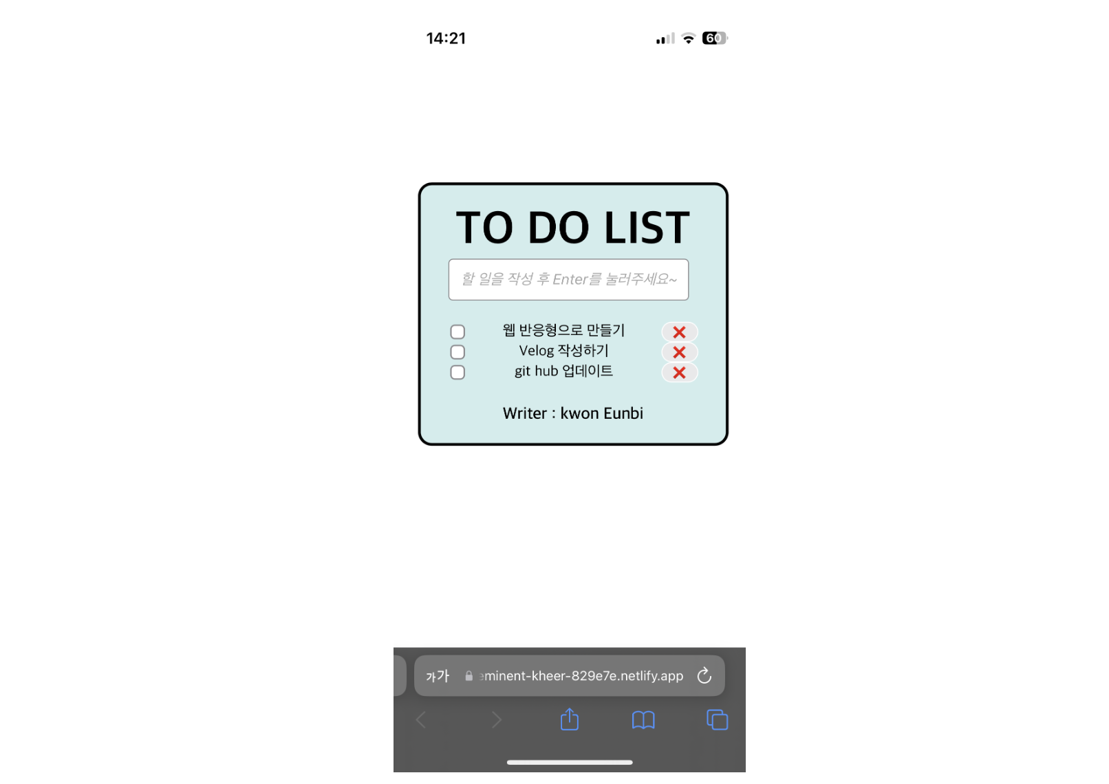
내가 만든 TO DO LIST를 웹 반응형 디자인으로 만들기!
✍ 내가 만든 TODOLIST (3)에서 부족했던 부분 Check !
PC에서는 레이아웃이 정상적으로 보여지지만 모바일 웹으로 접속하면 레이아웃이 깨짐 현상이 발생한다.
✍ TO DO LIST 만들기 (4)에 추가한 기능 Check !
CSS의 widht와 @media screen and (min-width:600px)를 수정하여 웹 반응형으로 만들어주었다.
📌 todo.css
* {
  box-sizing: border-box;
}

body {
  width: 100%;
  height: 100vh;
  display: flex;
  flex-direction: column;
  justify-content: center;
  align-items: center;
}

.wrapper {
  max-width: 700px;
  width: 90%;

  @media screen and (min-width: 600px) {
    .wrapper {
      width: 70%;
    }
    header {
      font-size: 60px;
    }
    .todo__write {
      font-size: 25px;
    }
  }
}

.wrapper {
  /* width: 70%; */
  background-color: hwb(180 82% 7%);
  padding: 20px 30px;
  border: 3px solid black;
  border-radius: 15px;
}

header {
  font-size: 50px;
  font-weight: 800;
  text-align: center;
}

main {
  display: flex;
  flex-direction: column;
  justify-content: center;
  align-items: center;
}

.todo__write,
.main__list {
  width: 100%;
}

.wrapper__main {
  display: flex;
  flex-direction: column;
}

.todo-form,
.wrapper__main__list {
  width: 100%;
}

.todo-form {
  display: flex;
  justify-content: center;
  align-items: center;
}

.todo__write {
  text-align: center;
  font-size: 25px;
  margin-right: 10px;
}

.todo__write::placeholder {
  font-size: 16px;
  font-style: oblique;
  text-align: center;
}

.wrapper__main__list {
  display: flex;
  justify-content: center;
  align-items: stretch;
  font-size: 23px;
  width: 100%;
}

.main__list {
  width: 100%;
  padding: 0;
}

ul {
  width: 100%;
  list-style: none;
  display: flex;
  flex-wrap: wrap;
  justify-content: center;
}

li {
  width: 100%;
  display: flex;
  flex-direction: row;
  justify-content: space-between;
}

span {
  margin: 0px 10px 0px 10px;
  font-size: 16px;
  font-style: unset;
}

.writer {
  font-weight: 600;
  font-size: 18px;
  word-wrap: normal;
  text-align: center;
}
✍ 수정 사항
화면 크기에 따라 레이아웃이 적절히 조정되도록 만들어주었다.
.wrapper 클래스의 너비를 고정 퍼센트 값(70%)에서 최대 너비(max-width)로 변경하고, 작은 화면에서는 너비를 100%로 설정하였다. 이로 인해 모바일 화면에서도 페이지가 온전히 보여진다.
텍스트 크기도 미디어 쿼리를 사용하여 화면 크기에 따라 조정해주었다.
아래 CSS 코드는 위 수정 사항을 변경해준 것이다.
body {
  width: 100%;
  height: 100vh;
  display: flex;
  flex-direction: column;
  justify-content: center;
  align-items: center;
}

.wrapper {
  max-width: 700px;
  width: 90%;

@media screen and (min-width:600px) { /* Adjust breakpoint as needed */
    .wrapper {
        width:70%;
    }
    header {
        font-size :60px;
    }
    .todo__write{
        font-size :25px;
    }
}

.todo__write,
.main__list {
    width: 100%;
}

.todo-form,
.wrapper__main__list {
    width: 100%;
}
위의 코드에서 max-width는 .wrapper 요소의 최대 너비를 정의하고, width는 작은 화면(예, 모바일)에서 .wrapper 요소가 차지하는 너비 비율을 정의한다.
또한, @media screen and (min-width :600px) 부분은 뷰포트의 넓이가 600px(이 값은 필요에 따라 조정 가능) 이상일 때 적용되는 스타일을 정의한다.