수업 3일차
실시간 온라인 수업을 두번째 하는날이다.
오랜시간 앉아서 수업을 듣는것도 슬 적응할때가 되었는데 언제 적응할까 ㅜㅜ
수업내용
-
CSS
margin 병합현상 (형제간) : 두 마진이 겹치면 큰 쪽이 적용됨
margin 병합현상 (부모간) : 자식 마진이 부모에게도 영향을 미침, 부모영향 안줄려면 border주면됨
display : inline/block 지정가능, inline-block(크기 지정할수 있음), table(table과 같은 속성), none(공간 차지x)
float : 현재 흐름에서 벗어날 수 있음, 다른 레이아웃에 영향을 줌, clear로 사용해제
그룹 선택자 : 여러 선택자를 그룹화해서 적용하는 개념, ,로 여러개 선택자 지정
특정 선택자 : 특정 속성 값을 가지고 있는 요소를 선택할 수 있음, 주로 input태그에 적용
자식 선택자 : 바로 아래 자식에게만 적용, 손자는 영향 받지 않음 >
가상 선택자 : hover는 해당 요소에 마우스가 올라갔을 때를 의미 ex) #ex1 : hover
flex container : 마치 linline을 적용한 듯한 모습
flex item : container 내 item이 비율만큼 차지, 여백의 공간을 지정된 비율로 적용
flex-grow : 여백의 비율, 공간을 나눠가짐
flex-basis : 요소의 기본 크기
flex-shrink : 요소의 크기 축소 비율, 0이면 컨텐츠의 사이즈는 유지됨, 추가됬을때 공간을 나눔
justify-items : 메인방향 정렬
align-items : 수직 축 방향 정렬
align-content : 여러 행 수직 축 방향 정렬
align-self : 수직 축 방향 아이템 정렬
grid : 2차원적으로 flex 정렬
grid container : fr(fraction 의미-비율), px로 고정값도 가능
repeat(5, 1fr) = 1fr 1fr 1fr 1fr 1fr
ex) grid-template-columns : repeat(3, 1fr) = 3*3컬럼 생성
row-gab : row 간 공간 설정
column-gab : column 간 공간 설정
gab : 한번에 설정가능
gird-gab : 브라우저 호환을 위함
grid-column : 축약형으로 쓸 수 있음, 1/ span2 : 1번에서 2칸을 차지함
grid-row : 위설명과 동일 row 형
nth-child(1) : 동일한 이름의 자식중에 첫번째 자식
justify-items : 가로 방향 정렬
align-items : 세로방향 정렬
place-items : justify와 align 모두 설정
justify-self : 가로방향 아이템 정렬
align-self : 세로방향 아이템 정렬
place-self : justify와 align 모두설정
부트스트랩 : 인터넷 상에서 만들어져있는 CSS를 그대로 가져와 사용가능 -
애니메이션
transform : 요소에 회전, 크기조절, 기울이기, 이동효과를 부여
rotate : 해당 요소를 회전
scale : 해당 요소의 스케일
skew : 해당 요소를 비틂
translate : 해당 요소를 이동
transition : 애니메이션 화 해서 보여줌
transition-property : 적용할려는 속성
transition-duration : 효과가 나타나는 시간
transition-timing-function : 효과의 속도 함수
transition-delay : 효과가 나타나기 전 딜레이
prefix : 지원하는 브라우저가 다르기때문에 붙여준다.
animation : 변화가 없어도 보여주는 애니메이션
animation-name : keyframes로 호출할 이름
animation-duration : 효과가 나타나는 시간
animation-timing-function : 효과의 속도 함수
animation-delay : 효과가 나타나기 전 딜레이
animation-iteration-count : 효과 반복 수
animation-direction : 효과 진행 방향
letter-spacing = 글자간 간격
media Query : (순서 중요!)
@media : 미디어 쿼리 사용
screen : 화면에 대해 적용
max-width : 최대 width 내 있다면 적용
ex) @media screen and (max-width: 640px)
자주쓰는 화면 크기 min max
PC 1024px
태블릿 768px 1024px
모바일 768px
git : 분산 버전 관리 시스템, 코드의 버전 관리, 빨간색은 이전버전 , 초록생은 이번버전
실습
최종 모습
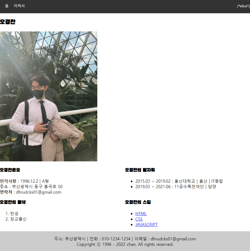
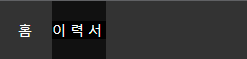
메뉴바를 버튼으로 생성해서 커서를 올려둘때 배경색이 변경되게 설정
메뉴바 마지막에 로고를 넣기 위해 중간에 공백 생성

@media를 사용하여 사진에 커서를 올려뒀을때 커지는 애니메이션 효과 나타냄
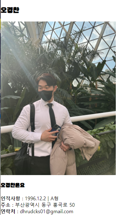
커서를 사진에 올리기전
커서를 올린후
HTML
<!DOCTYPE html>
<html>
<head>
<meta charset="utf-8" />
<title>나의 이력서</title>
<link rel="preconnect" href="https://fonts.googleapis.com" />
<link rel="preconnect" href="https://fonts.gstatic.com" crossorigin />
<link
href="https://fonts.googleapis.com/css2?family=Black+Han+Sans&display=swap"
rel="stylesheet"
/>
<link rel="stylesheet" href="main.css" />
</head>
<body>
<header>
<nav>
<ul>
<li class="menu-btn"><a href="#">홈</a></li>
<li class="menu-btn"><a href="#">이력서</a></li>
<li class="nav-space"></li>
<li>/*elice*/</li>
</ul>
</nav>
</header>
<h1 id="title">이력서</h1>
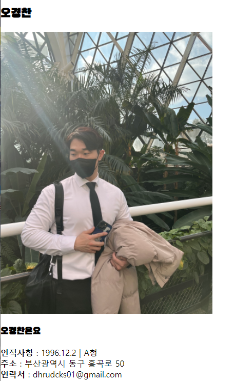
<h2>오경찬</h2>
<div class="profile">
<img
src="C:\Users\dhrud\Desktop\KakaoTalk_20220406_165117206.jpg"
alt="오경찬"
width="400"
height="500"
/>
</div>
<div class="container1">
<div class="item item1">
<h3>오경찬은요</h3>
<div><strong>인적사항</strong> : 1996.12.2 | A형</div>
<div><strong>주소</strong> : 부산광역시 동구 홍곡로 50</div>
<div><strong>연락처</strong> : dhrudcks01@gmail.com</div>
</div>
<div class="item item2">
<h3>오경찬의 발자취</h3>
<ul>
<li>2015.03 ~ 2019.02 : 울산대학교 | 울산 | IT융합</li>
<li>2019.03 ~ 2021.06 : 11공수특전여단 | 담양</li>
</ul>
</div>
<div class="item item3">
<h3>오경찬의 활약</h3>
<ol>
<li>탄생</li>
<li>장교출신</li>
</ol>
</div>
<div class="item item4">
<h3>오경찬의 스킬</h3>
<ul>
<li><a href="https://">HTML</a></li>
<li><a href="https://">CSS</a></li>
<li><a href="https://">JAVASCRIPT</a></li>
</ul>
</div>
</div>
<footer>
<p>
주소: 부산광역시 | 전화 : 010-1234-1234 | 이메일 :
dhrudcks01@gmail.com<br />
Copyright ⓒ 1996 - 2022 chan. All rights reserved.
</p>
</footer>
</body>
</html>
CSS
body{
    margin: 0;
    padding: 0;
}
nav {

    background-color: #333;


}
nav ul{
    display: flex;
    margin: 0;
    padding: 0;


}

nav ul li{
    list-style: none;
    /* text-decoration: none; */
    margin-left: 20px ;
    padding: 20px 0;
    text-align: center;
    color: white;
    font-size: 14px;
    /* transition: all 0.4s ease-out; */
}
/* 링크 선색상 */
 nav ul li :link{
    color: white;
    text-decoration: none;
}
/* 방문된 링크 색상 */
nav ul li :visited{
    text-decoration: none;
    color: white;
}
nav .nav-space {
    flex-grow: 1;
}

.menu-btn {
    transition: all 0.4s ease-out;
}
.menu-btn:hover {
    background-color: #111;
    letter-spacing: 4px;
}
main{
    padding: 32px;
}
nav ul li :hover{

    letter-spacing: 4px;
    background-color: black;
}
#title {
    display: none;
}
#name {
    font-size: 80px;
}
.profile img {
    width: auto;
    height: 500px;
    transition: all 0.6s ease-out;
}

.profile img:hover {
    width: auto;
    height: 550px;
}

h1{

    font-family: 'Black Han Sans', sans-serif;
}

h2{

    font-family: 'Black Han Sans', sans-serif;
}

h3{

    font-family: 'Black Han Sans', sans-serif;

}
.container1{

    display: grid;
    grid-template-columns: 1fr 1fr;

}
footer{
    padding: 2px;
    background-color: rgb(204, 204, 204);
    text-align: center;

}

@media (max-width: 768px) {
	.container {
		display: block;
	}

    .profile {
        width: 400px;
    }

    .profile img {
        width: 400px;
        height: auto;
    }

    .profile img:hover {
        width: 110%;
        height: auto;

    }
}