
오늘은 마이페이지 내에 있는 posts ( 로그인한 사용자가 작성한 댓글을 모아서 보여주는 란)에 대해 작성해보고자 한다.
마이페이지 내에는 유저보드와 메디리스트, 포스트 이렇게 3가지가 있다. 메디리스트는 다음 편에 작성할 예정이고, 유저보드는 모바일 사이즈에서의 디자인만 맡았기 때문에 패스하도록 하겠다.
폴더구조
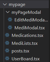
🟡 src\components\templates\mypage\posts.tsx
"use client";
import React, { useEffect, useState } from "react";
import { supabase } from "@/utils/supabase/client";
interface Post {
id: string;
title: string;
contents: string;
created_at: string;
}
const Posts: React.FC = () => {
const [posts, setPosts] = useState<Post[]>([]);
const [currentPage, setCurrentPage] = useState(1);
const [isMobile, setIsMobile] = useState(false);
useEffect(() => {
const handleResize = () => {
setIsMobile(window.innerWidth < 768);
};
handleResize();
window.addEventListener('resize', handleResize);
return () => window.removeEventListener('resize', handleResize);
}, []);
const postsPerPage = isMobile ? 4 : 3;
useEffect(() => {
const fetchPosts = async () => {
try {
const { data: sessionData } = await supabase.auth.getSession();
const user = sessionData?.session?.user;
if (user) {
const { data, error } = await supabase
.from("posts")
.select("*")
.eq("user_id", user.id);
if (error) {
console.error("Error fetching posts:", error);
} else {
setPosts(data);
}
}
} catch (error) {
console.error("Error fetching user session:", error);
}
};
fetchPosts();
}, []);
const formatDate = (dateString: string) => {
const options: Intl.DateTimeFormatOptions = {
year: "numeric",
month: "short",
day: "numeric",
hour: "2-digit",
minute: "2-digit",
};
return new Date(dateString).toLocaleString(undefined, options);
};
// Get current posts
const indexOfLastPost = currentPage * postsPerPage;
const indexOfFirstPost = indexOfLastPost - postsPerPage;
const currentPosts = posts.slice(indexOfFirstPost, indexOfLastPost);
// Change page
const handleNextPage = () => {
setCurrentPage(currentPage + 1);
};
const handlePrevPage = () => {
setCurrentPage(currentPage - 1);
};
return (
<div className="w-full flex justify-center desktop:block">
<div className="w-[335px] desktop:w-[996px]">
<h2 className="text-[16px] desktop:text-2xl font-bold mb-6 text-gray-1000">
내가 쓴 글
</h2>
<div className="flex flex-col gap-6 items-center">
{currentPosts.map((post) => (
<div
key={post.id}
className="bg-[#f5f6f7] rounded-xl p-4 w-full h-[119px] desktop:h-auto desktop:py-5"
>
<h3 className="text-[14px] desktop:text-base font-bold mb-2 desktop:mb-[9px] text-brand-gray-1000">
{post.title}
</h3>
<p className="text-[12px] desktop:text-xs text-brand-gray-600 mb-2 desktop:mb-[9px] line-clamp-2">
{post.contents}
</p>
<p className="text-[12px] desktop:text-xs text-brand-gray-400">
{formatDate(post.created_at)}
</p>
</div>
))}
</div>
{/* Pagination Buttons */}
<div className="flex justify-center mt-4 space-x-1">
<button
onClick={handlePrevPage}
className={`px-4 py-2 ${
currentPage === 1
? "text-brand-gray-400 cursor-not-allowed"
: "text-brand-gray-700"
}`}
disabled={currentPage === 1}
>
<
</button>
{Array.from(
{ length: Math.ceil(posts.length / postsPerPage) },
(_, index) => (
<button
key={index}
onClick={() => setCurrentPage(index + 1)}
className={`px-4 py-2 ${
currentPage === index + 1
? "text-brand-primary-600"
: "text-brand-gray-700"
}`}
>
{index + 1}
</button>
)
)}
<button
onClick={handleNextPage}
className={`px-4 py-2 ${
indexOfLastPost >= posts.length
? "text-brand-gray-400 cursor-not-allowed"
: "text-brand-gray-700"
}`}
disabled={indexOfLastPost >= posts.length}
>
>
</button>
</div>
</div>
</div>
);
};
export default Posts;"use client";
import React, { useEffect, useState } from "react";
const [posts, setPosts] = useState<Post[]>([]);
const [currentPage, setCurrentPage] = useState(1);
const [isMobile, setIsMobile] = useState(false);
- use client : 클라이언트 컴포넌트로 사용된다는 것을 명시. 클라이언트 컴포넌트는 브라우저에서 실행되며, 서버 컴포넌트와 달리 상태 관리 및 훅을 사용 가능.
클라이언트 사이드에서 동작하는 컴포넌트이므로, 사용자 인터페이스와 상호작용이 필요하기 때문에 명시해준다.
- useState : 컴포넌트에서 상태를 관리할 수 있도록 해줌.
ex) 포스트 목록, 현재 페이지, 화면 모바일 여부 등
- useEffect : 컴포넌트가 처음 렌더링 되거나 상태가 변경될 때, 실행되는 부수효과 처리. 데이터 가져오기나 이벤트 리스너 등에 사용
const [posts, setPosts] = useState<Post[]>([]);
const [currentPage, setCurrentPage] = useState(1);
const [isMobile, setIsMobile] = useState(false);
페이지 초기값은 1로 설정.
true일 경우 모바일 사이즈를 의미
useEffect(() => {
  const handleResize = () => {
    setIsMobile(window.innerWidth < 768);
  };

  handleResize();  // 초기 실행 시에도 한 번 체크
  window.addEventListener('resize', handleResize);

  return () => window.removeEventListener('resize', handleResize);
}, []);
컴포넌트가 처음 마운트될 때 화면 크기를 확인하고, 모바일 화면인지 확인.
resize 이벤트가 있을 때마다 모바일 여부를 체크하여 isMobile 상태를 업데이트
화면이 768px 미만이면 모바일 화면으로 간주.
useEffect(() => {
  const fetchPosts = async () => {
    try {
      const { data: sessionData } = await supabase.auth.getSession();
      const user = sessionData?.session?.user;
      if (user) {
        const { data, error } = await supabase
          .from("posts")
          .select("*")
          .eq("user_id", user.id);

        if (error) {
          console.error("Error fetching posts:", error);
        } else {
          setPosts(data);
        }
      }
    } catch (error) {
      console.error("Error fetching user session:", error);
    }
  };

  fetchPosts();
}, []);
포스트 데이터를 가져오는 useEffect
컴포넌트가 mount될 떄 실행되며 수파베이스에서 포스트 데이터를 가져온다.
사용자의 세션을 가져오고, 세션이 유효하면 해당 사용자의 포스트 데이터를 수파베이스에서 가져온다.
데이터를 성공적으로 가져오면 setPosts(data)를 호출해 posts 상태에 저장.
const postsPerPage = isMobile ? 4 : 3;
페이지네이션. 모바일에선 4개, 웹에선 3개를 보여줌.
const indexOfLastPost = currentPage * postsPerPage;
const indexOfFirstPost = indexOfLastPost - postsPerPage;
const currentPosts = posts.slice(indexOfFirstPost, indexOfLastPost);
현재 페이지에서 보여줄 포스트들의 인덱스를 계산하고, posts 배열에서 해당 범위 만큼 잘라 설정
const handleNextPage = () => {
  setCurrentPage(currentPage + 1);
};

const handlePrevPage = () => {
  setCurrentPage(currentPage - 1);
};
페이지 이동 핸들러.
다음 페이지 버튼 클릭시 1증가, 이전 페이지 클릭 시 1 감소.
{currentPosts.map((post) => (
  <div key={post.id} className="bg-[#f5f6f7] rounded-xl p-4 w-full h-[119px] desktop:h-auto desktop:py-5">
    <h3 className="text-[14px] desktop:text-base font-bold mb-2 desktop:mb-[9px] text-brand-gray-1000">{post.title}</h3>
    <p className="text-[12px] desktop:text-xs text-brand-gray-600 mb-2 desktop:mb-[9px] line-clamp-2">{post.contents}</p>
    <p className="text-[12px] desktop:text-xs text-brand-gray-400">{formatDate(post.created_at)}</p>
  </div>
))}
currentPosts 배열을 순회하며 포스트 데이터를 화면에 출력.
제목, 내용, 날짜가 표시.
<div className="flex justify-center mt-4 space-x-1">
<button onClick={handlePrevPage} disabled={currentPage === 1}> < </button>
{Array.from({ length: Math.ceil(posts.length / postsPerPage) }, (_, index) => (
<button key={index} onClick={() => setCurrentPage(index + 1)}>
{index + 1}
</button>
))}
<button onClick={handleNextPage} disabled={indexOfLastPost >= posts.length}> > </button>
</div>
<와 > 버튼으로 페이지를 앞뒤로 이동
페이지 번호 버튼은 포스트 전체 길이를 기준으로 동적으로 생성
각 버튼을 클릭하면 setCurrentPage를 통해 해당 페이지로 이동
return (
  <div className="w-full flex justify-center desktop:block">
    <div className="w-[335px] desktop:w-[996px]">
<h2 className="text-[16px] desktop:text-2xl font-bold mb-6 text-gray-1000">
  내가 쓴 글
</h2>
간단한 css여서 넘어가겠다.
<div className="flex flex-col gap-6 items-center">
  {currentPosts.map((post) => (
    <div key={post.id} className="bg-[#f5f6f7] rounded-xl p-4 w-full h-[119px] desktop:h-auto desktop:py-5">
      <h3 className="text-[14px] desktop:text-base font-bold mb-2 desktop:mb-[9px] text-brand-gray-1000">
        {post.title}
      </h3>
      <p className="text-[12px] desktop:text-xs text-brand-gray-600 mb-2 desktop:mb-[9px] line-clamp-2">
        {post.contents}
      </p>
      <p className="text-[12px] desktop:text-xs text-brand-gray-400">
        {formatDate(post.created_at)}
      </p>
    </div>
  ))}
</div>
게시물을 flex로 세로로 나열하고 가운데 정렬해준다.
currentPosts 배열을 map으로 순회하면서 각 게시물을 렌더링.
key={post.id}는 각 게시물의 고유 식별자를 지정하여 React가 효율적으로 DOM을 업데이트할 수 있도록 한다.
line-clamp-2는 글 내용이 두 줄까지만 보이도록 제한하는 CSS 클래스
<div className="flex justify-center mt-4 space-x-1">
<button onClick={handlePrevPage} ...> < </button>
{Array.from({ length: Math.ceil(posts.length / postsPerPage) }, (_, index) => (
<button key={index} onClick={() => setCurrentPage(index + 1)} ...> {index + 1} </button>
))}
<button onClick={handleNextPage} ...> > </button>
</div>
이전 페이지 버튼 : < 기호로 표시되는 버튼은 currentPage가 1일 때 비활성화(disabled), 그렇지 않으면 활성화.
사용자가 클릭하면 handlePrevPage 함수가 호출되어 이전 페이지로 이동.
페이지 번호 버튼 : Array.from으로 페이지 번호의 배열을 만들어 순회하며 버튼을 생성.
각 버튼을 클릭 시 setCurrentPage로 페이지 번호를 업데이트하여 해당 페이지로 이동.
현재 페이지는 강조된 색상(text-brand-primary-600)으로 표시되고, 나머지 페이지는 기본 색상(text-brand-gray-700)
다음 페이지 버튼 : > 기호로 표시되는 버튼은 마지막 페이지에 도달하면 비활성화되고, 그렇지 않으면 활성화.
사용자가 클릭하면 handleNextPage 함수가 호출되어 다음 페이지로 이동.