Getting Started
styled-components 유틸리티는 컴포넌트를 스타일링 하기위해 템플릿 리터럴을 이용한다.
기존의 컴포넌트 생성방법을 사용하지 않고 스타일로 구성된 컴포넌트 생성방법을 사용한다.
const Title = styled.h1`
  font-size: 1.5em;
  text-align: center;
  color: palevioletred;
`;

const Wrapper = styled.section`
  padding: 4em;
  background: papayawhip;
`;

render(
  <Wrapper>
    <Title>
      Hello World!
    </Title>
  </Wrapper>
);
styled-components에서의 CSS rules는 자동으로 vendor prefix가 붙여진다.
CSS rules에 prefixing을 위해 styled-components는 stylis.js 패키지를 이용한다.
Adapting based on props
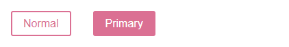
styled-components의 템플릿 리터럴에 해당 컴포넌트의 props을 전달받는 함수를 넣을 수 있다.
이 버튼 컴포넌트는 색깔을 변경하는 $primary prop을 가지고 있다.
$primary prop을 true로 설정할 때, 버튼의 색깔이 변경된다.
styled-components에서는 $ 를 사용하여 props와 변수로 구분할 수 있다.
이 코드에서 $primary 은 Button 컴포넌트의 prop중 하나이지만, $ 을 사용했기 때문에 이를 styled-components를 위한 변수라고 볼 수 있다.
$ 를 사용하는 것은 단지 가독성을 높이기 위한 것이다.
$ 를 사용하면 props와 변수를 구분하고 가독성을 높일 수 있다.
$ 를 사용하지 않고도 위의 코드를 작성할 수 있다.
하지만 $ 를 사용하면 props와 변수를 명확하게 구분할 수 있으므로 코드를 이해하거나 유지보수하기 더 쉬워진다.
또한 $ 를 사용하면 VSCode와 같은 일부 코드 에디터에서 props와 변수를 더 쉽게 구분할 수 있다.
const Button = styled.button`
  /* Adapt the colors based on primary prop */
  background: ${props => props.$primary ? "palevioletred" : "white"};
  color: ${props => props.$primary ? "white" : "palevioletred"};

  font-size: 1em;
  margin: 1em;
  padding: 0.25em 1em;

  border: 2px solid palevioletred;
  border-radius: 3px;
`;

render(
  <div>
    <Button>Normal</Button>
    <Button $primary>Primary</Button>
  </div>
);
Extending Styles
컴포넌트를 재사용할 때, 해당 컴포넌트의 스타일링을 약간씩만 변경하고 싶을 때가 종종 있다.
위에서의 방법처럼 props을 기반으로 하는 함수를 템플릿 리터럴에 전달하는 방식으로 구현할 수도 있지만, 스타일을 재정의 하기 위해 꽤 많은 노력이 필요하다.
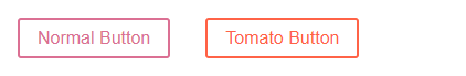
styled() 생성자 함수를 사용해서 다른 컴포넌트 또는 태그의 스타일을 상속받는 새로운 컴포넌트를 만든 후, 스타일을 오버라이딩하는 방법이 있다.
const Button = styled.button`
  color: palevioletred;
  font-size: 1em;
  margin: 1em;
  padding: 0.25em 1em;
  border: 2px solid palevioletred;
  border-radius: 3px;
`;

const TomatoButton = styled(Button)`
  color: tomato;
  border-color: tomato;
`;

render(
  <div>
    <Button>Normal Button</Button>
    <TomatoButton>Tomato Button</TomatoButton>
  </div>
);
컴포넌트가 아닌 태그를 상속받기 위해서는
styled("div")와 같이 문자열로 전달받는다.
기본적으로 Button 컴포넌트는 <button> 태그를 렌더링한다.
하지만 만약 <a> 태그로 렌더링하고 싶다면, as prop을 사용하여 다음과 같이 작성할 수 있다.
<Button as="a" href="/">Link</Button>위의 코드에서 Button 컴포넌트는 <a> 태그를 렌더링한다.
이것은 as prop을 사용하여 <button> 태그 대신 <a> 태그를 렌더링하도록 지정했기 때문이다.
as prop을 사용하면 동일한 스타일을 가진 컴포넌트를 여러 가지 태그로 렌더링할 수 있으며, 태그에 따라 다른 기능을 수행할 수 있다.
이를 통해 코드의 재사용성을 높일 수 있다.
const Button = styled.button`
  display: inline-block;
  color: palevioletred;
  font-size: 1em;
  margin: 1em;
  padding: 0.25em 1em;
  border: 2px solid palevioletred;
  border-radius: 3px;
  display: block;
`;

const TomatoButton = styled(Button)`
  color: tomato;
  border-color: tomato;
`;

render(
  <div>
    <Button>Normal Button</Button>
    <Button as="a" href="#">Link with Button styles</Button>
    <TomatoButton as="a" href="#">Link with Tomato Button styles</TomatoButton>
  </div>
);
태그 뿐 아니라 사용자 컴포넌트로도 바꿔서 렌더링할 수 있다.
const Button = styled.button`
  display: inline-block;
  color: palevioletred;
  font-size: 1em;
  margin: 1em;
  padding: 0.25em 1em;
  border: 2px solid palevioletred;
  border-radius: 3px;
  display: block;
`;

const ReversedButton = props => (
  <Button {...props} children={props.children.split('').reverse()} />
);

render(
  <div>
    <Button>Normal Button</Button>
    <Button as={ReversedButton}>Custom Button with Normal Button styles</Button>
  </div>
);
위의 코드를 살펴보자.
<Button as={ReversedButton}>Custom Button with Normal Button styles</Button>해당 컴포넌트는 ReversedButton 사용자 컴포넌트를 상속한다.
ReversedButton은 styled-components인 Button 컴포넌트를 텍스트 부분을 뒤집은채 리턴하는 컴포넌트이다.
따라서 텍스트 노드가 뒤집힌 styled-components인 Button을 리턴하는 ReversedButton을 상속하는 Button이 렌더링 된다.
버전 4보다 이전 버전인 경우, as prop 대신 다른 방법을 사용해야 한다고 하는데, 그냥 최신버전 쓰자.
Styling any component
styled() 메서드는 전달받는 컴포넌트가 다음과 같은 경우에는 동작하지 않는다.
const Button = props => <button>{props.children}</button>;

const TomatoButton = styled(Button)`
  color: tomato;
  border-color: tomato;
`;

render(
  <div>
    <Button>Normal Button</Button>
    <TomatoButton>Tomato Button styles</TomatoButton>
  </div>
);
전달받는 컴포넌트가 자신의 className prop을 가상 DOM Element로 전달해줘야 제대로 동작한다.
const Button = props => (
  <button className={props.className}>{props.children}</button>
);

const TomatoButton = styled(Button)`
  color: tomato;
  border-color: tomato;
`;

render(
  <div>
    <Button>Normal Button</Button>
    <TomatoButton>Tomato Button styles</TomatoButton>
  </div>
);
서드파티 컴포넌트의 스타일도 변경할 수 있다.
const StyledLink = styled(Link)`
  color: palevioletred;
  font-weight: bold;
`;

render(
  <div>
    <Link>Unstyled, boring Link</Link>
    <br />
    <StyledLink>Styled, exciting Link</StyledLink>
  </div>
);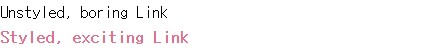
위의 <Link> 컴포넌트는 react-router의 컴포넌트이다.
제대로 동작하는 이유는 내부적으로
const Link = ({ className, children }) => (
  <a className={className}>
    {children}
  </a>
);
와 같이 클래스명을 가상 DOM으로 전달하기 때문이다.
Passed props
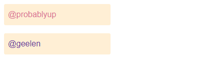
스타일된 대상이 기본 엘리먼트인 경우 (예 <div>) styled-components는 적용된 HTML 어트리뷰트를 DOM으로 그대로 전달한다.
스타일된 대상이 커스텀 컴포넌트인 경우 styled-components는 모든 props를 전달한다.
const Input = styled.input`
  padding: 0.5em;
  margin: 0.5em;
  color: ${props => props.inputColor || "palevioletred"};
  background: papayawhip;
  border: none;
  border-radius: 3px;
`;

render(
  <div>
    <Input defaultValue="@probablyup" type="text" />
    <Input defaultValue="@geelen" type="text" inputColor="rebeccapurple" />
  </div>
);
attrs() 메소드를 사용하면 여러 가지 속성을 한 번에 설정하거나, 동적으로 속성 값을 변경할 수있다.
또한, attrs() 메소드는 속성 값을 계산하는 로직을 함수 안에 포함할 수 있어서 코드를 더욱 간결하게 만들어 줄 수 도 있다.
const Input = styled.input.attrs(props => ({
  type: props.type || "text",
  defaultValue: props.defaultValue || "@probablyup"
}))`
  background: white;
  border: 2px solid black;
`;

render(
  <div>
    <Input />
  </div>
);
Coming from CSS
How do Styled Components work within a component?
다음은 CSSModules을 이용하여 작성된 코드이다.
import styles from './styles.module.css';
import { useState } from "react";

export default function Counter() {
  const [count, setCount] = useState();

  const increment = () => {setCount(prev=>prev+1)};
  const decrement = () => {setCount(prev=>prev-1)};

  return (
    <div className={styles.counter}>
      <p className={styles.paragraph}>{count}</p>
      <button className={styles.button} onClick={()=>increment}>
        +
      </button>
      <button className={styles.button} onClick={()=>decrement}>
        -
      </button>
    </div>
  );
}
이를 styled-components로 변경하면 다음과 같다.
import styled from "styled-components";
import { useState } from "react";

const StyledCounter = styled.div`
  /* ... */
`;
const Paragraph = styled.p`
  /* ... */
`;
const Button = styled.button`
  /* ... */
`;

export default function Counter() {
  const [count, setCount] = useState();

  const increment = () => {
    setCount((prev) => prev + 1);
  };
  const decrement = () => {
    setCount((prev) => prev - 1);
  };

  return (
    <StyledCounter>
      <Paragraph>{count}</Paragraph>
      <Button onClick={() => increment()}>+</Button>
      <Button onClick={() => decrement()}>-</Button>
    </StyledCounter>
  );
}
Define Styled Components outside of the render method
렌더 메서드 외부에서(함수형 컴포넌트에서는 렌더링 되는 컴포넌트 외부) styled-components를 정의하는 것이 중요하다.
그렇지 않다면 컴포넌트가 렌더링 될때마다 style-components가 다시 생성된다.
그렇게 된다면 캐싱이 방해되고 렌더링 속도가 크게 느려지므로 피해야 한다.
다음과 같은 방법으로 작성하도록 한다.
const StyledWrapper = styled.div`
  /* ... */
`;

const Wrapper = ({ message }) => {
  return <StyledWrapper>{message}</StyledWrapper>;
};
아래와 같은 방법은 피하도록 한다.
const Wrapper = ({ message }) => {
  // WARNING: 매우 안좋은 방법
  const StyledWrapper = styled.div`
    /* ... */
  `;
  return <StyledWrapper>{message}</StyledWrapper>;
};
Pseudoelements, pseudoselectors, and nesting
& 앰퍼샌드를 이용해서 구현할 수 있다.
이는 styled-components의 기능이 아닌 CSS의 기본 기능이다.
CSS Nesting Module
Attaching additional props
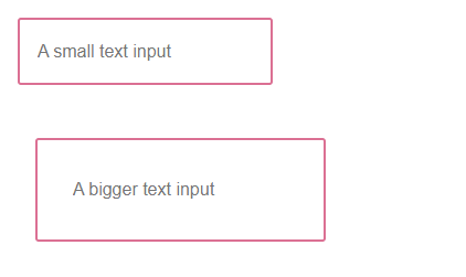
attrs() 생성자 함수를 이용해서 정적 props나 서드파티 props를 컴포넌트의 props로 전달할 수 있다.
뿐만 아니라, 동적 props도 전달할 수 있다.
const Input = styled.input.attrs(props => ({
  // we can define static props
  type: "text",

  // or we can define dynamic ones
  size: props.size || "1em",
}))`
  color: palevioletred;
  font-size: 1em;
  border: 2px solid palevioletred;
  border-radius: 3px;

  /* here we use the dynamically computed prop */
  margin: ${props => props.size};
  padding: ${props => props.size};
`;

render(
  <div>
    <Input placeholder="A small text input" />
    <br />
    <Input placeholder="A bigger text input" size="2em" />
  </div>
);
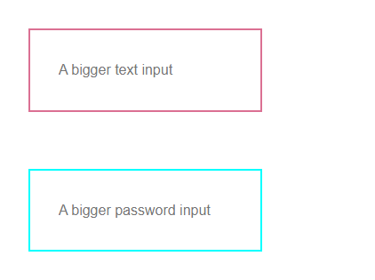
Overriding .attrs
styled() 함수로 styled-components를 상속받을 수 있다고 배웠다.
부모 styled-components와 자식 styled-componenets에 각각 .attrs() 함수가 사용되었다면, 부모가 먼저 적용되고 자식이 적용된다.
즉, 부모에서 적용된 props이 자식에서 정의한 props로 오버라이딩된다.
const Input = styled.input.attrs(props => ({
  type: "text",
  size: props.size || "1em",
}))`
  border: 2px solid palevioletred;
  margin: ${props => props.size};
  padding: ${props => props.size};
`;

// Input's attrs will be applied first, and then this attrs obj
const PasswordInput = styled(Input).attrs({
  type: "password",
})`
  // similarly, border will override Input's border
  border: 2px solid aqua;
`;

render(
  <div>
    <Input placeholder="A bigger text input" size="2em" />
    <br />
    {/* Notice we can still use the size attr from Input */}
    <PasswordInput placeholder="A bigger password input" size="2em" />
  </div>
);
Animations
// Create the keyframes
const rotate = keyframes`
from {
transform: rotate(0deg);
}
to {
transform: rotate(360deg);
}
`;
const Rotate = styled.div`
display: inline-block;
animation: ${rotate} 2s linear infinite;
padding: 2rem 1rem;
font-size: 1.2rem;
`;
render(
<Rotate>< 💅🏾 ></Rotate>
);react-native에서는 Keyframes가 지원되지 않는다.
대신 ReactNative.Animated API를 사용한다.
keyframes는 코드 분할을 가능하게 하는 lazy injection 방식으로 동작한다.
즉, 사용되기 전까지는 CSS에 삽입되지 않는다.
아래의 코드에서 styles 변수의 값은 일반 문자열 템플릿이므로, keyframes가 바로 적용되지 않아 오류가 발생한다.
이 문제를 해결하기 위해서는 CSS helper를 사용하여 styles 변수를 styled-components에서 사용되는 공유 스타일 코드 조각으로 만들어야 한다.
const rotate = keyframes``


// ❌ This will throw an error!
const styles = `
  animation: ${rotate} 2s linear infinite;
`


// ✅ This will work as intended
const styles = css`
  animation: ${rotate} 2s linear infinite;
`
style rule을 부분적으로 구성하는 경우에도 CSS helper를 사용해야 한다.
import styled, { css, keyframes } from 'styled-components'

const pulse = keyframes`
  0% {
    opacity: 0;
  }
  100% {
    opacity: 1;
  }
`

const animation = props =>
  css`
    ${pulse} ${props.animationLength} infinite alternate;
  `

const PulseButton = styled.button`
  animation: ${animation};
`
[참고]: 스타일 컴포넌트 공식 홈페이지