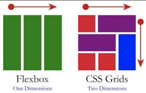
Line Naming
.grid {
  display: grid;
  gap: 10px;
  grid-template-columns: [first-line] 100px [second-line] 100px [third-line] 100px [fourth-line] 100px [fifth-line] 100px;
  grid-template-rows: repeat(4, 100px);
}

.header {
  background-color: #2ecc71;
  grid-column: span 4;
}
.content {
  background-color: #3498db;
  grid-column: first-line / fourth-line;
  grid-row: span 2;
}
.grid {
display: grid;
gap: 5px;
height: 50vh;
grid-template:
"header header header header" 1fr /* row의 높이를 정해줘야 함 */
"content content content nav" 2fr /* 마찬가지로 높이.. */
"footer footer footer footer" 1fr / 1fr 1fr 1fr 1fr; /* height을 적고 슬래시 다음에 너비를 정해줌 */
}
.header {
background-color: #2ecc71;
grid-area: header;
}
.content {
background-color: #3498db;
grid-area: content;
}
.nav {
background-color: #8e44ad;
grid-area: nav;
}
.footer {
background-color: #f39c12;
grid-area: footer;
}Place items
justify-items, align-items로 위치 조정 가능
.grid {
  display: grid;
  gap: 5px;
  height: 50vh;
  grid-template-columns: repeat(4, 1fr);
  grid-template-rows: repeat(4, 1fr);
  justify-items: end;  /* stretch 디폴트 */
  align-items: end;
}
place-items is a shortcuts
.grid {
  display: grid;
  gap: 5px;
  height: 50vh;
  grid-template-columns: repeat(4, 1fr);
  grid-template-rows: repeat(4, 1fr);
  place-items: stretch center; /* align, justify 순서로 나열 */
}
Place content
.grid {
  display: grid;
  color: white;
  background: #000000;
  gap: 5px;
  height: 150vh;
  grid-template-columns: repeat(4, 100px);
  grid-template-rows: repeat(4, 100px);
  place-content: center end;
}
place-content 모든 사각형 다같이 적용
place-items 각 사각형 하나하나에 어떤 걸 적용하는지에 관한 것
Auto columns and rows
.grid {
  display: grid;
  color: white;
  gap: 5px;
  height: 150vh;
  grid-template-columns: repeat(4, 100px);
  grid-template-rows: repeat(4, 100px);
}

.header {
  background-color: #2ecc71;
  /* align-self: end;
  justify-self: center; 아래 한 줄로 합치기 */
	place-self: end center;
}
.grid {
display: grid;
color: white;
gap: 5px;
grid-template-columns: repeat(4, 100px);
grid-template-rows: repeat(4, 100px);
}
.item:nth-child(odd) {
background-color: #2ecc71;
}
.item:nth-child(even) {
background-color: #3498db;
}auto-fill & auto-fit
auto-fill: for exact size. fill the row. → 창이 넓어져도 크기는 그대로. 정확한 사이즈를 위해.
auto-fit: for fluid size element들을 한 줄에 fit하게 stretch. → 창이 넓어지면 너비가 늘어남. 유동적인 사이즈.
max-content & min-content
Content의 사이즈가 중요 (박스의 사이즈에 연연하지 않아도 됨)
max-content box를 컨텐츠에 필요한 만큼 커짐
min-content box를 컨텐츠가 작아질 수 있는 최소한의 크기로 작아짐
내 이름 고은정, 은을 180deg 돌려 고긍정 🤭