import 'package:flutter/material.dart';
void main() {
runApp(const TikTokApp());
}
class TikTokApp extends StatelessWidget {
const TikTokApp({super.key});
Widget build(BuildContext context) {
return MaterialApp(
title: 'TikTok Clone',
theme: ThemeData(
primaryColor: const Color(0xFFE9435A),
),
home: Container(),
);
}
}이 상태로 tiktok clone 코딩 시작!
[[primaryColor 와 primarySwatch의 차이]]
primaryColor
primaryColor는 앱의 주요 색상을 나타냅니다. 앱의 상단 앱 바 (앱 바 또는 탐색 표시줄)와 같은 중요한 부분에 사용됩니다.- 예를 들어,
primaryColor를 파란색으로 설정하면 앱 바의 배경색이 파란색이 될 것입니다. - 일반적으로
primaryColor는Color객체로 설정됩니다. 예를 들어,Colors.blue또는 사용자 정의 색상을 할당할 수 있습니다.
primarySwatch
primarySwatch는 기본 색상을 생성하기 위한 기본 색상 팔레트를 정의하는 데 사용됩니다.- 기본 색상 팔레트는 다양한 색상 계통을 생성하는 데 도움이 됩니다. 이 팔레트는 주로 위젯의 머터리얼 디자인 요소에 사용됩니다.
- 예를 들어,
primarySwatch를Colors.blue로 설정하면 해당 색상의 변형인 10가지 다른 색상이 생성되어 사용할 수 있게 됩니다. 예를 들어,Colors.blue[100],Colors.blue[200], ...Colors.blue[900]등이 생성됩니다.
보통primaryColor와primarySwatch중 하나를 선택하여 사용할 수 있습니다.primarySwatch를 사용하면 해당 색상 팔레트의 다양한 색상을 더 쉽게 활용할 수 있으며,primaryColor를 직접 설정하면 원하는 특정 색상을 사용할 수 있습니다.
lib/screens/sign_up/sign_up_screen.dart
import 'package:flutter/material.dart';
import 'package:tiktok_clone/constants/gaps.dart';
import 'package:tiktok_clone/constants/sizes.dart';
class SignUpScreen extends StatelessWidget {
const SignUpScreen({super.key});
Widget build(BuildContext context) {
return Scaffold(
body: const SafeArea(
child: Padding(
padding: EdgeInsets.symmetric(horizontal: Sizes.size40),
child: Column(
children: [
Gaps.v80,
Text(
'Sign Up TikTok',
style: TextStyle(
fontSize: Sizes.size24,
fontWeight: FontWeight.w700,
),
),
Gaps.v20,
Text(
'Create a profile, follow other accounts, make your own videos, and more.',
style: TextStyle(
fontSize: Sizes.size16,
color: Colors.black45,
),
textAlign: TextAlign.center,
),
],
),
),
),
**bottomNavigationBar: BottomAppBar**(
color: Colors.grey.shade100,
elevation: 2,
child: Padding(
padding: const EdgeInsets.symmetric(vertical: Sizes.size16),
child: Row(
mainAxisAlignment: MainAxisAlignment.center,
children: [
const Text('Already have an account?'),
Gaps.h5,
Text(
'Log in.',
style: TextStyle(
color: Theme.of(context).primaryColor,
fontWeight: FontWeight.w600,
),
),
],
),
),
),
);
}
}SafeArea
핸드폰의 맨 위 상단 StatusBar 같은 것에 화면의 요소가 가리지 않도록 보장하는 위젯.
bottomNavigationBar
Scaffold Widget 안에서 설정 가능.
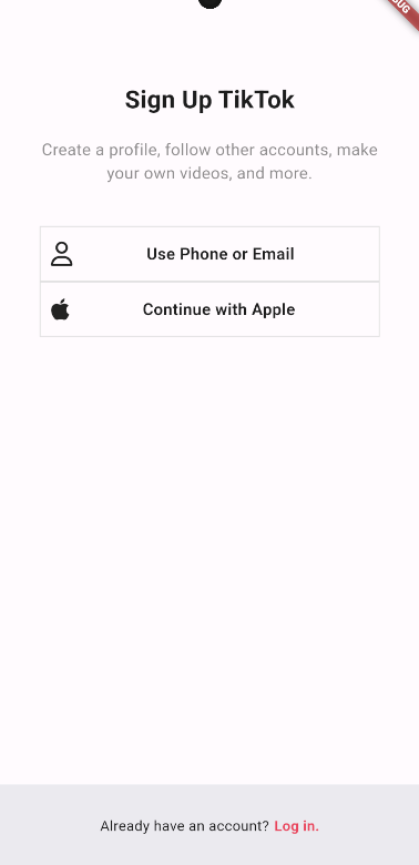
![[Pasted image 20231122005231.png]]
처음에 다음과 같이 Column 위젯으로 설정하고 padding이 필요하다고 생각해서 padding 위젯으로 감쌌다.
기능 별로 폴더를 구분짓자
폴더 구조를 만들 때, 화면 별로 나누다보면 같은 기능을 하는 곳에서 같은 위젯을 공유할 때가 많은데 화면 별로 나누다보면 중복이 생길 수 있다. 그렇기 때문에 기능(Authentication, etc...) 별로 폴더를 구분짓는 것이 좋다.
GestureDetector
GestureDetector 위젯은 Flutter에서 제스처를 감지하고 처리하기 위한 유용한 위젯입니다. 이 위젯을 사용하면 사용자의 터치 제스처나 다른 상호 작용을 감지하고 이벤트를 처리할 수 있습니다. GestureDetector는 다양한 제스처를 감지하고 이벤트 처리를 위해 콜백 함수를 등록할 수 있습니다.
GestureDetector 위젯의 중요한 속성 및 기능은 다음과 같습니다:
onTap: 사용자가 위젯을 탭할 때 실행할 콜백 함수를 정의합니다. 이를 통해 단일 탭 제스처를 처리할 수 있습니다.onDoubleTap: 사용자가 위젯을 더블 탭할 때 실행할 콜백 함수를 정의합니다.onLongPress: 사용자가 위젯을 길게 누르고 있을 때 실행할 콜백 함수를 정의합니다.onPan: 드래그 또는 스와이프와 같은 제스처를 처리하는 데 사용됩니다.onPan콜백 함수를 정의하여 이벤트를 처리할 수 있습니다.onScale: 사용자의 핀치 제스처(두 손가락으로 확대 또는 축소)를 처리하는 데 사용됩니다.onVerticalDrag,onHorizontalDrag: 수직 및 수평 드래그 제스처를 처리하는 데 사용됩니다.child:GestureDetector가 제스처를 감지할 위젯을 포함하는데 사용됩니다. 일반적으로GestureDetector는 하나의 자식 위젯만을 가집니다.
FractionallySizedBox
FractionallySizedBox 위젯은 부모 위젯의 크기에 대한 상대적인 크기로 자식 위젯의 크기를 조정하는 위젯입니다. FractionallySizedBox 위젯은 widthFactor와 heightFactor 매개변수를 사용하여 자식 위젯의 너비와 높이를 부모 위젯의 너비와 높이의 비율로 지정할 수 있습니다. 예를 들어, widthFactor가 0.5이면 자식 위젯의 너비는 부모 위젯의 너비의 50%가 됩니다. FractionallySizedBox 위젯은 유동적인 크기를 가지는 위젯을 만들 때 유용합니다. 아래는 FractionallySizedBox 위젯을 사용한 예시 코드입니다:
FractionallySizedBox(
  widthFactor: 0.5,
  heightFactor: 0.5,
  child: Container(
    color: Colors.blue,
  ),
)
위 코드는 부모 위젯의 너비와 높이의 50% 크기를 가지는 파란색 컨테이너를 생성합니다. 자식 위젯의 크기는 부모 위젯의 크기에 대한 상대적인 크기로 지정되기 때문에, 부모 위젯의 크기가 변경되면 자식 위젯의 크기도 함께 변경됩니다. 이를 통해 유동적인 크기를 가지는 위젯을 쉽게 구현할 수 있습니다1
import 'package:flutter/material.dart';
import 'package:font_awesome_flutter/font_awesome_flutter.dart';
import 'package:tiktok_clone/constants/sizes.dart';
class AuthButton extends StatelessWidget {
const AuthButton({
super.key,
required this.text,
required this.icon,
});
final String text;
final FaIcon icon;
Widget build(BuildContext context) {
return FractionallySizedBox(
widthFactor: 1,
child: Container(
padding: const EdgeInsets.symmetric(
vertical: Sizes.size14,
horizontal: Sizes.size10,
),
decoration: BoxDecoration(
border: Border.all(
color: Colors.grey.shade300,
width: Sizes.size1,
),
),
child: Row(
**mainAxisAlignment: MainAxisAlignment.center**,
children: [
icon,
Text(
text,
textAlign: TextAlign.center,
style: const TextStyle(
fontSize: Sizes.size16,
fontWeight: FontWeight.w600,
),
),
],
),
),
);
}
}
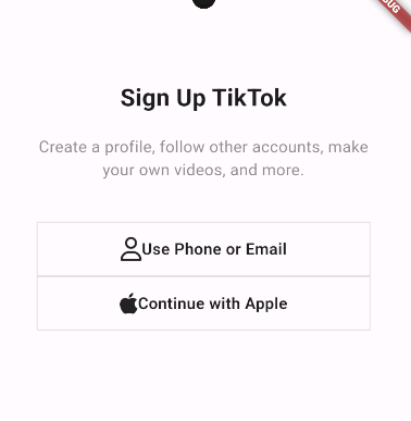
Row: mainAxisAlignment: MainAxisAlignment.center를 하면
다음과 같이 아이콘과 텍스트가 중앙정렬 되는 것을 볼 수 있다.
Expanded
Row나 Column 내에서 사용할 수 있는 만큼 공간을 전부 차지하는 위젯
Expanded 위젯은 Flutter에서 사용되는 레이아웃 위젯 중 하나로, 부모 위젯 내에서 공간을 확장하고 나머지 위젯에 대한 크기 및 위치를 조정하는 데 사용됩니다. Expanded 위젯은 일반적으로 Row, Column, 또는 Flex와 함께 사용되어 자식 위젯을 확장하고 사용 가능한 공간을 채우는 데 도움을 줍니다.
Expanded 위젯은 다음 속성을 사용합니다:
flex: flex 속성은 자식 위젯이 얼마나 많은 공간을 확장할지를 결정합니다. 부모 위젯 내의 모든 Expanded 위젯에 대해 flex 값을 설정하면 해당 비율에 따라 공간이 분배됩니다. 예를 들어, flex 값을 2로 설정한 Expanded 위젯은 flex 값을 1로 설정한 Expanded 위젯보다 두 배의 공간을 확장합니다.
Expanded 위젯은 주로 Row 또는 Column 내에서 사용되며, 다음은 Row 내에서 Expanded를 사용하는 예제입니다:
Row(
  children: [
    Expanded(
      flex: 2,
      child: Container(
        color: Colors.red,
        height: 50,
      ),
    ),
    Expanded(
      flex: 1,
      child: Container(
        color: Colors.blue,
        height: 50,
      ),
    ),
    Expanded(
      flex: 3,
      child: Container(
        color: Colors.green,
        height: 50,
      ),
    ),
  ],
)
하지만 Expanded 위젯을 사용하면 텍스트 위젯이 가운데에 정확히 오지 않는 문제가 있다. 그렇기 때문에 Stack 위젯을 사용할 것이다.
Stack
Stack 위젯은 Flutter에서 다른 위젯들을 겹쳐서 표시하는 데 사용되는 레이아웃 위젯입니다. Stack을 사용하면 여러 위젯을 동일한 공간에 쌓거나 겹칠 수 있으며, 각 위젯의 위치와 크기를 조정하여 복잡한 레이아웃을 만들 수 있습니다.
Stack 위젯은 다음 중요한 속성을 가집니다:
children:Stack위젯 내에 배치할 자식 위젯들의 리스트입니다. 이 자식 위젯들은 순서대로 쌓이며, 첫 번째 자식 위젯은 가장 하위에 위치하고 나중에 추가된 자식 위젯은 위에 위치합니다.
alignment:Stack위젯 내에서 자식 위젯들의 정렬 방법을 지정하는 속성입니다. 예를 들어,Alignment.center로 설정하면 자식 위젯들이 중앙에 정렬됩니다.
fit:Stack위젯 내의 자식 위젯들이 어떻게 크기를 조정할지를 지정하는 속성입니다. 기본값은StackFit.loose로, 자식 위젯들은 가능한 크기로 표시됩니다.StackFit.expand로 설정하면 자식 위젯들이Stack의 전체 공간을 채우도록 크기를 확장합니다.
Stack 위젯을 사용하여 다양한 레이아웃을 구성할 수 있으며, 예를 들어 로딩 스피너를 텍스트 위에 표시하거나 아이콘을 배경 이미지 위에 겹치는 등의 레이아웃을 쉽게 구현할 수 있습니다. 아래는 간단한 예제입니다:
Stack(
  alignment: Alignment.center,
  children: <Widget>[
    Container(
      width: 200,
      height: 200,
      color: Colors.blue,
    ),
    Text(
      '위에 텍스트',
      style: TextStyle(fontSize: 24, color: Colors.white),
    ),
  ],
)
FractionallySizedBox 오류!!
FractionallySizedBox Trouble shoot
"BoxConstraints forces an infinite width"와 관련된 오류 메시지는 화면 레이아웃에서 제약 조건이 올바르게 설정되지 않았음을 나타냅니다.
FractionallySizedBox나 Expanded와 같은 위젯을 사용할 때, 부모 위젯의 제약 조건이 올바르게 설정되어야 합니다. 일반적으로 Expanded나 FractionallySizedBox를 사용하는 경우에는 부모 Row, Column, 또는 다른 레이아웃 위젯에서 적절한 제약 조건을 설정해야 합니다. 오류를 해결하려면 다음을 고려해 보세요:
** Expanded나 FractionallySizedBox를 포함하는 부모 위젯의 Row, Column 등의 레이아웃 위젯에서 적절한 제약 조건을 설정하세요. 예를 들어, Row 내에서 Expanded를 사용할 때는 mainAxisSize를 MainAxisSize.min으로 설정하여 자식 위젯의 크기가 필요한 만큼만 확장되도록 할 수 있습니다.**
ThemeData
import 'package:flutter/material.dart';
import 'package:tiktok_clone/constants/sizes.dart';
import 'package:tiktok_clone/features/authentication/sign_up_screen.dart';
void main() {
runApp(const TikTokApp());
}
class TikTokApp extends StatelessWidget {
const TikTokApp({super.key});
Widget build(BuildContext context) {
return MaterialApp(
title: 'TikTok Clone',
theme: ThemeData(
primaryColor: const Color(0xFFE9435A),
appBarTheme: const AppBarTheme(
centerTitle: true,
titleTextStyle: TextStyle(
fontSize: Sizes.size16 + Sizes.size2,
fontWeight: FontWeight.w600,
color: Colors.black,
),
foregroundColor: Colors.black,
backgroundColor: Colors.white,
),
scaffoldBackgroundColor: Colors.white,
),
home: const SignUpScreen(),
);
}
}
다음과 같이 ThemeData 를 통해 전역적으로 Scaffold Widget의 테마를 설정할 수 있다.
Code Challenge
// sign_up_screen.dart

void _onEmailTap(BuildContext context) {
    Navigator.of(context).push(
      MaterialPageRoute(
        builder: (context) => const EmailScreen(),
      ),
    );
  }
...
AuthButton(
  text: 'Use email & password',
  icon: const FaIcon(FontAwesomeIcons.user),
  onTap: (context) => _onEmailTap(context),
),
다음과 같이 AuthButton 위젯 안에 GestureDetector을 넣어주었다.
import 'package:flutter/material.dart';
import 'package:font_awesome_flutter/font_awesome_flutter.dart';
import 'package:tiktok_clone/constants/sizes.dart';
class AuthButton extends StatelessWidget {
const AuthButton({
super.key,
required this.text,
required this.icon,
**required this.onTap,**
});
final String text;
final FaIcon icon;
**final void Function(BuildContext context) onTap;**
Widget build(BuildContext context) {
return GestureDetector(
**onTap: () => onTap(context),**
child: FractionallySizedBox(
widthFactor: 1,
child: Container(
padding: const EdgeInsets.all(Sizes.size14),
decoration: BoxDecoration(
border: Border.all(
color: Colors.grey.shade300,
width: Sizes.size1,
),
),
child: Stack(
alignment: Alignment.center,
children: [
Align(
alignment: Alignment.centerLeft,
child: icon,
),
Text(
text,
textAlign: TextAlign.center,
style: const TextStyle(
fontSize: Sizes.size16,
fontWeight: FontWeight.w600,
),
),
],
),
),
),
);
}
}
TextField
전체코드
import 'package:flutter/material.dart';
import 'package:tiktok_clone/constants/gaps.dart';
import 'package:tiktok_clone/constants/sizes.dart';
class UsernameScreen extends StatefulWidget {
const UsernameScreen({super.key});
State<UsernameScreen> createState() => _UsernameScreenState();
}
class _UsernameScreenState extends State<UsernameScreen> {
final TextEditingController _usernameController = TextEditingController();
String _username = '';
void initState() {
super.initState();
_usernameController.addListener(() {
setState(() {
_username = _usernameController.text;
});
});
}
Widget build(BuildContext context) {
return Scaffold(
appBar: AppBar(
title: const Text(
'Sign up',
),
),
body: Padding(
padding: const EdgeInsets.symmetric(horizontal: Sizes.size36),
child: Column(
crossAxisAlignment: CrossAxisAlignment.start,
children: [
Gaps.v40,
const Text(
'Create username',
style: TextStyle(
fontSize: Sizes.size24,
fontWeight: FontWeight.w700,
),
),
Gaps.v8,
const Text(
'You can always change it later.',
style: TextStyle(
fontSize: Sizes.size16,
color: Colors.black54,
),
),
Gaps.v16,
TextField(
controller: _usernameController,
cursorColor: Theme.of(context).primaryColor,
decoration: InputDecoration(
hintText: 'Username',
enabledBorder: UnderlineInputBorder(
borderSide: BorderSide(
color: Colors.grey.shade400,
),
),
focusedBorder: UnderlineInputBorder(
borderSide: BorderSide(
color: Colors.grey.shade400,
),
),
),
),
Gaps.v16,
FractionallySizedBox(
              widthFactor: 1,
              child: AnimatedContainer(
                duration: const Duration(milliseconds: 300),
                padding: const EdgeInsets.symmetric(vertical: Sizes.size16),
                decoration: BoxDecoration(
                  borderRadius: BorderRadius.circular(Sizes.size5),
                  color: _username.isEmpty
                      ? Colors.grey.shade300
                      : Theme.of(context).primaryColor,
                ),
                child: const Text(
                  'Next',
                  textAlign: TextAlign.center,
                  style: TextStyle(
                    color: Colors.white,
                    fontSize: Sizes.size16,
                    fontWeight: FontWeight.w600,
                  ),
                ),
              ),
            )
],
),
),
);
}
}
TextField Widget을 사용하기 위해서는 Stateful Widget에서 Controller를 멤버 변수로 선언해야한다.
class _UsernameScreenState extends State<UsernameScreen> {
final TextEditingController _usernameController = TextEditingController();
String _username = '';
void initState() {
super.initState();
_usernameController.addListener(() {
setState(() {
_username = _usernameController.text;
});
});
}
다음과 같이 _usernameController를 TextEditingController()로 선언한 후 initState를 통해 addListener로 setState를 정의해준다.
FractionallySizedBox(
widthFactor: 1,
child: AnimatedContainer(
duration: const Duration(milliseconds: 300),
padding: const EdgeInsets.symmetric(vertical: Sizes.size16),
decoration: BoxDecoration(
borderRadius: BorderRadius.circular(Sizes.size5),
color: _username.isEmpty
? Colors.grey.shade300
: Theme.of(context).primaryColor,
),
child: const Text(
'Next',
textAlign: TextAlign.center,
style: TextStyle(
color: Colors.white,
fontSize: Sizes.size16,
fontWeight: FontWeight.w600,
),
),
),
)그리고 다음과 같이 멤버변수 _username에 따라 동적으로 boxcontainer의 색상이 변할 수 있도록 한다.
Animation
이때 Container는 AnimatedContainer widget을 사용해서 박스 색이 300ms 동안 천천히 변하도록 설정한다.
Reusable Widget으로 만들기
// form_button.dart
import 'package:flutter/material.dart';
import 'package:tiktok_clone/constants/sizes.dart';
class FormButton extends StatelessWidget {
const FormButton({
super.key,
required this.disabled,
});
final bool disabled;
Widget build(BuildContext context) {
return FractionallySizedBox(
widthFactor: 1,
child: AnimatedContainer(
duration: const Duration(milliseconds: 500),
padding: const EdgeInsets.symmetric(vertical: Sizes.size16),
decoration: BoxDecoration(
borderRadius: BorderRadius.circular(Sizes.size5),
color:
disabled ? Colors.grey.shade300 : Theme.of(context).primaryColor,
),
child: AnimatedDefaultTextStyle(
duration: const Duration(milliseconds: 500),
style: TextStyle(
color: disabled ? Colors.grey.shade400 : Colors.white,
fontSize: Sizes.size16,
fontWeight: FontWeight.w600,
),
child: const Text(
'Next',
textAlign: TextAlign.center,
),
),
),
);
}
}
다음과 같이 FormButton을 분리했다.
우리는 _username이 isEmpty인지만 궁금하기 때문에 Parameter로 _username를 받지 않고 disabled만 받도록 코드를 수정한다.
TextButton vs FormButton
TextButton 은 Flutter에서 제공하는 Material Widget이다.
하지만 Flutter에서 제공하는 이런 기본 widget을 자주 사용할 경우에 연습하기에 좋지 않다.
그렇기 때문에 우리는 사용자 지정 widget을 자주 만들어 사용할 것이다.
Context in STL, STF
처음 SignUpScreen에서
void _onEmailTap(BuildContext context) {
    Navigator.of(context).push(
      MaterialPageRoute(
        builder: (context) => const UsernameScreen(),
      ),
    );
  }
상호작용 함수는 다음과 같이 Parameter로 BuildContext context를 설정했다.
반대로
UsernameScreen에서는
void _onNextTap() {
    if (_username.isEmpty) {
      return;
    }
    Navigator.of(context).push(
      MaterialPageRoute(
        builder: (context) => const EmailScreen(),
      ),
    );
  }
다음과 같이 Parameter로 아무것도 설정하지 않았다.
그 이유는 StatefulWidget의 경우 State 안에 있다면 어디서든지 context를 사용할 수 있기 때문이다
UsernameScreen은 StatefulWidget이기 때문에 Parameter로 BuildContext를 넘겨주지 않아도 된다.
Birthday Screen
Scaffold(
    bottomNavigationBar: BottomAppBar(
    height: 300,
    child: CupertinoDatePicker(
      maximumDate: initialDate,
      initialDateTime: initialDate,
      mode: CupertinoDatePickerMode.date,
      onDateTimeChanged: _setTextFieldDate,
    ),
  ),
);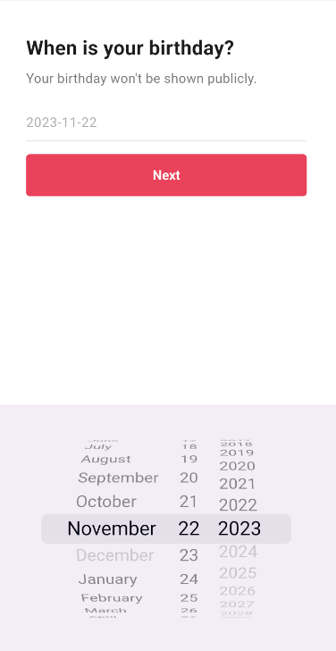
다음과 같이 화면에 아래에서 DatePicker를 설정할 수 있다.
Code Challenge
DateTime initialDate =
      DateTime.now().subtract(const Duration(days: 365 * 12));
initialDate 12년전으로 설정하려면 다음과 같이 수정하면 된다.
TextField 와 TextFormField의 차이
[[TextField]]
[[TextFormField]]
TextField와 TextFormField는 Flutter에서 텍스트 입력을 다루기 위한 두 가지 주요 위젯입니다. 이 둘은 유사한 기능을 제공하지만, 사용 목적과 통합 방식에서 차이가 있습니다.
TextField
- 기본 설명:
TextField는 간단한 텍스트 입력 필드로, 사용자가 텍스트를 입력할 수 있는 기본적인 UI 컴포넌트입니다. - 특징:
- 단독으로 사용될 수 있으며, 양식(Form)과 관련된 추가 기능 없이 텍스트 입력을 처리합니다.
- 컨트롤러(
TextEditingController), 스타일링, 입력 형식 지정(TextInputType), 장식(InputDecoration) 등의 기본적인 텍스트 입력 기능을 제공합니다.
TextFormField
- 기본 설명:
TextFormField는TextField를 기반으로 하지만,Form위젯과 함께 사용되도록 설계된 특별한TextField입니다. - 특징:
Form위젯과 함께 사용될 때 유용합니다. 폼 검증(validation), 폼 저장(save) 등의 기능을 쉽게 통합할 수 있습니다.validator함수를 통해 입력값 검증이 가능하며,onSaved콜백을 통해 폼이 저장될 때 입력값을 저장할 수 있습니다.TextField의 모든 기능을 포함하며, 추가적으로 폼 관련 기능을 제공합니다.
사용 시나리오
- TextField 사용: 단순한 텍스트 입력이 필요할 때, 예를 들어 검색 필드, 메시지 입력 필드 등에서 사용합니다.
- TextFormField 사용: 사용자 입력을 검증하고 저장해야 하는 복잡한 양식에서 사용합니다. 예를 들어, 로그인 화면, 회원가입 양식, 설정 화면 등에서 유용합니다.
결론
TextField는 기본적인 텍스트 입력을 위한 위젯이며, TextFormField는 폼과 연동되어 사용자 입력의 유효성을 검사하고 저장하는 데 사용됩니다. 사용 목적에 따라 적절한 위젯을 선택하면 됩니다.