CSS의 JS화, Styled-Components
리액트에서 CSS를 다뤄보았다면 여간 불편한게 한두가지가 아니다.
HTML밖에 몰랐던 시절 CSS를 쓰고 있으면 크게 불편한게 없었지만,
리액트라는 라이브러리에서는 JS나 HTML은 편리하고 효율적으로 바뀌었지만
그에 비해 CSS는 고전적인 비효율적인 방법으로 할 수 밖에 없었다.
그래서 등장한 Styled-Components는 HTML, CSS, JS를 하나로 합쳐
스타일링도 효율적이고 편리하게 적용이 가능하다.
- 설치하기
npm install --save styled-components


추가로 아래 코드는 package.json에 추가한다. 이 코드는 여러 버전의
Styled Components가 설치되어 발생하는 문제를 줄여준다.

{
  "resolutions": {
    "styled-components": "^5"
  }
}
- 사용하기
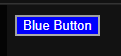
import styled from "styled-components";

//기본 문법은 아래와 같다. styled.<태그>`<속성들>`
const BlueButton = styled.button`
  background-color: blue;
  color: white;
`;

export default function App() {
  return <BlueButton>Blue Button</BlueButton>;
}

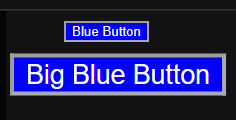
2-1. 재활용하기
import styled from "styled-components";

const BlueButton = styled.button`
  background-color: blue;
  color: white;
`;						//styled(재활용할 컴포넌트)로 재활용이 가능하다.
const BigBlueButton = styled(BlueButton)`
  scale: 2;
`

export default function App() {
  return (
  <>
  <BlueButton>Blue Button</BlueButton>
  <BigBlueButton>Big Blue Button</BigBlueButton>
  </>
  )
}
2-2 Props로 사용하기
import styled from "styled-components";


const BlueButton = styled.button`
  background-color: ${(props)=>props.bg || "white"};
  color: white;			//bg라는 props가 있으면 bg를 사용, 없으면 "white"를 사용
`;

export default function App() {
  return <BlueButton bg="blue">Blue Button</BlueButton>;
}
3. 전역에 사용하기
전역에 사용하기 위해서는 먼저 createGlobalStyle를 임포트 해줘야한다.
import { createGlobalStyle } from "styled-components";
그리고 전역에 적용하고 싶은 스타일을 작성해준다.
const GlobalStyle = createGlobalStyle`
	*{
	padding : 5px;
    margin : 2px;
    border-radius : 5px;
  }
`
위 코드를 아까 사용했던 BlueButton에 적용해보자.
import { createGlobalStyle, styled } from "styled-components";

const GlobalStyle = createGlobalStyle`
	button {
	padding : 5px;
    margin : 2px;
    border-radius : 5px;
  }
`;
const BlueButton = styled.button`
  background-color: blue;
  color: white;
`;

export default function App() {
  return (
  	<>
    <GlobalStyle/>
    <BlueButton>Blue Button</BlueButton>
    </>
  )
}
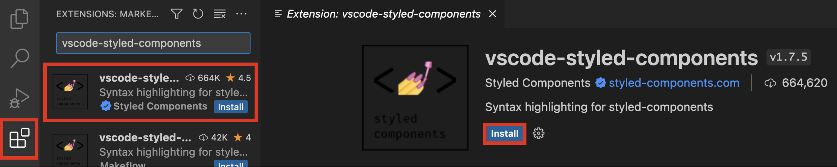
끝으로 styled-components를 사용하면 기존의 CSS파일에서는 적용되던
자동완성 기능이 구현이 되어있지 않다.
따라서 별도의 익스텐션(확장 라이브러리)를 다운받아 적용시켜줘야한다. (아래그림 참고)

용호의 코딩블로그 22.11 코딩공부 시작 23.2 부트캠프 입소