폰트오썸 링크 태그 추가
https://cdnjs.com/libraries/font-awesome/5.15.4
html
<div class="container">
<!-- 왼쪽상단 버튼 -->
<div class="circle-container">
<div class="circle">
<button id="close">
<i class="fas fa-times"></i>
</button>
<button id="open">
<i class="fas fa-bars"></i>
</button>
</div>
</div>
<!-- 글 내용 -->
<div class="content">
<h1>Amazing Article</h1>
<small>Florin Pop</small>
<p>
lorem 단축키 (더미 글자들)
</p>
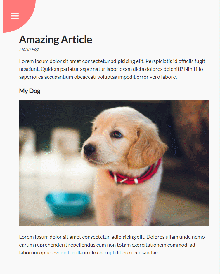
<h3>그림 제목</h3>
<img
src="이미지링크"
/>
<p>
lorem 단축키 (더미 글자들)
</p>
</div>
</div>
<!-- 왼쪽하단 메뉴 -->
<nav>
<ul>
<li><i class="fas fa-home"></i><a href="#"> Home</a></li>
<li><i class="fas fa-user-alt"></i><a href="#"> About</a></li>
<li><i class="fas fa-envelope"></i><a href="#"> Contact</a></li>
</ul>
</nav>css
@import url('https://fonts.googleapis.com/css?family=Lato&display=swap');

* {
  box-sizing: border-box;
}

body {
  font-family: 'Lato', sans-serif;
  background-color: #333;
  color: #222;
  overflow-x: hidden;
  margin: 0;
}

.container {
  background-color: #fafafa;
  transform-origin: top left;
  transition: transform 0.5s linear;
  width: 100vw;
  min-height: 100vh;
  padding: 50px;
}

.container.show-nav {
  transform: rotate(-20deg);
}

.circle-container {
  position: fixed;
  top: -100px;
  left: -100px;
}

.circle {
  background-color: #ff7979;
  height: 200px;
  width: 200px;
  border-radius: 50%;
  position: relative;
  transition: transform 0.5s linear;
}

.container.show-nav .circle {
  transform: rotate(-70deg);
}

.circle button {
  cursor: pointer;
  position: absolute;
  top: 50%;
  left: 50%;
  height: 100px;
  background: transparent;
  border: 0;
  font-size: 26px;
  color: #fff;
}

.circle button:focus {
  outline: none;
}

.circle button#open {
  left: 60%;
}

.circle button#close {
  top: 60%;
  transform: rotate(90deg);
  transform-origin: top left;
}

.container.show-nav + nav li {
  transform: translateX(0);
  transition-delay: 0.3s;
}

nav {
  position: fixed;
  bottom: 40px;
  left: 0;
  z-index: 100;
}

nav ul {
  list-style-type: none;
  padding-left: 30px;
}

nav ul li {
  text-transform: uppercase;
  color: #fff;
  margin: 40px 0;
  transform: translateX(-100%);
  transition: transform 0.4s ease-in;
}

nav ul li i {
  font-size: 20px;
  margin-right: 10px;
}

nav ul li + li {
  margin-left: 15px;
  transform: translateX(-150%);
}

nav ul li + li + li {
  margin-left: 30px;
  transform: translateX(-200%);
}

nav a {
  color: #fafafa;
  text-decoration: none;
  transition: all 0.5s;
}

nav a:hover {
  color: #ff7979;
  font-weight: bold;
}

.content img {
  max-width: 100%;
}

.content {
  max-width: 1000px;
  margin: 50px auto;
}

.content h1 {
  margin: 0;
}

.content small {
  color: #555;
  font-style: italic;
}

.content p {
  color: #333;
  line-height: 1.5;
}
픽서