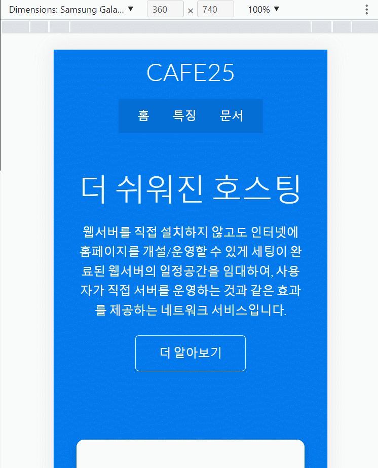
반응형 웹 페이지
- 화면사이즈 769px 이상 (위에서 한 css 적용)
- 화면사이즈 501 ~ 768px (태블릿 css 덮어서 적용)
- 화면사이즈 508px 이하 (모바일 css 덮어서 적용)
/* 반응형 페이지 */
/* 태블릿 가로 사이즈 768 이하  */
@media (max-width: 768px) {
  .grid,
  .showcase .grid,
  .stats .grid,
  .cli .grid,
  .cloud .grid,
  .features-main .grid,
  .docs-main .grid {
    grid-template-columns: 1fr;
    grid-template-rows: 1fr;
  }

  .showcase {
    height: auto;
  }

  .showcase-text {
    text-align: center;
    margin-top: 40px;
    animation: slideInFromTop 1s ease-in;
  }

  .showcase-form {
    justify-self: center;
    margin: auto;
    animation: slideInFromBottom 1s ease-in;
  }

  .cli .grid > *:first-child {
    grid-column: 1;
    grid-row: 1;
  }

  .features-head,
  .features-sub-head,
  .docs-head {
    text-align: center;
  }

  .features-head img,
  .features-sub-head img,
  .docs-head img {
    justify-self: center;
  }

  .features-main .grid > *:first-child,
  .features-main .grid > *:nth-child(2) {
    grid-column: 1;
  }
}

/* Mobile  가로 사이즈 500px 이하*/
@media (max-width: 500px) {
  .navbar {
    height: 110px;
  }

  .navbar .flex {
    flex-direction: column;
  }

  .navbar ul {
    padding: 10px;
    background-color: rgba(0, 0, 0, 0.1);
  }

  .showcase-form {
    width: 300px;
  }
}
픽서