TextField
import android.os.Bundle
import androidx.activity.ComponentActivity
import androidx.activity.compose.setContent
import androidx.compose.foundation.layout.*
import androidx.compose.foundation.text.KeyboardOptions
import androidx.compose.material.*
import androidx.compose.material.icons.Icons
import androidx.compose.material.icons.filled.CheckCircle
import androidx.compose.material.icons.filled.Email
import androidx.compose.material.icons.filled.Person
import androidx.compose.runtime.*
import androidx.compose.ui.Modifier
import androidx.compose.ui.res.painterResource
import androidx.compose.ui.text.input.KeyboardType
import androidx.compose.ui.text.input.PasswordVisualTransformation
import androidx.compose.ui.text.input.TextFieldValue
import androidx.compose.ui.text.input.VisualTransformation
import androidx.compose.ui.tooling.preview.Preview
import androidx.compose.ui.unit.dp
import com.example.dong.ui.theme.MyComposeStudyTheme
class MainActivity : ComponentActivity() {
override fun onCreate(savedInstanceState: Bundle?) {
super.onCreate(savedInstanceState)
setContent {
MyComposeStudyTheme {
Surface(
modifier = Modifier.fillMaxSize(),
color = MaterialTheme.colors.background
) {
textFieldContainer()
}
}
}
}
}
@Composable
fun textFieldContainer(){
var userInput by remember {
mutableStateOf(TextFieldValue())
}
var phoneNumberInput by remember {
mutableStateOf(TextFieldValue())
}
var passwordInput by remember {
mutableStateOf(TextFieldValue())
}
var shouldShowPassword by remember {
mutableStateOf(false)
}
val passwordResource : (Boolean) -> Int = {
if(it) {
R.drawable.baseline_visibility_24
}else{
R.drawable.baseline_visibility_off_24
}
}
Column(
Modifier
.padding(16.dp)
.fillMaxWidth()
, verticalArrangement = Arrangement.SpaceEvenly
){
TextField(
modifier = Modifier.fillMaxWidth(),
value = userInput,
singleLine = true,
onValueChange = { userInput = it },
label = { Text("singleLine") },
placeholder = { Text("텍스트를 작성해주세요.")}
)
TextField(
modifier = Modifier.fillMaxWidth(),
value = userInput,
maxLines = 3,
onValueChange = { userInput = it },
label = { Text("maxLine") },
placeholder = { Text("텍스트를 작성해주세요.")}
)
OutlinedTextField(
modifier = Modifier.fillMaxWidth(),
value = phoneNumberInput,
singleLine = true,
keyboardOptions = KeyboardOptions(keyboardType = KeyboardType.Phone),
onValueChange = { phoneNumberInput = it },
label = { Text("OutlinedTextField(Number)") },
placeholder = { Text("010-****-****")}
)
OutlinedTextField(
modifier = Modifier.fillMaxWidth(),
value = phoneNumberInput,
singleLine = true,
leadingIcon = { Icon(
imageVector = Icons.Default.Email
, contentDescription = null
)},
trailingIcon = { Icon(
imageVector = Icons.Default.CheckCircle
, contentDescription = null
)},
keyboardOptions = KeyboardOptions(keyboardType = KeyboardType.Email),
onValueChange = { phoneNumberInput = it },
label = { Text("OutlinedTextFiel(email))") },
placeholder = { Text(" @ .com")}
)
OutlinedTextField(
modifier = Modifier.fillMaxWidth()
,value = phoneNumberInput
,singleLine = true
,leadingIcon = { Icon(
imageVector = Icons.Default.Email
, contentDescription = null
)}
,trailingIcon = {
IconButton(onClick = {
}) {
Icon(
imageVector = Icons.Default.CheckCircle
, contentDescription = null
)
}
}
,keyboardOptions = KeyboardOptions(keyboardType = KeyboardType.Email)
,onValueChange = { phoneNumberInput = it }
,label = { Text("buttonIcon") }
,placeholder = { Text(" @ .com")}
)
OutlinedTextField(
modifier = Modifier.fillMaxWidth()
,value = passwordInput
,singleLine = true
,leadingIcon = { Icon(
imageVector = Icons.Default.Person
, contentDescription = null
)}
,trailingIcon = {
IconButton(onClick = {
shouldShowPassword = !shouldShowPassword
}) {
Icon(painter = painterResource(
id = passwordResource(shouldShowPassword))
, contentDescription = null
)
}
}
, visualTransformation = if(shouldShowPassword) VisualTransformation.None
else PasswordVisualTransformation()
,keyboardOptions = KeyboardOptions(keyboardType = KeyboardType.Password)
,onValueChange = { passwordInput = it }
,label = { Text("password") }
,placeholder = { Text("password")}
)
}
}
@Preview(showBackground = true)
@Composable
fun DefaultPreview() {
MyComposeStudyTheme {
textFieldContainer()
}
}
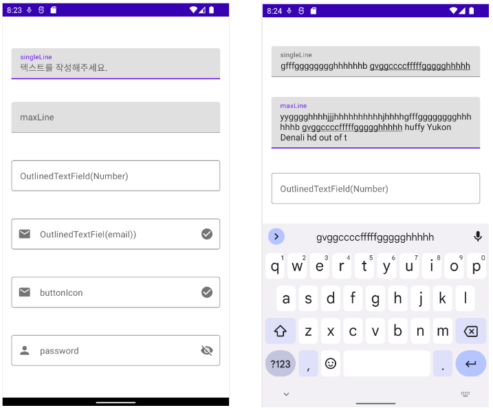
- singleLine과 maxLine에 같은 입력을 넣었을 때 singleLine속성은 한 줄로 유지 되는 것을 확인할 수 있습니다. 반면 maxLine=3을 지정해 두었기에 최대 3줄 까지만 줄이 생성됩니다.
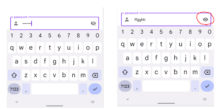
- 우측 눈 모양 버튼을 누르면 입력한 비밀번호가 보이는 것을 확인할 수 있습니다.
VisualTransformation: shouldShowPassword가 true이면 VisualTransformation.None으로 설정하여 비밀번호를 보여주고, 그렇지 않으면 PasswordVisualTransformation()을 사용하여 비밀번호를 가려줍니다.