
애니메이션 | Jetpack Compose | Android Developers
예제[1]
AnimatedVisibility - enter
- fadeIn
- scaleIn
- slideIn
- slideInHorizontally
- slideInVertically
- expandIn
- expandHorizontally
- expandVertically
- AnimatedVisibility
AnimatedVisibility - exit
- fadeOut
- scaleOut
- slideOut
- slideOutHorizontally
- slideOutVertically
- shrinkOut
- shrinkHorizontally
- shrinkVertically
- AnimatedVisibility
@OptIn(ExperimentalAnimationApi::class)
@Composable
fun AnimationEx() {
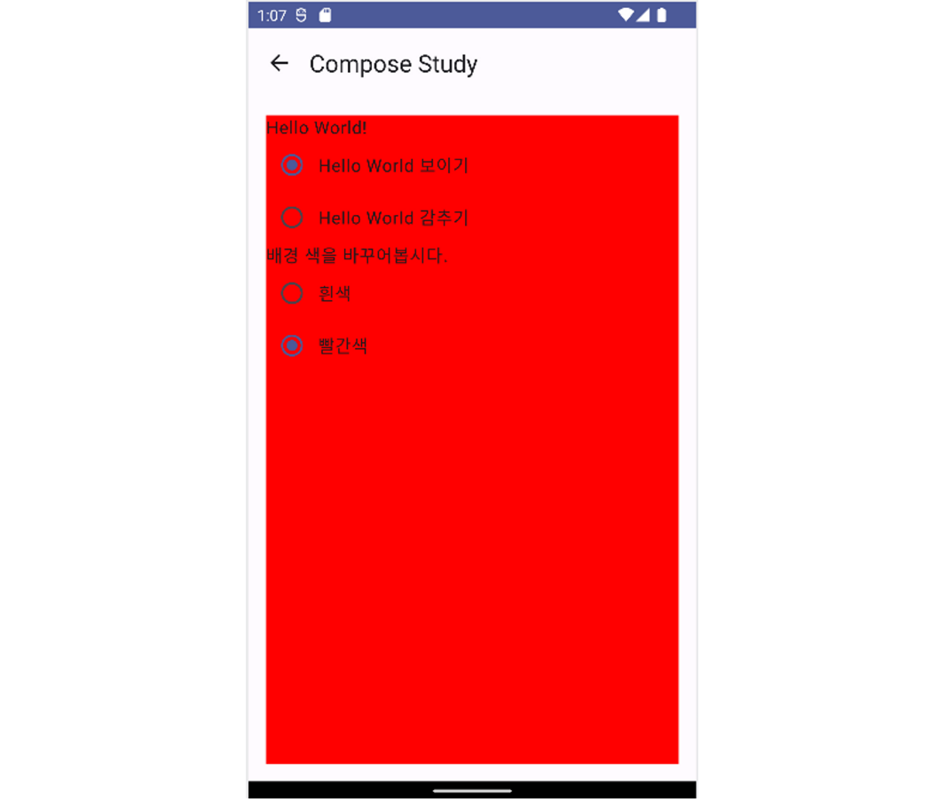
var helloWorldVisible by remember { mutableStateOf(true) }
var isRed by remember { mutableStateOf(false) }
// Red -> White로 애니메이션이 적용되어 색상 변경
val backgroundColor by animateColorAsState(
targetValue = if(isRed) Color.Red else Color.White
)
// alpha값을 애니메이션 적용
val alpha by animateFloatAsState(
targetValue = if(isRed) 1.0f else 0.5f
)
Column(
modifier = Modifier
.padding(16.dp)
.background(backgroundColor) // animation - background
.alpha(alpha) // animation - alpha
.fillMaxSize()
) {
// 1. AnimatedVisibility
// helloWorldVisible의 값에 따라 보이기 또는 사라지게 애니메이션 적용
AnimatedVisibility(
visible = helloWorldVisible,
enter = fadeIn() + expandHorizontally(), // 넓이를 0에서 ~ 보이게 하기 (옆으로 나타남 Horizon이라서)
exit = slideOutHorizontally() // 사라지게 하기
) {
Text(text = "Hello World!")
}
Row(
Modifier.selectable(
selected = helloWorldVisible,
onClick = {
helloWorldVisible = true
}
),
verticalAlignment = Alignment.CenterVertically
) {
RadioButton(
selected = helloWorldVisible,
onClick = { helloWorldVisible = true }
)
Text(
text = "Hello World 보이기"
)
}
Row(
Modifier.selectable(
selected = !helloWorldVisible,
onClick = {
helloWorldVisible = false
}
),
verticalAlignment = Alignment.CenterVertically
) {
RadioButton(
selected = !helloWorldVisible,
onClick = { helloWorldVisible = false }
)
Text(
text = "Hello World 감추기"
)
}
Text(text = "배경 색을 바꾸어봅시다.")
Row(
Modifier.selectable(
selected = !isRed,
onClick = {
isRed = false
}
),
verticalAlignment = Alignment.CenterVertically
) {
RadioButton(
selected = !isRed,
onClick = { isRed = false }
)
Text(
text = "흰색"
)
}
Row(
Modifier.selectable(
selected = isRed,
onClick = {
isRed = true
}
),
verticalAlignment = Alignment.CenterVertically
) {
RadioButton(
selected = isRed,
onClick = { isRed = true }
)
Text(
text = "빨간색"
)
}
}
}
@Preview(showBackground = true)
@Composable
fun AnimationPreview() {
Compose_exampleTheme {
AnimationEx()
}
}
예제[2]
- updateTransition
- Crossfade
@Composable
fun Animation2Ex() {
    var isDarkMode by remember { mutableStateOf(false) }

    // backGroundStatus, textColorStatus, alpha 와 같이 여러가지 애니메이션을 한 단위로 묶어 관리가 가능
    val trasition = updateTransition(targetState = isDarkMode, label = "darkMode Ani")

    // 아래 state -> 는 trasition의 isDarkMode
    val backGroundStatus by trasition.animateColor(label = "darkmode backGroundColor") { state ->
        when(state) {
            false -> { Color.White }
            true -> { Color.Black }
        }
    }

    val textColorStatus by trasition.animateColor(label = "darkmode textColorStatus") { state ->
        when(state) {
            false -> { Color.Black }
            true -> { Color.White }
        }
    }

    val alpha by trasition.animateFloat (label = "darkmode alpha"){ state ->
        when(state) {
            false -> 0.7f
            true -> 1.0f
        }
    }

    Column (
      modifier = Modifier
          .background(backGroundStatus)
          .alpha(alpha)
          .fillMaxSize()
    ) {
        // 일반모드, 다크모드
        RadioButtonWithText(text = "일반 모드", color=textColorStatus, selected = !isDarkMode) {
            isDarkMode = false
        }
        RadioButtonWithText(text = "다크 모드", color=textColorStatus, selected = isDarkMode) {
            isDarkMode = true
        }

        // darkmode 상태에 따라 박스 위치 변경하는 애니메이션
        // Crossfade는 컨텐츠에 애니메이션을 적용할 때 주로 사용됨.
        Crossfade(targetState = isDarkMode, label = "") { state ->
            when(state) {
                false -> {
                    Column {
                        Box(modifier = Modifier
                            .background(Color.Red)
                            .size(20.dp)) {
                            Text("1")
                        }
                        Box(modifier = Modifier
                            .background(Color.Magenta)
                            .size(20.dp)) {
                            Text("2")
                        }
                        Box(modifier = Modifier
                            .background(Color.Blue)
                            .size(20.dp)) {
                            Text("3")
                        }
                    }
                }
                true -> {
                    Row {
                        Box(modifier = Modifier
                            .background(Color.Red)
                            .size(20.dp)) {
                            Text("1")
                        }
                        Box(modifier = Modifier
                            .background(Color.Magenta)
                            .size(20.dp)) {
                            Text("2")
                        }
                        Box(modifier = Modifier
                            .background(Color.Blue)
                            .size(20.dp)) {
                            Text("3")
                        }
                    }
                }
            }

        }
    }
}

@Preview(showBackground = true)
@Composable
fun AnimationPreview2() {
    Compose_exampleTheme {
        RadioButtonWithText(
            text = "라디오 버튼",
            color = Color.Red,
            selected = true,
            onClick = {}
        )
    }
}

@Composable
fun RadioButtonWithText(
    text: String,
    color: Color = Color.Black,
    selected: Boolean,
    onClick: () -> Unit
) {
    Row(
        modifier = Modifier.selectable(
            selected = selected,
            onClick = onClick
        ),
        verticalAlignment = Alignment.CenterVertically
    ) {
        RadioButton(selected = selected, onClick = onClick)
        Text(text = text, color = color)
    }
}