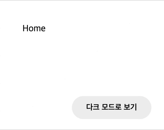
Why?
다크 모드를 설정할 수 없는 웹사이트가 대부분이지만 많은 웹사이트들이 다크모드를 지원하고있다. 다크 모드를 구현하려면 어두운 테마에 맞는 디자인이 추가적으로 들어간다. 추가적인 리소스를 쏟으면서 다크 모드를 구현하는 이유가 무엇일까? 우리가 어두운 곳에서 핸드폰을 할 때 핸드폰 밝기를 낮춘 경험이 있을 것이다. 바로 주변이 어두운 경우 우리의 눈은 빛에 예민해진다. 예민한 눈에 계속해서 밝은 빛을 비추면 눈이 쉽게 피로해지며 눈 건강에도 좋지 않다. 하지만 어두운 곳이 아님에도 빛에 예민한 사용자들이 있다. 이러한 사용자들은 라이트 모드 밖에 없는 웹사이트를 이용할 때 우리가 어두운 곳에서 밝기가 고정된 핸드폰을 하는 느낌을 받게 될 것이다. 그렇기에 웹 접근성을 높이기 위해서 다크 모드를 설정 가능하도록 구현해야한다.
개발 진행
개발 환경
- Next.js
- Typescript
- Emotion
ThemeProvider
이번 프로젝트에서 Emotion을 스타일 라이브러리로 사용하고 있다. 테마 스타일를 적용하기 위해 Emotion에서 제공하는 ThemeProvider 컴포넌트를 커스텀하여 사용했다. ThemeProvider에 Theme을 제공하게 되면 자식 요소에서 해당 Theme을 받아서 사용할 수 있되어 추후 Theme 수정시 일괄적으로 생상 변경이 가능하므로 유지보수에 편리하다.
고려 상황들
window 객체와 Next.js
- 문제
사용자의 다크모드 설정을 localStorage에 저장하고 불러와서 쓰기위해서 window 객체가 필요했다. 하지만 Next.js에서는 window 객체를 React처럼 그냥 사용한다면ReferenceError: window is not defined라는 에러를 만나게된다. Next.js는 기본적으로 SSG를 지원하기 때문에 브라우저 환경에서 사용할 수 있는 window 객체 사용 불가능하다. - 해결
그렇기 때문에 브라우저 환경에서 해당 코드가 실행되게 하기위해 useEffect를 활용해서 마운트 되었을 때 window를 사용해 주었다.
// 예시 코드
useEffect(() => {
    if (
      window.localStorage.getItem('welcoming-theme') === 'dark'
    ) {
      setDark(true);
    }
  }, []);
사용자 테마 감지
시스템을 다크 테마를 사용하는 사용자에게는 웹사에트 첫 방문시 다크 모드를 적용해서 보여준다면 더 나은 사용자 경험을 제공할 것이다.
사용자의 시스템의 테마를 확인하기위해 prefers-color-scheme을 이용해 확인할 수 있다.
Type error
Typescript와 ThemeProvider를 같이 사용할 때 테마의 타입을 제공하지 않으면 css props에서 theme의 값을 사용할 수 없다. 공식문서를 확인해보면 props.theme을 의도적으로 비워뒀기 때문이다. type-safe를 위해서 비워뒀고 우리가 해당 타입을 정의해서 사용해야한다.
// 예시 코드
import '@emotion/react'

declare module '@emotion/react' {
  export interface Theme {
    color: {
      primary: string
      positive: string
      negative: string
    }
  }
}
Code
_app.tsx 파일 설정
// _app.tsx
import type { AppProps } from 'next/app';
import client from '../apollo';
import { CustomThemeProvider } from '../styles/CustomThemeProvider';

function MyApp({ Component, pageProps }: AppProps) {
  return (
    <CustomThemeProvider>
      <Component {...pageProps} />
    </CustomThemeProvider>
  );
}

export default MyApp;
CustomThemeProvider.tsx 구현
//CustomThemeProvider.tsx
import { Global, ThemeProvider } from '@emotion/react';
import styled from '@emotion/styled';
import { useCallback, useEffect, useState } from 'react';
import { GlobalStyles } from './globals';
import { mode } from './theme';

export const CustomThemeProvider: React.FC = ({ children }) => {
  const [mounted, setMounted] = useState(false);
  const [theme, setTheme] = useState(mode.light);
  const [dark, setDark] = useState(false);
  useEffect(() => {
    setMounted(true);
    if (
      window.localStorage.getItem('welcoming-theme') === 'dark' ||
      (window.matchMedia('(prefers-color-scheme: dark)').matches &&
        !window.localStorage.getItem('welcoming-theme'))
    ) {
      setDark(true);
    }
  }, []);
  useEffect(() => {
    window.localStorage.setItem(
      'welcoming-theme',
      `${dark ? 'dark' : 'light'}`,
    );
    if (window.localStorage.getItem('welcoming-theme') === 'dark') {
      setTheme(mode.dark);
    } else if (window.localStorage.getItem('welcoming-theme') === 'light') {
      setTheme(mode.light);
    }
  }, [dark]);
  const toggleTheme = useCallback(() => {
    setDark((curr) => !curr);
  }, [dark]);

  const body = (
    <ThemeProvider theme={theme}>
      <Global styles={GlobalStyles(theme)} />
      {children}
      <DarkModeBtn type="button" onClick={toggleTheme}>
        {dark ? '라이트 모드로 보기' : '다크 모드로 보기'}
      </DarkModeBtn>
    </ThemeProvider>
  );

  if (!mounted) {
    return <div style={{ visibility: 'hidden' }}>{body}</div>;
  }
  return body;
};

const DarkModeBtn = styled.button`
  position: fixed;
  bottom: 30px;
  right: 30px;
  height: 40px;
  padding: 0 25px;
  border-radius: 20px;
  background: ${({ theme }) => theme.bg.darkBtn};
  color: ${({ theme }) => theme.text.darkBtn};
  font-weight: 600;
`;
theme.ts 테마 파일 설정
// theme.ts
import { Theme, ThemeMode } from '@emotion/react';

declare module '@emotion/react' {
  export interface ThemeMode {
    bg: {
      primary: string;
      bodyBg: string;
      darkBtn: string;
    };
    text: {
      primary: string;
      bodyText: string;
      darkBtn: string;
    };
  }
  export interface Theme extends ThemeMode {
    mediaQuery: {
      mobile: string;
      tablet: string;
      laptop: string;
      desktop: string;
    };
  }
}
interface ThemeGroup {
  light: Theme;
  dark: Theme;
}

const light: ThemeMode = {
  bg: {
    primary: '#35c5f0',
    bodyBg: '#ffffff',
    darkBtn: '#eeeeee',
  },
  text: {
    primary: '#35c5f0',
    bodyText: '#000000',
    darkBtn: '#000000',
  },
};
const dark: ThemeMode = {
  bg: {
    primary: '#050505',
    bodyBg: '#1e1f21',
    darkBtn: '#757575',
  },
  text: {
    primary: '#fbfbfc',
    bodyText: '#d9d9d9',
    darkBtn: '#ffffff',
  },
};
interface MEDIA {
  mobile: string;
  tablet: string;
  laptop: string;
  desktop: string;
}

export const mediaQuery: MEDIA = {
  mobile: '375px',
  tablet: '768px',
  laptop: '1024px',
  desktop: '1600px',
};

export const mode: ThemeGroup = {
  light: { ...light, mediaQuery },
  dark: { ...dark, mediaQuery },
};
Global style 설정
import { css, Theme } from '@emotion/react';

export const GlobalStyles = (theme: Theme) => css`
  /* reset css 적용 */
  body {
    background: ${theme.bg.bodyBg};
    color: ${theme.text.bodyText};
  }
`;

export default GlobalStyles;
위의 코드처럼 css props를 구조분해 할당을 이용하여 theme 값을 받아와서 사용할 수 있다.