
리액트에서 컴포넌트를 스타일링 할 때는 다양한 방식을 사용할 수 있다. 크게 4가지의 방법이 있다.
- 일반 CSS : 가장 기본적인 방식
- Sass : 자주 사용하는 CSS 전처리기의 일종. 확장된 CSS 문법을 갖는다.
- CSS Module : CSS 클래스가 다른 클래스들의 이름과 충돌하지 않도록 고유한 이름을 자동으로 생성해 준다.
- styled-components : 스타일을 자바스크립트 파일 안에 내장시키는 방식
일반 CSS
가장 순정이고 기본적인 CSS 적용 방식. 긴 설명은 생략!
CSS 작성법 : https://developer.mozilla.org/ko/docs/Web/CSS/CSS_Selectors
import './App.css';만 작성해 주면 바로 적용이 가능하다.
CSS 작성 시 이름 규칙
create-react-app으로 자동 생성된 App.css 을 살펴보면 클래스 이름이 컴포넌트 이름-클래스 형태로 지어져 있다. (예:App-header) 컴포넌트끼리 비슷한 이름의 클래스를 사용하더라도 중복을 피할 수 있다.
Sass
복잡한 작업을 쉽게 하게끔 해 주고 스타일 코드의 재활용성을 높여 준다. 뿐만 아니라 코드의 가독성 또한 높여 준다. 확장자 .scss와 sass를 지원한다.
.sass 코드의 모습
$font-stack: Helvetica, sans-serif
$primary-color: #333

body
	font: 100% $font-stack
    color: $primary-color
.scss 코드의 모습
$font-stack: Helvetica, sans-serif;
$primary-color: #333;

body {
	font: 100% $font-stack;
    color: $primary-color;
}
sass 확장자는 중괄호와 세미콜론을 사용하지 않는다.
scss 확장자는 기존의 css 문법과 비슷하다.
$red: #fa5252;
$orange: #fd7e14;
$yellow:#fcc419;
$green: #40c057;
$blue: #339af0;
$indigo: #5c7cfa;
$violet: #7950f2;

@mixin square($size) {
    $calculated: 32px * $size;
    width: $calculated;
    height: $calculated;
}

.SassComponent {
    display:flex;
    .box {
        background: red;
        cursor: pointer;
        transition: all 0.3s ease-in;

        &.red {
            background: $red;
            @include square(1);
        }
        &.orange {
            background: $orange;
            @include square(2);
        }
        &.yellow {
            background: $yellow;
            @include square(3);
        }
        &.green {
            background: $green;
            @include square(4);
        }
        &.blue {
            background: $blue;
            @include square(5);
        }
        &.indigo {
            background: $indigo;
            @include square(6);
        }
        &.violet {
            background: $violet;
            @include square(7);
        }
        &:hover {
            background: black;
        }
    }
}
const SassComponent = () => {
return (
<div className="SassComponent">
<div className="box red"></div>
<div className="box orange"></div>
<div className="box yellow"></div>
<div className="box green"></div>
<div className="box blue"></div>
<div className="box indigo"></div>
<div className="box violet"></div>
</div>
)
}간단한 예제.
utils 함수 분리
$red: #fa5252;
$orange: #fd7e14;
$yellow:#fcc419;
$green: #40c057;
$blue: #339af0;
$indigo: #5c7cfa;
$violet: #7950f2;

@mixin square($size) {
    $calculated: 32px * $size;
    width: $calculated;
    height: $calculated;
}
이 부분을 따로 파일로 저장해서 /styles/utils.scss 파일로 만든 후,
@import './styles/utils.scss';
이런 식으로 import 해서 사용할 수 있다.
CSS Module
CSS module은 CSS를 사용할 때, 클래스를 고유한 값으로 자동으로 바꾸어 컴포넌트의 클래스 이름이 중첩되는 현상을 방지해 준다.
간단한 예제를 만들어 보자.
CSSModule.js
export default function CSSModule() {
  return (
    <div className={styles.wrapper}>
        안녕하세요. 저는 <span className='something'>CSS Module!</span>
    </div>
  );
};
CSSModule.module.css
.wrapper {
    background: black;
    padding: 1rem;
    color: white;
    font-size: 2rem;
}

:global .something {
    font-weight: 800;
    color: aqua;
}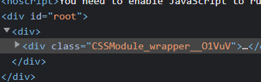
클래스를 'wrapper' 라고만 설정해 주었는데, 자동으로 {파일명}_{클래스명}_{해시 값} 형태로 바뀐 것을 볼 수 있다.
classnames
클래스명을 조건부로 설정할 때 아주 유용한 라이브러리이다.
npm install classnames조건부로 클래스 지정
import classNames from 'classnames';

classNames('one', {'two':(조건)});
이런 식으로 콜론 뒤에 조건을 붙여 주면 조건의 참/거짓 여부에 따라 class를 지정할 수 있다.
CSS Module과 함께
import classNames from 'classnames/bind';
import styles from './CSSModule.module.css';

const cx = classNames.bind(styles);

...

<div className={cx('wrapper', 'inverted')>
매번 styles.something 이라고 지정해줄 필요 없이 간편하게 module css를 사용할 수 있다.
styled-components
설치
npm install styled-components자바스크립트 파일 하나에 스타일까지 작성이 가능하기 때문에, css 파일을 따로 만들지 않아도 된다는 이점이 있다.
예시 코드
import styled, { css } from "styled-components";

const Box = styled.div`
  background: ${(props) => props.color || "blue"};
  padding: 1rem;
  display: flex;
`;

const Button = styled.button`
  background: white;
  color: black;
  border-radius: 4px;
  padding: 0.5rem;
  display: flex;
  align-items: center;
  justify-content: center;
  box-sizing: border-box;
  font-size: 1rem;
  font-weight: 600;

  &:hover {
    background: rgba(255, 255, 255, 0.9);
  }

  ${(props) =>
    props.inverted &&
    css`
      background: none;
      border: 2px solid white;
      color: white;

      &:hover {
        background: white;
        color: black;
      }
    `};
  & + button {
    margin-left: 1rem;
  }
`;
정리
다양한 리액트 컴포넌트 스타일링 방식을 배워 보았고 이 중에서 편한 것을 사용하면 된다.
나는 새 것을 받아들이기엔 아직 많이 부족한지, 기본 css가 제일 편한 것 같다... ㅋㅋ