
1. Transform
- 요소를 회전 시키고, 왜곡하고 확대 축소 늘리기 등 요소에 대한 여러가지 변형이
가능한 태그 입니다.
1.1 Transform 속성
| 속성 | 내용 | 단위 |
|---|---|---|
| transform: rotate | 요소를 회전시킨다. | 각도(deg) |
| transform: scale | 요소를 x,y 축으로 축소, 확대 한다. | 0, 양수 |
| transform: scaleX | 요소를 x축만 축소, 확대 한다. | 0, 양수 |
| transform: scaleY | 요소를 y축만 축소, 확대 한다. | 0, 양수 |
| transform: translate | 요소를 x,y 축으로 이동 시킨다. | px, %, em 등 |
| transform: translateX | 요소를 x축만 이동 시킨다. | px, %, em 등 |
| transform: translateY | 요소를 y축만 이동 시킨다. | px, %, em 등 |
| transform: skew | 요소를 x,y 축으로 기울인다 | 각도(deg) |
| transform: skewX | 요소를 x축으로 기울인다. | 각도(deg) |
| transform: skewY | 요소를 y축으로 기울인다. | 각도(deg) |
1.2 Transform 사용
<section>
        <h1>rotate</h1>
        <h1>scale</h1>
        <h1>translate</h1>
        <h1>skew</h1>
</section>

<section>
        <h1>rotate</h1>
        <h1>scale</h1>
        <h1>translate</h1>
        <h1>skew</h1>
</section>
h1 {
width: 300px;
padding: 10px;
margin: 20px auto;
/* 중앙 정렬 */
text-align: center;
font-size: 1.5em;
border: solid 2px black;
background-color: #babbf6;
}
section {
margin-bottom: 100px;
}
/* h1 색상 부여 */
h1:nth-of-type(2n) {
background-color: #ff6d71;
}
h1:nth-of-type(3n) {
background-color: #8b8587;
}
h1:nth-of-type(4n) {
background-color: #ff8d4e;
}
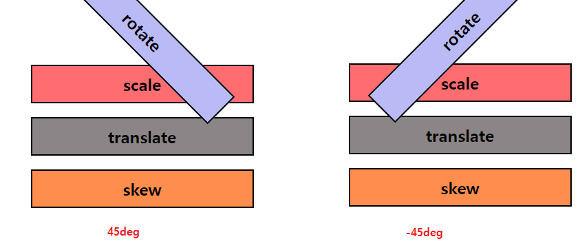
1.3 Transform-rotate
section:nth-of-type(1) h1:nth-of-type(1) {
	transform: rotate(45deg);
    /* 요소를 45도 만큼 회전 시킨다
    	음수를 넣는 경우, 역회전 합니다. */
}
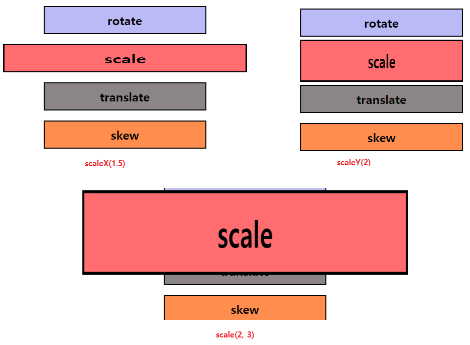
1.4 Transform-scale
section:nth-of-type(1) h1:nth-of-type(1) {
	transform: scale(2, 3);
    /* 요소의 너비는 2배(x) 높이는 3배(y)로 확대 한다. */

    /* transform: scaleX(1.5);
    	요소의 너비만 1.5배로 확대

       transform: scaleY(2);
       	요소의 높이만 2배로 확대

      축소가 필요한 경우에는 0. 단위를 사용
    */
}
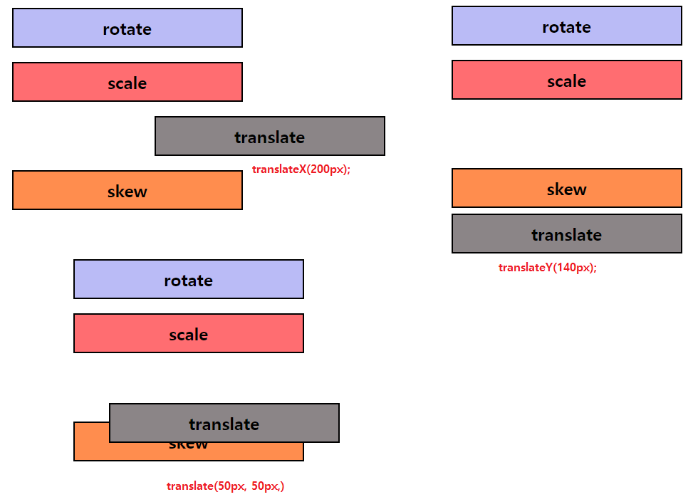
1.5 Transform-translate
section:nth-of-type(1) h1:nth-of-type(3) {
    transform: translate(50px, 50px);
    /* 요소의 위치를 x축으로 50, y축으로 50 이동 */

    /* transform: translateX(200px);
    	요소를 X축 기준으로 우측으로 200px 이동
        음수인 경우 좌측으로 이동 한다. */

   /* transform: translateY(140px);
   		요소를 y축 기준으로 아래로 140px 이동
        음수인 경우 위로 이동 한다. */
}
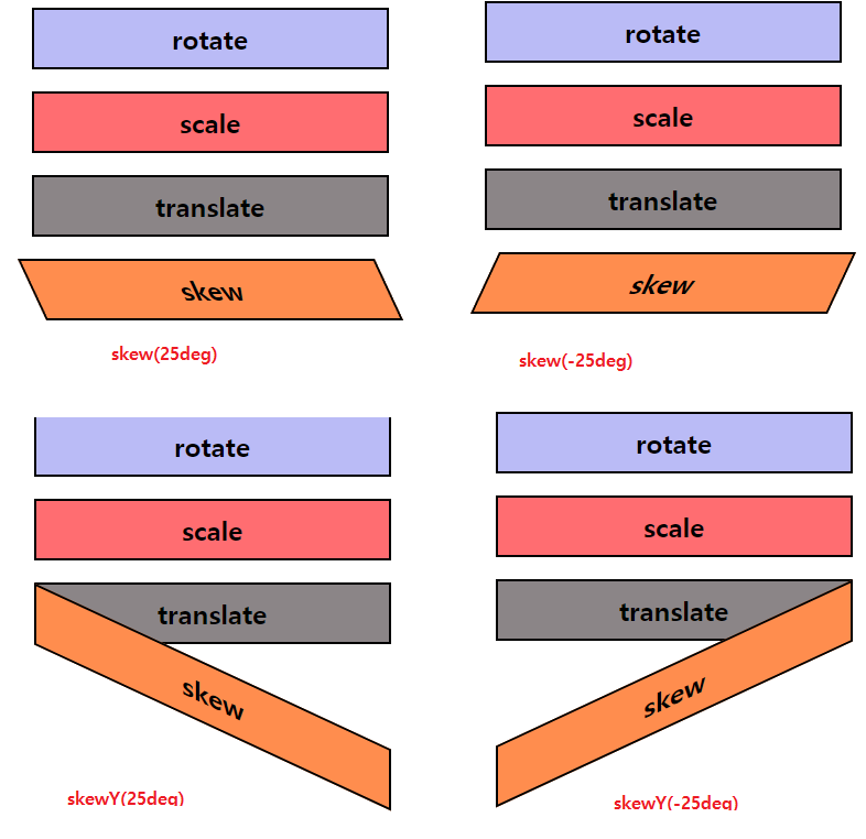
1.6 Transform-skew
section:nth-of-type(1) h1:nth-of-type(4) {
    transform: skew(25deg);
    /* 요소를 X축으로 25각도만큼 기울기, Y축의 값은 0 */

    /* transform: skewY(25deg)
    	요소를 Y축으로 좌측에서 25각도만큼 기울기 */

    /* transform: skewY(-25deg)
    	요소를 Y축으로 우측에서 -25각도만큼 기울기 */
}
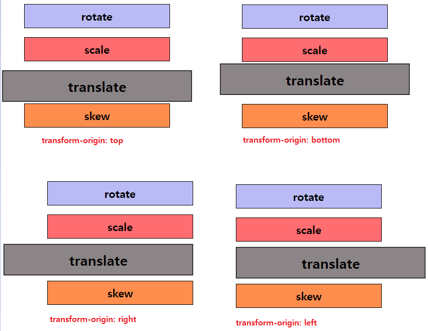
2. Transform-origin
- 요소가 변형할 때 기준이 되는 기준점을 정해줍니다.
section:nth-of-type(1) h1:nth-of-type(3) {
    transform: scale(1.3);
    transform-origin: top;
    /* 변형의 기준점은 top(위)에서부터 1.3배 크기로 확대 된다 */

    /* transform-origin: bottom;
    	변형의 기준점은 bottom(아래)에서부터 1.3배 크기로 확대 된다 */

    /* transform-origin: right;
    	변형의 기준점은 right(우측)에서부터 1.3배 크기로 확대 된다 */

    /* transform-origin: top left;
    	변형의 기준점은 top, left (위 좌측)에서 부터 1.3배 크기로 확대 된다 */
}

프론트엔드 개발자가 되기 위한 학습 과정을 정리하는 블로그