😁 반응형 디자인
👨🏻 현대 어플리케이션을 디자인하기 위하여
- 현대에 들어 사용자는 다양한 기기로 어플리케이션을 실행하게 되었다.
- 넓고 큰 모니터부터 손바닥만한 화면의 핸드폰까지 다양한 기기에 최적화된 디자인은 어떻게 구현할 수 있을까?
- 간단한 방법으로는 출력 기기의 사이즈에 따라 화면을 축소시키는 방법이 있다.
- 하지만 이보다 더 좋은 방법으로 '반응형 디자인'이 있다.
- 바로 아래의 예시처럼 가로 세로 비율에 따라 아예 다른 포맷을 따르는 디자인을 하기 위해 우리는 무엇을 배워야 할가?
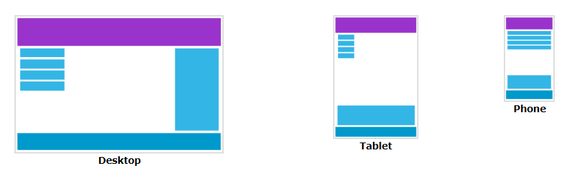
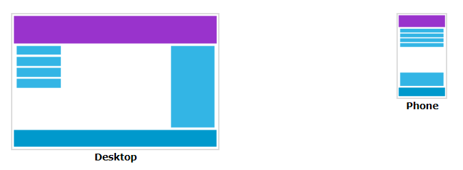
👩🏻 데스크톱 vs 태블릿 vs 모바일
🤣 Viewport
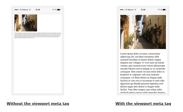
👶🏻 Veiwport란?
- 뷰포트란 사용자가 볼 수 있는 웹페이지 영역를 말한다.
- 뷰포트는 기기에 따라 다르다.
👵🏻 Viewport 설정하기
<meta name="viewport" content="width=device-width, initial-scale=1.0">- 위 설정은 브라우저가 페이지의 크기와 축적을 어떻게 조절할 지 알려준다.
width=device-width는 페이지의 넓이를 스크린의 넓이에 맞춰준다.initial-scale=1.0는 페이지가 처음 로딩될 때 확대 레벨을 1로 맞추어준다.
👴🏻 Viewport 사용시 주의사항
- 사용자들은 기본적으로 스크롤을 위 아래로 내리지 양옆으로 움직이지 않는다는 점을 알아야한다.
- 큰 폭을 고정값으로 갖는 element를 쓰지 마라.
- 만약 페이지 뷰포트 넓이 보다 큰 요소를 쓰게 될 시, 사용자는 좌우로 스크롤을 해야한다.
- element의 폭은 반드시 뷰포트의 폭에 맞추어 작성하라.
- 특정 뷰포트에 맞추어 디자인하지 마라.
- 스크린은 기기에 따라 크게 변화한다.
- 그러므로 컨텐츠를 특정 뷰포트의 폭에 맞춰 디자인 하지 마라.
- 작은 화면과 큰 화면에 동시에 적용할 디자인이라면 미디어쿼리를 써라
- width: 100%를 활용해라.
- 위치를 정할 때도 뷰포트를 벗어나지 않도록 주의해라.
😎 Grid-View
👸🏻 Grid-View란?
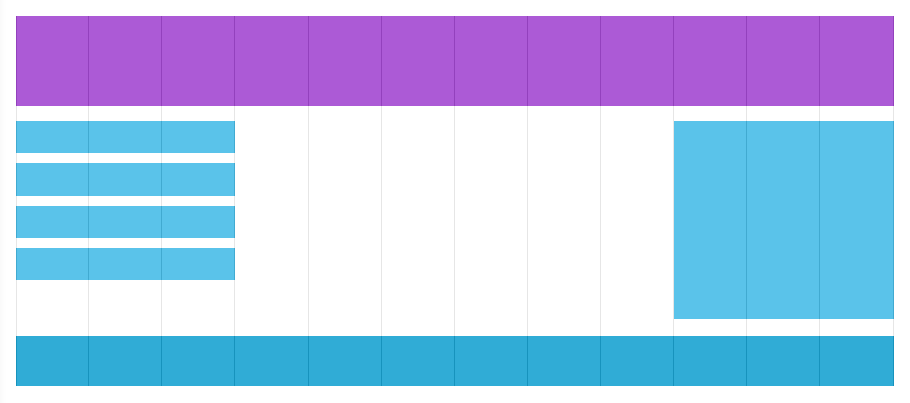
- 많은 사이트가 그리드뷰를 기본으로 디자인되어 있다.
- 그리드 뷰란 페이지를 여러개의 컬럼으로 분할하여 디자인하는 것을 말한다.
- 반응형 그리드뷰라고 말할 때는 보통 12개의 컬럼으로 나누는 것을 의미한다.
🤴🏻 Responsive Grid-View 적용하기
- 가장 먼저 모든 element의 padding과 border가 전체 width와 height에 포함되도록 아래 명령어를 입력해야한다.
    * {
      box-sizing: border-box;
}- 이후 12가지 컬럼의 넓이를 아래와 같이 정한다.
- 이 클래스들이 왼쪽에 붙을 수 있도록 float: left를 정한다.
    [class*="col-"] {
      float: left;
      padding: 15px;
      border: 1px solid red;
    }
    .col-1 {width: 8.33%;}
    .col-2 {width: 16.66%;}
    .col-3 {width: 25%;}
    .col-4 {width: 33.33%;}
    .col-5 {width: 41.66%;}
    .col-6 {width: 50%;}
    .col-7 {width: 58.33%;}
    .col-8 {width: 66.66%;}
    .col-9 {width: 75%;}
    .col-10 {width: 83.33%;}
    .col-11 {width: 91.66%;}
.col-12 {width: 100%;}- 이렇게 설정한 col- 클래스들은 12개 단위마다 div로 감싸줘야 한다.
    <div class="row">
      <div class="col-3">...</div> <!-- 25% -->
      <div class="col-9">...</div> <!-- 75% -->
</div>- (여기는 무슨 말인지 모르겠다.)
- The columns inside a row are all floating to the left, and are therefore taken out of the flow of the page, and other elements will be placed as if the columns do not exist. To prevent this, we will add a style that clears the flow:
    .row::after {
      content: "";
      clear: both;
      display: table;
    }
🙄 Media Query
🙋🏻♀️ Media Query란?
- 미디어 쿼리란 CSS3에서 소개된 기술이다.
- 아래처럼 쓸 수 있다.
    @media only screen and (max-width: 600px) {
      body {
        background-color: lightblue;
      }
}🙋🏻♂️ 분기점을 정하자
- 768px을 기준으로 화면의 구성을 완전히 바꿀 수 있다.
- 아래의 코드와 예시 사진을 보자
    /* For desktop: */
    .col-1 {width: 8.33%;}
    .col-2 {width: 16.66%;}
    .col-3 {width: 25%;}
    .col-4 {width: 33.33%;}
    .col-5 {width: 41.66%;}
    .col-6 {width: 50%;}
    .col-7 {width: 58.33%;}
    .col-8 {width: 66.66%;}
    .col-9 {width: 75%;}
    .col-10 {width: 83.33%;}
    .col-11 {width: 91.66%;}
    .col-12 {width: 100%;}

    @media only screen and (max-width: 768px) {
      /* For mobile phones: */
      [class*="col-"] {
        width: 100%;
      }
    }
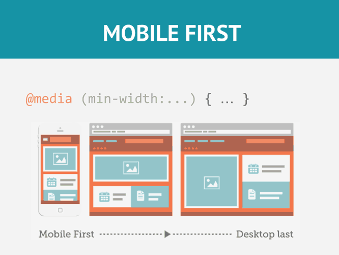
🙅🏻♀️ 반드시 모바일 버전을 먼저 디자인하라!!
- 모바일 버전 디자인이 끝난 후에 분기점을 잡고 데스크탑 버전을 디자인해라
- 아래 코드와 예시를 보자 (데모 링크)
- 데모 링크를 누르고 우측의 렌더링 페이지의 넓이를 바꿔봐라
/* For mobile phones: */
[class*="col-"] {
  width: 100%;
}

@media only screen and (min-width: 600px) {
  /* For tablets: */
  .col-s-1 {width: 8.33%;}
  .col-s-2 {width: 16.66%;}
  .col-s-3 {width: 25%;}
  .col-s-4 {width: 33.33%;}
  .col-s-5 {width: 41.66%;}
  .col-s-6 {width: 50%;}
  .col-s-7 {width: 58.33%;}
  .col-s-8 {width: 66.66%;}
  .col-s-9 {width: 75%;}
  .col-s-10 {width: 83.33%;}
  .col-s-11 {width: 91.66%;}
  .col-s-12 {width: 100%;}
}

@media only screen and (min-width: 768px) {
  /* For desktop: */
  .col-1 {width: 8.33%;}
  .col-2 {width: 16.66%;}
  .col-3 {width: 25%;}
  .col-4 {width: 33.33%;}
  .col-5 {width: 41.66%;}
  .col-6 {width: 50%;}
  .col-7 {width: 58.33%;}
  .col-8 {width: 66.66%;}
  .col-9 {width: 75%;}
  .col-10 {width: 83.33%;}
  .col-11 {width: 91.66%;}
  .col-12 {width: 100%;}
}<div class="row">
<div class="col-3 col-s-3">...</div>
<div class="col-6 col-s-9">...</div>
<div class="col-3 col-s-12">...</div>
</div>🙅🏻♂️ 스크린의 방향에 따라 다른 디자인을 적용해라
- 화면을 세워 사용할 때와 눕혀 사용할 때는 다른 디자인이 필요하다
    @media only screen and (orientation: landscape) {
      body {
        background-color: lightblue;
      }
}🧏🏻♀️ 필요에 따라 요소를 숨길 필요도 있다.
- 작은 화면에서는 불필요한 요소를 숨김 처리하자.
    @media only screen and (max-width: 600px) {
      div.example {
        display: none;
      }
    }
자바스크립트와 파이썬 그리고 컴퓨터와 네트워크