Some reflections on the process of creating custom components: figuring out where to start + logical sequence of steps to implement, debugging, identifying what can be improved and factors that need to be taken into account. A structural overview of each component, and key takeaways. (To be updated: tags, advanced:autocomplete)
Common pitfalls
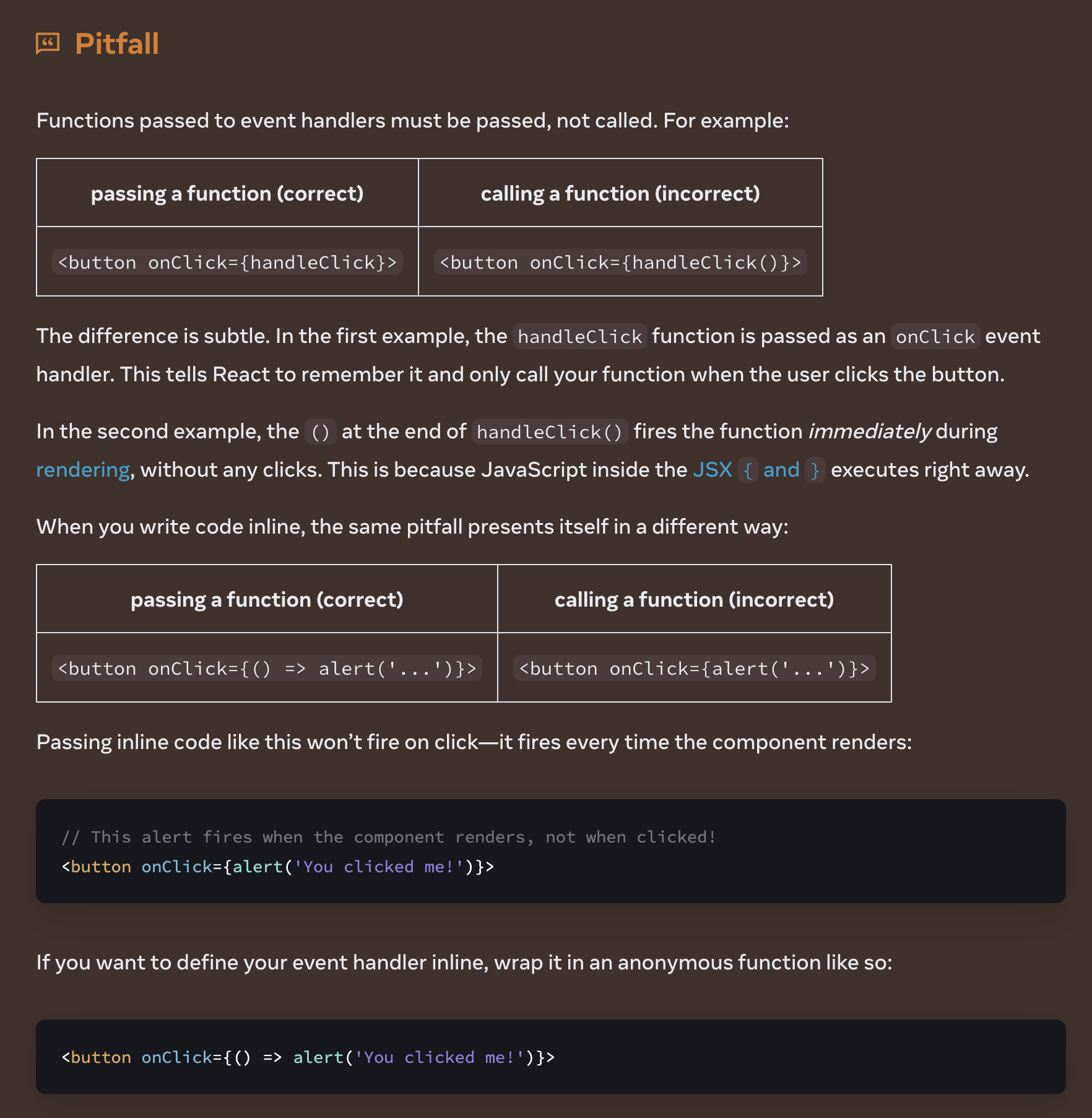
Event Handling & Arrow Functions
I keep forgetting why exactly I need to use arrow functions when passing event handlers.. the following explains why you need to use them to pass functions with arguments inline (I always revert back to this link every time):
Controlled vs. Uncontrolled Components
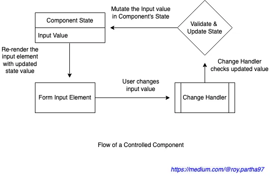
Definition of a controlled component -
...in the controlled component the form input element’s values and mutations are totally driven by event handlers and the value of the input element is always inferred from the state
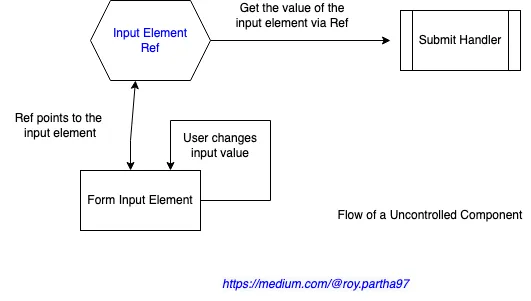
whereas an uncontrolled component -
doesn't use any states on input elements or any event handler ... doesn't care about an input element’s real-time value changes.
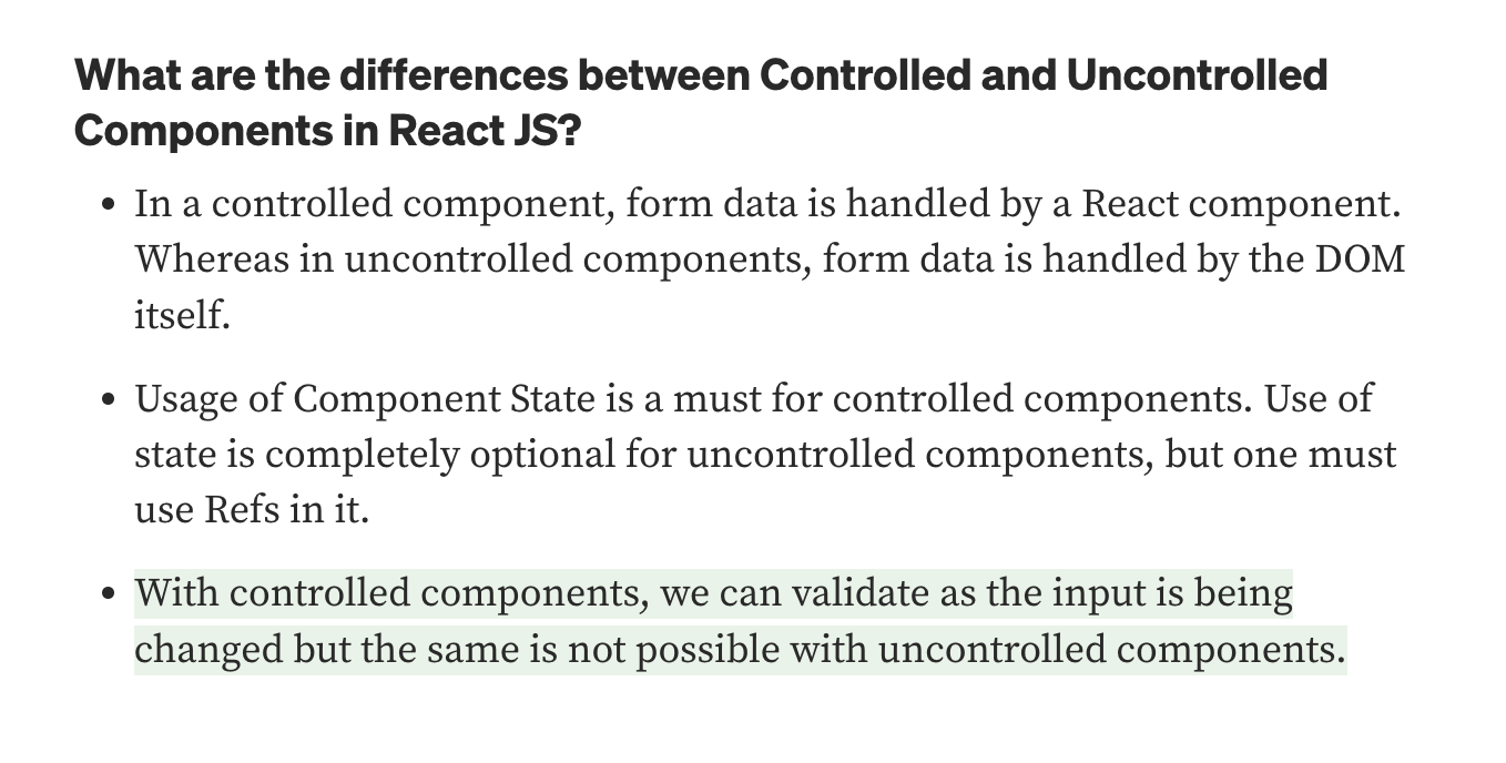
In short, the state of controlled components are controlled by React, vs. the state of uncontrolled components which are controlled by the DOM. Connecting a managed state with input value makes that input value a controlled component. Refs are used in uncontrolled components to access the input values. Uncontrolled components may be easier to use for smaller applications, but controlled components offer more effective control and consistency which is advantageous for bigger applications. React recommends using controlled components for implementing forms.
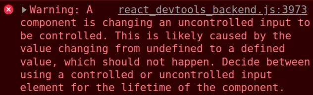
When a controlled input value is undefined, it essentially becomes uncontrolled, which triggers this error:
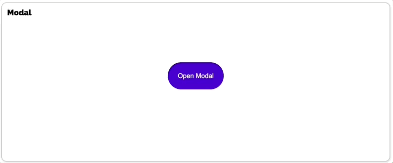
Modal
Takeaways
- No need for complicated methods for detecting clicks outside component if you use Ref's built-in
focus/blurmethods ModalBackdropis a parent component toModalViewin the DOM tree, which is why when theModalViewis clicked, the event bubbles toModalBackdropand triggers its onClick handler as well. This is problematic since we only want to trigger the handler when the click is detected outsideModalView. To do this, we need to use the stopPropagation() method withinModalView's event handler to suppress event bubbling.- Modal overlay is implemented by setting the div's CSS as
position: fixed styled.div.attrsuse case
Logical Flow
There is one state variable isOpen, and one event handler that toggles this state variable. When you click the ModalBtn component, its event handler toggles the isOpen state (turns it on), which then triggers a re-rendering of the Modal component. Since the state isOpen changed to true, the button text changes, and the ModalBackdrop and ModalView components are displayed. Clicking the x button or anywhere outside the ModalView window toggles the isOpen state off, which triggers a re-rendering that hides the modal state view (ModalBackdrop & ModalView).
//Styled Component Elements
import { useState } from 'react';
import styled from 'styled-components';

export const ModalContainer = styled.div`
  display: flex;
  flex-direction: row;
  color: black;
  align-items: center;
  justify-content: center;
  width: 100%;
  height: 100%;
  overflow: hidden;
`;

export const ModalBackdrop = styled.div`
  display: flex;
  align-items: center;
  justify-content: center;
  position: fixed;
  margin: 0;
  width: 100vw;
  height: 100vh;
  background: rgba(48, 48, 48, 0.75);
`;

export const ModalBtn = styled.button`

  background-color: var(--coz-purple-600);
  text-decoration: none;
  border: none;
  padding: 20px;
  color: white;
  border-radius: 30px;
  cursor: grab;
`;

export const ModalView = styled.div.attrs((props) => ({
  role: 'dialog',
}))`
  display: flex;
  flex-direction: column;
  justify-content: center;
  align-items: center;
  width: 400px;
  height: 100px;

  border: 1px solid black;
  background: white;
  border-radius: 25px;
  text-decoration: none;
  color: black;
`;
export const Modal = () => {
const [isOpen, setIsOpen] = useState(false);
const openModalHandler = () => {
setIsOpen(!isOpen);
};
//you don't need to put another onclick handler in a child component, because it already exists in a parent component!
return ( //clicking backdrop and x closes the window (parent->child propagation), and clicking the dialog box you need to stop event bubbling
<>
<ModalContainer>
<ModalBtn onClick={openModalHandler}>
{isOpen ? 'Opened!' : 'Open Modal'}
</ModalBtn>
{isOpen ? <ModalBackdrop onClick={openModalHandler}>
<ModalView onClick={e => e.stopPropagation()}><div onClick={openModalHandler}>×</div>Hello Codestates!</ModalView>
</ModalBackdrop> : null}
</ModalContainer>
</>
);
};Toggle
Takeaways
- Ampersand(&) usage in styled components - useful for adding classes and managing transitions
- & refers to all instances of the component and is used for applying broad overrides (&.green and & .green is different!)
- CSS transitions: set
transitionproperty inside CSS selectors
Logical Flow
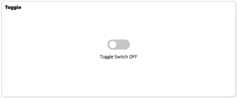
The togglehandler toggles the isOn state, which triggers a re-rendering of the component and adds a new class toggle--checked to the div components, which changes its CSS properties (toggles it on and off.)
import { useState } from 'react';
import styled from 'styled-components';

const ToggleContainer = styled.div`
  position: relative;
  margin-top: 8rem;
  left: 47%;
  cursor: pointer;

  > .toggle-container {
    width: 60px;
    height: 30px;
    border-radius: 40px;
    background: #8b8b8b;
    background: linear-gradient(to left, #8b8b8b 50%, var(--coz-purple-600) 50%) right;
    background-size: 200%;
    transition: .5s ease-out;
    ${'' /* when toggle--checked is also on, turn this on */}
    &.toggle--checked {
      background-position: left;
      transition: .4s ease-out;
    }
  }

  > .toggle-circle {
    position: absolute;
    top: 4px;
    left: 4px;
    width: 22px;
    height: 22px;
    border-radius: 50%;
    background-color: #ffffff;
    transition: left 0.5s;
    &.toggle--checked{
      left: 34px;
      transition: left 0.5s ease-out;
    }
  }
`;

const Desc = styled.div`
  display: flex;
  margin-top: 20px;
  justify-content: center;
  color: black;
  ${'' /* background: pink; */}
  ${'' /* width: 30%; */}

`;
export const Toggle = () => {
  const [isOn, setisOn] = useState(false);

  const toggleHandler = () => {
    setisOn(!isOn);
  };

  //onclick, trigger togglehandler
  //if toggle is on, add toggle--checked class
  //change description text depending on toggle state
  return (
    <>
      <ToggleContainer onClick={toggleHandler}>
        <div className={`toggle-container ${isOn ? 'toggle--checked' : ''}`}/>
        <div className={`toggle-circle ${isOn ? 'toggle--checked' : ''}`}/>
      </ToggleContainer>
      {isOn ? <Desc>Toggle Switch On</Desc> : <Desc>Toggle Switch Off</Desc>}
    </>
  );
};
Tabs
Logical Flow
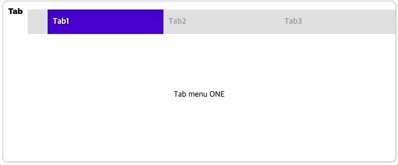
The menuArr array contains all the data for the tabs as individual objects with two keys: name, and content. Inside the TabMenu component, all the tabs are loaded as list items using the map function, each with an onclick handler that changes the currentTab index when clicked. When the state change triggers a re-rendering, the Desc component loads the content of the currentTab, and the focused class is added to the individual tab item that corresponds to the currentTab index (which changes its color.)
The Tabs component is re-rendered every time a tab is clicked, even when the currently displayed tab is clicked again . This can be revised so that state changes only occur when the clicked tab is different from the currently loaded one, which may decrease some redundant flickering.
Structure
- data:
menuArrincludes data for all tabs - 1 managed state:
currentTab(index), updated on click (selectMenuHandlerupdates state) - 2 styled components:
TabMenu(actual tab) &Desc(tab content)TabMenucreates the overall tab line, and the classsubmenuwithin it determines the overall style of the individual tabs- each submenu's width is calculated by dividing the whole width into 1/3
- The clicked tab overrides its style to
.focused Descdefines the style for the tab content, which is also dependent on the currentTab index- What is & div.desc? - doesn't seem to work anywhere!
const TabMenu = styled.ul`
  background-color: #dcdcdc;
  color: rgba(73, 73, 73, 0.5);
  font-weight: bold;
  display: flex;
  flex-direction: row;
  justify-items: center;
  align-items: center;
  list-style: none;
  margin-bottom: 7rem;

  .submenu {
    padding: 10px 50px 10px 4px;
    color: darkgray;
    width: calc(100%/3);
  }

  .focused {
    color: white;
    background-color: var(--coz-purple-600);
  }

  & div.desc {
    text-align: center;
  }
`;

const Desc = styled.div`
  text-align: center;
`;
export const Tab = () => {
// manage what tab is currently selected
const [currentTab, setCurrentTab] = useState(0);
const menuArr = [
{ name: 'Tab1', content: 'Tab menu ONE' },
{ name: 'Tab2', content: 'Tab menu TWO' },
{ name: 'Tab3', content: 'Tab menu THREE' },
];
//triggered on clicking a different tab, tab content changes depending on what the currenttab is
const selectMenuHandler = (index) => {
setCurrentTab(index);
};
return (
<>
<div>
<TabMenu>
{/* adds a class depending on whether it is the currentab or not*/}
{/* onclick, the currenttab is updated (passes idx)*/}
{menuArr.map((menu, idx)=> {
return <li key={idx}
className={currentTab === idx ? 'submenu focused' : 'submenu'}
onClick={()=>selectMenuHandler(idx)}
>{menu.name}
</li>;
})}
</TabMenu>
<Desc>
{/* show content of current tab*/}
<p>{menuArr[currentTab].content}</p>
</Desc>
</div>
</>
);
};Tags
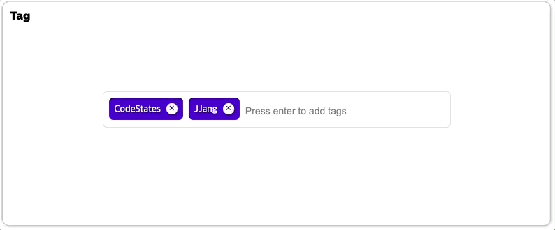
Logical Flow
The Tags Component loadstags (initialized with initialTags) as unordered list items with the map function. Each tag contains a "tag" class, with a "tag-title" and "tag-close-icon" class element stylized via styled components. Clicking the close-icon span element triggers the removeTags handler which updates the state of tags (filtering out the clicked element), and this state change triggers a re-rendering to update the view to match the new tags state. Typing something into the input box updates the newTag state, and what is typed(newTag) is added to tags when the Enter key is clicked (but only if the tag does not already exist in tags, and is not an empty string. the newTag state is initialized into an empty string once tag adding is complete.) When the view is updated with the state change, the new tag appears alongside pre-existing ones.
Structure
TagsInput: styled component that defines the following styles: how the tags appear in a row, individual tags when added (including the tag close icon), and input box for creating new tags (including when the box is focused)- Two states:
tags(current tag list), andnewTag(new tag being made before it is added)newTagis updated with every key being typed, and only when the Enter key is clicked is the newTag added to thetagslist and then initialized to an empty stringtagsis initialized with two strings ininitialTags
- Two event handlers:
addTags&removeTagsaddTags: triggered when Enter key is clicked from input box- only adds target value if it's not an empty string, and if it's not already included in the tags list
- initializes the
newTagstate
removeTags: triggered when x button is clicked. the tag's index is passed to the handler, which uses the index to filter the current tag list (the most compact way of updating current tag list)
- The component is re-rendered on every keystroke!
//Tag.js
import { useState } from 'react';
import styled from 'styled-components';

export const TagsInput = styled.div`
  margin: 8rem auto;
  display: flex;
  align-items: flex-start;
  flex-wrap: wrap;
  min-height: 48px;
  width: 480px;
  padding: 0 8px;
  border: 1px solid rgb(214, 216, 218);
  border-radius: 6px;

  > ul {
    display: flex;
    flex-wrap: wrap;
    padding: 0;
    margin: 8px 0 0 0;

    > .tag {
      width: auto;
      height: 32px;
      display: flex;
      align-items: center;
      justify-content: center;
      color: #fff;
      padding: 0 8px;
      font-size: 14px;
      list-style: none;
      border-radius: 6px;
      margin: 0 8px 8px 0;
      background: var(--coz-purple-600);
      > .tag-title{
        color: white;
      }
      > .tag-close-icon {
        display: block;
        width: 16px;
        height: 16px;
        line-height: 16px;
        text-align: center;
        font-size: 10px;
        margin-left: 8px;
        color: var(--coz-purple-600);
        border-radius: 50%;
        background: #fff;
        cursor: pointer;
      }
    }
  }

  > input {
    flex: 1;
    border: none;
    height: 46px;
    font-size: 14px;
    padding: 4px 0 0 0;
    :focus {
      outline: transparent;
    }
  }

  &:focus-within {
    border: 1px solid var(--coz-purple-600);
  }
`;
export const Tag = () => {
const initialTags = ['CodeStates', 'kimcoding'];
const [tags, setTags] = useState(initialTags);
const [newTag, setNewTag] = useState('');
//triggered when x is clicked
//copies taglist to avoid directly changing state variable
const removeTags = (indexToRemove) => {
//const tagsCopy = tags.slice();
//tagsCopy.splice(indexToRemove, 1)
//setTags(tagsCopy);
//could use filter instead!
setTags(tags.filter((el, idx) => idx !== indexToRemove))
};
//in addition to adding tags when enter is clicked, this method
//1. checks if the tag already exists before adding the tag
//2. if there is no input, does not add tag
//3. once a tag is added, the input value is emptied
const addTags = (event) => {
if(event.target.value.length){ //when there is no input, no tag added
if(!tags.includes(event.target.value)){
setTags([...tags, event.target.value]);
setNewTag('');
}
}
};
const newTagHandler = e => {
setNewTag(e.target.value);
}
return (
<>
<TagsInput>
<ul id="tags">
{tags.map((tag, index) => (
<li key={index} className="tag">
<span className="tag-title">{tag}</span>
<span className="tag-close-icon" onClick={()=> removeTags(index)}>×</span>
</li>
))}
</ul>
<input
className="tag-input"
type="text"
value={newTag}
onChange={newTagHandler}
onKeyUp={(e) => {
{
if (e.key==='Enter'){
addTags(e);
}
}
}}
placeholder="Press enter to add tags"
/>
</TagsInput>
</>
);
};AutoComplete (Advanced)
Takeaways
- Use
useEffectto initialize dropdown selected state to -1 whenever the input changes - Use
useEffectto update options as input value changes - Use
filterinstead of pushing related elements in new array (my initial choice) to filter relevant options
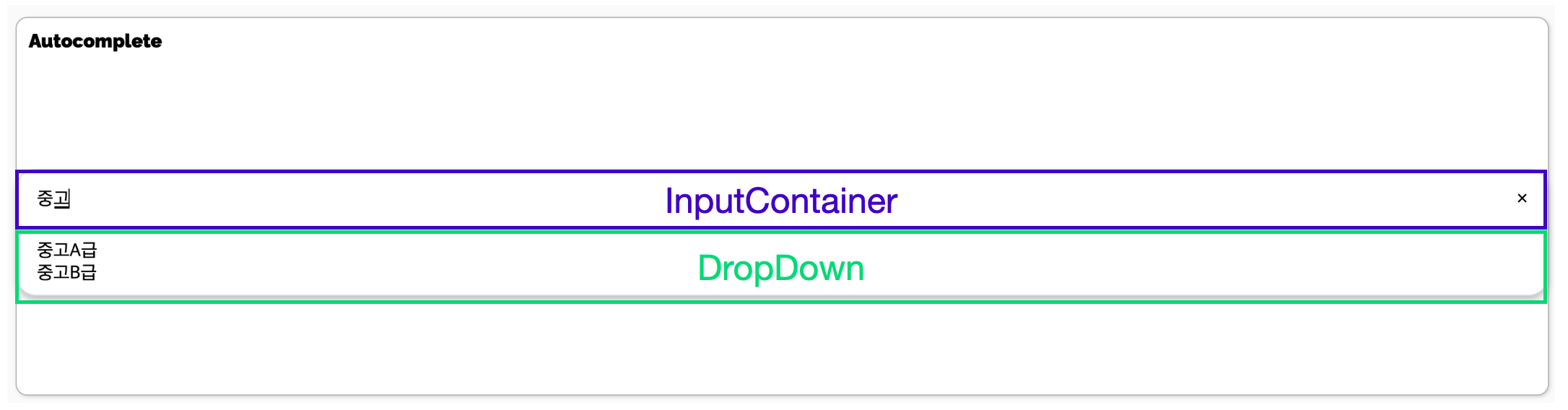
Functional logic
- 3 states:
hasText: state for deciding whether to show dropdown or notinputValue: controlled componentoptions: state for options relevant to changing input value
Click to Edit (Advanced)
Takeaways
- input property
onBlur: event when an input loses focus (e.g. the user clicks somewhere outside the input), can be hooked to an event handler that exits edit mode when this happens
Logical Flow
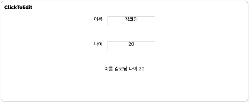
When the span element is clicked, its event handler handleClick changes the isEditMode state to true, and this state change triggers the following:
- a re-rendering of the
MyInputcomponent which then displays theInputEditcomponent instead of the span element - the
MyInputcomponent receives focus, since auseEffecthook is used to turn the Ref focus on withisEditModeas a dependency
In edit mode we can type the text we want into the input, and any changes in input fires the handleInputChange handler, which updates the state variable newValue to match what is being typed. To exit edit mode, we can either press and either press the Enter key or click anywhere else with the mouse. Any key or blur event invokes the handleBlur handler which does the following:
- changes the state of
isEditModeto false (if it's a key event, only when the key is 'Enter') - passes the state variable
newValuetohandleValueChangeto update the parent component's state variablename&age, which triggers a re-rendering of the parent component to reflect the changes in its text description- The
MyInputchild components are then re-rendered to updatenewValueto match the parent state variable value throughuseEffect
- The
Structure
MyInputcomponent (each input component)- Props
value: for initializing newValue(input value state)handleValueChange: updates state variable managed in parent component to reflect input changes in child component
- Ref variable
inputEl: reference for the input component (to turn its focus on when in edit mode), linked to input ref property
- State variables:
isEditMode: switch condition for entering and exiting edit modenewValue: updated input value, linked to input value property
- Event handlers:
handleClick: when span is clicked, turns edit mode onhandleBlur: when anywhere else is clicked, turns edit mode off, then updates parent component state to match newValuehandleInputChange: updates newValue to match changes in input
- Props
ClickToEditComponent- State variables:
name: initialized to cache object's name value, then passed down toMyInputas propsage: initialized to cache object's age value, then passed down toMyInputas props
- Event handlers:
handleValueChange: declared inline, passed down toMyInputas props to update parent state variables depending on input interaction
- State variables:
export const MyInput = ({ value, handleValueChange }) => {
  const inputEl = useRef(null);
  const [isEditMode, setEditMode] = useState(false);
  const [newValue, setNewValue] = useState(value);

  useEffect(() => {
    if (isEditMode) {
      inputEl.current.focus();
    }
  }, [isEditMode]);

  useEffect(() => {
    setNewValue(value);
  }, [value]);

  const handleClick = () => { //change editState
    // console.log('change mode!');
    setEditMode(!isEditMode);
  };

  const handleBlur = (e) => { //change editState
    if ( e.key && e.key==="Enter"){
      setEditMode(false);
    }else if (!e.key){ //if it's not a key event
      setEditMode(false);
    }
    handleValueChange(newValue);
  };

  const handleInputChange = (e) => { //update value to what's typed
    setNewValue(e.target.value);
  };

  return ( //onClick to the entire InputBox
    <InputBox>
      {isEditMode ? (
        <InputEdit
          type='text'
          value={newValue}
          ref={inputEl} //reference for each input element
          onChange={handleInputChange} //when input changes, update state variable
          onBlur={handleBlur} //when it loses focus, exit edit mode
          onKeyDown={handleBlur} //on clicking enter, exit edit mode
        />
      ) : (
        <span
        onClick={handleClick} //when clicked, enter edit mode
        >{newValue}</span>
      )}
    </InputBox>
  );
}
const cache = {
  name: '김코딩',
  age: 20
};

export const ClickToEdit = () => {
  const [name, setName] = useState(cache.name);
  const [age, setAge] = useState(cache.age);

  return (
    <>
      <InputView>
        <label>이름</label>
        <MyInput value={name} handleValueChange={(newValue) => setName(newValue)}/>
      </InputView>
      <InputView>
        <label>나이</label>
        <MyInput value={age} handleValueChange={(newValue) => setAge(newValue)}/>
      </InputView>
      <InputView>
        <div className='view'>이름 {name} 나이 {age}</div>
      </InputView>
    </>
  );
};
References
React: Responding to Events
Detect click outside React component
Controlled vs. Uncontrolled Elements
*What are controlled and uncontrolled components in React JS? Which one to use?
Controlled vs uncontrolled React components - why not both?
Styled Components
[TIL] styled-component 활용하기
Styled Components: Basics
12 Coding Examples of Ampersand Usages in Styled Components
Understanding styled components component selector and ampersand (StackOverflow)
Keyboard Interactions
Building accessible Select component in React
Codepen: Accessible Select: 4. Keyboard Interactions
Codepen: keyboard-navigable list in React