
Component-Driven Approach to Development (CDD)
Google "component-driven development" and the first search result yields:
Keywords for CDD include 'bottom-up' and reusability. A components-based approach empowers developers to flexibly respond to changes in design needs as they arise. You can readily re-tool, re-purpose and expand on components to use as building blocks for increasingly complex designs and demands.
Breaking down the UI from the start into independent components (styles and functionality) that are re-usable, consistent, and configurable obviously demands more pre-planning and structured, logical thinking than winging it as you go. It definitely requires an adjustment in thinking, but its benefits will become only more acutely apparent with time as the project grows in size and complexity and involves more and more people. Components-based thinking and framework can also facilitate collaboration and teamwork between developers and designers. Putting in the effort from the beginning and with every update would ultimately save a lot more pain in the future.
Structured Approaches to CSS
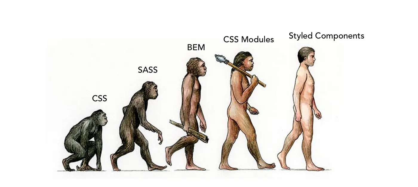
(For a deep dive into how CSS has evolved to its present form, this article is a gem.)
CSS Preprocessors
It doesn't take much for stylesheets to grow into an uncontrollably large mess that becomes more and more difficult to make sense of and maintain. SASS (short for syntactically awesome style sheets) emerged as a means of making CSS code easier to write, maintain, and organize. It extended CSS functionalities by making it possible to use "variables, if/else statements, for/while/each loops, inheritance, and other computational logic in their CSS code." (1) It provided some way for users to split their CSS code into smaller, re-usable pieces that got compiled into a global css file.
CSS Methodologies
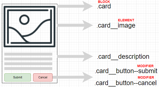
SASS apparently created as much, if not more, (new) problems than it purportedly solved. Its dire drawbacks did pave way for methodologies such as BEM, OOCSS, SMACSS, which strove to apply some form of structural consistency to writing CSS code. These methodologies all share the following objectives:
- Code Reusability
- Easy Maintainability
- Expandability
- Predictability
(e.g. meaningful semantic class naming conventions)
These are all factors that vastly impact teamwork - but like SASS that came before it, approaches such as BEM solved some problems but caused new ones. They are still important in understanding the problem space of CSS and constantly evolving best practices.

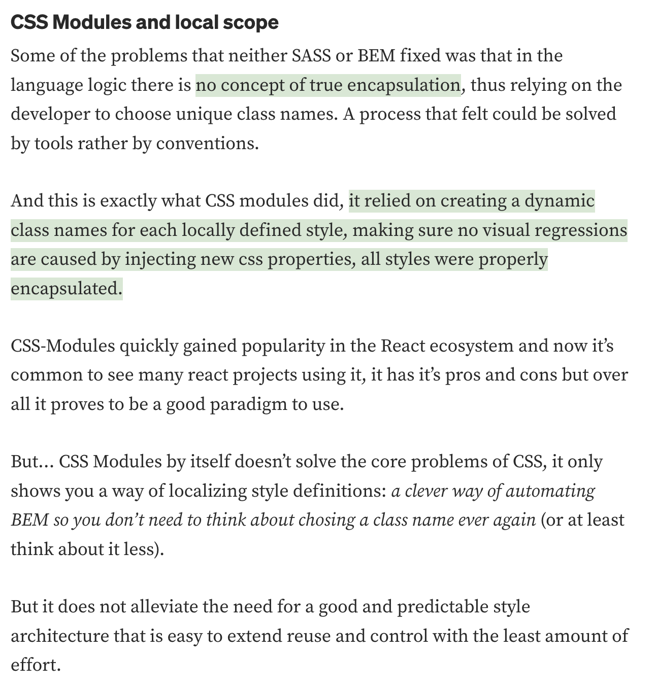
CSS Modules
Excerpt from this article (a gem if you're looking for a deep dive into how CSS has evolved to its present-day form):
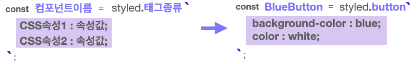
CSS-in-JS: Styled Components
React's Styled-Components library component-ifies CSS! Using this library, we can break down stylization into readily deployable, reusable, expandable components that also accept props to adapt its properties.
Basic Template
const BlueButton = styled.button`
	background: blue;
	color: white;
`
Installation
# with npm
npm install --save styled-components

# with yarn
yarn add styled-components
add this to package.json:
{
  "resolutions": {
    "styled-components": "^5"
  }
}
then import into the component like below:
//MY TEMPLATE FOR USING STYLED COMPONENTS!
import "./styles.css";
import styled from 'styled-components'; //import library
import { createGlobalStyle } from "styled-components";
//setting a global style to apply to the topmost component
//padding, border-radius would be overridden by PracButton settings,
//since it has higher specificity
const GlobalStyle = createGlobalStyle`
button {
padding : 5px;
margin : 2px;
border-radius : 5px;
}
`
//use template literals, and &:hover
//how to use props to dynamically define style properties
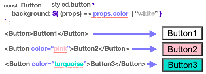
const PracButton = styled.button`
padding: 1rem;
font-size: 2rem;
background: ${props => props.color || 'black'};
border-radius: 1rem;
transition: 0.5s;
&:hover{
background: ${(props) => props.hoverColor || "cornflowerblue"};
color: white;
transition: 0.5s;
}
`;
export default function App() {
// return <button id="practice">Practice!</button>;
return (
<>
<GlobalStyle />
<PracButton color="turquoise">Practice!</PracButton>
<PracButton hoverColor="turquoise">Practice!</PracButton>
</>
)
}(1) Normal / (2) Hover over right button / (3) Hover over left button


Re-using components to build new ones: Template
const BigBlueButton = styled(BlueButton)`
	padding: 10px;
	margin-top: 10px;
`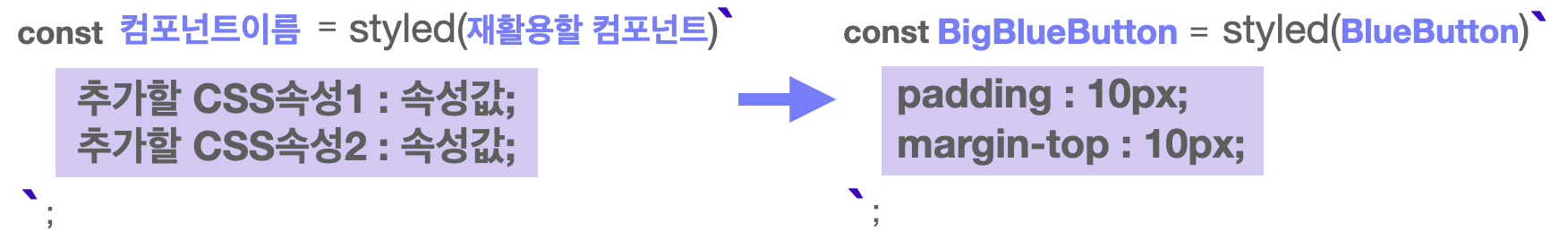
const BlueButton = styled.button`
  background-color: blue;
  color: white;
`;

//Built on top of button
const BigBlueButton = styled(BlueButton)`
  padding: 10px;
  margin-top: 10px;
`;

//Stackable
const BigRedButton = styled(BigBlueButton)`
  background-color: red;
`;

export default function App() {
  return (
    <>
      <BlueButton>Blue Button</BlueButton>
      <br />
      <BigBlueButton>Big Blue Button</BigBlueButton>
      <br />
      <BigRedButton>Big Red Button</BigRedButton>
    </>
  );
}
Comparison: A Summary
| Characteristics | Pros | Cons | |
|---|---|---|---|
| CSS | Basic styling method | - | • Enforcing consistent pattern difficult • Abuse of !important |
| SASS | Employs computational methods to create compiled CSS (preprocessor) | • Applies concepts like variables, functions, inheritance • Re-usable • Structured approach to CSS | • Preprocessing makes it hard to debug • Compiled CSS file grows enormous |
| BEM | Methodology that enforces a consistent pattern for naming classes | • Naming convention takes out guesswork • No preprocessing needed | • Long-ass names • Too many classes |
| Styled Component | LIbrary that allows component-based CSS writing | Encapsulation of CSS • No need to worry about naming or optimization | Not optimal for quickly loading page |
Component-Driven UI (Storybook)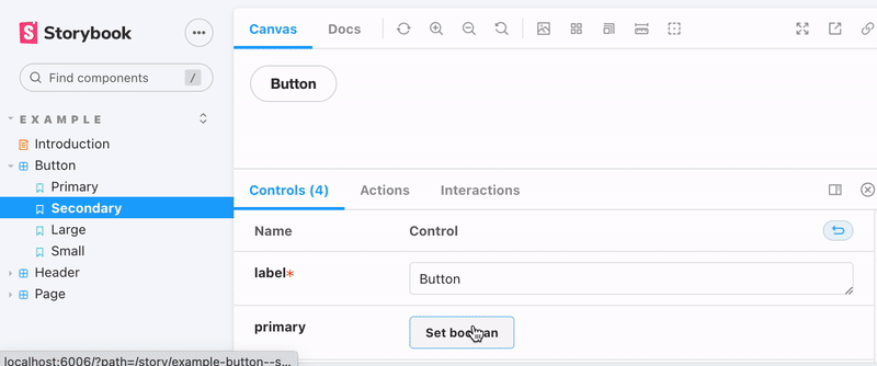
Storybook is a JavaScript tool that allows developers to create organized UI systems making both the building process and documentation more efficient and easier to use.
.
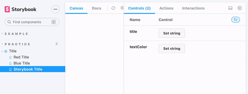
Once you build out a component, Storybook lets you create a "story" file where you can then import your component and create various use case examples in an iFramed sandbox using that component.
.
This provides an organized and focused environment to build new components and work on existing ones. (link)
Storybook enables developers to build UI components in isolation using independent building blocks. With Storybook, you can quickly create UI components using your favorite framework while also providing a decluttered interface to work on each component. (link)
Installing Storybook
npx create-react-app storybook-practice
npx storybook init
npm i @testing-library/dom
npm run storybook
npm8 & storybook workaround: 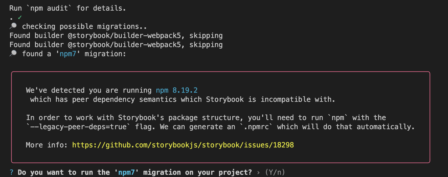
Follow this tutorial to learn more.
Practice: A Template
//Title.js
import React from "react";
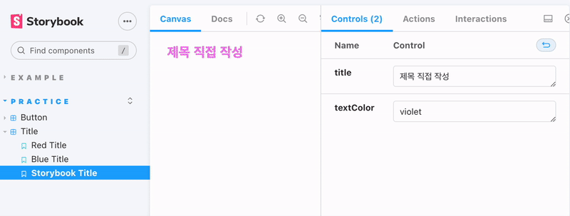
// title은 h1 요소의 textContent, textColor은 글자색이 되는 props입니다.
const Title = ({title, textColor}) => (
<h1 style={{color: textColor}}>{title}</h1>
);
export default Title;title: "Practice/Title"
Template.bind({});
//Title.stories.js
// 앞에서 작성한 컴포넌트를 불러옵니다.
import Title from "./Title";

// title : 컴포넌트 이름으로, '/'를 넣어 카테고리화 할 수 있습니다.
//         이후 예시에서 조금 더 자세히 설명합니다.
// component : 어떤 컴포넌트를 가져와서 스토리로 만들 것인지 명시합니다.
// argTypes : 컴포넌트에 필요한 전달인자의 종류와 타입을 정해줍니다.
//            지금은 title, textColor이라는 전달인자에 text 타입이 필요함을 의미합니다.
export default {
    title: "Practice/Title",
    component: Title,
    argTypes: {
        title: { control: "text" },
        textColor: {control: "text"}
    }
}

// 템플릿을 만들어줍니다. 이 템플릿에서는
// Title 컴포넌트가 args를 전달받아 props로 내려줍니다.
const Template = (args) => <Title {...args} />

// Storybook에서 확인하고 싶은 컴포넌트는 export const로 작성합니다.
// 템플릿을 사용하여 Storybook에 넣어줄 스토리를 하나 만들어주었습니다.
// Template.bind({}); 는 정해진 문법이라고 생각하고 사용하시면 됩니다.
export const RedTitle = Template.bind({});

// 만들어준 스토리의 전달인자를 작성해줍니다.
RedTitle.args= {
    title: "Red Title",
    textColor: "red"
}

// 스토리를 하나 더 만듭니다.
export const BlueTitle = Template.bind({});

// 스토리의 전달인자를 작성해줍니다.
BlueTitle.args= {
    title: "Blue Title",
    textColor: "blue"
}

export const StorybookTitle = (args) =>{
    return <Title {...args} />
}
//Button.js
import React from 'react';
import styled from 'styled-components';

const StyledButton = styled.button`
    background: ${props => props.color || 'white'};
    width: ${props => props.size === 'big'? '200px' : '100px'};
    height: ${props => props.size === 'big'? '80px' : '40px'};
`

const Button = (({color, size, text}) => <StyledButton color={color} size={size} >{text}</StyledButton>)

export default Button;
//Button.stories.js
// 컴포넌트를 불러옵니다.
import Button from "./Button";
export default {
title: "Practice/Button",
component: Button,
// 이번에 작성한 전달인자의 타입은 Storybook을 보고 직접 확인해보세요.
argTypes: {
color: { control: 'color'},
size: { control: { type:'radio', options : ['big', 'small'] }},
text: { control: 'text'}
}
};
export const StorybookButton = (args) => (
<Button {...args}></Button>
)
References
Component Driven User Interfaces
What is component-driven development and why to use it
CSS
CSS Evolution: From CSS, SASS, BEM, CSS Modules to Styled Components
On the Growing Popularity of Atomic CSS
Popular CSS Preprocessors With Examples: Sass, Less & Stylus
[CSS방법론] SMACSS, BEM, OOCSS (2015)
CSS-in-JS
Styled Components: Basics
Advanced: Organize styled-components theme in React with Functional Programming
Storybook
Intro to Storybook for React
Storybook React: A Beginner's Tutorial to UI Components
Fix NPM7 peer dependencies
What is Storybook and How Can I Use It to Create a Component Library in React?

Sales development is a crucial component of any successful business strategy, focusing on identifying and nurturing potential leads to drive revenue growth. By leveraging data-driven insights and targeted outreach, sales development teams can effectively engage prospects and qualify them for the sales pipeline. A platform like Promogen.org can enhance these efforts by providing valuable tools and resources for tracking engagement, managing relationships, and optimizing communication strategies. With its user-friendly interface and robust features, Promogen.org empowers sales development professionals to streamline their processes, increase productivity, and ultimately convert more leads into loyal customers, fostering long-term business success.