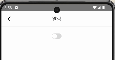
토글을 Switch 컴포넌트로 만들었더니 iOS랑 Android의 기본 Switch 디자인이 다른거였다!
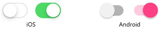
iOS는 내가 기대한 디자인대로 잘 나왔는데 Android는 저렇게 못생기게(?) 나왔다.
iOS에서만 테스트하거나 Android에서만 테스트 했으면 몰랐을 것들이 많다.. 항상 크로스 체크를 하자 ✅
아무튼 Switch 컴포넌트의 스타일을 바꿀 수 있나 찾아봤는데.. 결국 토글 버튼을 내가 직접 구현하는 방법밖에 없었다.
나는 typescript와 styled-components를 쓰고있다. 혹시 다른 스타일을 쓰고 계시다면 챗GPT에게 물어봐서 수정하기를..
import React, {useEffect} from 'react';
import styled from 'styled-components/native';
import {Animated, Easing} from 'react-native';
import {colors} from '@/styles/colors';

type Props = {
  onToggle: () => void;
  isOn: boolean;
};

const Toggle = ({onToggle, isOn}: Props) => {
  const [animatedValue] = useState(new Animated.Value(isOn ? 1 : 0));

  useEffect(() => {
    Animated.timing(animatedValue, {
      toValue: isOn ? 1 : 0,
      duration: 200,
      easing: Easing.linear,
      useNativeDriver: false,
    }).start();
  }, [isOn, animatedValue]);

  const translateX = animatedValue.interpolate({
    inputRange: [0, 1],
    outputRange: [1, 17],
  });

  const color = isOn ? colors.main : colors.backgroundGray;

  return (
    <ToggleContainer onPress={onPress} color={color}>
      <ToggleWheel
        style={{
          transform: [{translateX}],
        }}
      />
    </ToggleContainer>
  );
};

export default Toggle;

const ToggleContainer = styled.TouchableOpacity<{color: string}>`
  width: 36px;
  height: 20px;
  border-radius: 10px;
  justify-content: center;
  background-color: ${props => props.color};
`;

const ToggleWheel = styled(Animated.View)`
  width: 18px;
  height: 18px;
  background-color: white;
  border-radius: 99px;
`;

잘 나온다!

개발괴발