styled-components 란?
- javascript에서 css를 사용할 수 있도록 도와주는 CSS-in-JS 스타일링 프레임워크다.
- styled-components는 React 컴포넌트 시스템의 스타일링을 위해 CSS를 어떻게 향상시킬 수 있는지 궁금해한 결과이다.
- React와 React Native 모두에서 사용할 수 있다.
React 컴포넌트 스타일링
React 컴포넌트의 스타일을 지정하는 방법에는 여러 가지가 있다.
외부 CSS파일에서 CSS를 사용
전통적인 방법이다.
//Movie.module.css
.movie__title {
	background-color: red;
    color: white;
}
//Movie.js
import styles from "./Movie.module.css";
function Movie({title}) {
return (
<div className={styles.movie__title}>
<h1>{title}</h1>
</div>
)
}애플리케이션이 비대해지면 css파일이 점점 커지고 복잡해지기 시작한다. 이에 대한 솔루션으로 SASS가 도입되고 도움도 되지만 추상화 조차도 그 자체로 복잡해지기 시작한다.
sass는 mixin을 통해 공통 패턴을 의미적이고 재사용 가능한 덩어리로 추상화 가능하다.
React 구성 요소 내부에 CSS를 사용
//Movie.js
function Movie({title}) {
	return (
    	<div style={{backgroundColor: "red", color: "white"}}>
      		<h1>{title}</h1>
      	</div>
    )
}
이 방법은 지속 가능하지도 확장이 가능하지도 않기 때문에 권장하지 않는다.
CSS-in-JS
javascript를 사용하여 구성 요소의 스타일을 지정하는 기술이다.
이 javascript가 구문 분석되면 CSS가 스타일 요소로 생성되어 DOM 위에 직접 첨부된다.
styled-components, Emotion, JSS, Radium, Aphrodite 등의 프레임워크가 많이 있다.
그중 styled-components가 가장 인기가 많다.
styled-components 시작하기
- 설치
npm i styled-components - styled-components를 import 해준다.
import styled from "styled-components";예제
노마드코더 강의의 예제를 정리
1.
import styled from "styled-components";

const Father = styled.div`
	display: flex;
`;
const BoxOne = styled.div`
  background-color: teal;
  width: 100px;
  height: 100px;
`;
const BoxTwo = styled.div`
  background-color: tomato;
  width: 100px;
  height: 100px;
`;

function App() {
  return (
    <Father>
      <BoxOne />
      <BoxTwo />
    </Father>
  );
}
export default App;
변수를 생성하면서 import 해준 styled. 뒤에 HTML요소를 적고 백틱을 입력해서 적용하고 싶은 스타일을 입력해주면 된다.
그리고 해당 스타일이 적용된 요소를 넣고 싶은 부분에 생성한 변수명을 넣어준다.
2.
위의 예제를 보면 스타일이 중복된 값이 있음을 볼 수 있다.
그걸 더 깔끔하게 적용해보자.
import styled from "styled-components";

const Father = styled.div`
	display: flex;
`;
const Box = styled.div`
  background-color: ${(props) => props.bgColor};
  width: 100px;
  height: 100px;
`;

function App() {
  return (
    <Father>
      <Box bgColor="teal" /> {/*bgColor는 props로 보낸다.*/}
      <Box bgColor="tomato" />
    </Father>
  );
}
export default App;
위의 예제보다 짧은 코드로 같은 화면이 완성된다.
<Box bgColor="teal" /> 에서 bgColor 는 정해진 값이 아니다.
background-color: ${(props) => props.bgColor}; props. 뒤에 오는 문자와 동일하면 된다.
3.
다른 스타일을 간편하게 가져다 확장해서 스타일을 적용해 사용할 수 있다.
import styled from "styled-components";

const Father = styled.div`
	display: flex;
`;
const Box = styled.div`
  background-color: ${(props) => props.bgColor};
  width: 100px;
  height: 100px;
`;
const Circle = styled(Box)`
  border-radius: 50px;
`

function App() {
  return (
    <Father>
      <Box bgColor="teal" /> {/*bgColor는 props로 보낸다.*/}
      <Circle bgColor="tomato" />
    </Father>
  );
}
export default App;
const Circle = styled(Box) styled. 뒤에 요소를 안넣고 괄호 안에 생성한 요소 스타일을 넣어 확장해서 사용할 수 있다.
4. as
예를 들어 Button 태그에 스타일을 적용했지만 Button 뿐만이 아닌 다른 태그에도 해당 스타일을 적용하고 싶을때 사용한다.
위의 예제처럼 styled() 해서 사용도 가능하겠지만 확장이 목적이 아닌 그대로 사용하려는 것이기에 사용하기에 적절하지 못하다.
이때 as에 태그명을 적어 props로 보내주면 된다.
import styled from "styled-components";

const Father = styled.div`
  display: flex;
`;
const Btn = styled.button`
  color: white;
  background-color: tomato;
  border: 0;
  border-radius: 15px;
`;

function App() {
  return (
    <Father>
      <Btn>Log in</Btn>
      <Btn as="a" href="/">
        Log in
      </Btn>
    </Father>
  );
}
export default App;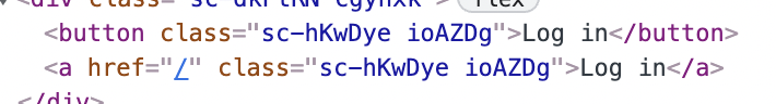
button 태그에 적용한 스타일이 as를 사용함으로서 a태그로 바뀌는것을 볼 수 있다.
5. attrs
위의 방법들은 스타일을 적용하기 위해 사용되었는데 attrs를 사용하면 태그의 속성도 적용이 가능하다.
import styled from "styled-components";

const Father = styled.div`
  display: flex;
`;
const Input = styled.input.attrs({ required: true })`
  background-color: tomato;
`;

function App() {
  return (
    <Father as="header">
      <Input />
      <Input />
      <Input />
      <Input />
      <Input />
    </Father>
  );
}
export default App;
Input에 required 속성을 모두 적용한 것이다.
styled.input.attrs({ required: true, minLength: 10 })
이런식으로 속성을 추가할 수 있다.
6. animations
import styled, { keyframes } from "styled-components";

const Wrapper = styled.div`
  display: flex;
`;
const rotationAnimation = keyframes`
  0% {
    transform:rotate(0deg);
    border-radius:0px;
  }
  50% {
    border-radius:100px;
  }
  100%{
    transform:rotate(360deg);
    border-radius:0px;
  }
`;

const Box = styled.div`
  height: 200px;
  width: 200px;
  background-color: tomato;
  display: flex;
  justify-content: center;
  align-items: center;
  animation: ${rotationAnimation} 1s linear infinite;
  span {
    font-size: 36px;
    &:hover {
      font-size: 48px;
    }
    &:active {
      opacity: 0;
    }
  }
`;

function App() {
  return (
    <Wrapper>
      <Box>
        <span>🤩</span>
      </Box>
    </Wrapper>
  );
}
export default App;
import를 해주고 keyframes를 통해 애니메이션을 줄 수 있다.(css의 @keyframes과 같음.)
그리고 scss처럼 styled.div`` 안에 span{}, &: 등과 같이 태그를 입력해서 스타일을 적용해줄 수 있다.
7.
위의 예제는 span과 같이 태그명에 의존해서 스타일을 적용한다. 태그명에 의존하고 싶지 않을때를 예로 들자.
import styled, { keyframes } from "styled-components";

const Wrapper = styled.div`
  display: flex;
  height: 100vh;
  width: 100vw;
  justify-content: center;
  align-items: center;
`;
const rotationAnimation = keyframes`
  0% {
    transform:rotate(0deg);
    border-radius:0px;
  }
  50% {
    border-radius:100px;
  }
  100%{
    transform:rotate(360deg);
    border-radius:0px;
  }
`;

const Emoji = styled.span`
  font-size: 36px;
`;

const Box = styled.div`
  height: 200px;
  width: 200px;
  background-color: tomato;
  display: flex;
  justify-content: center;
  align-items: center;
  animation: ${rotationAnimation} 1s linear infinite;
  ${Emoji}:hover {
    font-size: 98px;
  }
`;

function App() {
  return (
    <Wrapper>
      <Box>
        <Emoji>🤩</Emoji>
      </Box>
      <Emoji>🔥</Emoji>
    </Wrapper>
  );
}
export default App;
${Emoji}:hover 와 같이 styled components 자체를 타겟팅 할 수 있다.
<Box> 안의 <Emoji>만 hover 가 적용된다.
8. themes
다크모드를 구현할때 50% 정도를 담당한다고 한다. (나머지 50%는 local Estate Management)
//App.js
import styled from "styled-components";

const Title = styled.h1`
  color: ${(props) => props.theme.textColor};
`;
const Wrapper = styled.div`
  display: flex;
  height: 100vh;
  width: 100vw;
  justify-content: center;
  align-items: center;
  background-color: ${(props) => props.theme.backgroundColor};
`;

function App() {
  return (
    <Wrapper>
      <Title>Hello</Title>
    </Wrapper>
  );
}
export default App;
//index.js
import React from "react";
import ReactDOM from "react-dom";
import App from "./App";
import { ThemeProvider } from "styled-components";
const darkTheme = {
textColor: "whitesmoke",
backgroundColor: "#111",
};
const lightTheme = {
textColor: "#111",
backgroundColor: "whitesmoke",
};
ReactDOM.render(
<React.StrictMode>
<ThemeProvider theme={darkTheme}>
<App />
</ThemeProvider>
</React.StrictMode>,
document.getElementById("root")
);위에서 보면 알수있듯이 ThemeProvider를 사용하면 App.js 에서 ${(props) => props.theme.backgroundColor}를 사용하여 스타일을 일일이 바꿔줄 필요없이 ThemeProvider theme={} 에 지정한 object의 내용만 바꿔주면 알아서 적용이 된다.
ThemeProvider theme={} 에 lightTheme, darkTheme를 바꿔 넣어보면 바뀌는것을 알 수 있다.
property의 이름은 똑같아야된다.
Reference
https://dkje.github.io/2020/10/13/StyledComponents
https://nomadcoders.co/react-masterclass
https://blog.logrocket.com/benefits-using-styled-components-react
https://styled-components.com/docs/basics