
Plotly란?
Plotly는 클릭에 반응하는 인터렉티브한 그래프(3D 그래프, 파이 차트 등등)를 만들 수 있고,
다양한 언어(Python, JavaScript, R 등등)를 지원하는 오픈소스 그래프 라이브러리이다.
Plotly 공식 사이트(Python)
Plotly 기본이해
-
Plotly를 통해 그래프를 그리는 방법은 크게 2가지가 있다.
plotly.graph_objects를 사용하는 경우 그래프의 구성요소를 세부적으로 지정해주는 방식으로 그래프에 대한 디테일한 커스텀이 가능하다. (본 게시글에서 다루는 방법)plotly.express를 사용하는 경우 graph_objects를 API 형식으로 제공하는 방법으로 데이터만을 가공하여 API에 입력하면 그래프를 그릴 수 있다.
-
Plotly의 기본구조

-
Figure
- Plotly 작업의 기본 단위이며 graph_objects.Figure() 메소드를 통해 생성이 가능하다.
- data와 layout를 입력으로 받고, 해당 정보를 기반으로 show() 메소드를 통해 그래프를 그려준다.
-
data
- data는 figure가 표현할 데이터를 의미하는데 trace를 하나 또는 그이상을 파이썬 리스트로 감싸서 입력받는다.
- trace란 그리고자 하는 그래프의 타입(ex. Bar, Scatter, Line, Box..)과 그 그래프에 시각화 하고자 하는 Raw 데이터를 품고있는 단위이다.
-
layout
- 그래프의 data와는 무관하고 그외 모든 부분을 편집 및 가공하는 부분이다.
- Title, legend, Colors, Hover-label, Axes, Shape 등 시각화를 높히기 위한 다양한 도구들은 모두 layout을 통해 지정한다.
-
Bar Chart
일반적인 Bar Chart
from plotly import graph_objects as go
langs = ['C', 'C++', 'Java', 'Python', 'PHP']
students = [23,17,35,29,12]

# x축과 y축에 해당하는 데이터를 각각 넣고 리스트로 감싸줌
data = [go.Bar(x = langs, y = students)]
# 만들어놓은 데이터 전달
fig = go.Figure(data = data)

# 그래프 출력
fig.show()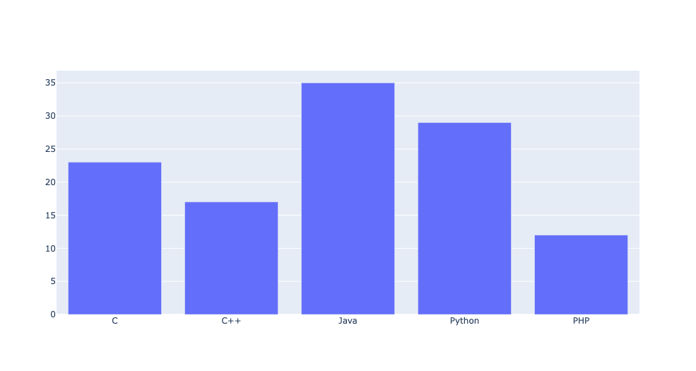
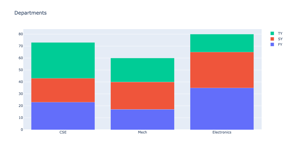
그룹화와 스택화
from plotly import graph_objects as go

branches = ['CSE', 'Mech', 'Electronics']

fy=[23,17,35]
sy=[20,23,30]
ty=[30,20,15]

# x는 동일하되 y의 값은 다른 3개의 Bar객체 생성
trace1=go.Bar(
    x = branches,
    y = fy,
    name = 'FY')

trace2=go.Bar(
    x = branches,
    y = sy,
    name = 'SY')

trace3=go.Bar(
    x = branches,
    y = ty,
    name = 'TY')

data = [trace1,trace2,trace3]

# 그룹화 된 막대 차트를 표시하려면 레이아웃 개체의 막대 모드 속성을 그룹으로 설정해야함
layout = go.Layout(barmode='group',title='Departments')
fig = go.Figure(data=data,layout=layout)
fig.show()

# 스택형 막대 차트를 표시하려면 레이아웃 개체의 막대 모드 속성을 그룹으로 설정해야함
layout=go.Layout(barmode='stack', title='Departments')
fig = go.Figure(data=data, layout=layout)
fig.show()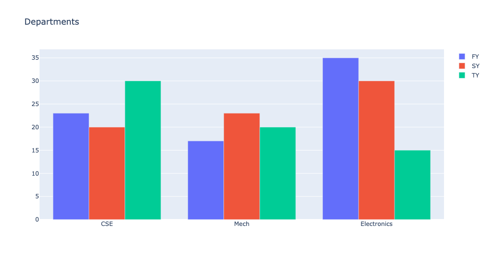
색상 커스터마이징
from plotly import graph_objects as go

years = [1995, 1996, 1997, 1998, 1999, 2000, 2001, 2002, 2003, 2004, 2005, 2006, 2007, 2008, 2009, 2010, 2011, 2012]
rest = [219, 146, 112, 127, 124, 180, 236, 207, 236, 263, 350, 430, 474, 526, 488, 537, 500, 439]
china = [16, 13, 10, 11, 28, 37, 43, 55, 56, 88, 105, 156, 270, 299, 340, 403, 549, 499]

trace1=go.Bar(
    x=years,
    y=rest,
    name='Rest of the World',
    # 색상 커스터마이징을 위한 정보를 딕셔너리에 담아서 marker에 전달
    marker=dict(
    	# RGB값 설정
        color='rgb(49,130,189)',
        # 불투명도 설정
        opacity=0.7
    )
)

trace2=go.Bar(
    x=years,
    y=china,
    name='China',
    marker=dict(
        color='rgb(204,204,204)',
        opacity=0.5
    )
)

data=[trace1,trace2]
layout=go.Layout(barmode='group', title='Export of Plastic Scrap')
fig=go.Figure(data=data, layout=layout)
fig.show()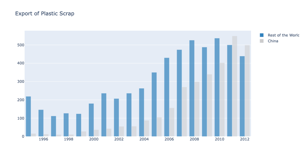
Pie Chart
일반적인 Pie Chart
from plotly import graph_objects as go

langs = ['C','C++','Java','Python','PHP']
students = [23,17,35,29,12]

data = [go.Pie(
    labels = langs,
    values = students,
    # 각각의 인덱스에 배정된 조각을 원점을 기준으로 얼마나 당길건지 설정
    pull=[0.1,0,0,0,0]
)]

fig = go.Figure(data=data)
fig.show()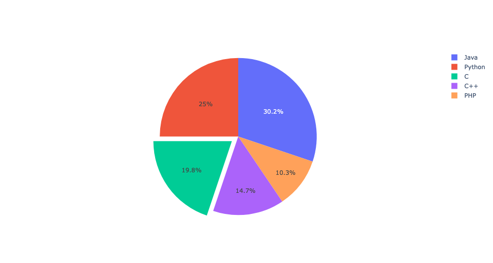
Pie Chart의 여러 옵션 및 subplots 활용
from plotly import graph_objects as go
from plotly.subplots import make_subplots

countries = ["US", "China", "European Union", "Russian Federation", "Brazil", "India", "Rest of World"]
ghg = [16, 15, 12, 6, 5, 4, 42]
co2 = [27, 11, 25, 8, 1, 3, 25]

fig = make_subplots(rows=1,cols=2,
                    specs=[[{'type':'domain'},{'type':'domain'}]]) # 1x2형식의 subplot 생성
fig.add_trace(go.Pie(labels=countries,
                    values=ghg,
                    name="GHG Emissions"),
             # 1행 1열에 위치
             row=1,col=1)

fig.add_trace(go.Pie(labels=countries,
                    values=co2,
                    name="CO2 Emissions"),
             # 1행 2열에 위치
             row=1,col=2)

# hole은 파이차트 가운데 구멍의 크기를 설정
# hoverinfo는 마우스 커서를 갖다 댔을때 띄워질 정보 설정
fig.update_traces(hole=0.4, hoverinfo="label+percent+name")

fig.update_layout(
    title_text="Global Emissions 1990-2011", # 타이틀 설정
    # annotations은 주석에 대한 정보를 딕셔너리형태로 표현하고 리스트에 넣어서 전달 받음.
    # showarrow가 True면 해당좌표를 화살표로 가리킴.
    annotations=[dict(text='GHG',x=0.19, y=0.5, font_size=20, showarrow=False),
                 dict(text='CO2',x=0.8, y=0.5, font_size=20, showarrow=False)])

fig.show()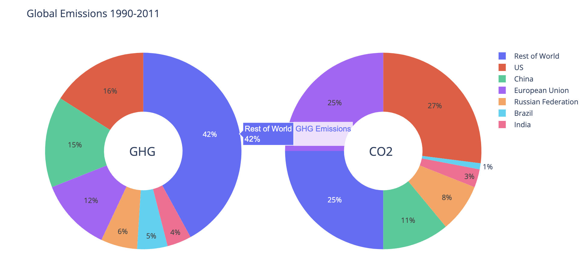
Scatter Plot
from plotly import graph_objects as go
import numpy as np

N = 100

# 0~1사이안에서 N개의 요소를 동일한 간격으로 나누어 놓은 1차원 넘파이 배열 반환
# 예를 들어 linspace(0,10,11)이면 [0,1,2,...,9,10]를 반환한다는 것
x_vals = np.linspace(0,1,N)

# 데이터 준비
# randn: 표준정규분포를 따르는 난수 발생
y1 = np.random.randn(N)+5
y2 = np.random.randn(N)
y3 = np.random.randn(N)-5

trace1 = go.Scatter(
    x=x_vals,
    y=y1,
    # mode는 데이터 포인트의 모양을 결정
    mode='markers',
    name='markers'
)

trace2 = go.Scatter(
    x=x_vals,
    y=y2,
    mode='lines+markers',
    name='lines+markers'
)

trace3 = go.Scatter(
    x=x_vals,
    y=y3,
    mode='lines',
    name='lines'
)

data=[trace1,trace2,trace3]
fig=go.Figure(data=data)
fig.show()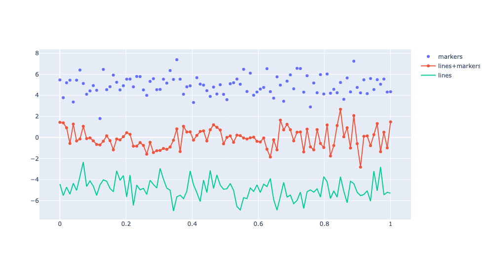
Dot plot
from plotly import graph_objects as go

schools=["Brown", "NYU", "Notre Dame", "Cornell", "Tufts", "Yale",
         "Dartmouth", "Chicago", "Columbia", "Duke", "Georgetown",
         "Princeton", "U.Penn", "Stanford", "MIT", "Harvard"]

trace1=go.Scatter(
    x=[72, 67, 73, 80, 76, 79, 84, 78, 86, 93, 94, 90, 92, 96, 94, 112],
    y=schools,
    marker=dict(color='crimson', size=12),
    mode="markers",
    name="Women")

trace2=go.Scatter(
    x=[92, 94, 100, 107, 112, 114, 114, 118, 119, 124, 131, 137, 141, 151, 152, 165],
    y=schools, marker=dict(color="gold", size=12),
    mode="markers",
    name="Men")

data=[trace1,trace2]

layout=go.Layout(title="Gender Earnings Disparity",
                xaxis_title='Annual Salary (in thousands)',
                yaxis_title='School')

fig=go.Figure(data=data,layout=layout)

fig.show()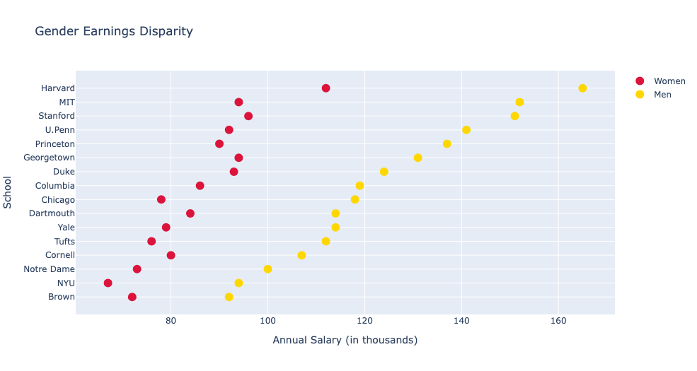
Histogram
일반적인 Histogram
from plotly import graph_objects as go
import numpy as np

np.random.seed(1)

# 표준 정규분포를 따르는 난수 500개를 ndarray로 반환
x = np.random.randn(500)
data=[go.Histogram(x=x)]

fig=go.Figure(data)
fig.show()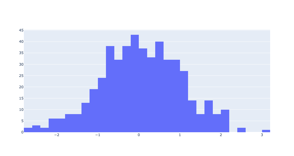
중첩된 Histogram
import plotly.graph_objects as go
import numpy as np

x0=np.random.randn(500)
x1=np.random.randn(500)+1

fig=go.Figure()
# go.Figure(data = []) 방법이 아닌 add_trace 메소드를 통해 직접 Trace를 추가할 수도 있음
fig.add_trace(go.Histogram(x=x0))
fig.add_trace(go.Histogram(x=x1))

# 중첩해서 표현
fig.update_layout(barmode='overlay')
# 중첩해서 보여주기 위해 불투명도 설정(각각의 trace에서 따로 설정가능)
fig.update_traces(opacity=0.75)
fig.show()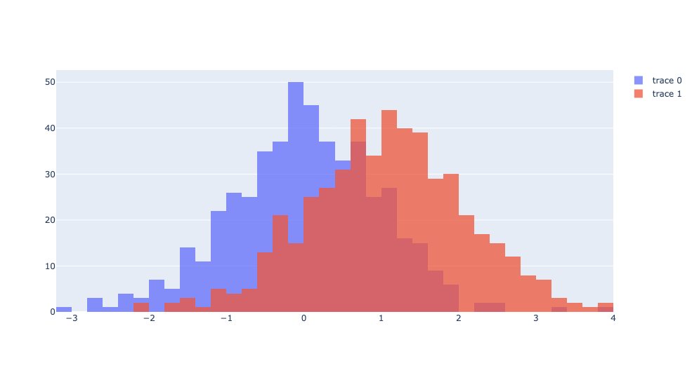
2D Histogram
import plotly.graph_objects as go
import numpy as np
np.random.seed(1)

x=np.random.randn(500)
y=np.random.randn(500)+1

# 2차원으로 표현해서 색깔이 밝을 수록 해당 구간에 데이터가 많다는 것을 표현
fig=go.Figure(go.Histogram2d(x=x,y=y))
fig.show()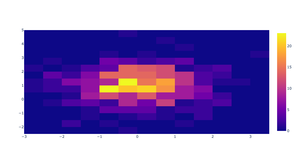
Box plot
Box Plots은 주로 데이터에서 이상치를 탐지하는데 사용한다.
q1은 하위 25%를 의미하고 q3는 상위 25%를 의미한다.
import plotly.graph_objects as go

yaxis = [1140,1460,489,594,502,508,370,200]
data = go.Box(y = yaxis)
fig = go.Figure(data)
fig.show()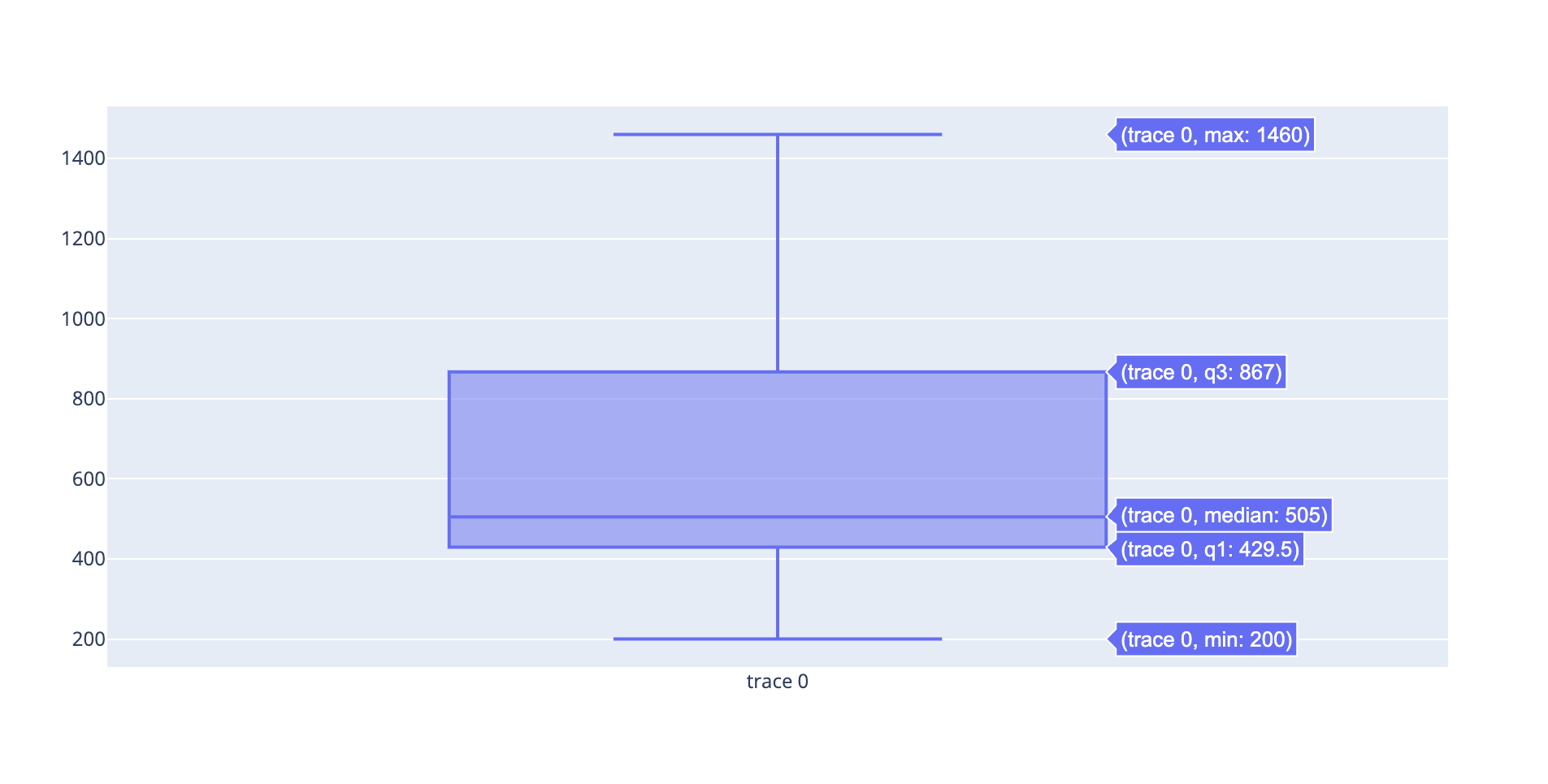
Violin plot
Violin plot은 box plot과 유사하지만 데이터의 밀도를 표현한다는 점이 특징이다.
import plotly.graph_objects as go
import numpy as np

np.random.seed(10)
c1 = np.random.normal(100, 10, 200)
c2 = np.random.normal(80, 30, 200)

# 평균선 표시 여부 설정
trace1 = go.Violin(y=c1, meanline_visible=True)
# 박스 플롯 표시 여부 설정
trace2 = go.Violin(y=c2, box_visible=True)
data = [trace1, trace2]

fig = go.Figure(data=data)
fig.show()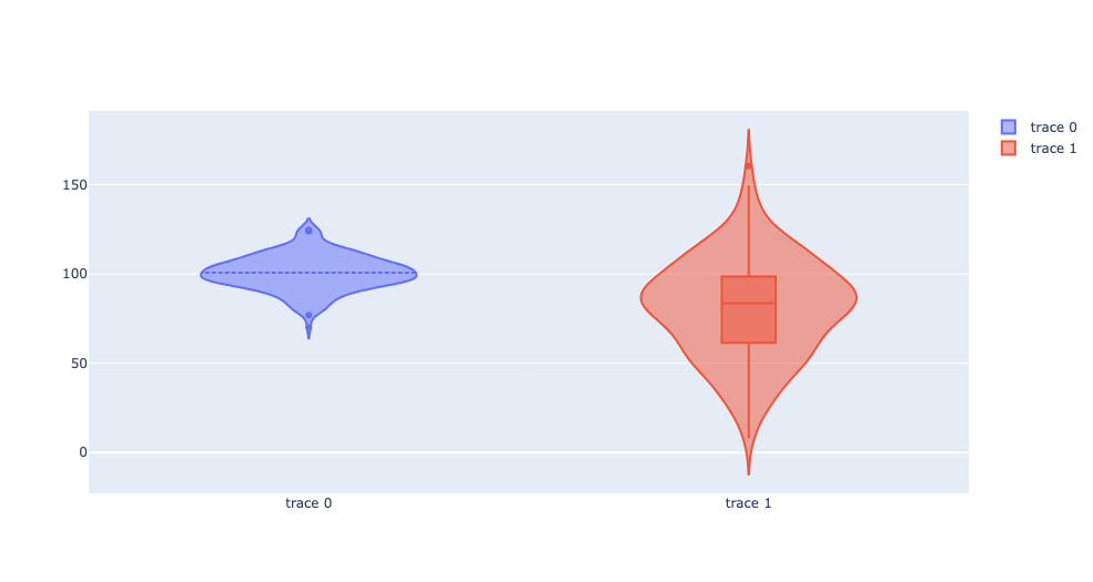

좋은 글 감사합니다~~!