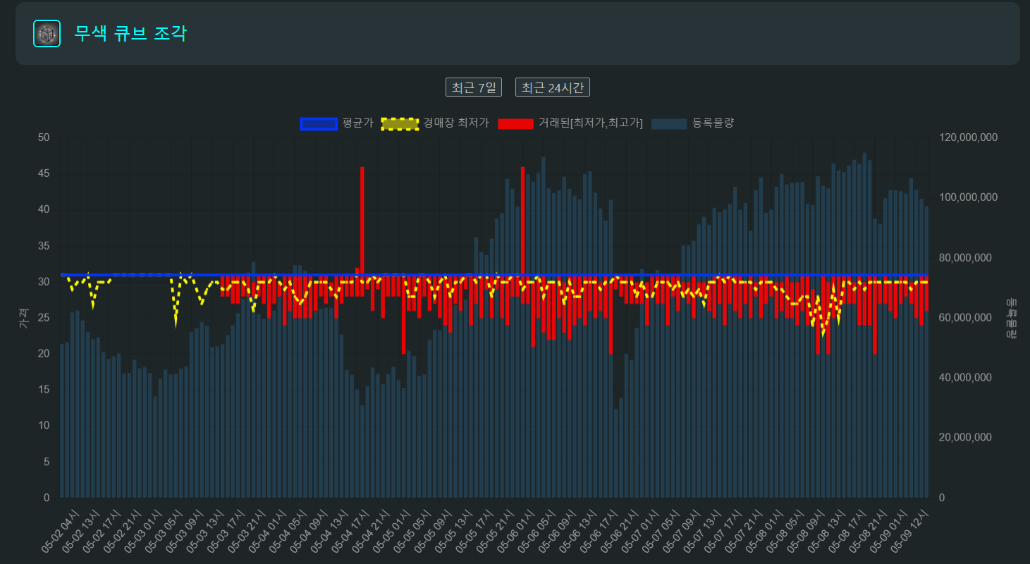
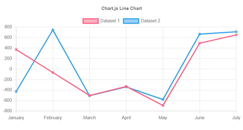
ChartJS 예제
line chart
import React from 'react';
import {
  Chart as ChartJS,
  CategoryScale,
  LinearScale,
  PointElement,
  LineElement,
  Title,
  Tooltip,
  Legend,
} from 'chart.js';
import { Line } from 'react-chartjs-2';
import faker from 'faker';

ChartJS.register(
  CategoryScale,
  LinearScale,
  PointElement,
  LineElement,
  Title,
  Tooltip,
  Legend
);

export const options = {
  responsive: true,
  plugins: {
    legend: {
      position: 'top' as const,
    },
    title: {
      display: true,
      text: 'Chart.js Line Chart',
    },
  },
};

const labels = ['January', 'February', 'March', 'April', 'May', 'June', 'July'];

export const data = {
  labels,
  datasets: [
    {
      label: 'Dataset 1',
      data: labels.map(() => faker.datatype.number({ min: -1000, max: 1000 })),
      borderColor: 'rgb(255, 99, 132)',
      backgroundColor: 'rgba(255, 99, 132, 0.5)',
    },
    {
      label: 'Dataset 2',
      data: labels.map(() => faker.datatype.number({ min: -1000, max: 1000 })),
      borderColor: 'rgb(53, 162, 235)',
      backgroundColor: 'rgba(53, 162, 235, 0.5)',
    },
  ],
};

export function App() {
  return <Line options={options} data={data} />;
}
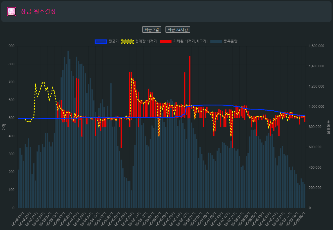
내가 사용한 ChartJS의 option, dataset
const options = {
    responsive: true,
    maintainAspectRatio: false, // 크기가 조정될 때 원본 캔버스의 방향 비율 유지.
  // responseive, maintainAspectRatio가 둘다 true값을 가지면
  // 웹에서 크기를 줄였다가 다시 키웠을 때 화면 크기가 작을때의 상태를 유지해서 false로 변경
    interaction: {
      mode: "index" as const, // - 같은 선상(index) 에 있는 값들 툴팁 다 보여줌
      // mode: 'point' as const,// - 특정 지점에 마우스를 호버하였을 때, 해당 툴팁 보여줌
      axis: "x" as const, // mode 가 index 일 때, 같은 선상이 x축인지 y축인지
    },
    plugins: {
      legend: { // 범례
        position: "top" as const, //범례를 어디에 보여줄 것인지
        labels: {
          font: {
            size: isWeb ? 12 : 9, // react-responsive useMediaQuery를 사용해서
        	// 770px 이하에서 폰트 조정.
          },
        },
      },
    },
    scales: {
      //보통은 x축을 하나만 가지기 때문에 x값도 하나만 쓰지만
      // 최대한 주식차트처럼 만들고 싶어서 등록물량과 거래된 최고가,최저가를 같은 선상에 놓으려다보니
      // x를 구분하면 가능하다는 것을 오랫동안 검색한 결과 알게 되었다.
      x1: {
        // display: false, //x 축값 표시 default: true
        reverse: true,
      },
      x2: {
        //등록물량의 x축
        display: false, //x 축값 표시 default: true
        reverse: true,
        barPercentage: 0.5,
      },
        //y축도 마찬가지로 등록물량과 다른 값의 기준이 달라서 구분해줬다.
        // 예제 사이트에 multi-axis를 보면 잘 나와있다.
      y1: {
        title: {
          //y축 값
          display: true,
          text: "가격",
          font: {
            size: 12,
          },
        },
        type: "linear" as const,
        display: true,
        beginAtZero: true, // 항상 0부터 시작. (값이 없으면 -값부터 시작해서)
        position: "left" as const,
      },
      y2: {
        type: "linear" as const,
        title: {
          display: true,
          text: "등록물량",
          font: {
            size: 12,
          },
        },
        display: true,
        position: "right" as const,
        beginAtZero: true,
      },
    },
  };

// type 'any'를 쓰지 않으려 했으나 x축을 두개로 분리하면서 최저가,최고가를 한번에 가지고 가면
// datasets의 타입이 number[][] number[] 두가지를 모두 가지고 있어야 하는데 다른 타입을
// 읽지 못해서 어쩔수 없이 any로..
const data: any = {
      labels,
      datasets: [
        {
          type: "line" as const,
          label: "평균가",
          data: avgData,
          pointStyle: "circle", //포인터 스타일 변경
          // pointBorderWidth: 2, //포인터 보더사이즈
          pointRadius: 1,
          borderColor: "rgb(0, 51, 255)",
          backgroundColor: "rgba(0, 51, 255, 0.5)",
          xAxisID: "x1",
          yAxisID: "y1",
        },
        {
          type: "line" as const,
          label: "경매장 최저가",
          data: lowerData,
          pointStyle: "circle", //포인터 스타일 변경
          // pointBorderWidth: 2, //포인터 보더사이즈
          pointRadius: 1,
          borderDash: [5, 5],
          backgroundColor: "rgba(255, 247, 0, 0.5)", //포인터 색상
          borderColor: "rgb(255, 247, 0)", // line 색상
          xAxisID: "x1",
          yAxisID: "y1",
        },
        {
          type: "bar" as const,
          label: "거래된[최저가,최고가]",
       	  //여기서 data를 [최저가, 최고가]로 집어넣어야 주식차트에서 시가,종가처럼 나온다.
  		  //이 data의 type만 number[][]라 나머지 경우의 dataset이 꼬여서 type을 any로 했다.
          data: soldUpperData?.map((x, idx) => [soldLowerData[idx], x]),
          backgroundColor: "rgba(255, 0, 0, 0.9)",
          xAxisID: "x1",
          yAxisID: "y1",
        },
        {
          type: "bar" as const, //등록물량은 추세가 있는 값이 아니기 때문에 bar차트로 설정.
          label: "등록물량",
          data: totalCountData,
          backgroundColor: "rgba(53, 162, 235, 0.2)",
          xAxisID: "x2",
          yAxisID: "y2",
        },
      ],
    };
    return data;
  };
참조
https://react-chartjs-2.js.org/examples/vertical-bar-chart - react-chartJS 예시 사이트
https://www.chartjs.org/docs/latest/ - chartjs 공식문서

Hi