📔 media query
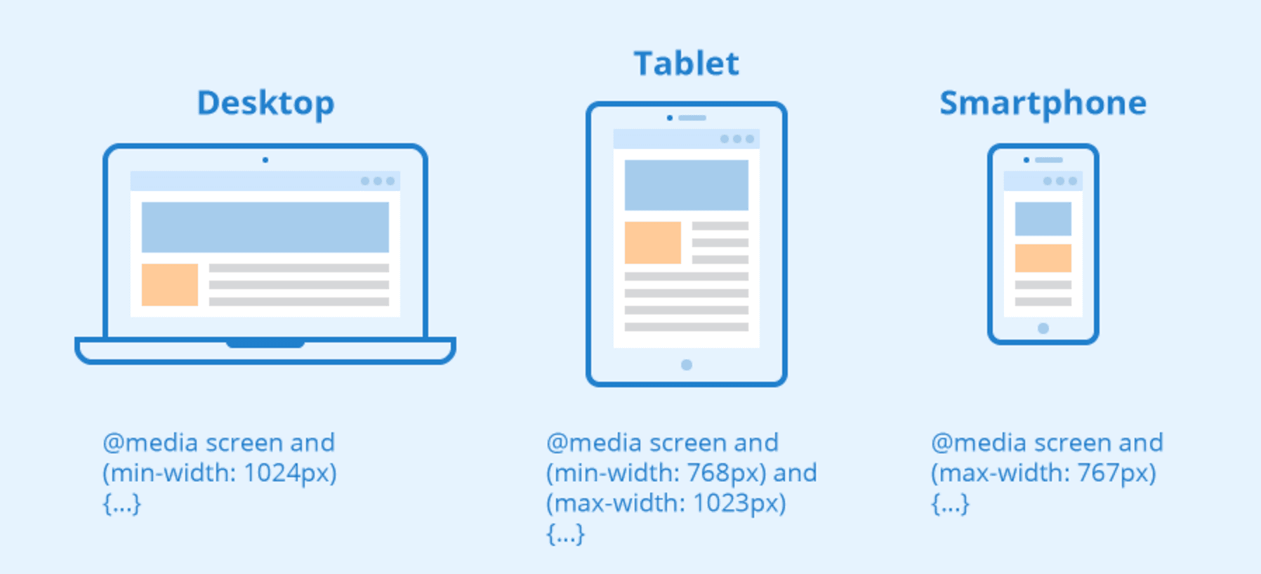
기기의 종류나, 화면 크기 등의 조건에 따라 CSS 속성을 다르게 설정되도록 하는 기능
media query 종류
all - 모든 기기
screen - 스크린이 있는 기기
print - 출력 미리보기 화면
media query 조건 목록
| 이름 | 기능 |
|---|---|
| webkit-min-device-pixel-ratio, webkit-max-device-pixel-ratio | |
| min-width, max-width | 스크롤을 포함한 뷰포트의 최소, 최대 높이 |
| orientation | 뷰포트의 방향 |
이외의 다양한 사용 예시
https://developer.mozilla.org/en-US/docs/Web/CSS/Media_Queries/Using_media_queries
-webkit-device-pixel-ratio
https://developer.mozilla.org/en-US/docs/Web/CSS/@media/-webkit-device-pixel-ratio
resolution
https://developer.mozilla.org/en-US/docs/Web/CSS/@media/resolution
- -webkit-device-pixel-ratio는 standard media query 속성이 아님! 그래서 mdn에서는 resolution을 사용하는걸 권장한다.
- 근데 왜 resolution을 안쓰고 -webkit-device-pixel-ratio을 사용하는가?
- safari에서 resolution속성을 지원하고 있지 않기 때문에
모니터의 픽셀이 많을 수록 GOOD👍 - 이미지를 더 촘촘하게 표현 가능
모니터의 픽셀이 이미지의 픽셀보다 작으면 흐리게 나타난다.
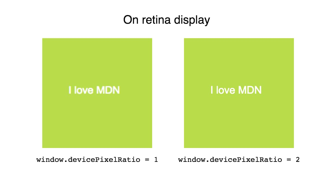
따라서 사용자 모니터 해상도에 따른 이미지를 고려할 필요가 있다!
레티나 대응
물리픽셀: 디바이스가 실제로 처리할 수 있는 화소의 기본 단위논리픽셀: CSS에서 표현되는 화소의 기본 단위
모니터의 css 1px당 픽셀 수를 알려주는 js 함수
https://developer.mozilla.org/en-US/docs/Web/API/Window/devicePixelRatio
알려주는 사이트
https://johankj.github.io/devicePixelRatio/
화면 규격 기준
구글 검색 시, screen breakpoint 라고 검색하면 더 많은 정보를 찾을 수 있다
| width | 기기 | CSS |
|---|---|---|
| 320px — 480px | Mobile devices | @media screen and (max-width: 480px) {} |
| 481px — 768px | iPads, Tablets | @media screen and (min-width: 481px) and (max-width: 768px) {} |
| 769px — 1024px | Small screens, laptops | @media screen and (min-width: 769px) and (max-width: 1024px) {} |
| 1025px — 1200px | Desktops, large screens | @media screen and (min-width: 1025px) and (max-width: 1200px) {} |
| 1201px and more | Extra large screens, TV | @media screen and (min-width: 1201px) {} |
다음과 같이 조건문으로 걸러낸다고 생각하고 min-max를 모두 적지 않고도 작성할 수도 있음.
좀 더 디테일한 breakpoint 코드
/* Smartphones (portrait and landscape) ----------- */
@media only screen and (min-device-width : 320px) and (max-device-width : 480px) {
/* Styles */
}

/* Smartphones (landscape) ----------- */
@media only screen and (min-width : 321px) {
/* Styles */
}

/* Smartphones (portrait) ----------- */
@media only screen and (max-width : 320px) {
/* Styles */
}

/* iPads (portrait and landscape) ----------- */
@media only screen and (min-device-width : 768px) and (max-device-width : 1024px) {
/* Styles */
}

/* iPads (landscape) ----------- */
@media only screen and (min-device-width : 768px) and (max-device-width : 1024px) and (orientation : landscape) {
/* Styles */
}

/* iPads (portrait) ----------- */
@media only screen and (min-device-width : 768px) and (max-device-width : 1024px) and (orientation : portrait) {
/* Styles */
}
/**********
iPad 3
**********/
@media only screen and (min-device-width : 768px) and (max-device-width : 1024px) and (orientation : landscape) and (-webkit-min-device-pixel-ratio : 2) {
/* Styles */
}

@media only screen and (min-device-width : 768px) and (max-device-width : 1024px) and (orientation : portrait) and (-webkit-min-device-pixel-ratio : 2) {
/* Styles */
}
/* Desktops and laptops ----------- */
@media only screen  and (min-width : 1224px) {
/* Styles */
}

/* Large screens ----------- */
@media only screen  and (min-width : 1824px) {
/* Styles */
}

/* iPhone 4 ----------- */
@media only screen and (min-device-width : 320px) and (max-device-width : 480px) and (orientation : landscape) and (-webkit-min-device-pixel-ratio : 2) {
/* Styles */
}

@media only screen and (min-device-width : 320px) and (max-device-width : 480px) and (orientation : portrait) and (-webkit-min-device-pixel-ratio : 2) {
/* Styles */
}
좀 더 자세한 설명 ▽
https://stackoverflow.com/questions/21574881/responsive-design-with-media-query-screen-size
💥 페이지를 만드는 과정에서 media내의 변경사항과 일반 코드를 바꿨을때 적용이 달라지는 문제가 발생함.
- ⏩ z-index가 얽히지 않았는지 확인
@media screen and (max-width: 1000px) {
  header {
    z-index: 1;
  }

  .slider {
    position: static;
    z-index: -1;
  }
}
📔 호환성 체크
✔ 항상 코드 작성 완료 후, html·css validator에 돌려보기
html validator : https://validator.w3.org/
css validator : http://www.css-validator.org/validator.html.ko
✔ 실제 기기들에 테스트 해보기
개발자도구로 보이는 화면과 실제 기기에 테스트했을 때 보이는 화면에 차이가 있음. 예를 들어 vw과 같이 화면크기에 따른 단위 사용시 컴퓨터 화면에서는 크게 보이지만 휴대폰 화면으로 보면 글씨가 컴퓨터에서 본 것보다 작게 보임.