📒 Transform
요소의 형태를 변형시키는 속성
scale
: 크기 변경
scaleX/ scaleY / scaleZ / scale3D(x,y,z) 로 세분화해서 표기 가능
rotate
: 회전
scale처럼 3차원까지 표현
translate
translateX(tx) = translate(tx, 0) = translate3D(tx,0,0)
translateX 하면 +tx 만큼 이동하는 줄 알았는데, y축이 0으로 생략되어 있는거였다! 포지셔닝할 때 주의하기!
scale처럼 3차원까지 표현
skew
: 비틀기
skew는 3차원으로 착각할 수 있지만, skewZ()가 없고 3차원 아님
origin
: 움직이는 기준점을 변경
syntax
 /* One-value syntax */
transform-origin: 2px;
transform-origin: bottom;

/* x-offset | y-offset */
transform-origin: 3cm 2px;

/* x-offset-keyword | y-offset */
transform-origin: left 2px;

/* x-offset-keyword | y-offset-keyword */
transform-origin: right top;

/* y-offset-keyword | x-offset-keyword */
transform-origin: top right;

/* x-offset | y-offset | z-offset */
transform-origin: 2px 30% 10px;

/* x-offset-keyword | y-offset | z-offset */
transform-origin: left 5px -3px;


/* x-offset-keyword | y-offset-keyword | z-offset */
transform-origin: right bottom 2cm;

/* y-offset-keyword | x-offset-keyword | z-offset */
transform-origin: bottom right 2cm;
📒 Transition
translate VS position
정적인 이미지 배치는position
동적인 이미지 배치는translate
- why❓
브라우저가 렌더링하는 과정에서 부담을 덜기 위해~
translate 는 브라우저가 처리하는게 아니라 GPU에서 처리
translate syntax
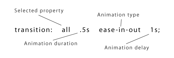
duration
애니메이션이 실행되는 시간
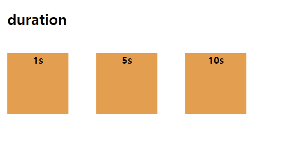
.c1 {
  animation: colorChange 1s;
}

.c2 {
  animation: colorChange 5s;
}

.c3 {
  animation: colorChange 10s;
}
delay
애니메이션이 시작하기까지 걸리는 시간
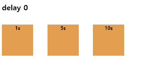
.c1 {
animation: colorChange 3s linear 1s;
}
.c2 {
animation: colorChange 3s linear 5s;
}
.c3 {
animation: colorChange 3s linear 10s;
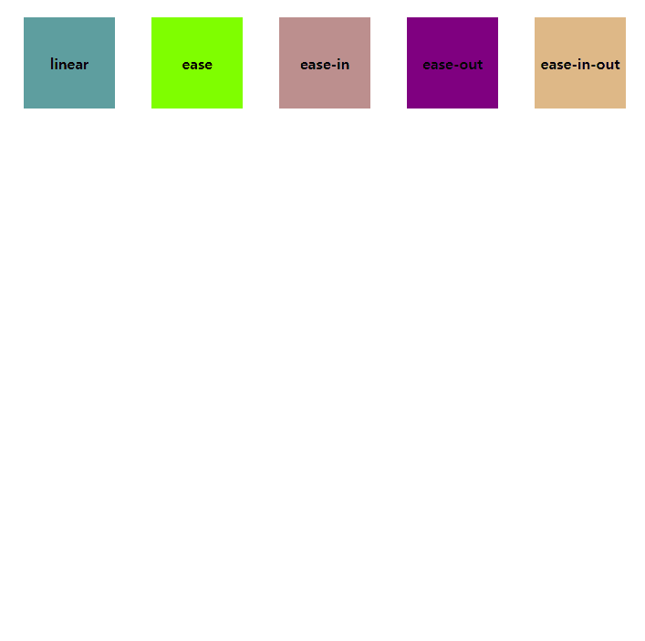
}type
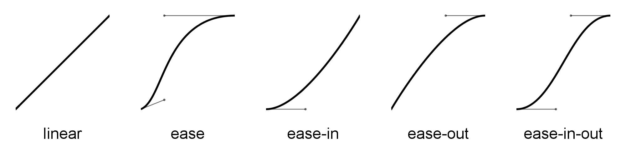
윙 위잉 위-잉의 차이라는데 사실 아직 디테일은 잘 모르겠다. 쓰면서 익숙해져야할 친구!
📒 animation
transition과 animation의 차이점
요소 상태에 대한 의존 여부의 차이
transition은 요소의 상태가 변경되어야 애니메이션을 실행할 수 있지만,
animation속성은 요소의 상태 변화와 관계없이 애니메이션 실행하며, keyframe으로 세부적인 애니메이션 표현 가능
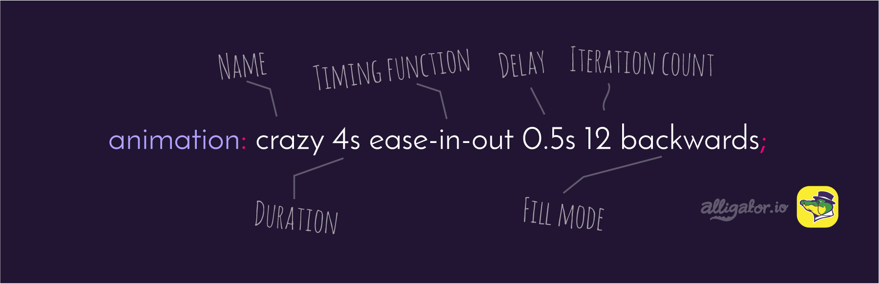
animation syntax
animation direction
normal : 원래 순서대로~
reverse : 반대로
alternate : 원래 순서 + 반대로 (왔다갔다)
alternate-reverse : 반대로 + 원래 순서 (왔다갔다)

.box{
        display: inline-block;
        width: 100px;
        height: 100px;
        background-color: tomato;
        animation: moveBox 10s linear alternate infinite;
    }

@keyframes moveBox {
    from {
         transform: translate(0,0);
         }

    30% {
        transform: translate(100px,0);
        }

    60% {
        transform: translate(100px,100px);
        }

    100% {
        transform: translate(0,100px);
        }
   }
animation fillmode
https://codepen.io/kikiki_kiki/pen/YBQErx
none : 애니메이션이 끝난 후, 원래 상태로 돌아옴.
forwards : 애니메이션이 끝난 후, 원래 상태로 돌아오지 않음.
backwards : 애니메이션이 끝난 후, 시작점으로 돌아옴.
both : 앞, 뒤 결과를 조합하여 설정
어처피 마우스를 떼면 돌아오기 때문에, hover나 active같은 마우스 속성에는 적합하지 않음.
📒 Perspective
perspective : z-index가 0일때 사용자와의 거리
perspective-origin : 어느 시야에서 바라보는지 설정
두 속성은 3차원에서 움직이는 child의 부모에 적용해야함. 본인에게 적용 X
transform : perspective() 는 이동하는 본인에게 적용
📒 카드 뒤집기 연습
참고 : https://3dtransforms.desandro.com/card-flip
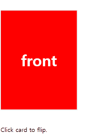
뒷면에 비치지 않게 하기 위해서 두 div를 absolute로 합치고 같은 부모안에 넣어준다. 뒷면은 y축으로 180 회전시킨 상태에서, 각각의 뒷면이 보여지지 않도록 backface-visibility : hidden 으로 설정해준다.
transform-style : preserve-3d
https://developer.mozilla.org/en-US/docs/Web/CSS/transform-style
나 지금 3차원임 이라고 알려주는 속성
default는 flat으로 2차원 상태를 의미한다.
예시와 함께 공부하기 좋은 사이트 https://webclub.tistory.com/622