display 유형: 자식요소를 배치할 때 사용할 레이아웃
block: 요소의 크기와 상관없이 한 라인 전체를 차지하고, 요소 다음에 줄 바꿈이 일어남.
inline: 요소의 크기만큼만 너비를 차지하고, 줄 바꿈이 일어나지 않음
종류: table, flex, grid
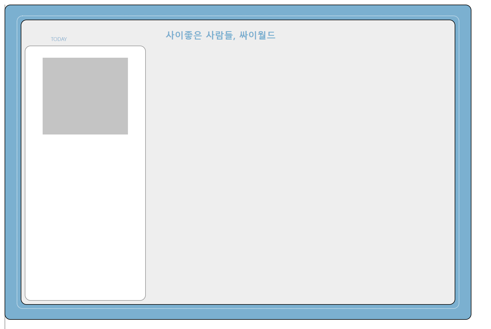
싸이월드 만들기
싸이월드 만들기 1탄에서 레이아웃 flex를 이용하는 것이 아니라
진짜 position:relative와 position:absolute를 이용해서 만드는데
역시 한계가 있었다.
그리고 하나 알아낸 점은,
position:absolute여러개를 하면 가장 부모에서 가까운 애를 기준으로 top, bottom, 등의 padding을 설정할 수 있다.
relative가 부모면 relative기준으로 패딩이 생기는 걸로 알았는데
absolute가 여러개 있으면 그거에서 가장 가까운 absolute를 기준으로 padding이 이뤄지는 것 같다. 이건 나중에 질문해 봐야겠다.
하나하나 따는 건 거의 노가다의 끝판왕이라서 역시나 레이아웃을 사용하는 것이 가장 효율적임을 알았다. 예시답안을 쓱 봤는데 flex를 이용한다.
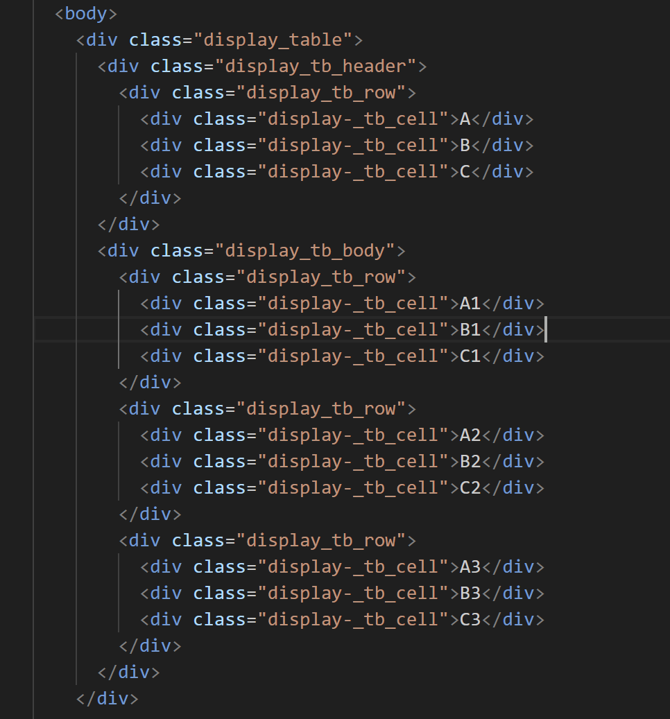
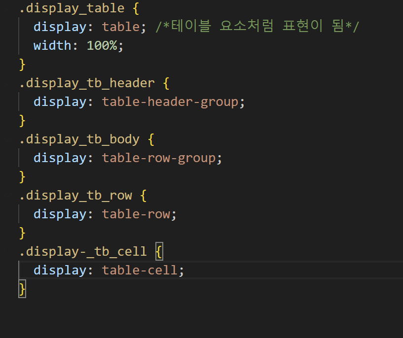
table

Flex
- 현업에서 제일 많이 사용하는 레이아웃
- 여러태그를 하나로 묶어서 정렬

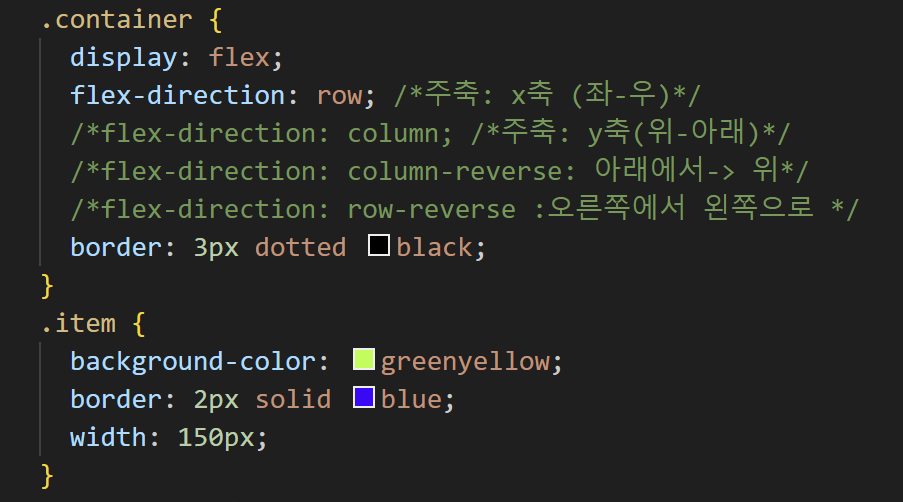
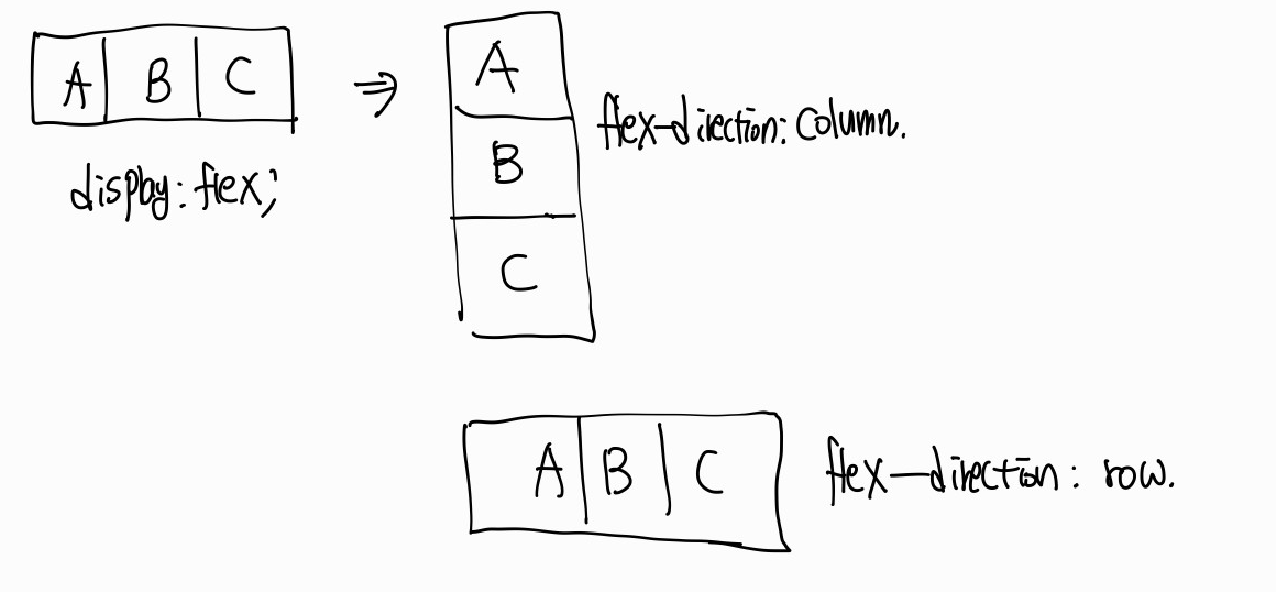
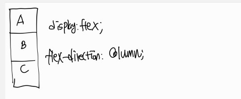
display:flex;
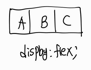
flex-direction: row; 일때
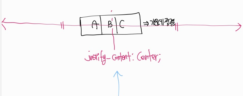
justify-content:center;
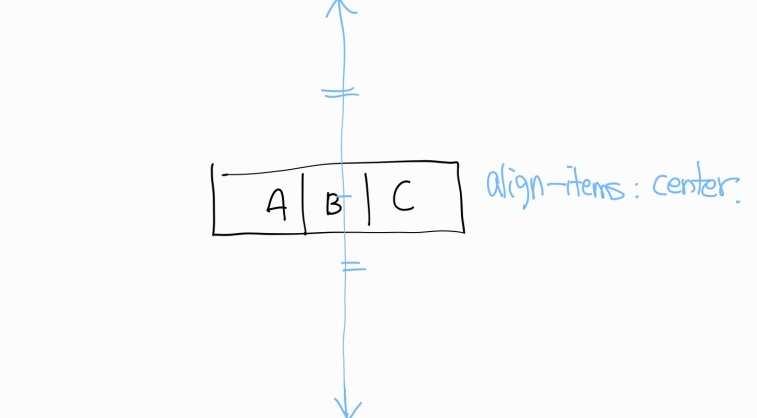
align-items: center;

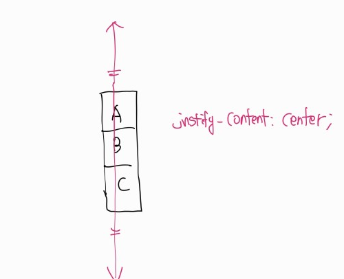
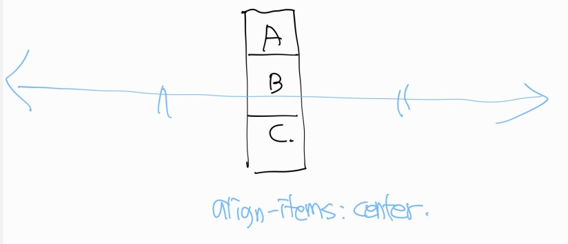
flex-direction:column;일때
justify-content: center;
align-items: center;
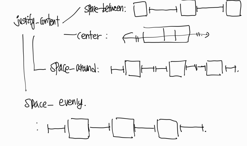
cf)justfiy-content의 종류
flex-direction과 justify-content는 같은방향, align-items는 수직방향이라고 생각하면 편하다.
이번엔 flex를 사용해서 만들어보았다.
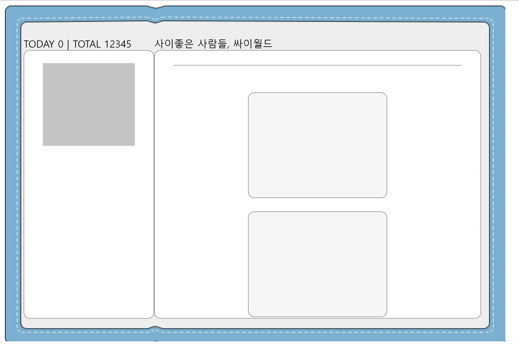
근데 아직 부족하다.. 다시 강의를 들어보고 부족한 점을 채워야겠다..!
*html코드
<!DOCTYPE html>
<html lang="en">
  <head>
    <meta charset="UTF-8" />
    <meta name="viewport" content="width=device-width, initial-scale=1.0" />
    <title>Document</title>
    <link rel="stylesheet" href="cy2.css" />
    <style>
      .글씨체1 {
        width: 35px;
        height: 10px;
        flex-shrink: 0;
        color: #000;
        text-align: right;
        font-family: Sci Fied Bitmap;
        font-size: 9px;
        font-style: normal;
        font-weight: 400;
        line-height: normal;
      }
      .글씨체배경 {
        display: flex;
        flex-direction: row;
      }
    </style>
  </head>
  <body>
    <div class="background">
      <div class="wrapper-left-0">
        TODAY 0 | TOTAL 12345
        <div class="wrapper-left">
          <div class="wrapper-left-bg">
            <div class="wrapper-left-profile"></div>
          </div>
        </div>
      </div>

      <div class="wrapper-right-0">
        <div>사이좋은 사람들, 싸이월드</div>
        <div class="wrapper-right">
          <br />
          <div class="line1"></div>
          <br /><br />
          <div class="wrapper-right-bg"></div>
          <br />
          <div class="wrapper-right-bg"></div>
          <div class=""></div>
        </div>
      </div>
    </div>
  </body>
</html>
*css코드
.background {
  display: flex;
  flex-direction: row;
  background-image: url("./background.png");
  width: 775px;
  height: 480px;
  padding: 50px 0px 10px 30px;
}
.wrapper-left {
  width: 208px;
  height: 430px;
  flex-shrink: 0;
  border-radius: 10px;
  border: 1px solid #999;
  background: #fff;
}
.wrapper-left-profile {
  position: relative;
  top: 20px;
  left: 30px;
  bottom: 287px;
  right: 30px;
  width: 148px;
  height: 133px;
  flex-shrink: 0;
  background: #c4c4c4;
}

.wrapper-right {
  display: flex;
  flex-direction: column;
  justify-content: center;
  align-items: center;
  width: 524px;
  height: 430px;
  flex-shrink: 0;
  border-radius: 10px;
  border: 1px solid #999;
  background: #fff;
}
.wrapper-right-bg {
  width: 222px;
  height: 168px;
  flex-shrink: 0;
  border-radius: 10px;
  border: 1px solid #999;
  background: #f6f6f6;
}
.line1 {
  width: 464px;
  height: 1px;
  background: #999;
}
/* .wrapper-left-0 {
  display: flex;
  flex-direction: column;
  justify-content: ;
} */
Let warmth color my joy💕