Boostcamp visualization 강의를 듣고 개인적으로 잘 몰랐거나 활용하면 좋을 것 같은 코드들을 업로드해보려고 한다.
Bar Plot
Percentage Stacked Bar Plot
fig, ax = plt.subplots(1, 1, figsize=(12, 7))

group = group.sort_index(ascending=False) # 역순 정렬
total=group['male']+group['female'] # 각 그룹별 합


ax.barh(group['male'].index, group['male']/total,
        color='royalblue')

ax.barh(group['female'].index, group['female']/total,
        left=group['male']/total,
        color='tomato')

ax.set_xlim(0, 1)! # x축 설정
for s in ['top', 'bottom', 'left', 'right']: # 선 없애기
    ax.spines[s].set_visible(False)

plt.show()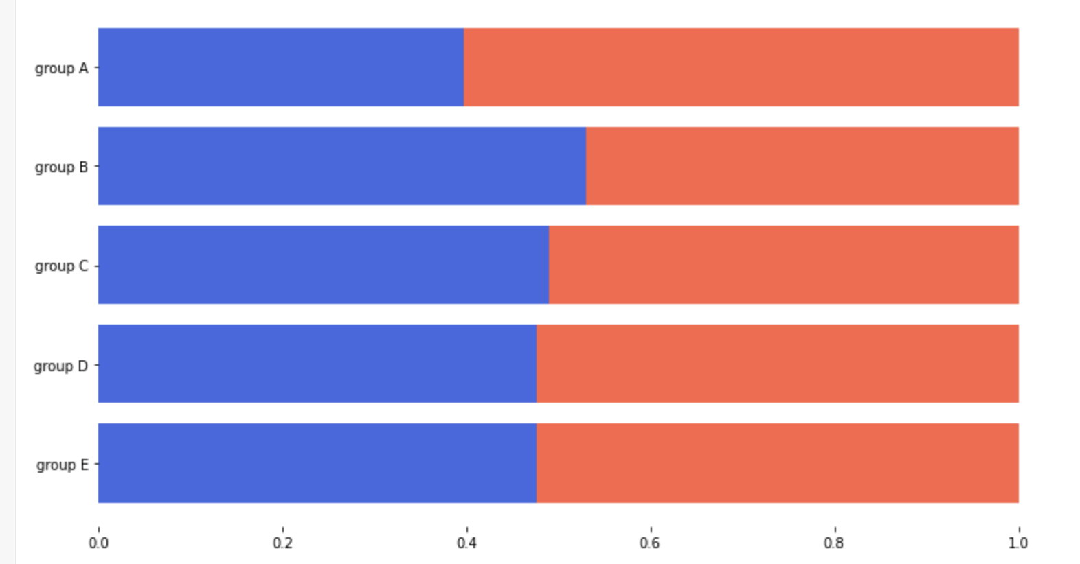
오차막대(표준편차)
fig, ax = plt.subplots(1, 1, figsize=(10, 10))

idx = np.arange(len(score.index))
width=0.3


ax.bar(idx-width/2, score['male'],
       color='royalblue',
       width=width,
       label='Male',
       yerr=score_var['male'],
       capsize=10
      )

ax.bar(idx+width/2, score['female'],
       color='tomato',
       width=width,
       label='Female',
       yerr=score_var['female'],
       capsize=10
      )

ax.set_xticks(idx)
ax.set_xticklabels(score.index)
ax.set_ylim(0, 100)
ax.spines['top'].set_visible(False)
ax.spines['right'].set_visible(False)

ax.legend()
ax.set_title('Gender / Score', fontsize=20)
ax.set_xlabel('Subject', fontweight='bold')
ax.set_ylabel('Score', fontweight='bold')

plt.show()
Line Plot
이동 평균(smoothing 기법)
google_rolling = google.rolling(window=20).mean()
# dpi : 해상도
fig, axes = plt.subplots(2, 1, figsize=(12, 7), dpi=300, sharex=True)

axes[0].plot(google.index,google['close'])
axes[1].plot(google_rolling.index,google_rolling['close'])

plt.show()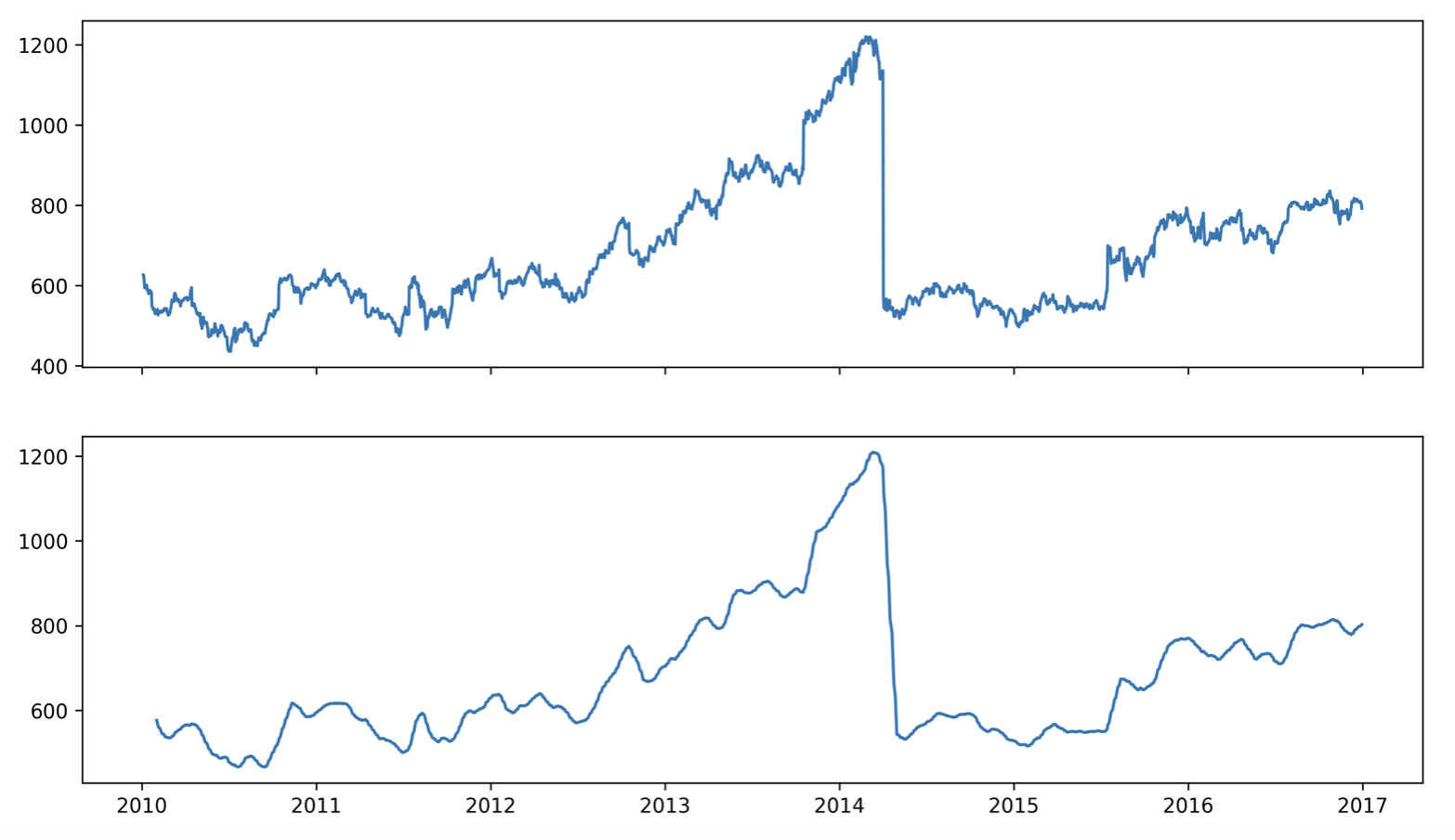
Scipy - 보간
from scipy.interpolate import make_interp_spline, interp1d
import matplotlib.dates as dates

fig, ax = plt.subplots(1, 2, figsize=(20, 7), dpi=300)

date_np = google.index
value_np = google['close']

date_num = dates.date2num(date_np)

# smooth
date_num_smooth = np.linspace(date_num.min(), date_num.max(), 50)

# scipy smoothing method
spl = make_interp_spline(date_num, value_np, k=3)
value_np_smooth = spl(date_num_smooth)

# print
ax[0].plot(date_np, value_np)
ax[1].plot(dates.num2date(date_num_smooth), value_np_smooth)

plt.show()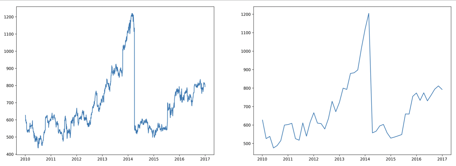
이중 축 사용
ax.twinx()
ax.secondary_xaxis()
Today is the day