Styled Components
- 컴포넌트를 기반으로 css를 작성할 수 있게 도와주는 라이브러리
- 우리가 알고있는 css를 그대로 사용할 수 있다.
- css를 컴포넌트 안으로 캡슐화하여 네이밍이나 최적화를 신경 쓸 필요가 없음
- 비교적 빠른 페이지 로드에 불리
Styled Components 설치법
- 터미널에서 Styled Components 라이브러리 설치
# with npm
$ npm install --save styled-components

# with yarn
$ yarn add styled-components- package.json에 상기 코드 추가 권장 (여러 버전 설치 방지)
{
  "resolutions": {
    "styled-components": "^5"
  }
}- 필요할때마다 import해서 사용
import styled from "styled-components"Styled Components 사용법
1. 전역 스타일 지정하기
전역스타일은 모든 html 요소에 대해서 공통적인 스타일을 가진다.
ex)
- 모든 li 태그에서 list-style 제거하기
- a 태그에서 text-decoration 제거하기
- button 태그에 cursor: pointer 지정하기
reset CSS를 통해 초기화하기 🔽
- index.jsx
import React from "react";
import ReactDOM from "react-dom/client";
import App from "./App";
//우선 전역 스타일을 설정하기 위해 Styled Components에서 createGlobalStyle함수를 불러옵니다.
import { createGlobalStyle, ThemeProvider } from "styled-components";

const root = ReactDOM.createRoot(document.getElementById("root"));

const GlobalStyle = createGlobalStyle`
  html, body, div, span, applet, object, iframe,
h1, h2, h3, h4, h5, h6, p, blockquote, pre,
a, abbr, acronym, address, big, cite, code,
del, dfn, em, img, ins, kbd, q, s, samp,
small, strike, strong, sub, sup, tt, var,
b, u, i, center,
dl, dt, dd, ol, ul, li,
fieldset, form, label, legend,
table, caption, tbody, tfoot, thead, tr, th, td,
article, aside, canvas, details, embed,
figure, figcaption, footer, header, hgroup,
menu, nav, output, ruby, section, summary,
time, mark, audio, video {
	margin: 0;
	padding: 0;
	border: 0;
	font-size: 100%;
	font: inherit;
	vertical-align: baseline;
}
/* HTML5 display-role reset for older browsers */
article, aside, details, figcaption, figure,
footer, header, hgroup, menu, nav, section {
	display: block;
}
body {
	line-height: 1;
}
ol, ul {
	list-style: none;
}
blockquote, q {
	quotes: none;
}
blockquote:before, blockquote:after,
q:before, q:after {
	content: '';
	content: none;
}

table {
	border-collapse: collapse;
	border-spacing: 0;
}

button {
	cursor: pointer;
}

*{
	box-sizing: border-box;
}

{/*a태그들에 밑줄안그어지게 하기*/}
a {
  text-decoration: none;
}

`;

const colorTheme = {
  footerBg: "#25262a",
  footerTitle: "hsl(210,8%,75%)",
  footerLink: "hsl(210,8%,60%)",
};

//여기서 render 가능 아니면 하위 설명 방법 사용 가능
root.render(
  <React.StrictMode>
    <ThemeProvider theme={colorTheme}>
      <GlobalStyle />
      <App />
    </ThemeProvider>
  </React.StrictMode>
);
or 이렇게 만들어진 <GlobalStyle>컴포넌트를 최상위 컴포넌트에서 사용해주면 전역에 <GlobalStyle>컴포넌트의 스타일이 적용됩니다.
- App.jsx
import Navigation from "./components/Navigation/Navigation";
import GlobalStyle from "./index.jsx";

function App() {
  return (
    <>
      <GlobalStyle />
      <Navigation />
      <div>데이터</div>
    </>
  );
}

export default App;
2. 컴포넌트 만들기
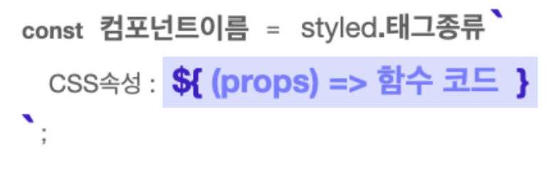
Styled Components는 ES6의 Templete Literals 문법을 사용합니다. 즉, 따옴표가 아닌 백틱(`)을 사용합니다.
const 컴포넌트이름 = styled.태그종류`
	css속성1: 속성값;
	css속성2: 속성값;
`
import styled from "styled-components";
//Styled Components로 컴포넌트를 만들고
const BlueButton = styled.button`
background-color: blue;
color: white;
`;
export default function App() {
// React 컴포넌트를 사용하듯이 사용하면 됩니다.
return <BlueButton>Blue Button</BlueButton>;
}3. 컴포넌트를 재활용해서 새로운 컴포넌트 만들기
const 컴포넌트이름 = styled(재활용할 컴포넌트)`
	추가할 css속성1: 속성값;
	추가할 css속성2: 속성값;
`
//만들어진 컴포넌트를 재활용해 컴포넌트를 만들 수 있습니다.
const BigBlueButton = styled(BlueButton)`
padding: 10px;
margin-top: 10px;
`;
//재활용한 컴포넌트를 재활용할 수도 있습니다.
const BigRedButton = styled(BigBlueButton)`
background-color: red;
`;
export default function App() {
return (
<>
<BlueButton>Blue Button</BlueButton>
<br />
<BigBlueButton>Big Blue Button</BigBlueButton>
<br />
<BigRedButton>Big Red Button</BigRedButton>
</>
);
}4. Props 활용하기
Styled Components는 템플릿 리터럴 문법( ${ } )을 사용하여 JavaScript 코드를 사용할 수 있습니다. props를 받아오려면 props를 인자로 받는 함수를 만들어 사용하면 됩니다.
- Props로 조건부 렌더링하기
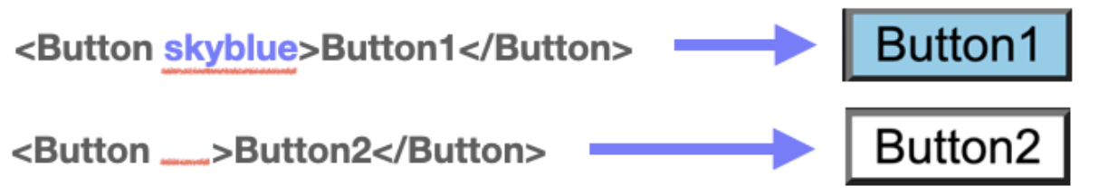
import styled from "styled-components";
import GlobalStyle from "./GlobalStyle";
//받아온 prop에 따라 조건부 렌더링이 가능합니다.
const Button1 = styled.button`
background: ${(props) => (props.skyblue ? "skyblue" : "white")};
`;
export default function App() {
return (
<>
<GlobalStyle />
<Button1>Button1</Button1>
<Button1 skyblue>Button1</Button1>
</>
);
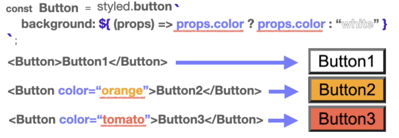
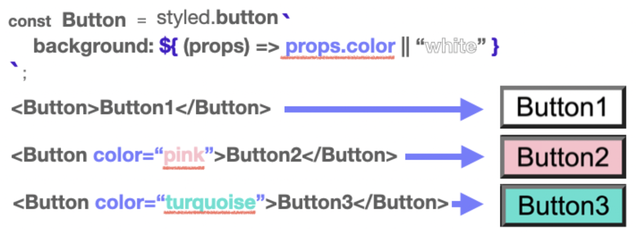
}- Props 값으로 렌더링하기
props의 값을 통째로 활용해서 컴포넌트 렌더링에 활용할 수 있습니다.
5. ThemeProvider 사용하기
- styled-components에서 ThemeProvider를 import한다.
import { ThemeProvider } from "styled-components";- ThemeProvider 컴포넌트를 가장 상위 컴포넌트로 배치한다.
(GlobalStyle보다 위에)
function App() {
	return (
		<ThemeProvider>
			<GlobalStyle />
			<BrowserRouter>
				<Switch>
					<Route path="/login">
						<LogIn />
					</Route>
					<Route path="/">
						<Home />
					</Route>
				</Switch>
			</BrowserRouter>
		</ThemeProvider>
	);
}- theme이라는 이름을 가진 비어있는 객체를 만든다.
const theme = {}- 생성한 theme 객체를 ThemeProvider의 props로 넣어준다.
그러면 styled-components가 모든 컴포넌트에 이 theme 변수를 inject해준다.
function App() {
	return (
		<ThemeProvider theme={theme}>
			<GlobalStyle />
			<BrowserRouter>
				<Switch>
					<Route path="/login">
						<LogIn />
					</Route>
					<Route path="/">
						<Home />
					</Route>
				</Switch>
			</BrowserRouter>
		</ThemeProvider>
	);
}- 원하는 theme 작성하기 (camelCase)
const theme = {
	primaryColor: "#f8049c",
	secondaryColor: " #fdd54f",
};
적용은 🔽
${props => props.theme.primaryColor}

//ex)
background-color: ${(props)=>
	props.secondary ? props.theme.secondaryColor : props.themeprimaryColor};

border-bottom: 3px solid ${(props) => props.theme.secondaryColor};
Styled Component 이벤트 주기
- App.js
import styled from "styled-components"; //스타일드컴포넌트 적용
import GlobalStyle from "./GlobalStyle"; //전역스타일 적용

const BlueButton = styled.button`
  background-color: powderblue;
  padding: 1rem;
  font-size: 2rem;
  border-radius: 1rem;
  transition: 0.5s;
//hover 이벤트 주기!!!
  &:hover {
    background: cornflowerblue;
    color: white;
    transition: 0.5s;
  }
`;

export default function App() {
  return (
    <>
      <GlobalStyle />
      <BlueButton>Practice!</BlueButton>
    </>
  );
}- GlobalStyle.js → 전역스타일 설정하기
import { createGlobalStyle } from "styled-components";

const GlobalStyle = createGlobalStyle`
* {  margin: 0.5rem;  }
`;

export default GlobalStyle;
[많을 (다) 빛날 (빈)] 빛이나는 사람이 되고 싶습니다