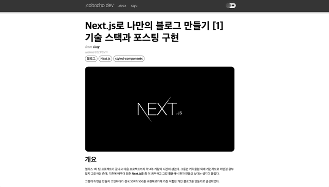
개요
요새 좀 친다는 블로그라면 죄다 다크 모드를 지원한다.
다크 모드를 지원하면 전력소모도 줄어들고 눈의 피로도 좀 더 줄일 수도 있기 때문이다.
또 워낙 개발업계 종사자들은 특히 다크 모드에 대한 강박이 존재하는 것 같기도 하다.
이러한 시대의 흐름을 따라서 다크 모드를 구현하지 않을 수가 없었다.
다크모드 구현 방법
다크모드의 구현하는데에는 여러가지 옵션이 주어진다.
라이브러리로 Chakra UI나 Tailwind를 사용 할 수도 있고 혹은 Sass같은 전처리기를 사용할 수도 있다.
하지만 이미 styled-components를 사용 중이니 이번엔 styled-components의 theme-provider와 Recoil을 사용해서 구현 해 볼 예정이다.
theme-provider
theme-provider란 styled-components에서 테마를 구현하기 위해 제공해주는 기능으로서 Context API를 기반으로 작동한다.
theme-provider의 하위에 위치한 컴포넌트들은 prop으로 theme를 받을 수 있게 되며 해당 theme의 CSS 값을 할당 할 수 있게 된다.
theme별 CSS 작성하기
// .../styles/themeStyles.ts

export const lightTheme = {
  bgColor: '#fff',

  categoryTextColor: '#000',
  categoryColor: '#fff',
  categoryShadow: 'inset 5px 5px 10px #ededed,inset -5px -5px 10px #ffffff, 5px 5px 10px #0000001b',

  selectedCategoryTextColor: '#fff',
  selectedCategoryShadow: 'none',
  selectedCategoryColor: '#000',

  textColor: '#000',
  fontWeight: 400,

  tagColor: '#000',
  tagTextColor: '#fff',

  blockColor: '#f1f1f1',

  togglerColor: '#e3e3e3',
  togglerButtonColor: '#565656',
  togglerButtonShadow: 'inset 6px 6px 5px #4b4b4b, inset -6px -6px 5px #616161',
  togglerShadow: 'inset 6px 6px 5px #c3c3c3, inset -6px -6px 5px #fdfdfd'
};

export const darkTheme = {
  bgColor: '#1c1c1c',

  categoryTextColor: '#fff',
  categoryColor: '#404040',
  categoryShadow: 'none',

  selectedCategoryTextColor: '#000',
  selectedCategoryShadow: 'inset 5px 5px 10px #ededed,inset -5px -5px 10px #ffffff, 5px 5px 10px #0000001b',
  selectedCategoryColor: '#fff',

  textColor: '#fff',
  fontWeight: 300,

  tagColor: '#fff',
  tagTextColor: '#000',

  blockColor: '#7d7d7d',

  togglerColor: '#5c5c5c',
  togglerButtonColor: '#fff',
  togglerButtonShadow: 'inset 6px 6px 5px #d9d9d9, inset -6px -6px 5px #fffff',
  togglerShadow: 'inset 6px 6px 5px #4e4e4e, inset -6px -6px 5px #6a6a6a'
};

export const theme = {
  lightTheme,
  darkTheme,
};

export default theme;
객체 형태의 theme에 lightTheme와 darkTheme를 프로퍼티로 할당한 후 export한다.
이후에 컴포넌트에서 props.theme에 접근시 현재 테마에 맞는 값을 얻을 수 있게 된다.
ThemeProvider 설정하기
// .../components/Layout.tsx

type Props = {
	children: JSX.Element,
}

const Layout = ({ children } : Props) => {
  const [currentTheme, setCurrentTheme] = useRecoilState(currentThemeState);

  useEffect(() => {
    if (localStorage.getItem('dark_mode') !== undefined) {
      const localTheme = Number(localStorage.getItem('dark_mode'));
      setCurrentTheme(localTheme);
    }
  }, [setCurrentTheme]);

  return (
    <ThemeProvider theme={currentTheme === ThemeFlag.dark ? darkTheme : lightTheme}>
      <GlobalStyle>
        <Header/>
        <LayoutBox>
          {children}
        </LayoutBox>
        <Footer />
      </GlobalStyle>
    </ThemeProvider>
  )
}

export default Layout;


// .../components/GlobalStyleBox.tsx

import styled from 'styled-components'

type Props = {
	children: JSX.Element[],
}

const GlobalStyleBox = styled.div`
  position: relative;
  color: ${(props) => props.theme.textColor};
  font-weight: ${(props) => props.theme.fontWeight};;
  background-color: ${(props) => props.theme.bgColor};

  transition: all 0.5s;

  a {
    color: ${(props) => props.theme.textColor};
  }
`

const GlobalStyle = ({ children } : Props) => {
  return (
    <GlobalStyleBox>
      {children}
    </GlobalStyleBox>
  )
}

export default GlobalStyle;


// .../store/theme.ts

import { atom } from 'recoil';

export enum ThemeFlag {
  light,
  dark,
}

export const currentThemeState = atom({
  key: 'currentThemeState',
  default: ThemeFlag.light,
});
styled-components에서 import한 ThemeProvider를 모든 컴포넌트를 감싸는 최상위 컴포넌를 감싸도록 작성한다.
이후 props로 theme를 할당하면 따로 props를 부여하지 않아도 하위 컴포넌트에서 해당 테마로 접근이 가능해진다.
예를 들어서 GlobalStyleBox 컴포넌트 같은 경우 theme인 props를 따로 설정해 주지 않았지만, ${(props) => props.theme.textColor}처럼 접근이 가능해진다. 참고로 props.theme는 ThemeProvider에 할당된 theme를 기준으로 값이 정해진다.
따라서 theme는 전역 상태관리를 통해 관리해주면 좀 더 편하게 컨트롤 할 수 있게 된다.
또한 최초 접속시 로컬스토리지를 탐색하여 기존에 설정한 테마가 존재하는지 판별한다.
테마 토글 버튼 작성
// .../components/ThemeToggle.tsx

import styled from "styled-components";
import ThemeButton from "../atoms/ThemeButton";
import { useRecoilState } from 'recoil';
import { ThemeFlag, currentThemeState } from "@/stores/theme";

const ToggleBox = styled.div`
  display: flex;
  align-items: center;
  width: 60px;
  height: 30px;
  border-radius: 15px;
  background-color: ${(props) => props.theme.togglerColor};
  box-shadow: ${(props) => props.theme.togglerShadow};

  -webkit-user-select:none;
  -moz-user-select:none;
  -ms-user-select:none;
  user-select:none;

  .icons {
    display: flex;
    justify-content: space-between;
    width: 100%;
    padding: 0 6px;
  }

  .material-symbols-outlined {
    color: ${(props) => props.theme.textColor};;
    font-size: 20px;
    font-variation-settings:
      'FILL' 1,
      'wght' 400,
      'GRAD' 0,
      'opsz' 40
  }

  &:hover {
    cursor: pointer;
  }
`

const ThemeToggle = () => {
  const [currentTheme, setCurrentTheme] = useRecoilState(currentThemeState);

  function changeThemeHandler() {
    if (currentTheme === ThemeFlag.dark) {
      setCurrentTheme(ThemeFlag.light);
      localStorage.setItem('dark_mode', String(ThemeFlag.light));
    }
    else {
      setCurrentTheme(ThemeFlag.dark);
      localStorage.setItem('dark_mode', String(ThemeFlag.dark));
    }
  }

  return (
    <ToggleBox onClick={changeThemeHandler}>
      <div className='icons'>
        <span className='material-symbols-outlined'>
          clear_night
        </span>
        <span className='material-symbols-outlined'>
          clear_day
        </span>
      </div>
      <ThemeButton currentTheme={currentTheme}/>
    </ToggleBox>
  )
}

export default ThemeToggle;


// .../components/ThemeButton.tsx

import React from "react";
import styled from "styled-components";
import { ThemeFlag } from "@/stores/theme";

type Props = {
  currentTheme: ThemeFlag;
}

type ThemeButtonProps = {
  currentTheme: number;
}

const ThemeButtonSwitch = styled.button<ThemeButtonProps>`
  width: 30px;
  height: 30px;
  position: absolute;
  border: none;
  border-radius: 50%;
  background-color: ${(props) => props.theme.togglerButtonColor};
  box-shadow: ${(props) => props.theme.togglerButtonShadow};

  transform: ${(props) => props.currentTheme === ThemeFlag.dark ? 'translateX(30px)' : 'translateX(0)'};
  transition: all 0.3s;

  &:hover {
    cursor: pointer;
  }
`

const ThemeButton = ({currentTheme} : Props) => {
  return (
    <ThemeButtonSwitch currentTheme={currentTheme}>
    </ThemeButtonSwitch>
  )
}

export default ThemeButton;
테마를 컨트롤하는 토글러 컴포넌트를 작성한 뒤 클릭마다 전역 상태의 테마를 변경하도록 구현한다.
이후 로컬스토리지에도 저장하여 브라우저의 기본 테마 세팅을 변경한다.
결과