
Overview
이번 시간에는 라이브러리 만들 때 CSS 적용 방식에 대해 알아보도록 하겠습니다. 제가 궁금한건 라이브러리 만들 때도 tailwindcss 를 사용할 수 있을까? 이걸 사용했을 때 사이즈 크기가 갑자기 늘어나지 않을까? 입니다.
제가 참고하고 있는 react-modal-sheet는 그냥 React 에서 style 설정하는 것처럼 사용하더군요. 그래서 이번에 두 방식 모두 알아보도록 하겠습니다.
style 만들어서 적용해보기 - TypeScript 적용
그냥 하면 재미없으니 이번에는 간단한 버튼 컴포넌트를 CSS를 입혀서 만들어보기로 했습니다.
import React from 'react';
import styles from './styles';

export interface ReactButtomSheetProps
  extends React.ButtonHTMLAttributes<HTMLButtonElement> {
  /**
   * The text to display
   */
  children: React.ReactNode;
}

export const ReactButtomSheet = ({ children }: ReactButtomSheetProps) => {
  return <button style={{ ...styles.wrapper }}>{children}</button>;
};
styles는 styles.ts라는 파일로 따로 빼줘서 관리하기로 합니다. 근데 그냥 쓰면 TypeScript 지원이 안되므로 여간 불편한게 아닙니다.
const styles = {
  wrapper: {
    width: '100px',
    heigh: '100px' // 심지어 에러도 안남
  },
};

export default styles;
style에 대한 타입스크립트 정의는 @types/react/ts5.0/index.d.ts에 CSSProperties라는 것에 있습니다. 이 녀석을 더 살펴보면 CSS.Properties<string | number> 인 것을 알 수 있습니다.
style?: CSSProperties | undefined;export interface CSSProperties extends CSS.Properties<string | number> {
/**
* The index signature was removed to enable closed typing for style
* using CSSType. You're able to use type assertion or module augmentation
* to add properties or an index signature of your own.
*
* For examples and more information, visit:
* https://github.com/frenic/csstype#what-should-i-do-when-i-get-type-errors
*/
}CSS.Properties에 대해 좀 더 깊숙히 들어가보면 이런식으로 되어있습니다.
export interface Properties<TLength = (string & {}) | 0, TTime = string & {}>
  extends StandardProperties<TLength, TTime>,
    VendorProperties<TLength, TTime>,
    ObsoleteProperties<TLength, TTime>,
    SvgProperties<TLength, TTime> {}
그 중에 가장 첫번째 StandardProperties에 웬만한 CSS 속성이 다 정의가 되어있는 것을 알 수 있었습니다.
export interface StandardLonghandProperties<TLength = (string & {}) | 0, TTime = string & {}> {
	accentColor?: Property.AccentColor | undefined;
	alignItems?: Property.AlignItems | undefined;
	...
	width?: Property.Width<TLength> | undefined;
	...
}
아무튼 이건 그냥 찾아본거고 최종 결론은 다음과 같습니다. "[key: string]: React.CSSProperties" 이렇게 사용하면 CSS 타입스크립트 지원이 가능합니다.
const styles: { [key: string]: React.CSSProperties } = {
  wrapper: {
    /* css button reset */
    border: 'none',
    background: 'none',
    margin: 0,
    /* button styles */
    backgroundColor: '#ffa000',
    cursor: 'pointer',
    borderRadius: '10px',
    padding: '10px 15px'
  }
};

export default styles;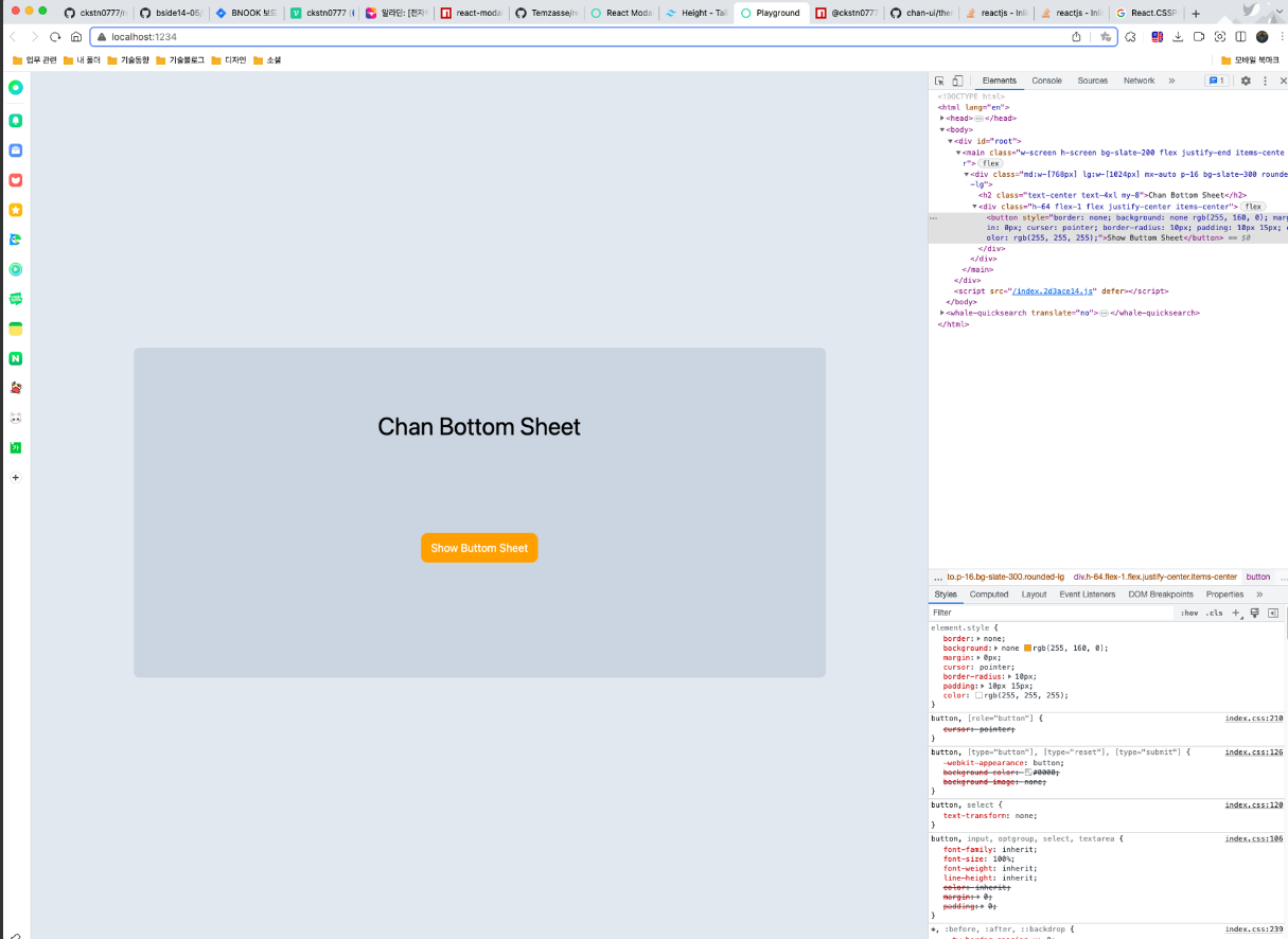
이렇게 만들고 build하고 size 측정했을때 500~600B 정도가 나왔습니다. 살짝 늘어났군요.
❯ yarn run size
yarn run v1.22.10
$ size-limit
✔ Adding to empty esbuild project

  dist/chan-bottom-sheet.cjs.production.min.js
  Size limit: 10 kB
  Size:       526 B with all dependencies, minified and gzipped

  dist/chan-bottom-sheet.esm.js
  Size limit: 10 kB
  Size:       631 B with all dependencies, minified and gzipped

✨  Done in 0.21s.
이제 tailwindcss를 적용해보도록 하자
tailwindcss를 설치하고 설정하고 기본 style.css 파일을 만들어서 import해서 사용하려고 했습니다.
@tailwind base;
@tailwind components;
@tailwind utilities;
근데 제대로 알아듣질 못하는군요...
✓ Creating entry file 703 ms
Error: Unexpected character '@' (Note that you need plugins to import files that are not JavaScript)

at /Users/ckstn0777/Documents/react-bottom-sheet/src/index.css:1:0

1: @tailwind base;
   ^
2: @tailwind components;
3: @tailwind utilities;

error Command failed with exit code 1.
info Visit https://yarnpkg.com/en/docs/cli/add for documentation about this command.
rollup 문제인가 해서 “rollup-plugin-postcss" 이걸 설치해서 사용하면 될 줄 알았는데… 이것도 잘 안되더군요.
- 블로그 : https://zach.codes/build-your-own-flexible-component-library-using-tsdx-typescript-tailwind-css-headless-ui/
- 참고 : https://github.com/chrisscott718/react-tailwind-typescirpt-component-library
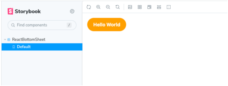
해당 프로젝트가 좋은 참고가 될 거 같아서 봤는데 흥미로운 점이 있었습니다. 여기서는 storybook에서 UI 테스트하고, example은 배포 이후에 해당 라이브러리를 가져다가 쓰도록 개발하는거 같습니다. 지금 현재 example 은 핫 리로드가 안되는 상태므로 여간 불편한게 아니었는데 storybook을 진작에 쓸 걸 그랬습니다.
storybook을 설정하고 적용하는 과정은 생략하도록 하겠습니다. 아래는 적용 결과입니다. 핫 리로드도 잘되므로 정말 편하네요.
잠시 이상한 길로 빠졌는데 다시 돌아와서 보면 build 과정에서 "yarn build-tailwind" 를 하나 더 추가해주면 됩니다. 그 전에 import "style.css" 했던건 에러가 발생하지 않도록 지워줍니다.
  "scripts": {
    "start": "tsdx watch",
    "build": "tsdx build && yarn build-tailwind",
    ...
    "storybook": "start-storybook -p 6006",
    "build-storybook": "build-storybook",
    "build-tailwind": "NODE_ENV=production npx tailwindcss -o ./dist/tailwind.css --minify"
  },
이 의미가 무엇이냐면 dist에 tailwind.css 를 포함시키겠다는 의미입니다. 개발 및 테스트는 storybook에서 tailwind를 적용해서 하고, 배포는 tailwind.css를 껴서 배포하겠다는 의미인 것이죠.
“Next, open up example/index.tsx and import the ToggleSwitch along with the tailwind.css file here. We'll also add the ToggleSwitch component to the main App component:”
이렇게 되면 나중에 라이브러리 사용자가 css 까지 import 해서 사용해야 합니다. 근데 좀 불편하겠죠??
import { ReactButtomSheet } from "chan-bottom-sheet";
import "chan-bottom-sheet/dist/tailwind.css";
라이브러리에 CSS 적용 방식
그래서 다른 여러 라이브러리들을 찾아본 결과 공통점이 있더군요. CSS 적용 방식은 2가지인 거 같습니다.
- tailwind.css나 index.css 처럼 별도 css 파일을 만들고 라이브러리 사용자가 이것 또한 import해서 사용하게 할 건지
- 혹은 자체 style 적용으로 라이브리 사용자가 컴포넌트만 쓰면 되겠끔 하던지.
- 아니면 CSS-in-JS 방식? styled-components나 emotion을 쓸 수도 있어보입니다.
style이 복잡하고 많은 경우라면 1번. 아니라면 2번이 적절해보입니다. 저는 가장 처음에 했던 방식. 즉, 2번 방식으로 진행하도록 하겠습니다.
마치면서
라이브러리에 CSS를 어떻게 적용할 것인지 생각해보면서 다른 라이브러리는 어떤식으로 되어있는지 찾아보는 재미도 있었고 css 파일을 별도로 import하는 라이브러리는 그런식으로 개발했기 때문에 라이브러리 사용자가 직접 import 해서 사용할 수 밖에 없었구나 라는 깨달음도 있었습니다.
다음 시간에는 본격적으로 Bottom Sheet 레이아웃을 설계해보도록 하겠습니다.