개요
- 레이아웃 구성
-메인화면
-title 컴포넌트
-addText 컴포넌트
-todo 컴포넌트
레이아웃 구성하기
1.메인화면
App.js
import React from 'react';
import {StyleSheet, StatusBar, KeyboardAvoidingView} from 'react-native';

import {SafeAreaView, SafeAreaProvider} from 'react-native-safe-area-context';


function App() {
  return (
    <SafeAreaProvider>
      <SafeAreaView style={styles.backView}>
        <KeyboardAvoidingView style={styles.avoid}>
          <StatusBar backgroundColor="#8b4513" />

        </KeyboardAvoidingView>
      </SafeAreaView>
    </SafeAreaProvider>
  );
}
키워드 SafeAreaView SafeAreaProvider StatusBar
SafeAreaView: IOS만 사용이 가능하고, 패딩을 자동설정해주는 라이브러리
SafeAreaProvider: SafeAreaView를 관리해주는 최상단 뷰
StatusBar: 상단바 제거
스타일
const styles = StyleSheet.create({
  backView: {
    flex: 1,
    backgroundColor: '#8b4513',
  },

  avoid: {
    flex: 1,
  },
});
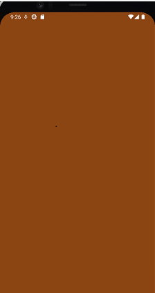
적용된 UI
2.타이틀 컴포넌트
title.js
import React from 'react';
import {View, Text, StyleSheet} from 'react-native';

function Title() {
  return (
    <View style={styles.title}>
      <Text style={styles.text}>Todo List</Text>
    </View>
  );
};

const styles = StyleSheet.create({
  title: {
    width: 400,
    height: 150,
    justifyContent: 'center',
    alignItems: 'center',
  },

  text: {
    fontSize: 74,
    justifyContent: 'center',
    alignItems: 'center',
    color: '#cd853f',
    marginTop: 18,
  },
});

export default Title;
title.js 컴포넌트를 App.js에 적용
import Title from './com/title';
<Title />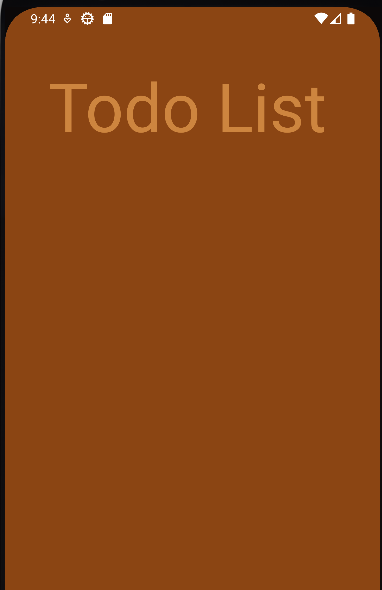
3.AddText 컴포넌트
addText.js
import React from 'react';
import {
  TextInput,
  StyleSheet,
  View,
  Image,
  Text,
  TouchableOpacity,

} from 'react-native';

function AddText() {
  return (
    <View style={styles.view}>
      <TextInput
        placeholder="Add Task"
        style={styles.input}
        maxLength={10}
        value={text}
        onChangeText={setText}
        returnKeyType="done"
      />

      <TouchableOpacity onPress={onPress}>
        <Image source={require('../com/plus.png')} style={styles.img} />
      </TouchableOpacity>
    </View>
  );
}

const styles = StyleSheet.create({
  view: {
    height: 50,
    justifyContent: 'center',
    flexDirection: 'row',
    paddingHorizontal: 16,
    backgroundColor: '#deb887',
    borderRadius: 20,
    margin: 25,
  },

  input: {
    justifyContent: 'center',
    alignItems: 'center',
    fontSize: 20,
    borderRadius: 15,
    borderColor: '#800000',
    color: '#000000',
    paddingVertical: 8,
    flex: 1,
  },

  img_view: {
    width: 30,
    height: 30,
  },

  img: {
    width: 40,
    height: 40,
    marginLeft: 30,
    marginTop: 5,
  },
});

export default AddText;
키워드 TouchableOpacity placeholder maxLength
TouchableOpacity : 뷰를 터치시 이벤트를 발생하게 해주는 기능
onPress()함수를 통해 랜더링
placeholder : TextInput 입력창에 힌트를 보여주는 기능
maxLength : TextInput의 입력 글자수를 제한해주는 기능
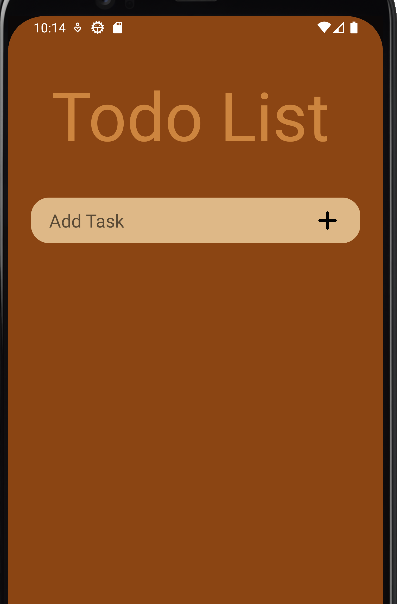
App.js에 적용시키기
import AddText from './com/addText';
<AddText onInsert/>
적용된 UI
4.todo 컴포넌트
todo 컴포넌트를 작성하기 전 아이템을 보여지는 컴포넌트로 미리 데이터셋을 하여 UI를 만들것이다.
App.js
import React, {useState} from 'react';

  const [todos, setTodo] = useState([
    {id: 1, text: '작업환경 설정', done: false, Editable: false},
    {id: 2, text: '리액트 네이티브 기초 공부', done: false, Editable: false},
    {id: 3, text: '투두리스트 만들어보기', done: false, Editable: false},
  ]);

     <Todo
            todos={todos}
          />
데이터 셋팅
id : 고유의 id값 text : 데이터 text done : 완료전 Boolean 값
키워드 Usestate, Todo 컴포넌트로 props 인자값을 보내 데이터 정보를 전달
Usestate : 데이터를 관리해주는 Hook의 종류 컴포넌트의 상태관리나 주기관리를 할 수 있도록 기능을 제공해준다.
todo.js
import React from 'react';

import {FlatList, StyleSheet} from 'react-native';
function Todo({todos}) {

  return (
    <FlatList
      style={styles.list}
      data={todos}
      renderItem={({item}) => (
        <Item
          id={item.id}
          text={item.text}
          done={item.done}
          editable={item.Editable}
        />
      )}
      keyExtractor={item => item.id.toString()}
    />
  );
};

const styles = StyleSheet.create({
  view: {
    width: 380,
    height: 500,
    marginStart: 15,
    marginTop: 15,
    borderRadius: 15,
    borderWidth: 1,
    borderColor: '#800000',
    alignItems: 'center',
  },

  list: {
    flex: 1,
  }
});
export default Todo;
키워드 FlatList keyExtractor renderItem
FlatList는 스크롤을 지원해주는 컴포넌트로 ScrollView와 FlatList가 있다.
ScrollView : 스크롤을 지원하며 데이터의 양이 적을 때 주로 사용하는 컴포넌트
FlatList : ScrollView와 달리 데이터의 양이 많을시에 주로 사용하는 컴포넌트로 한번에 모든 데이터를 렌더링하지 않고 화면에 보여지는 데이터만 렌더링하는 컴포넌트
KeyExtractor : 셋팅한 id값을 통해 요소를 구별해주는 기능
renderItem : Props로 전달받은 데이터를 render 시켜주는 콜백함수
item.js
아이템을 커스텀 해주는 컴포넌트
import React, {useState} from 'react';
import {
  View,
  Text,
  StyleSheet,
  Image,
  TouchableOpacity,
  Alert,
  TextInput,
} from 'react-native';

function Item({id, text, done, editable}) {

  return (
    <View style={styles.item}>
      <TouchableOpacity onPress={onPress_onToggle}>
        <View style={[styles.circle, done && styles.failed]}>
          {done && (
            <Image
              source={require('../com/toggle.png')}
              style={styles.toggle_img}
            />
          )}
        </View>
      </TouchableOpacity>

      <TextInput editable={editable} style={[styles.text, done && styles.line]}>
        {text}
      </TextInput>

      <TouchableOpacity onPress={onPress_onModify}>
        <View style={styles.img_view}>
          <Image source={require('../com/su.png')} style={styles.img} />
        </View>
      </TouchableOpacity>

      <TouchableOpacity onPress={onPress_onDelete}>
        <View style={styles.img_view}>
          <Image source={require('../com/delete.png')} style={styles.img} />
        </View>
      </TouchableOpacity>
    </View>
  );
}

const styles = StyleSheet.create({
  item: {
    flexDirection: 'row',
    backgroundColor: '#deb887',
    margin: 8,
    height: 70,
    borderRadius: 20,
    marginLeft: 20,
    marginRight: 20,
  },
  failed: {
    justifyContent: 'center',
    alignItems: 'center',
    backgroundColor: '#deb887',
    marginBottom: 1,
  },

  circle: {
    width: 25,
    height: 25,
    borderRadius: 12,
    borderWidth: 2,
    marginTop: 23,
    marginLeft: 8,
    borderColor: '#8b4513',
  },

  text: {
    fontSize: 20,
    marginLeft: 13,
    flex: 1,
    color: '#000000',
  },

  img_view: {
    width: 25,
    height: 25,
    marginRight: 13,
  },

  img: {
    width: 27,
    height: 27,
    marginTop: 19,
  },

  toggle_img: {
    alignItems: 'center',
    justifyContent: 'center',
    width: 25,
    height: 25,
  },

  line: {
    color: '#9e9e9e',
    textDecorationLine: 'line-through',
  }
});

export default Item;
todo.js에 item.js 컴포넌트 적용
import Item from './item';적용 후 완성된 UI
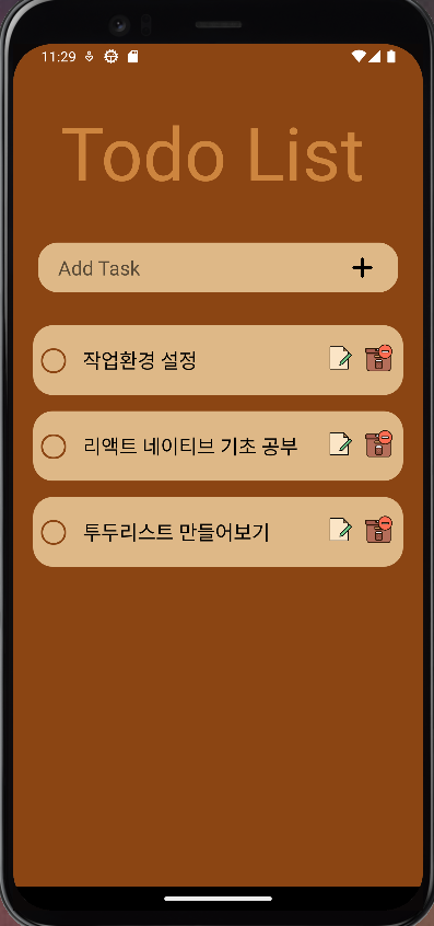
Todo list 프로젝트 (2)에서는 Insert, delete, edit, complete 기능을 소개하고 오류와 추가할 기능에 대해서 소개를 할 예정이다
