[구디아카데미]
transform
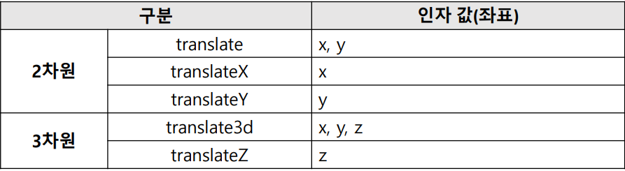
- 요소를 페이지의 일정 좌표로 이동하는 함수
속성
✅ scale
- 요소를 일정 페이지만큼 확대/축소 시키는 함수
- 양수 : 확대 / 음수 : 축소
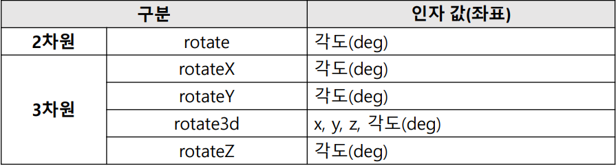
✅ rotate
- 지정 각도만큼 요소를 시계방향(양수)이나 반대방향(음수)으로 회전하는 함수
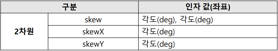
✅ skew
- 지정한 각도만큼 요소를 비틀어 변형하는 함수로 2차원만 가능
✅ perspective
- 화면에서 원근감을 갖게 하는 속성
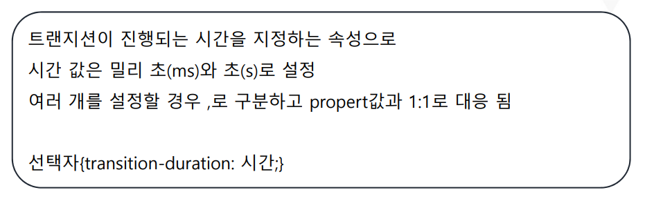
트랜지션
- 웹 요소의 스타일이 바뀌는 것 의미
- CSS로 애니메이션 같은 효과를 낼 수 있음
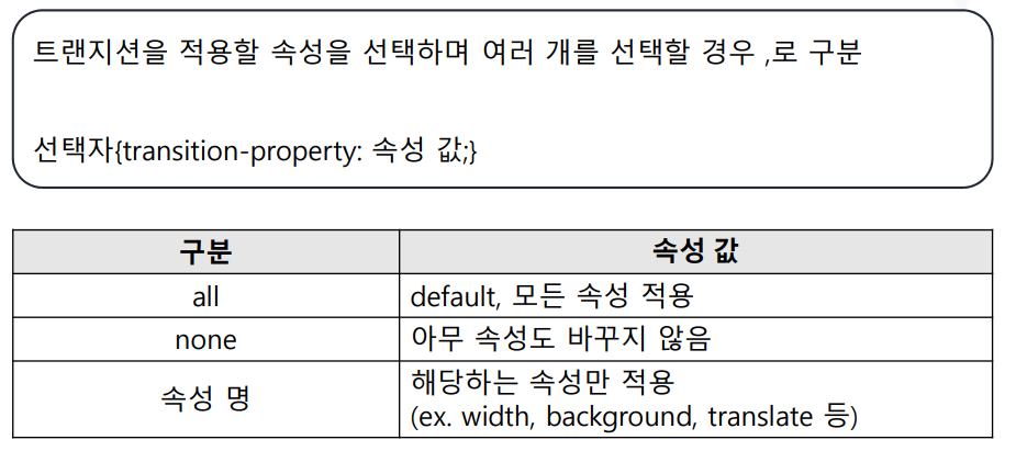
- 변형이 순차적으로 천천히 발생하게 하는 속성
종류
- transition-property : 트렌지션이 발생하는 css 속성 설정
- transition-duration : 트렌지션 발생시간 설정
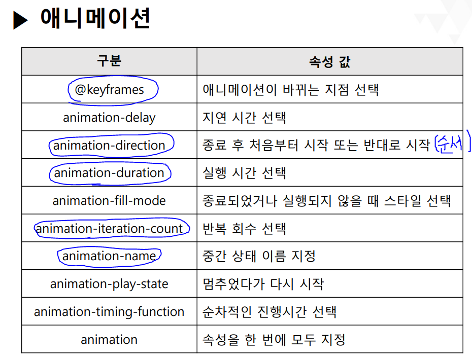
애니메이션
시작 스타일과 끝 스타일을 부드럽게 이어주는 기능을 하는 것은 트랜지션과 같지만 애니메이션은 중간 원하는 위치에서 keyframes라는 것을 이용하여 중간 스타일을 넣을 수 있음
    <style>
        @keyframes ani{
            to{
                background-color : salmon;
                font-size: 80px;
                transform: translate(200px, 200px);
            }from{
                background-color: darkmagenta;
                font-size: 25px;
                border:10px solid lime;
                border-radius: 100px;
                transform: rotate(180deg);
            }
        }
        .ani{
            animation-name: ani;
            animation-duration: 2s;
            animation-iteration-count: 3;
            animation-direction: alternate;
            /* alternate : 왔다 다시 반대로 */
        }
        @keyframes ani2{
            0%{
                transform: translate(300px,300px);
                background-color: aqua;
                font-size: 5px;
            }
            20%{
                background-color: darkorange;
                font-size: 30px;
                transform: rotate(360deg);
            }
            40%{
                background-color: red;
                font-size: 10px;
                transform: perspective(200px) rotateX(45deg);
            }
            60%{
                background-color: yellow;
                font-size: 40px;
                transform: scale(2);
            }
            80%{
                background-color: magenta;
                font-size: 20px;
                transform: translate(-100px, -100px);
            }
            100%{
                background-color: lime;
                font-size: 60px;
                transform: rotate(360deg);
            }
        }
        .ani2{
                animation-name:ani2;
                animation-duration:4s;
                animation-iteration-count: infinite;
                animation-direction: alternate;
            }
    </style>
전체 소스코드
<!DOCTYPE html>
<html lang="en">
<head>
    <meta charset="UTF-8">
    <meta http-equiv="X-UA-Compatible" content="IE=edge">
    <meta name="viewport" content="width=device-width, initial-scale=1.0">
    <title>변형 에니메이션</title>
</head>
<body>
    <h1>변형 이용하기</h1>
    <h1>
        태그가 특정이벤트에 의해 변경되는 것을 말함
        변형 -> 이동, 확대, 회전 등
        transform 속성을 이용
        transform 속성에는 css에서 제공하는 함수를 대입
    </h1>
    <h4>태그 이동시키기 </h4>
    <p>
        translate() : xy축으로 이동하는것
        translateX() : x축으로 이동
        translateY() : y축으로 이동
    </p>
    <p><img src="./images/나.jpg" alt="" width="200" height="200" class="translate"></p>
    <p><img src="./images/나.jpg" alt="" width="200" height="200" class="translateX"></p>
    <p><img src="./images/나.jpg" alt="" width="200" height="200" class="translateY"></p>

    <style>
        .translate:active{
            transform: translate(200px,200px);
        }
        .translateX:active{
            transform: translateX(200px);
        }
        .translateY:active{
            transform: translateY(200px);
        }
    </style>

    <h2>확대하기</h2>
    <div class="container">
        <p class="scale transition">여러분 이제 css거의 다 끝났어요.. 우와 신난다</p>
        <p class="scaleX transition">여러분 이제 css거의 다 끝났어요.. 우와 신난다</p>
        <p class="scaleY">여러분 이제 css거의 다 끝났어요.. 우와 신난다</p>
    </div>

    <style>
        .container{
            margin: 50px;
        }
        .scale:active{
            transform: scale(1,5);
            color: lime;
        }
        .scaleX:active{
            transform: scaleX(1.5);
            color: magenta;
        }
        .scaleY:active{
            transform: scaleY(1.5);
        }
    </style>

    <h3>skew 적용하기</h3>
    <!-- skew (각도만큼 찌그러트리기) -->
    <div class="container">
        <img src="./images/세숑이.png" alt="" width="200" height="200" class="skew">
        <h3 class="skew">이것도 적용되니</h3>
    </div>
    <style>
        .skew:active{
            /* transform: skew(45deg); */
            /* transform: skewX(45deg); */
            transform: skewY(45deg);
        }
    </style>

    <h3>회전시키기</h3>
    <div class="container">
        <img src="./images/나.jpg" alt="" width="200" height="200" class="rotate transition">
        <img src="./images/나.jpg" alt="" width="200" height="200" class="rotateX transition">
        <img src="./images/나.jpg" alt="" width="200" height="200" class="rotateY transition">
    </div>
    <style>
        .container>img{
            border: 1px solid lightcoral;
        }

        .rotate:active{
            /* perspective : 원근감 줌 */
            transform:perspective(200px) rotate(45deg);
        }
        .rotateX:active{
            transform:perspective(200px) rotateX(45deg);
        }
        .rotateY:active{
            transform:perspective(200px) rotateY(45deg);
        }
    </style>

    <h3>트렌지션적용하기</h3>
    <p>
        변형이 순차적으로 천천히 발생하게 하는 속성
        transition-property : 트렌지션이 발생하는 css 속성 설정
        transition-duration : 트렌지션 발생시간 설정
    </p>
    <style>
        .transition{
            transition-property: color,transform,height,width;
            transition-duration: 2s;
        }
    </style>

    <nav class="menu">
        <ul>
            <li><a href="">메인화면</a></li>
            <li><a href="">게시판</a></li>
            <li><a href="">갤러리</a></li>
            <li><a href="">자료실</a></li>
        </ul>
    </nav>
    <br><br><br><br>
    <style>
        .menu>ul{
            display: flex;
            list-style-type: none;
            justify-content: space-evenly;
        }
        .menu>ul>li>a{
            text-decoration: none;
            font-size: 30px;
            font-weight: bolder;
            color: lightgreen;
            letter-spacing: 10px;
        }
        .menu>ul>li,.menu>ul>li>a{
            transition-property: color,transform;
            transition-duration: 1s;
        }
        .menu>ul>li:hover{
            transform: scale(1.5);
        }
        .menu>ul>li>a:hover{
            color: lime;
        }
    </style>

</body>
</html>
우측 상단 햇님모양 클릭하셔서 무조건 야간모드로 봐주세요!!